A logo is a graphic element used to identify a company, a product, an organisation, an event and so on.
A logo is not there to sell, explain or advertise. A logo’s job is to identify.
A well-executed logo is:
- simple - and therefore easy to recognise and identify
- memorable - if it is simple, it is more likely to keep its elements intact at different sizes (small ones especially). It is easier to recognise and remember.
- appropriate - because not all industries are alike
- adaptable - it should look good at small sizes and in a single colour. On light and on dark backgrounds.
- built to last - will it feel just as current in 10 years’ time?
And a short, very useful video on placement, composition and design principles:
We should point out that the principles above concern the exercise of executing a logo itself, not research, analysis, strategic planning, branding, positioning and so on.
The process
First of all, or apologies upon apologies…
We should mention that we will make something fairly generic, without going too deep into the analysis, to save time. It is only an exercise.
The upside: this process holds, in principle, for executing the logo of any construction company.
The downside: we will not make the most of the potential for differentiation. And a logo’s main role is to identify. Differentiation is key to identification.
With that said, let’s get going. We pick the Basconslux logo for this exercise.
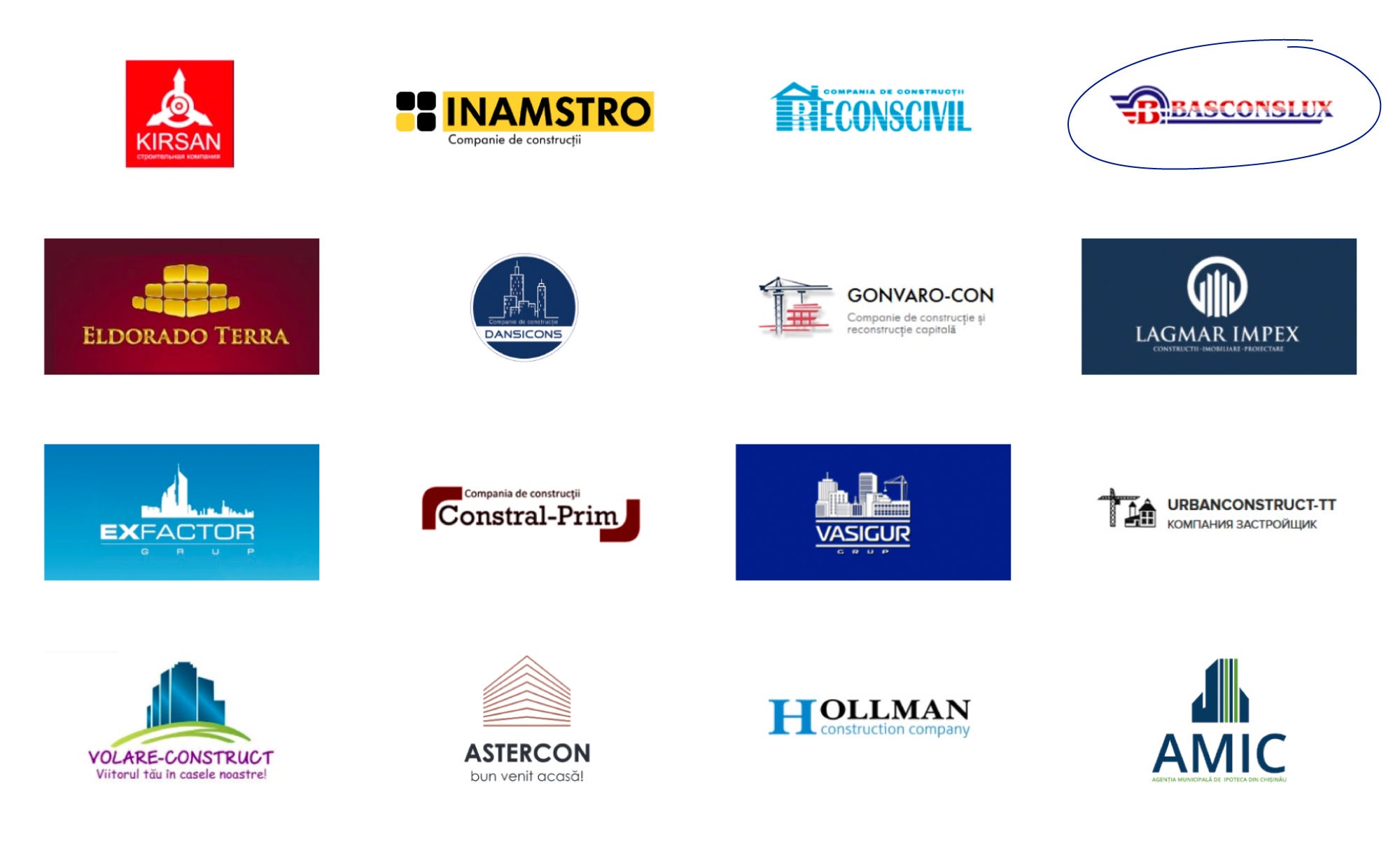
We notice that most construction companies actually have logos whose symbol explains what they do, trying to pack in graphic elements related to construction (apartment blocks, houses, cranes and so on). The result: while everyone is busy explaining, the identifying role - which, as we said, matters more - gets lost.
Relevant related elements:
- houses
- apartment blocks
- cranes
- perspective
- architecture
- home vs house (my home, as opposed to just any dwelling)
- trust
- growth / development
- the initial B
The symbol
We too take the classic route. We try to execute a relevant symbol that would include these elements: an apartment block, a house, arrows standing for growth / development, the initial B, and perspective as a link to architecture.
✏️ Sketching
At this stage, what matters is not the execution but speed. We use pencil and paper to get as many elements as possible onto the page. This is where ideas start to come about how the relevant elements could be combined into a symbol.
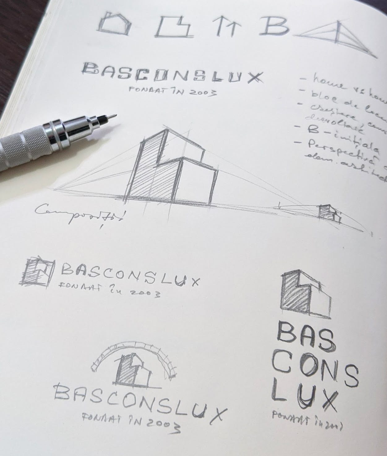
💡 Ideas often sound interesting and promising when we talk about them. But once they are put on paper / applied, we suddenly realise things look different, and sometimes even absurd.
We ask ourselves what the simplest graphic representation of the letter B, of an apartment block and of the other meanings above would be, and we work with the shapes a little until we reach the first results.
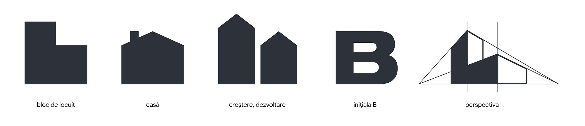
Goood. We have the B, the blocks and the perspective.

Left - we are close to an object much larger than us, looking up at it. Right - we are further away from the object.
Perspective: the sharper the top angle, the closer and larger the object appears. And the smaller we are. In other words, an aggressive position of superiority.

Whenever we execute symbols, we make sure they do not visually communicate anything other than what we intend. In our case there is also the danger that the blocks might read more like a drawing of a sofa.
And speaking of what the blocks mean - if a block is tall, it has an excessive number of storeys, which buyers might shy away from. So we have to find the visual balance at which to stop.

While we work on form / geometry, we try to use a single colour (black or dark grey, for example), because a well-made logo has to look good in one colour too. We can use lighter neutral tones if we need a placeholder for the second colour.
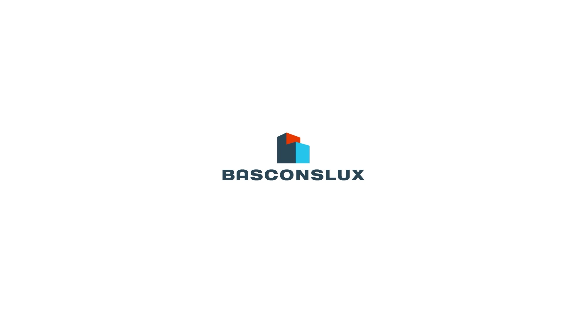
Eventually we reach an acceptable version of the symbol that carries all the meanings we wanted at the start. We give it colour. In our case we keep the same palette - blue and red.
The typeface
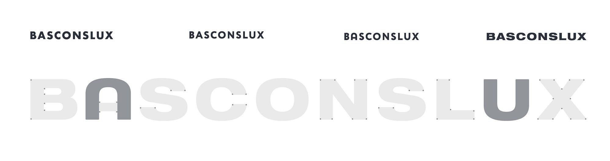
We go for something bold, solid and imposing, all in capitals, to suit the construction industry and inspire trust.
The brand name appears to be made up of three parts: Bas, Cons and Lux, presumably standing for “Basarabia construcții de lux” (Bessarabia luxury construction). So that we don’t have to write BasConsLux (highlighting the abbreviations at the expense of reading the name as one word) or Basconslux (which would ignore the abbreviations), we use BASCONSLUX.
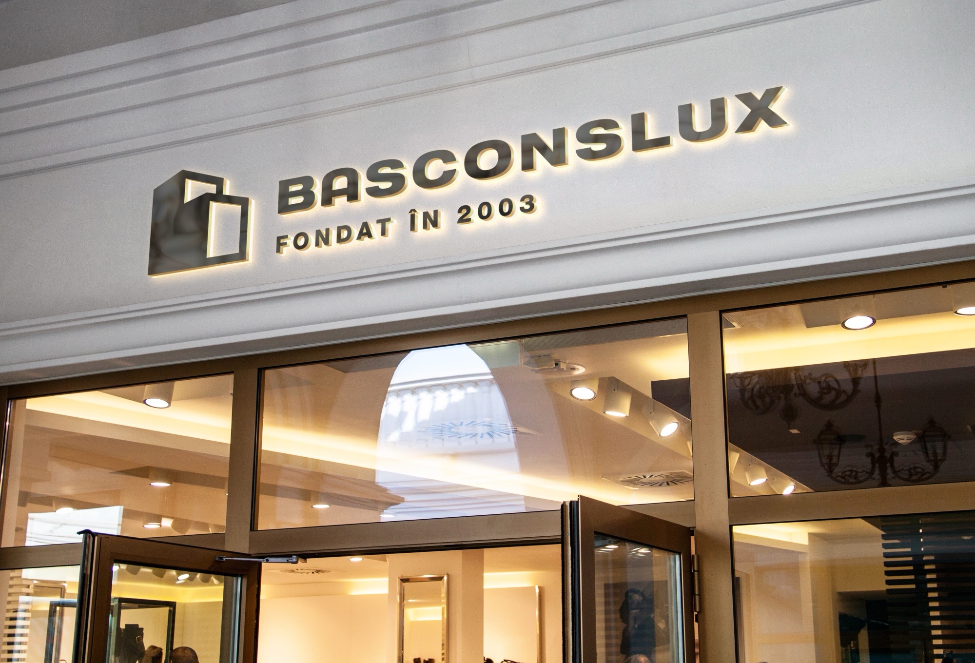
The A and the U share similar shapes, to build a little consistency and make the logo more distinctive. The A is inspired by the type of the German Bauhaus school. All the corners of the letters have been rounded very slightly.
Final composition
With the symbol and the wordmark in hand, we can assemble a few logo lock-ups. Here we take great care with the balance between symbol and type. And we can apply them on a few mock-ups to give more context.
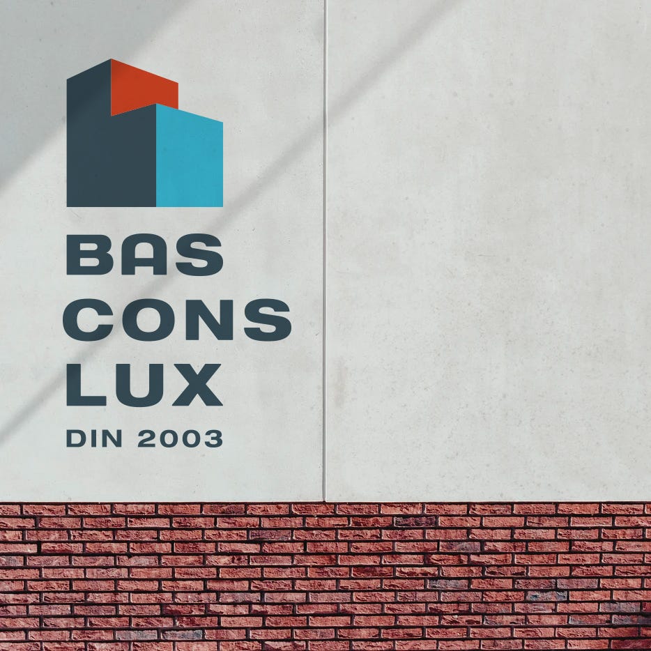
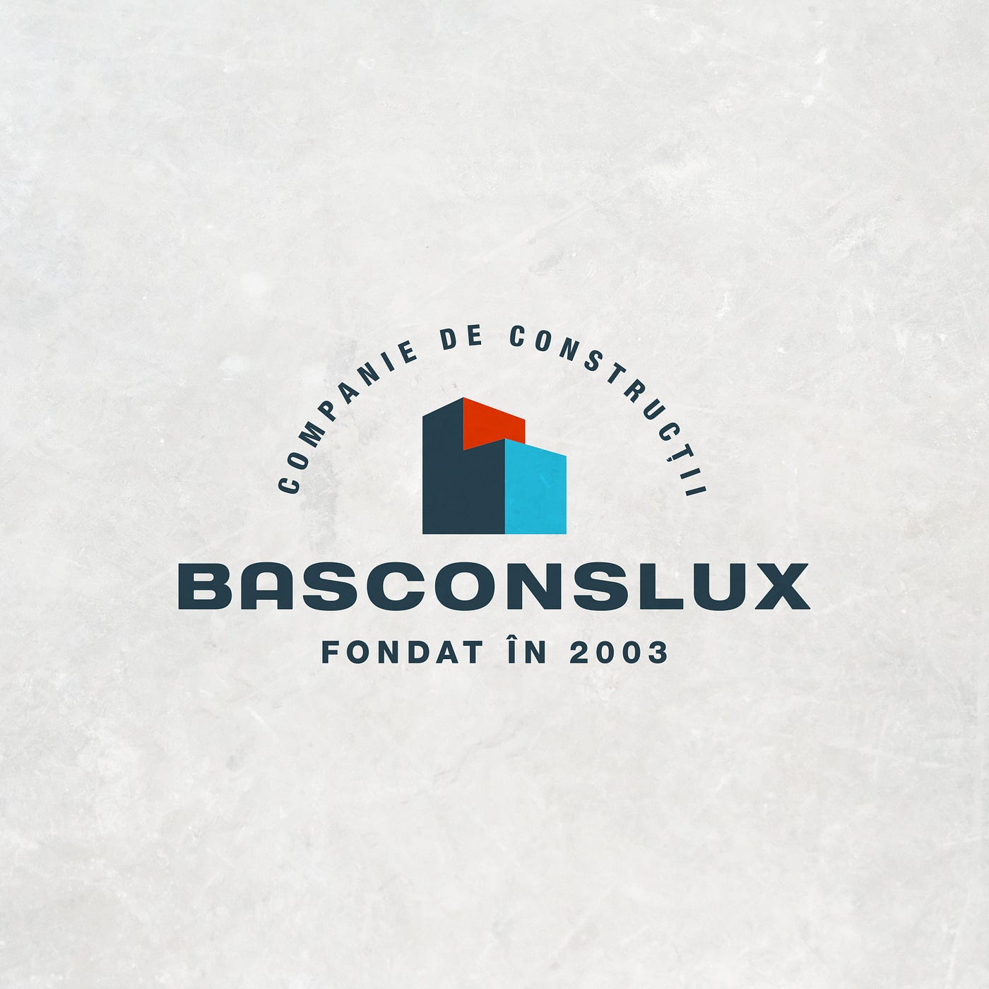
And this is where we can pause the exercise for now. Although the execution may not be bad (which was our aim), we have ended up with yet another logo like every other construction company on the market. What is missing is differentiation at the level of concept.
In other words, to be continued. Read part two here.