
At the Design Academy, for a more authentic experience, we use examples from local Moldovan producers as case studies and practice. We publish this series of articles in the hope that it will be useful to anyone interested in design.
Before anything else, a few principles worth respecting in design: contrast, repetition, alignment, proximity, balance.
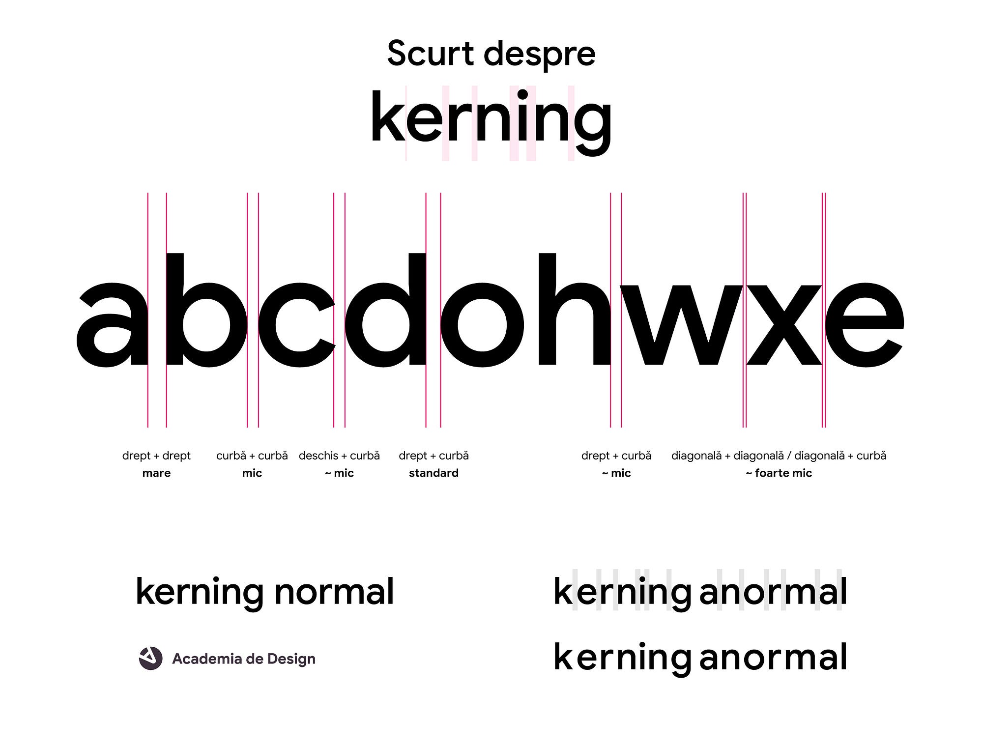
And a short explainer on typography.
Observations
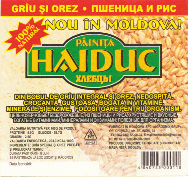
Fairly obvious ones:
- The whole word is set in capitals
- The letterforms have two stroke weights
- The A carries a calligraphic flourish
Closer observations
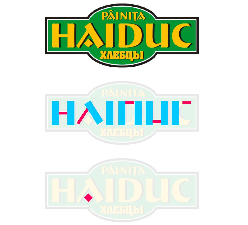
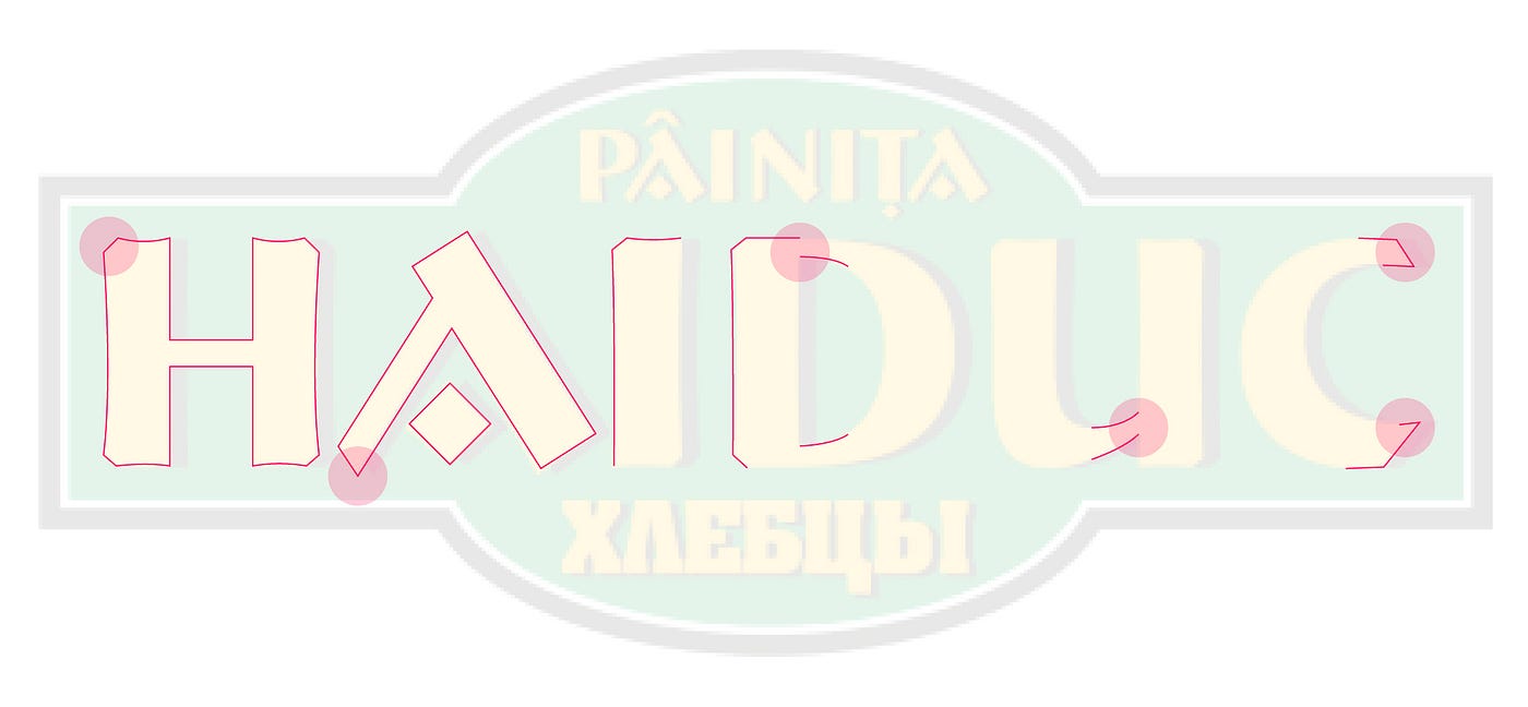
The bottom-left corner of the A is acute (unlike the right side or the top, where the corners are right angles).
The C is not consistent with the other letters. The thickness of the terminals varies, and so do the corner angles (top versus bottom).
Some letters have ornamented corners in some places (H, I, D, U). The A and the C do not.
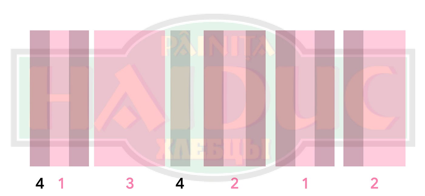
In theory, the H should be the same width as the U, and the D the same as the C. And the stem of the I should recur, as one of the two weights, in almost every letter.
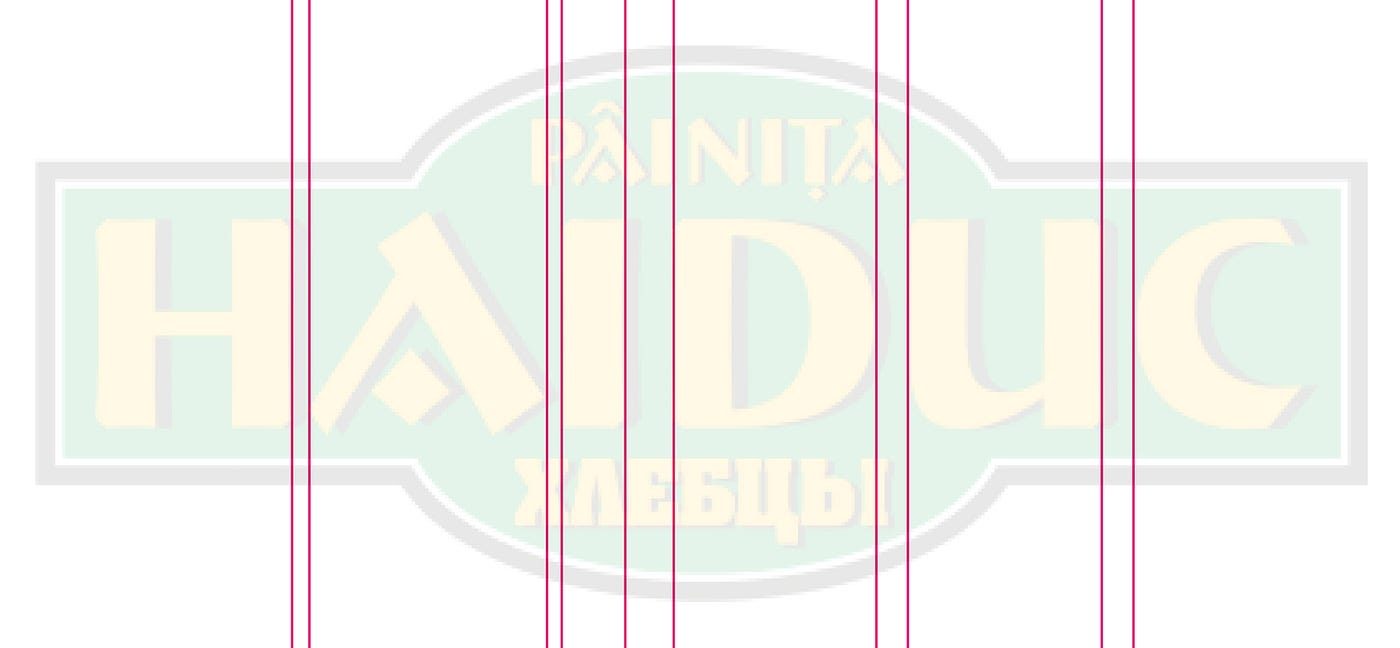
The kerning is more or less fine.
Before moving on to execution, a few notes:
- We will keep the calligraphic flourish on the A.
- We will keep the two weights.
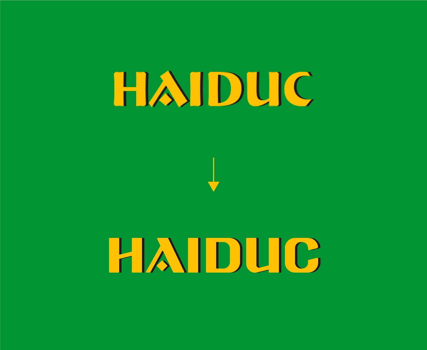
- We will round the corners ever so slightly, for some consistency between letters.
- We will look for anywhere else we can find elements that create consistency (angles, weights, spacing, rounding and so on).
Let’s begin
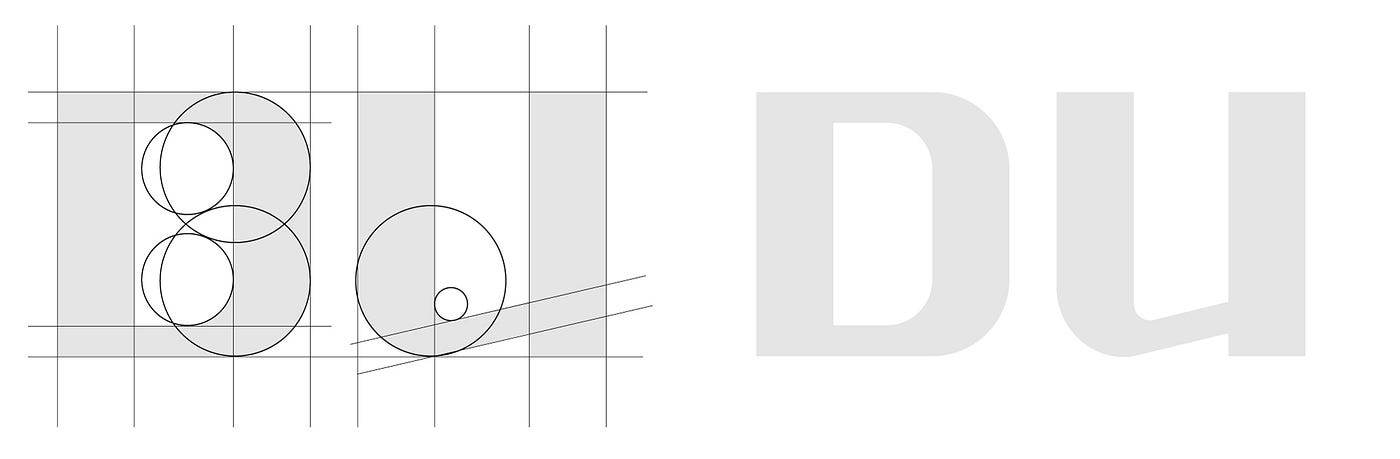
With the very rough geometry of the letters. Repetition of the stroke weights matters here.
Then we work on each letterform in turn. Consistency sits at the head of the table here (created through repetition, alignment, contrast, proximity).

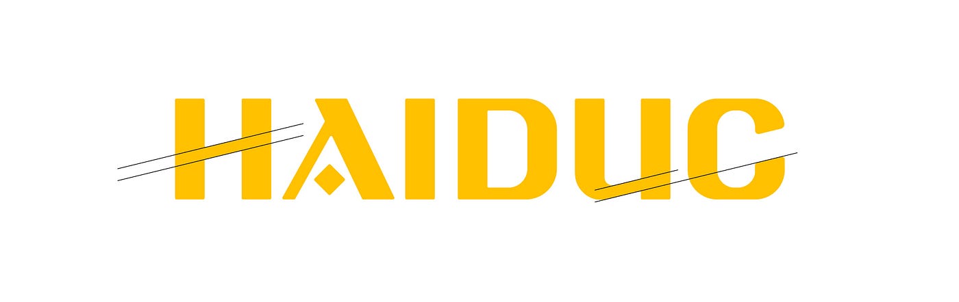
We slant the crossbar of the H at the same angle as the bottom stroke of the U. Repetition. Then we give the C the same angle too.

Every corner very subtly rounded.
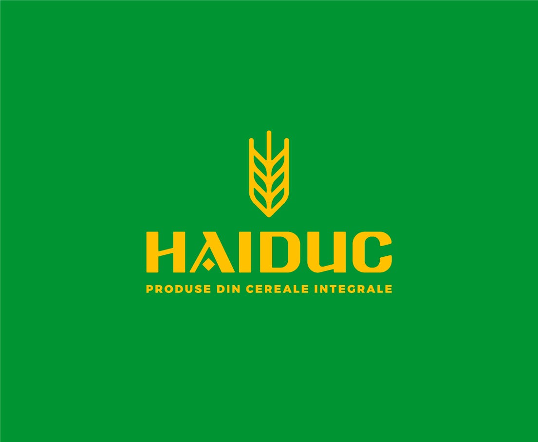
Good. From here, an improved version of the logo is a fairly short step away. We add an optional symbol and a stamp with the year the company was founded…

and…
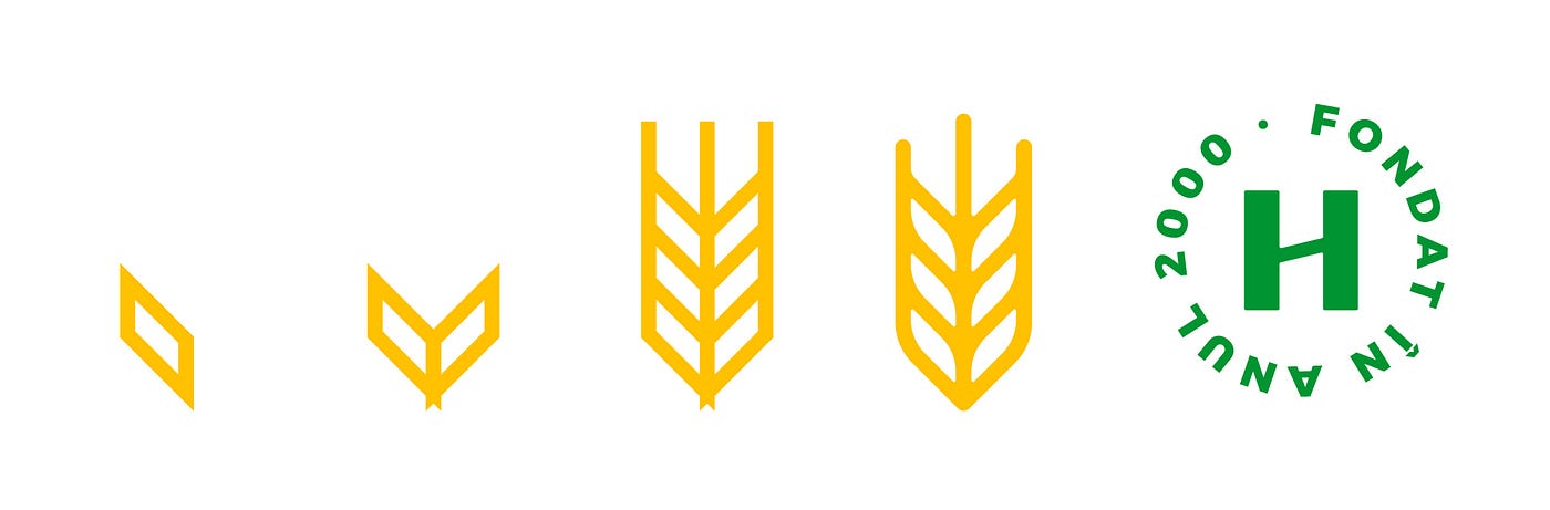
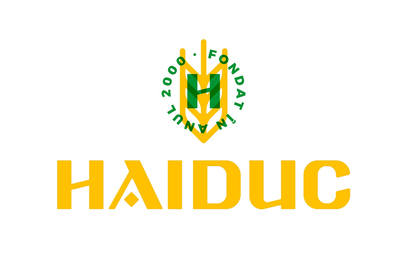

Context
When would improvements and changes like these apply? When the goal is a refreshed identity that evolves what came before, keeping some ties to the past, but re-executed to a higher standard.
In other words - evolution, not revolution.
Elements and characteristics are kept, but the work follows design principles to create consistency (through repetition, contrast, balance and so on).
Often the choice is a completely new identity. In this exercise, the work covered only the analysis and refinement of the lettering.