
Case study · September 2026 · 14 min · UI / HMI · Outside Moldova
Polestar 2. The driver display, rethought.
The studyWe rebuild the Polestar 2 driver display pixel for pixel, diagnose it with measurements rather than opinions, set a few principles and walk through seven variants to a proposal for Calm mode - the mapless view that most drivers see by default. Not a redesign of the car: an exercise in interface design, about how you read a screen you glance at hundreds of times an hour.
This is the first study in the series that is not about a Moldovan brand, and we say so in the first sentence rather than in a footnote. Polestar is Swedish, the car is built in China, the interface is designed in Gothenburg. But the car lives here, on Moldovan roads, driven every day - and the observation that started all this was made on the road to Orheiul Vechi, not in a studio. A car's interface is a piece of design you have a more intimate relationship with than with any logo: you look at it a few hundred times an hour, usually for half a second, usually with something else on your mind. From that angle, a driver display is the most demanding screen anyone can design. It deserves a study, wherever it was drawn.
A screen you glance at hundreds of times an hour
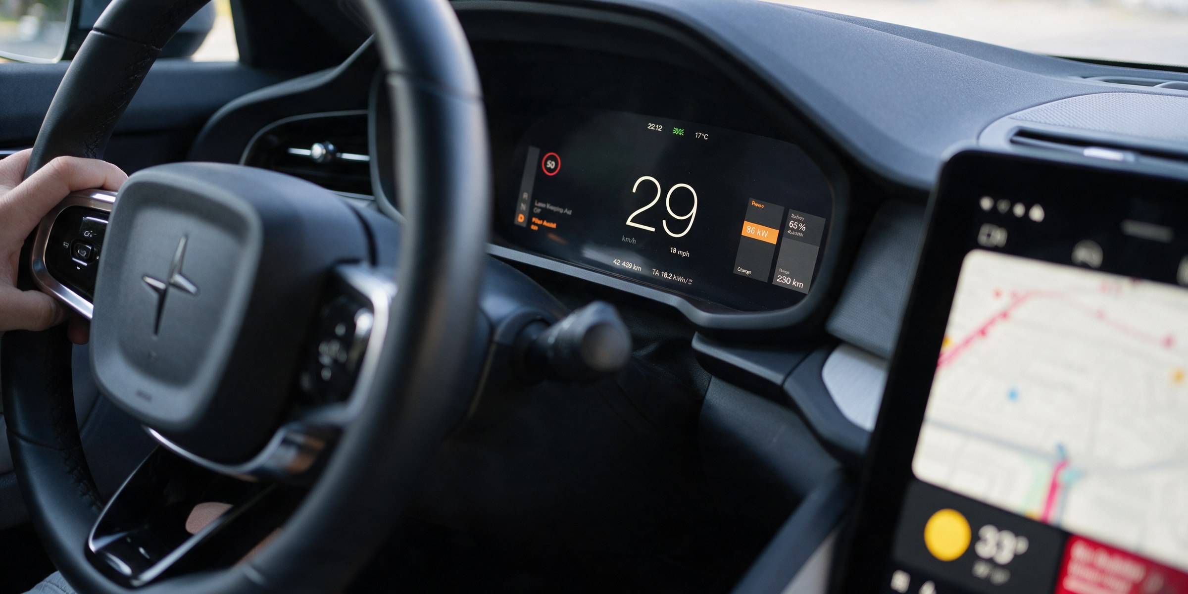
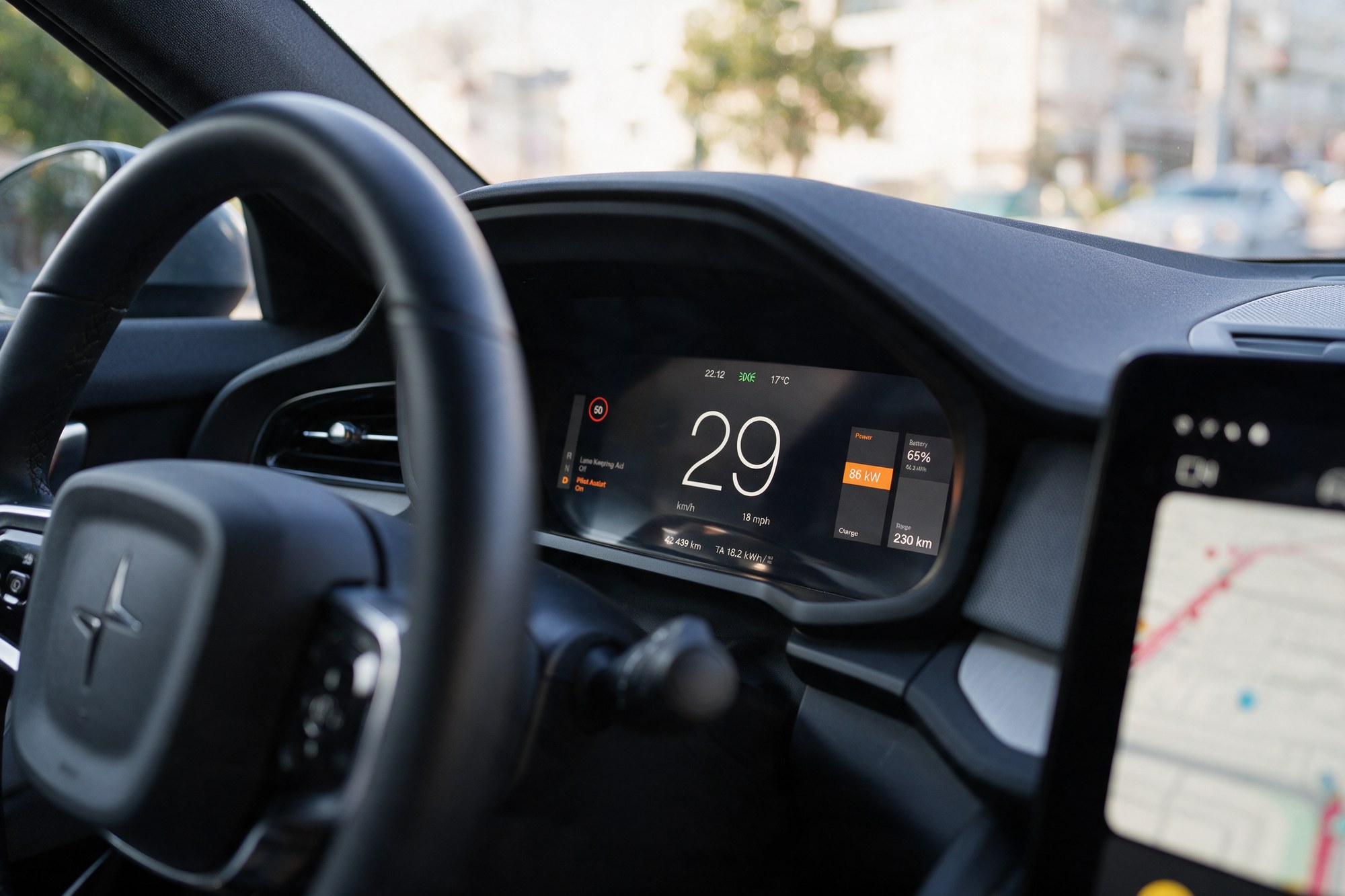
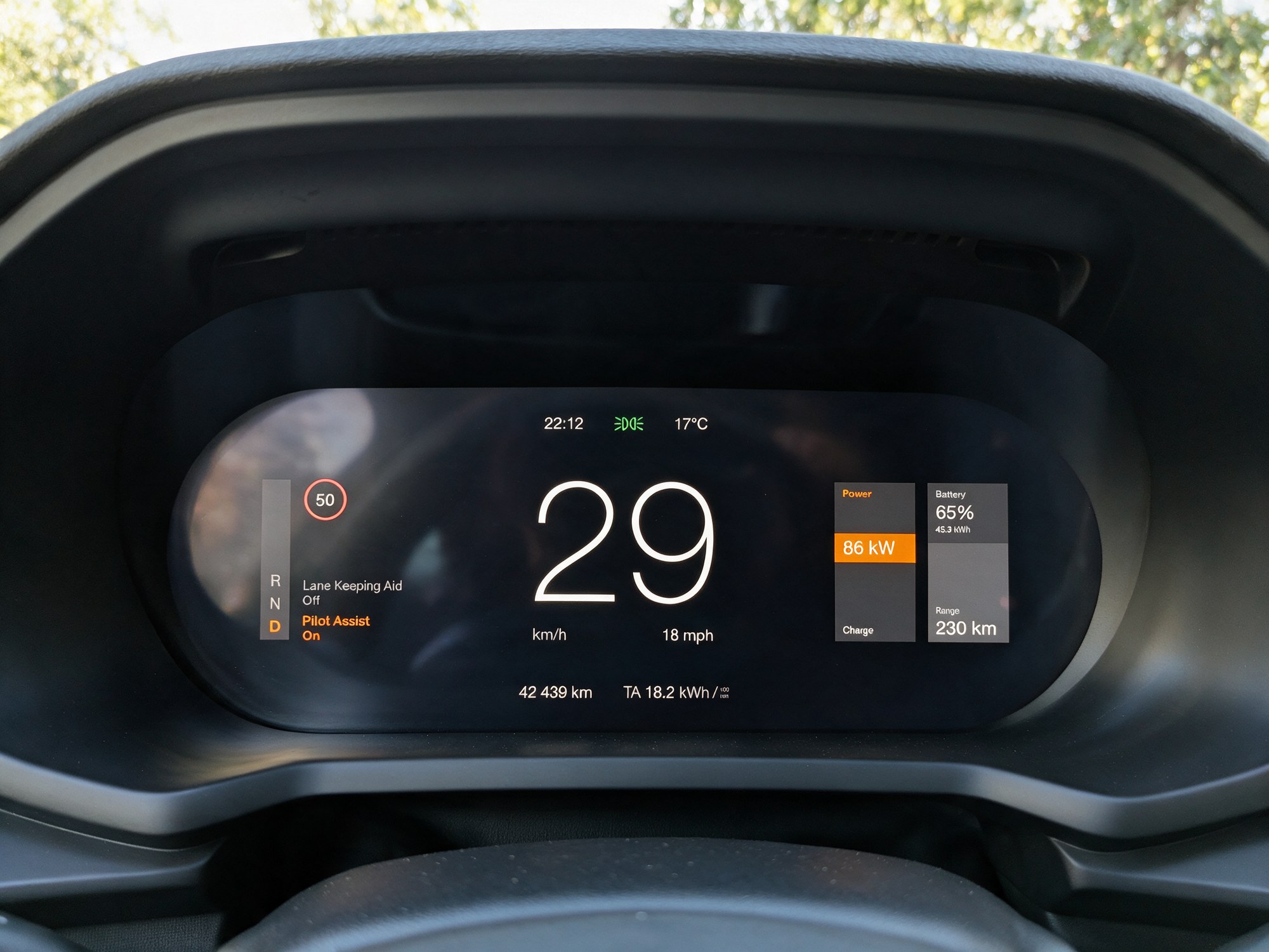
The Polestar 2 has two screens: the central, portrait one running Android Automotive OS, and the one behind the steering wheel - the driver display (the digital instrument cluster, the dashboard proper), a 12.3-inch panel shaped like an elongated pill. The second has several modes; the one we care about is Calm: no map, only driving information. It is the default for many drivers and, at the same time, the "emptiest" mode - which means every structural decision is exposed.
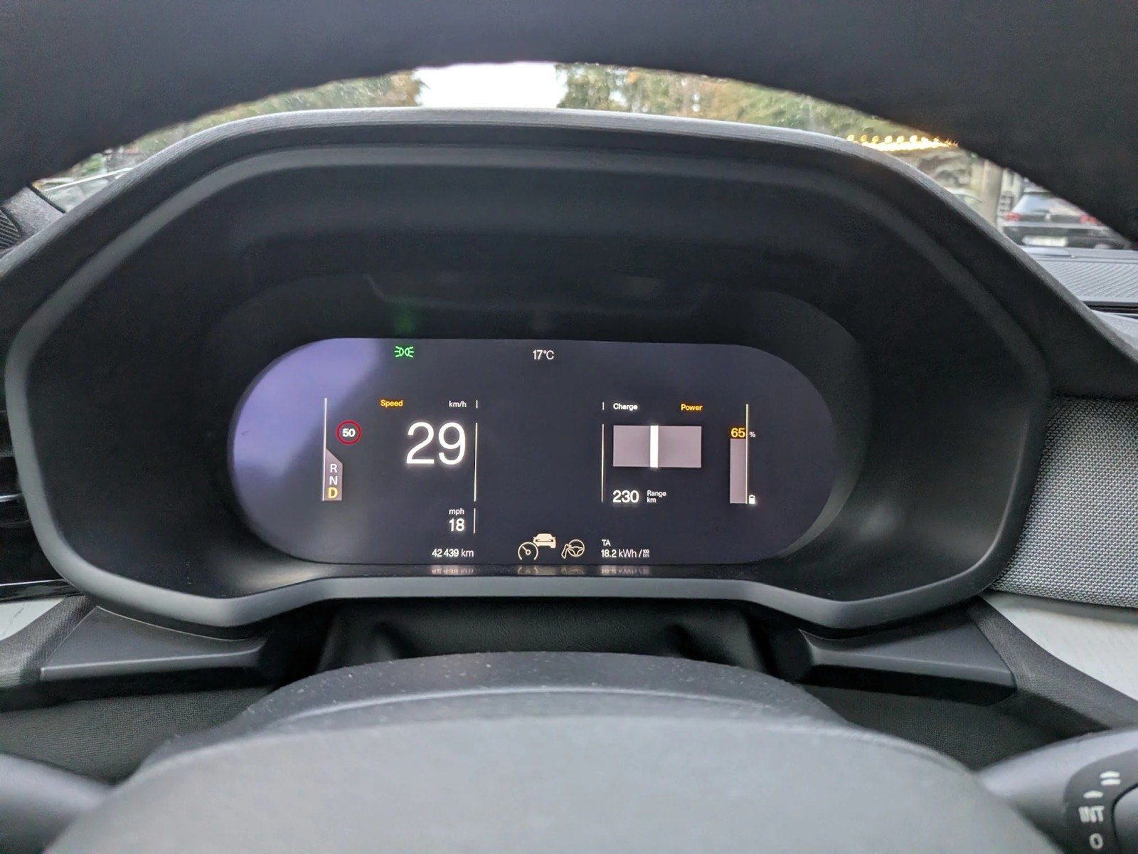
What you see above is a good interface. Clean, typographic, free of ornament, with a single accent colour. Polestar is rightly praised for it. That is exactly why it makes a good subject: analyzing a good interface teaches more than analyzing a bad one, because it forces you to argue with instruments instead of taste.
The method: first the same, then different
Our working rule, valid across the whole series: before you propose, you reproduce. We rebuilt the current screen as faithfully as photographs allow - 1920 × 720 pixels, the panel's resolution, with measured colours, symbols redrawn until they overlapped the originals, and the typeface identified. Only on this reconstruction did we mark what bothered us, and next to it we drew our own version. The reason is simple: this is what makes criticism measurable. "The speed digits are too small" is an opinion; "the speed digits are 2 centimetres tall and take up 11% of the screen height" is a measurement anyone can check.
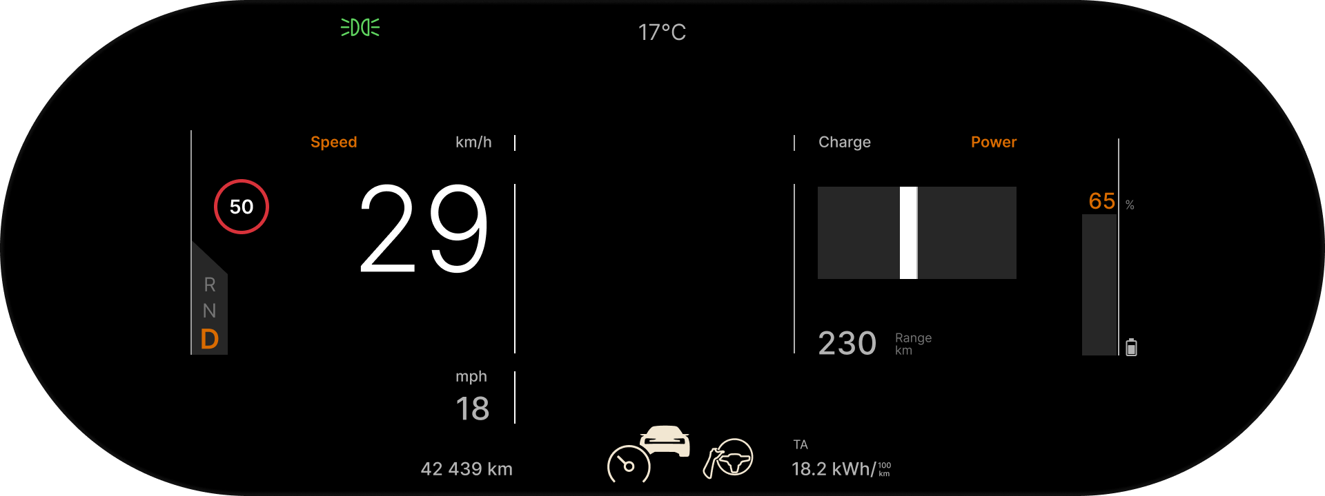
A note on the typeface, because it matters below: Polestar uses a custom version of Unica77 - a Swiss grotesque drawn in the late 1970s by Team'77 for the Haas foundry and revived by Lineto in 2015. Polestar describes it as the main element of communication inside the car. Keep the thought: the entire screen is built from straight lines, right angles and typography. It is a visual language with a small vocabulary and strict grammar - which makes any deviation easy to spot.
The diagnosis, from large to small
Order matters. In the short version of this observation, published on Boys Night, we started from a detail - a corner. Here we start from structure and reach the corner last, because that is how a diagnosis works: skeleton first, skin after.
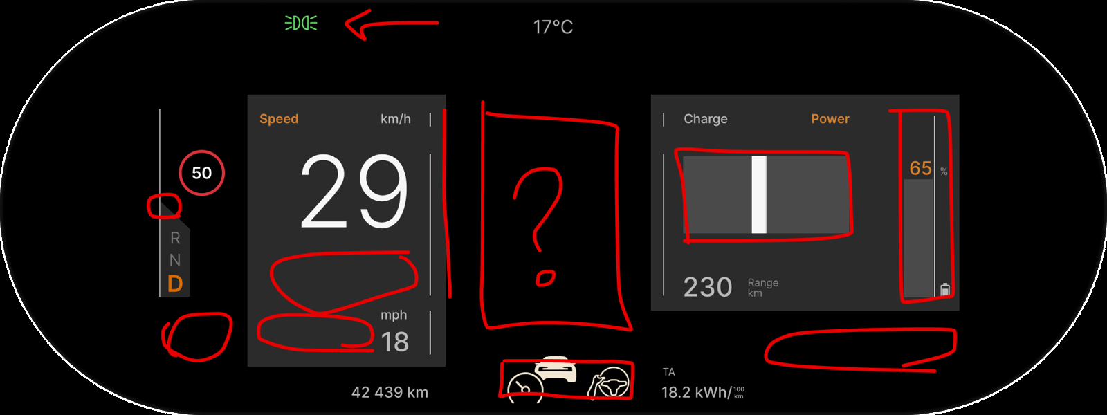
One - the lines group what should not be grouped. The interface uses vertical lines as separators. They appear to group nearby information; at driving speed they group nothing meaningful. One small line for the "Speed" and "km/h" labels, a tall one for the digits, another below for mph: three lines for a single piece of information. Draw a rectangle around everything that belongs to speed and the rectangle has large holes at the bottom left. The separator promises an order the content does not keep.
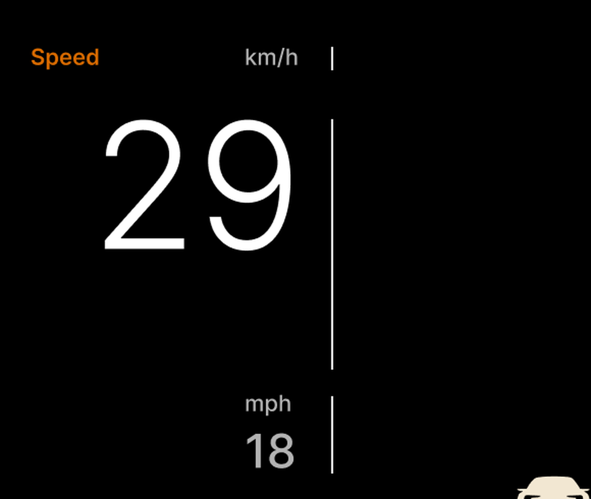
Two - the centre is empty. After the speed comes a blank space, right in the middle of the screen. Let us be precise, because this is easy to overstate: the whole screen is visible while driving; the edges are not hidden by the wheel. But the centre is the most natural place for the eye - it is where the axis of the wheel meets the axis of your gaze, the place you reach without searching. Polestar does not use it at all. The most important information, the speed, sits on the left, and in the most comfortable spot there is nothing.
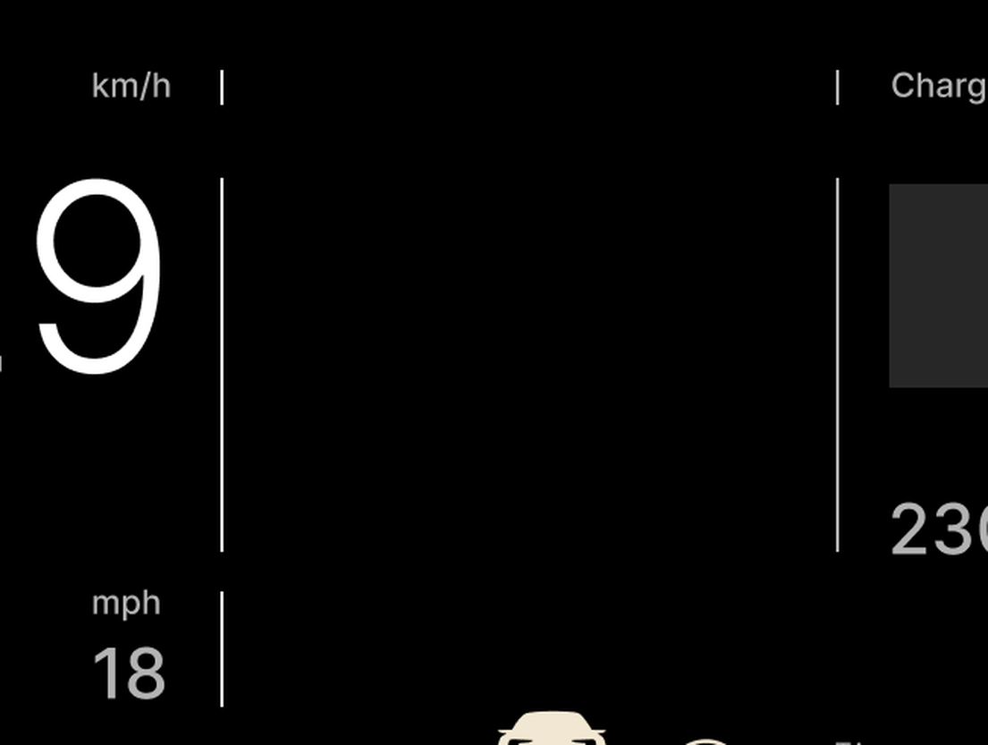
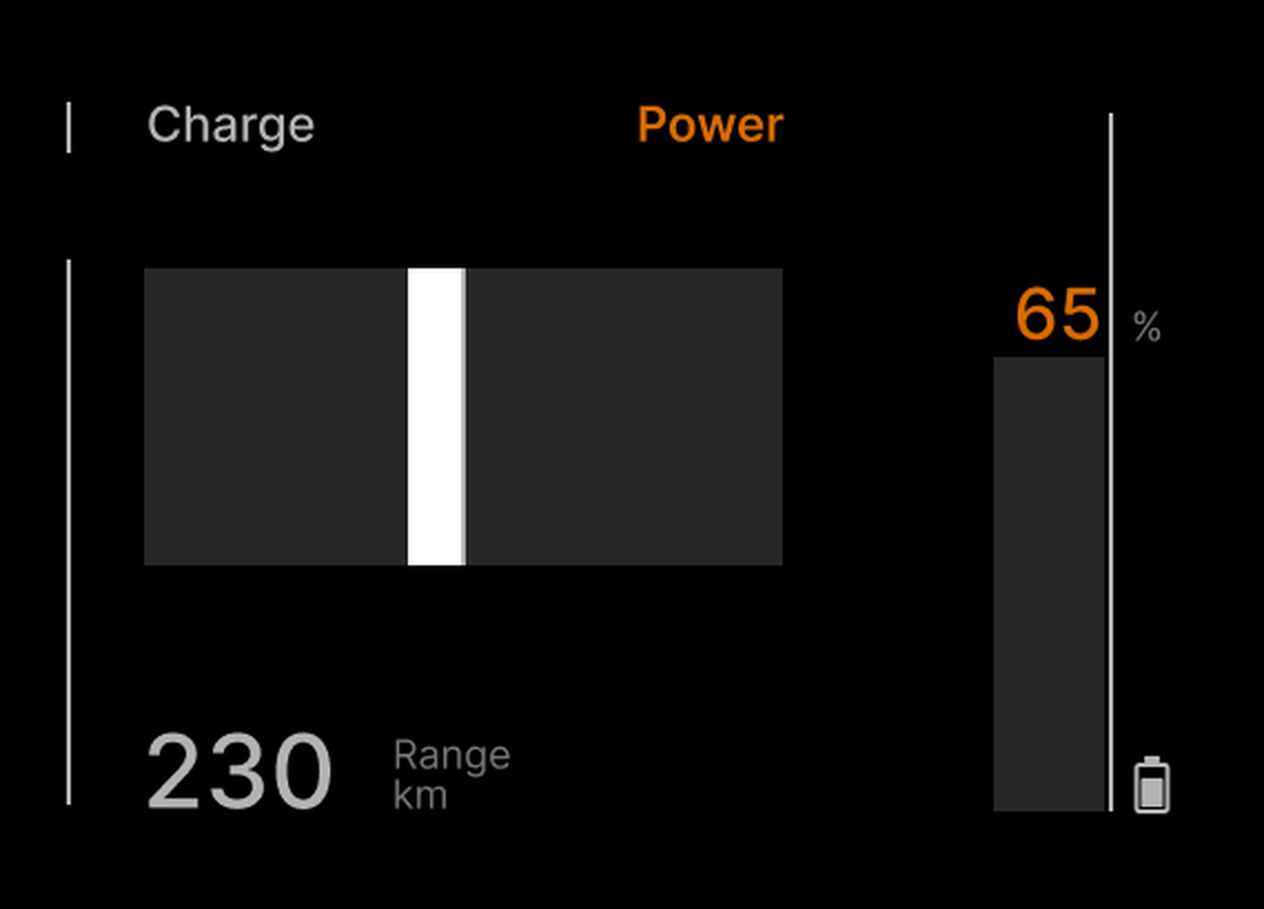
Three - one bar is horizontal, the other vertical. The power and regeneration gauge (Charge / Power) is a horizontal bar with zero in the middle; the battery gauge is a vertical bar. Both show a level. What justifies the difference? Not the content - most likely the space. In a coherent system, two instruments that measure the same thing (a share of a maximum) should speak the same language.
Four - the icons come from different sets. The three driver-assistance icons at the bottom - the cruise-control dial, the car silhouette, the steering wheel with a hand - have different weights: the dial is a stroke of roughly 3.3 pixels, the car is a solid silhouette, the wheel is a stroke of roughly 2.6 pixels, and none is sized against the others. In an interface that is otherwise typographically disciplined, here is one group that never went through the same discipline.

Five - the top row. The lights tell-tale sits on the left for no apparent reason; it could be centred between the time and the temperature. And the time is missing: it lives on the central screen, but drivers are used to seeing it on the cluster too - it is the piece of information people have looked for in the same place for decades.

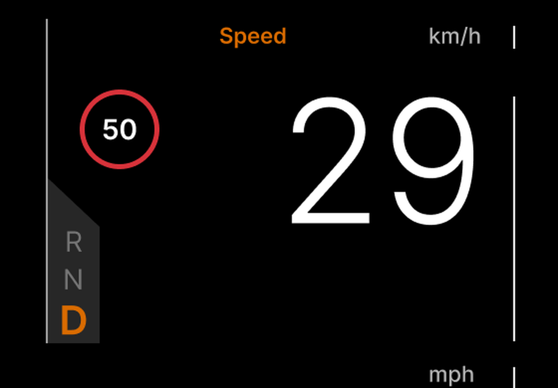
And yes - the corner. The gear selector (R N D) has its top-left corner cut diagonally. It is the only diagonal line in the entire structure of the screen. In a language of right angles, a diagonal is a foreign word - and a foreign word in a five-line text cannot hide. It is the detail that triggered the whole study and, in the order of the diagnosis, it comes last: a corner does not ruin an interface. But a corner tells you the whole screen deserves a look.
Why a dashboard reads differently from a phone
Before drawing anything, a short detour into theory - because every decision below follows from it.
The short glance. A phone screen is read; a dashboard is glanced at. Road-safety literature works in seconds: the NHTSA distraction guidelines recommend that a single glance away from the road should not exceed two seconds, and in practice glances at the cluster are far shorter - fractions of a second. The consequence for design is brutal: any piece of information that needs a second glance to be understood is a piece of information in the wrong place. It does not matter how elegantly it is drawn.
Visual angle, not pixels. Legibility standards for in-vehicle displays (the ISO 15008 family) do not speak in pixels but in visual angle: how much of your field of view a character occupies, at the real viewing distance. For a driver display that distance is about 70 centimetres. The speed digits in the current interface are roughly 2 centimetres tall - about 1.6 degrees of visual angle. The proposal takes them to almost 4 centimetres - about 3.3 degrees. Both are far above any legibility threshold; the difference is not whether they can be read but how fast the eye finds them among everything else on the screen. Hierarchy is a matter of speed, not of possibility.
Grouping by proximity, not by lines. Gestalt psychology describes how the eye groups elements: by proximity, by similarity, by common region. Separators - lines - are the weakest tool of all: they do not group, they divide, and when they divide something the content does not confirm, they create precisely the confusion in point one of the diagnosis. Blocks and the space between them group more strongly and more economically: they add no ink, only structure.
Optical, not geometric balance. A principle as old as typography: the centre the eye sees is not the centre the ruler computes. A composition with more visual weight on one side looks off-centre even when it is mathematically centred - and has to be shifted by a few millimetres to look centred. Below you will see exactly this, with numbers.
Standardised tell-tales. Some of the symbols on a cluster are not design choices: warning lights, brake, lights are standardised (ISO 2575 and type-approval regulations) and have fixed shapes. But the status indicators of driver-assistance functions - adaptive cruise control, lane keeping - are not on that mandatory list. They are design choices. Which means they can be discussed.
Principles, before drawing
Four rules follow from the diagnosis and the theory. We write them down before drawing, because the variants below are judged against them, not against taste.
- Three zones, by meaning: driving controls (gear, limit, assistance), speed, energy (power, battery, range). What belongs together stays together;
- speed in the centre - not because the rest would be invisible, but because the centre is the most natural place for the eye and the most important information deserves the most natural place;
- blocks and space, not lines - groups are created by common region and proximity, without separators;
- one language of angles - no sharp angle, no diagonal; and "text instead of icons" for the assistance functions, stated for now as a hypothesis to test, not a truth.
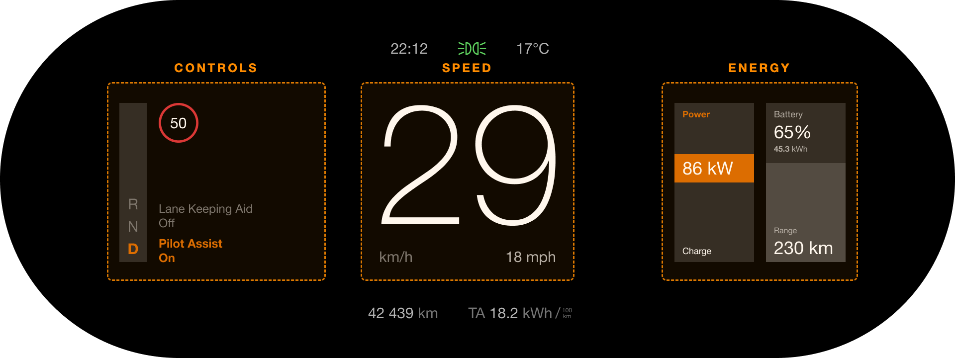
Seven roads
As with Gura Căinarului, we publish the process, not just the result. Seven variants, reordered here by their logic rather than by the order in which they were drawn. Each breaks exactly one of the rules above - and each shows what happens when you give in to it.
Road A - the speed stays where it is
The first instinct is conservative: keep the speed on the left, where it is now, and fix the rest. Familiarity has a real argument - the driver has nothing to relearn. Two variants: one with the assistance labels next to the speed, one with them aligned to the energy blocks on the right.
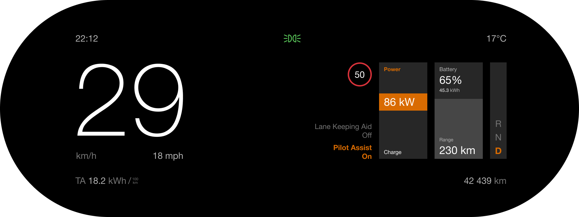
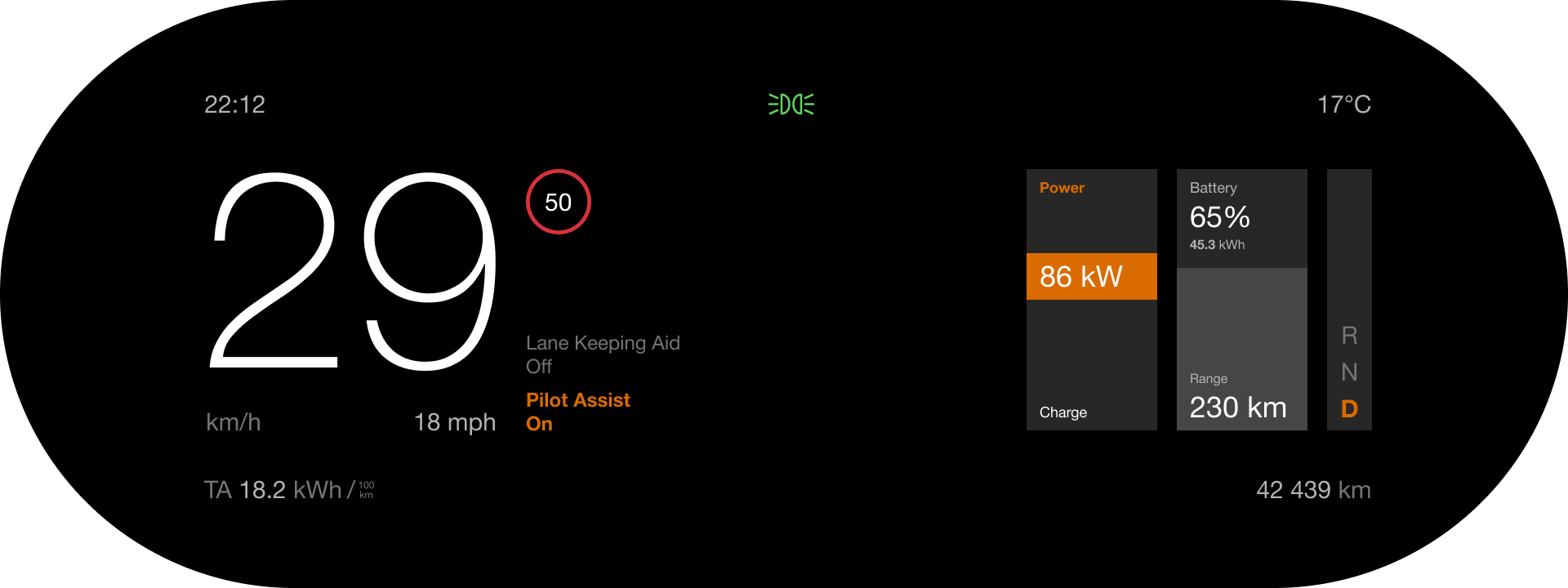
The verdict is in both images, in the same place: the middle. We fixed the grouping, removed the lines, unified the bars - and kept exactly the problem we started from. A useful road to travel, if only to learn that you cannot repair the structure unless you are willing to move the main piece.
Road B - the mirror test
If the speed does not sit well on the left, might it sit on the right? Worth drawing, if only so it does not remain a question.
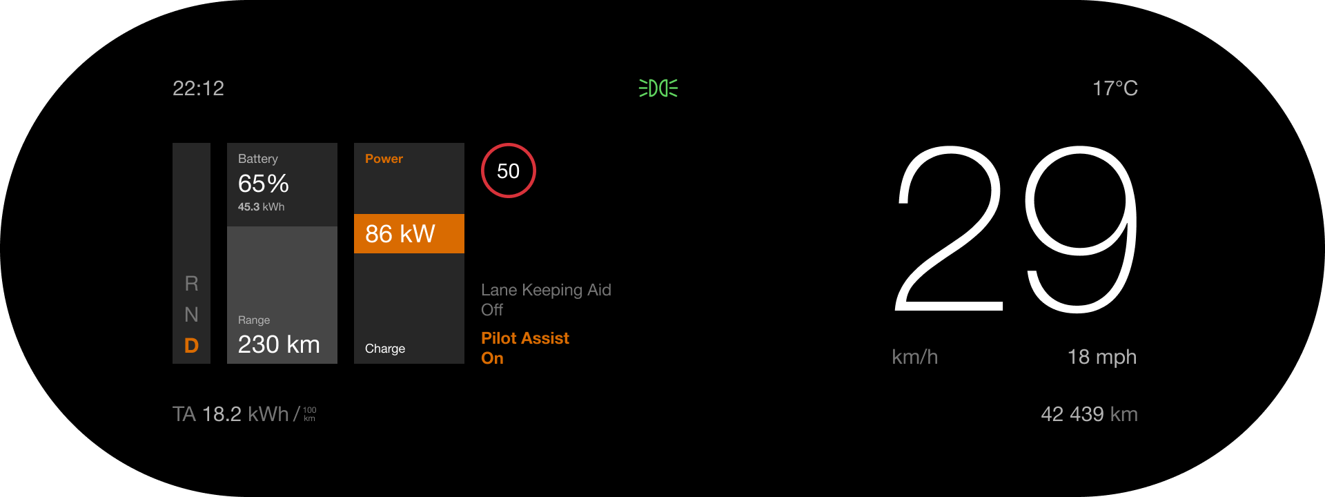
No. The large number on the right is spectacular as a poster and wrong as a cluster: it pushes the main information towards the edge of the screen and, once again, leaves the centre without a role. The mirror test does confirm something useful, though - the problem is not left or right. It is the edge.
Road C - the speed in the centre
The winning direction. Once the speed reaches the centre, the rest almost arranges itself: controls on the left, energy on the right, three zones by meaning. The real debate on this road is not where the speed goes, but how energy is drawn.
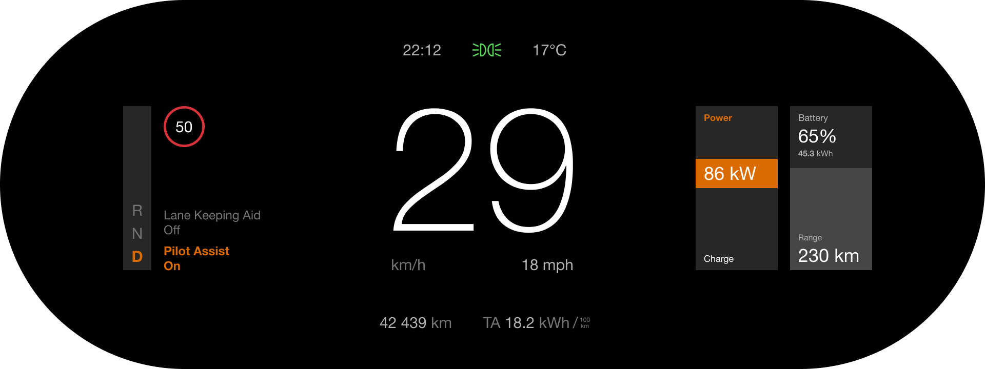
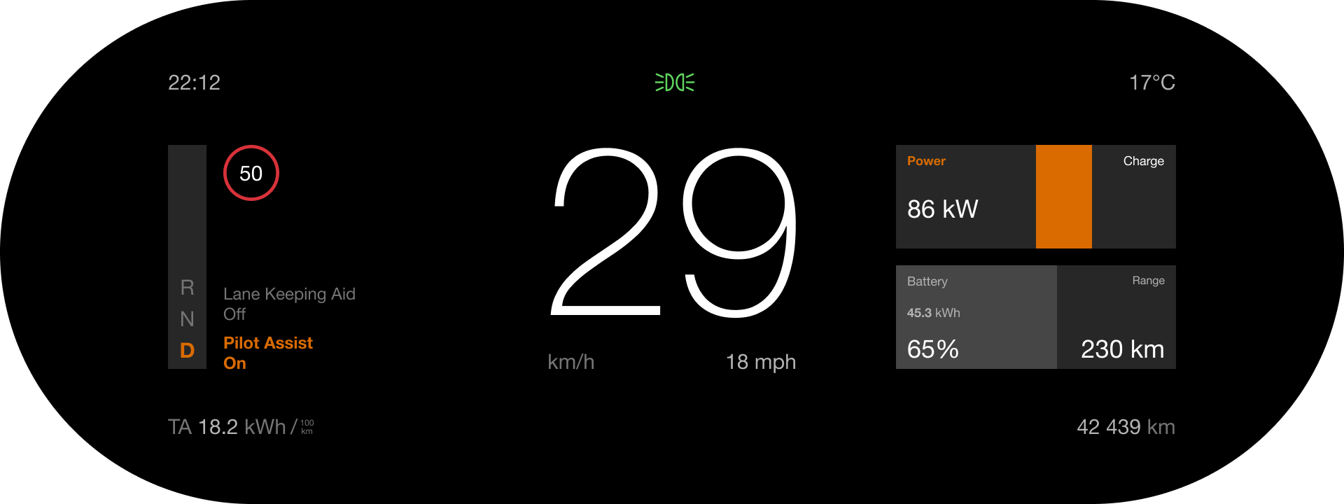
C1 makes both bars vertical - absolute consistency: the orange rising is Power, the white falling is Charge. C2 makes both horizontal, in a grid of four cards, and keeps the convention of electric cars for the power gauge: zero in the middle, power to the right, regeneration to the left. The case for C2 is that zero is visible; the case for C1 is that the verticals rhyme with the R N D rail on the left and give the screen a symmetry of columns. We chose C1, for the symmetry and because, in Calm mode, the power figure matters more than its position on a scale. But the debate is on record: it is the kind of decision properly settled by a test on the road, not on paper.
Road D - even less
The last temptation of any minimalist redesign: take away even more. Two variants try it - the R N D selector lies down horizontally, as a pill in the bottom corner, and the assistance labels move to the centre, under the speed limit.
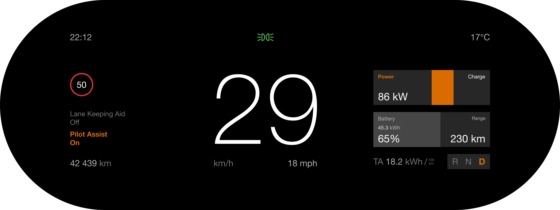
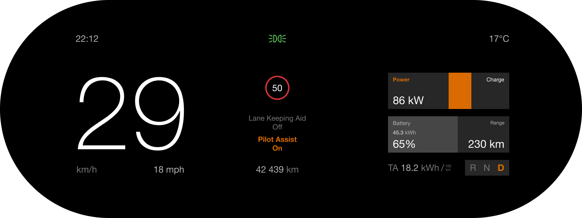
D1 gains calm and loses something subtler than size - the letters are exactly as large as in every other variant. It loses order: in the car, gears change vertically, R at the top, N in the middle, D at the bottom, and the vertical rail preserves precisely that mental map. Laid flat, the same information needs one extra translation - and when manoeuvring, when R or D has to be confirmed at a glance, one translation is one too many. D2 contradicts the second of our principles: it gives the most natural place to the least important information. Both are useful roads - they show where the limit of "less" is.
The final version
What changed, point by point. Three zones, without a single line: controls on the left, speed in the centre, energy on the right. The speed digits grew from roughly 2 to almost 4 centimetres and moved to the centre; km/h and mph sit beneath them, on the same level, as units rather than separate groups - mph is kept for a 1:1 comparison with the current state; it is a market setting, not information. No sharp angles: the R N D rail lost its corner and is the same height as the blocks on the right - even though its upper part stays empty. That is deliberate: symmetry matters more than visual density, and an empty block that holds the line is less disturbing than a short block that breaks it.
At the top: the time, the lights tell-tale centred, the temperature - three pieces of information of equal weight, on one line. On the right: both bars vertical; the orange rising is Power, and the "Power" label is orange too; the white falling is Charge. Zero is a thin line across the middle of the block, grey like the battery fill - deliberately discreet, because in the static state shown here it has nothing to announce: the bottom edge of the orange band is zero. The line earns its place in motion, when the band rises under acceleration and falls, white, under regeneration. On the battery we added the energy in kWh - the figure you actually use when working out how much charging is left.
A detail of balance: the right side weighs more, visually, than the left - two solid blocks against a rail and a few lines of text. So the central axis was shifted by 20 pixels, about 3 millimetres on the real screen. Optical balance, not geometric - the principle from the theory detour, applied with a ruler.
The semantics of orange. In the current interface, orange is used both as a label accent ("Speed", "Power") and as a state. In the proposal, orange means one thing: active. Gear D, Pilot Assist On, the power band. Everything that is not active is white or grey. One colour, one responsibility.
Text instead of icons, for the assistance functions. We acknowledge the counter-argument: an icon is remembered faster than a word. But the current icons, looked at closely, come from different sets - and text is exactly the language of the rest of the interface. The text is read once; after that you know by position: if the bottom left is orange, the assistance is on. "On" is bold and orange, "Off" is light and grey, so the difference survives for people who do not distinguish colours well. The limit of this choice is discussed honestly below.
In numbers
- Separator lines: 7 → 0;
- diagonals: 1 → 0;
- visual groups (counted by proximity): 9 → 5 - three zones and two rows;
- speed digits: ~2 cm → ~4 cm; ~1.6° → ~3.3° of visual angle, at 70 cm;
- roles of orange: 2 (label accent and state) → 1 (active);
- time on the cluster: absent → present;
- central axis: geometric → optically shifted by 20 px (~3 mm);
- distinct blobs at a short glance (the simulation below, detected automatically): 9 → 7.
The glance test
The final proof of a cluster is not made at zoom, but the other way round: what is left of an interface when you look at it for half a second, with your mind on the road. Below we simulated exactly that - both screens at the same scale, with resolution and sharpness reduced to what a short, peripheral glance perceives.
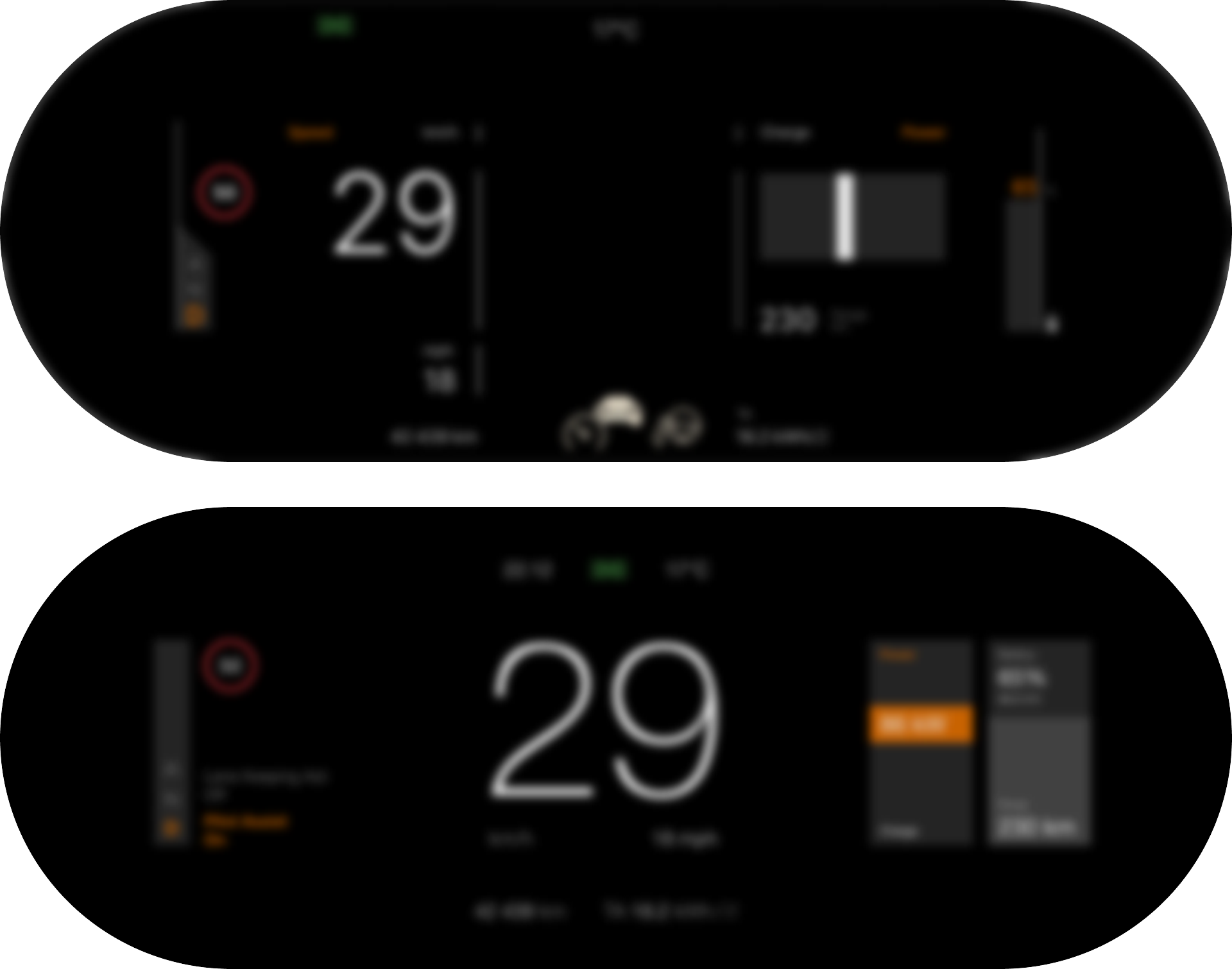
Above, the information fragments: the lines become noise, the speed digits are one blob among several, the icons at the bottom melt into a single beige smudge. Below, exactly three things remain - a shape on the left, a large number in the centre, two blocks on the right - and an orange band that says "something is on". Three groups, one hierarchy, one colour. That is all that needs to survive a short glance, and that is what survives.
In context
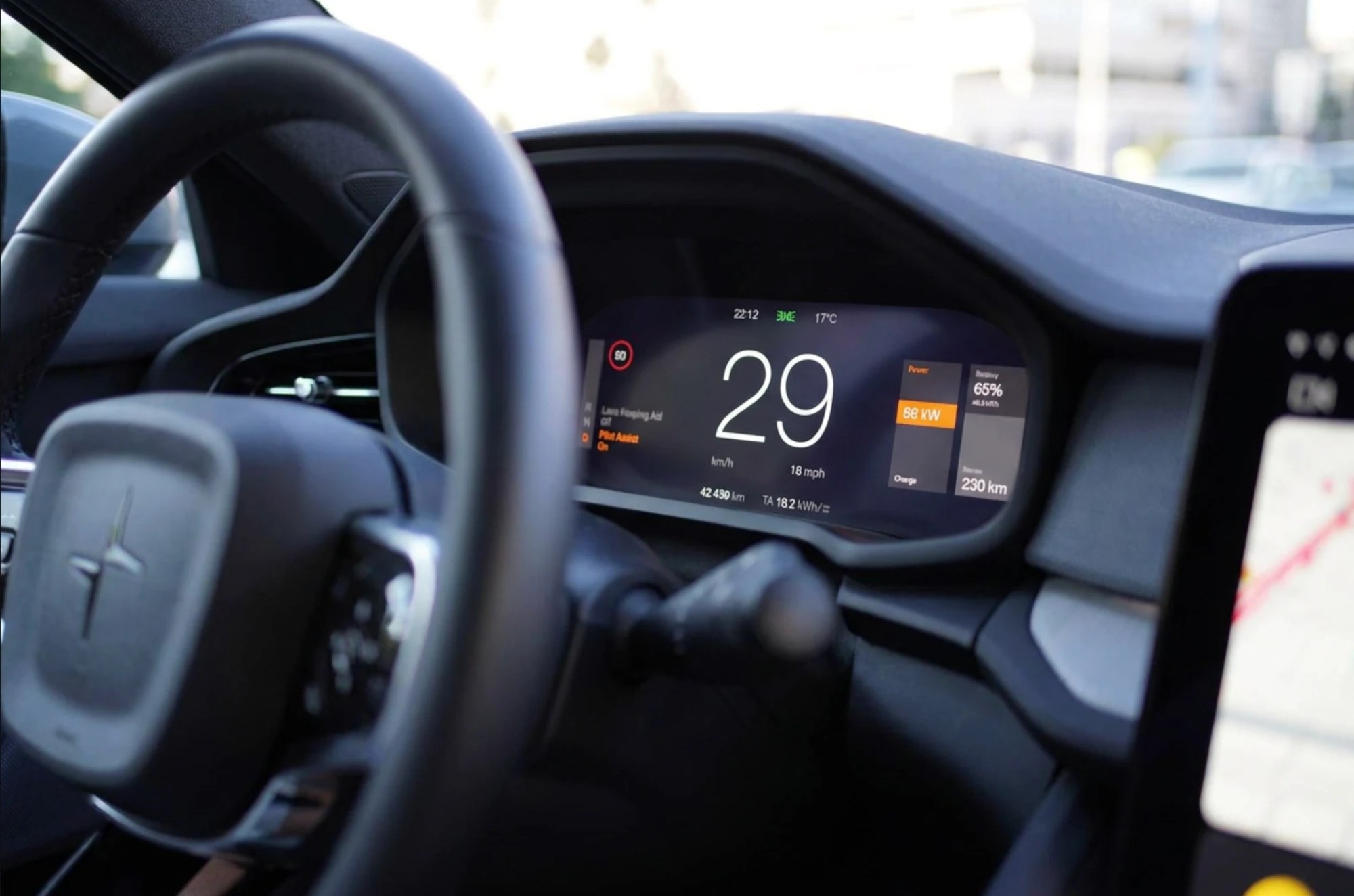
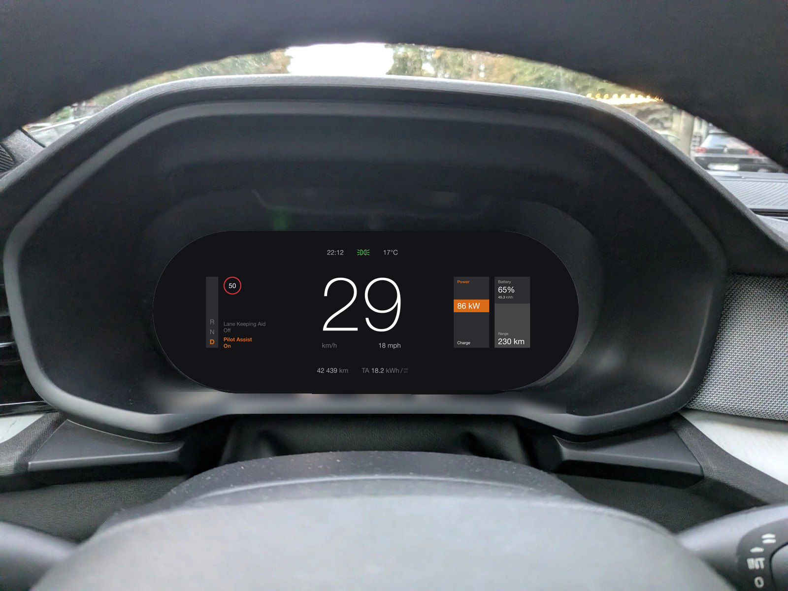
The interface lives behind a steering wheel, inside a cabin, in daylight or under city lights at night - not on a white background. We put the proposal in the car: in the real photograph the study started from, and in two generated cabin scenes. A note on method, because it is part of the series' honesty: the cabin scenes are generated, with the Figma render and our real photographs as references. Image models are good at light, materials and perspective; with text a few pixels tall, they sometimes improvise. That is why the source of the interface remains the exact Figma render shown above, and in the real photograph below the interface is composited pixel for pixel, not generated. The generated scenes are a reference for atmosphere, not for typography.
What we did not take into account
A case study is credible to the extent that it names its own limits. Here are ours.
- The other modes. The proposal is limited to Calm. The map mode, alerts, collision warnings, night mode - each has its own constraints and could contradict some of the decisions here. A real system is designed across all its states, not only the quietest one;
- localisation. "Text instead of icons" is the most attackable argument in the study. Polestar sells in dozens of markets; "Pilot Assist On" fits in one column, but its German or Finnish equivalent might not. Icons exist partly because they are the same in every language. A middle way - short labels, "Pilot · On" - would be worth testing;
- type approval. Part of what appears on a cluster is regulated: the shape of tell-tales, the presence of certain information, minimum contrast. We did not check the proposal against those requirements and do not claim it passes;
- the real test. All the reasoning above is on paper and in photographs. The difference between C1 and C2, the exact size of the digits, the position of the assistance labels - all of it would be settled properly with a few drivers, a few hours and a screen in the car. We do not have that. We have a study.
Both screens - the reconstruction and the proposal, plus the seven variants - are in an open Figma file, where they can be viewed, measured and contradicted.
One corner, the whole screen
We started from structure and ended with a corner, but the real story went the other way: a diagonally cut corner, noticed on day one, became a question about lines, then about the centre, then about what it means to read a screen with half a second to spare. A screen is not redesigned because of a corner. But a corner tells you the whole screen deserves a look.
And the conclusion on method is the same as everywhere in this series: we did not start from what we like, but from what can be measured. The 1:1 reconstruction, the diagnosis in numbers, the principles written before drawing, the roads published together with their failures, the glance test - all are tools anyone can use, on any interface, from any country. Perhaps that is why a Swedish brand found its place in a series about local ones: the method has no passport.
References
- NHTSA - Visual-Manual NHTSA Driver Distraction Guidelines for In-Vehicle Electronic Devices, Federal Register, 2013 - the two-second limit for a single glance away from the road;
- ISO 15008:2017 - Road vehicles - Ergonomic aspects of transport information and control systems - Specifications and test procedures for in-vehicle visual presentation - legibility expressed in visual angle;
- ISO 2575 - Road vehicles - Symbols for controls, indicators and tell-tales - the standardised tell-tale symbols;
- Palmer, S. E. (1992) - Common region: A new principle of perceptual grouping, Cognitive Psychology, 24(3) - grouping by common region;
- Wertheimer, M. (1923) - Untersuchungen zur Lehre von der Gestalt II, Psychologische Forschung, 4 - the laws of grouping, proximity included;
- Bringhurst, R. - The Elements of Typographic Style, Hartley & Marks - the optical centre and the balance of the page;
- Lineto - Unica77 - the typeface Polestar uses, in a custom version;
- Polestar - Polestar 2 - the official model page.