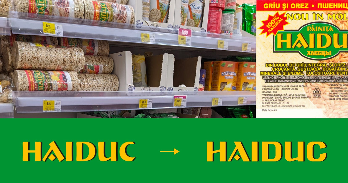
And today, dessert comes first - a video on the Gestalt principles:
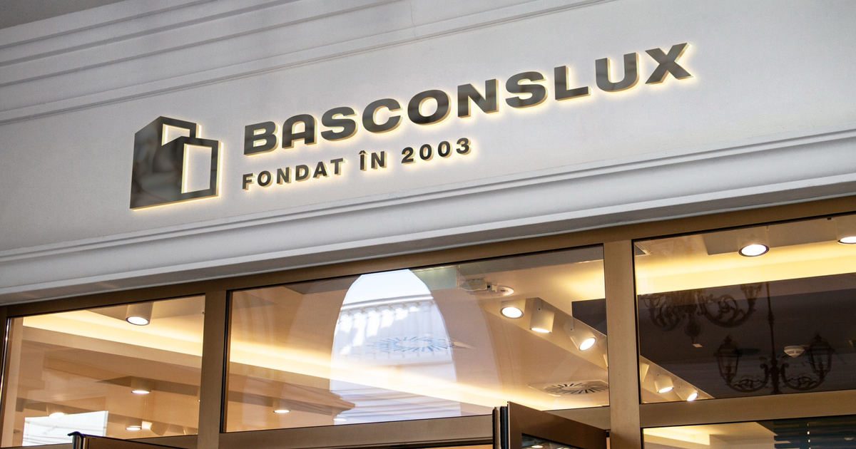
A quick recap, in a single image, of where we ended up last time:
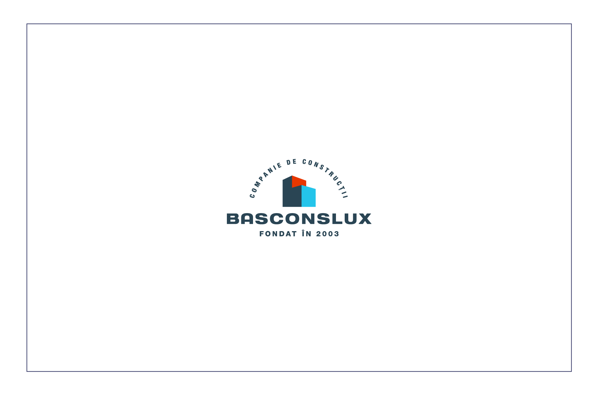
In other words: a logo executed well enough, technically, but with a fairly mediocre concept behind it. Yet another construction company logo that uses a drawing of apartment blocks as its symbol. Nothing new, nothing different. What is more, most construction companies in Moldova do exactly the same with their logos. So, as a concept - weak on differentiation.
Direction number 2
This time we put elements unique to Basconslux first, and elements specific to construction second. For the sake of the exercise, let us say that unique element is the letter B. So we start looking for versions.
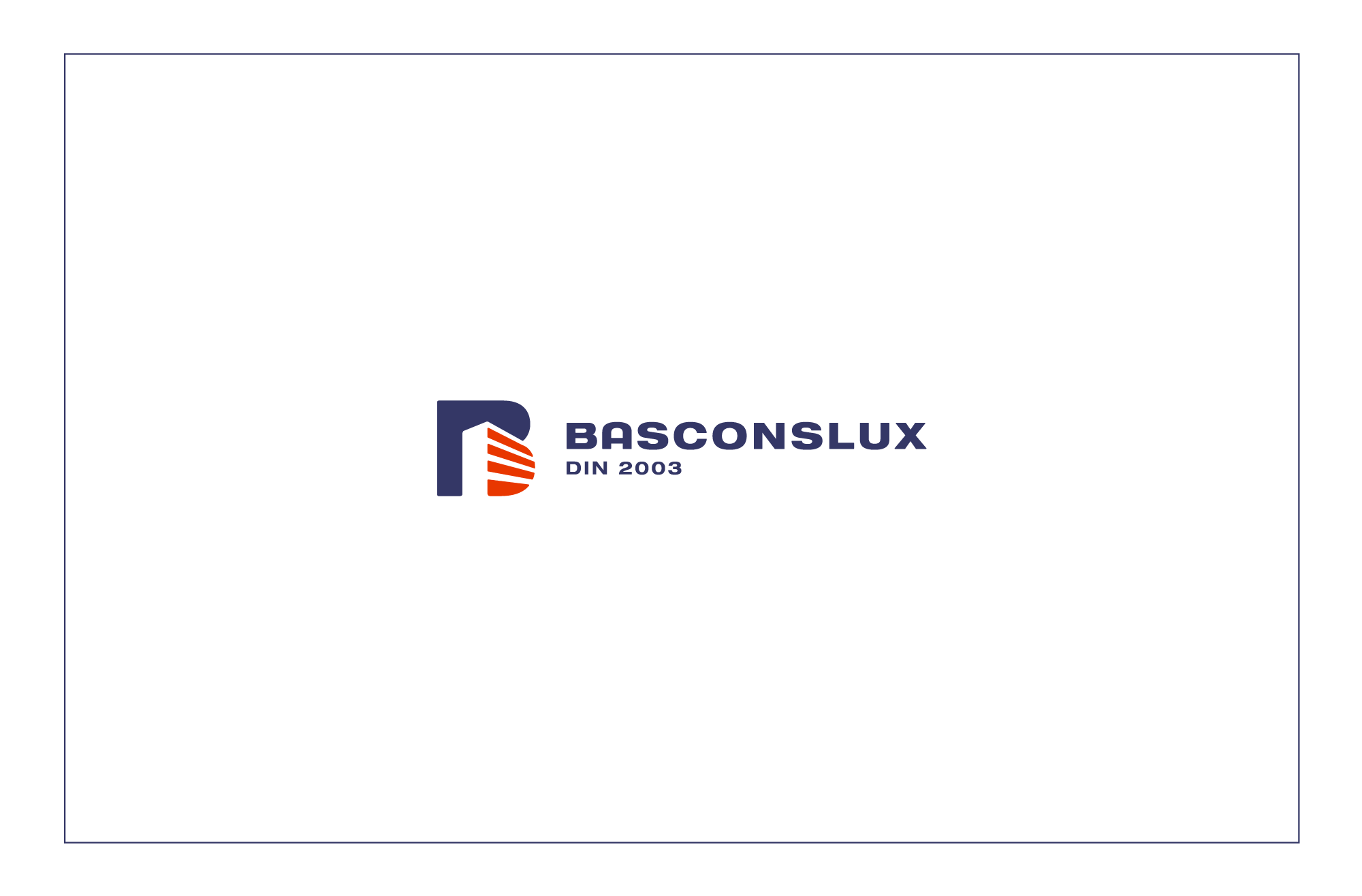
One idea is to build an apartment block into the silhouette of the B. Let us see how that works.
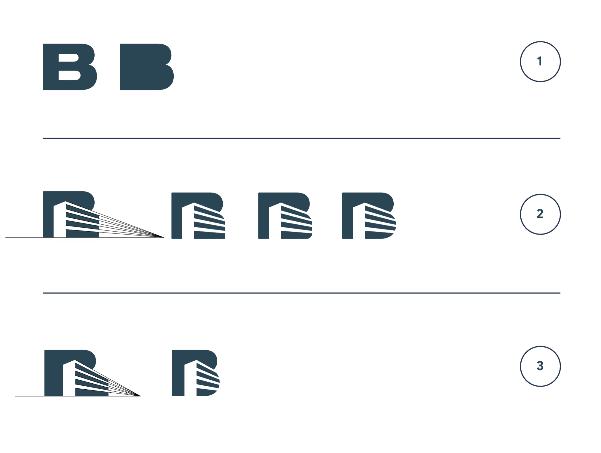
1. We take the B from the typeface used in part one and keep only its silhouette. 2. Using negative space, we place a drawing of an apartment block inside the silhouette of the B. 3. We change the perspective so the block feels less massive and long.
Of course the geometry could be refined further, but without too much talk, let us throw it into the ring and see whether it is better now.
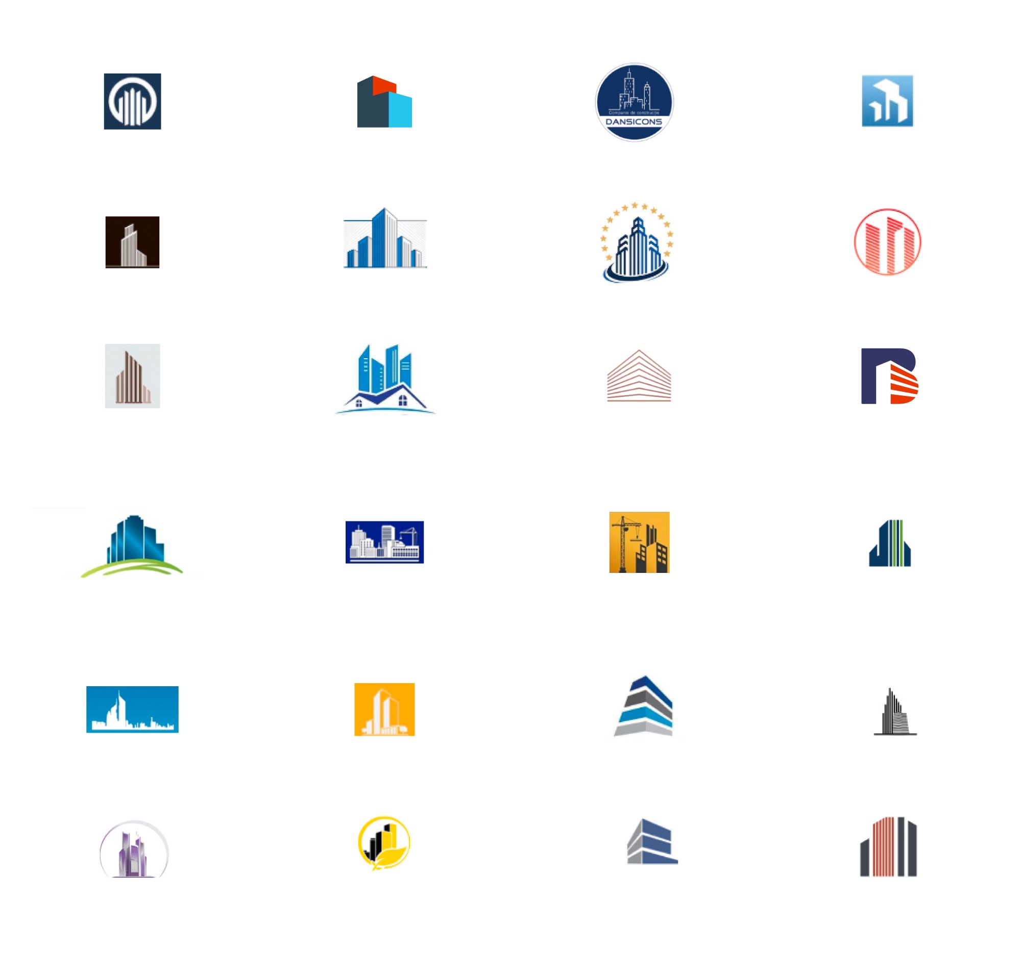
On top of explaining, it now differentiates as well. So yes - it is better.
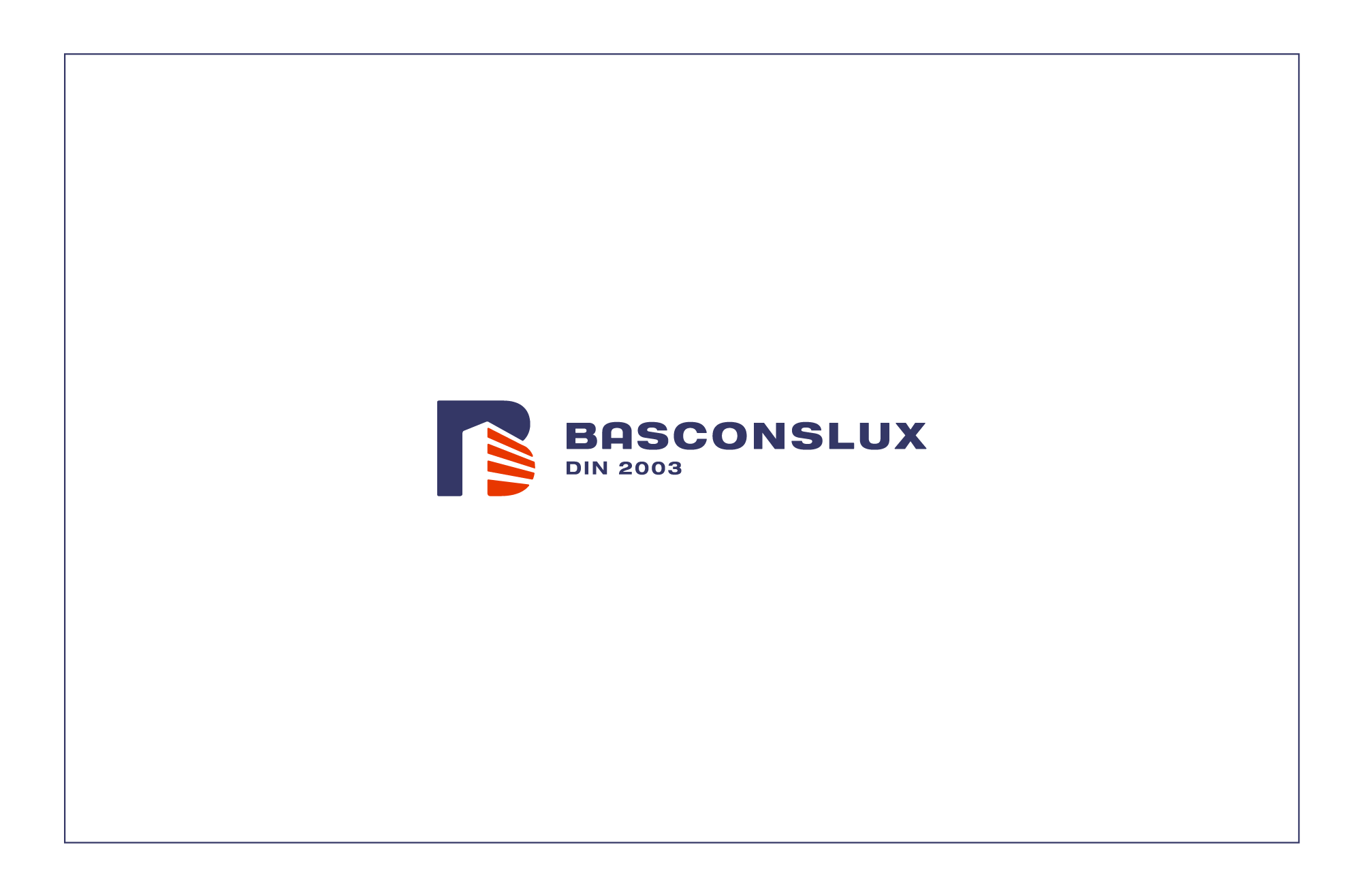
A third approach
And finally, for a third approach, what if we think about it like this: the company is one of the first on the market. Does it really need its symbol to explain the link with construction? Or… does it need a symbol at all? Perhaps a well-executed wordmark is enough?
To recap, we have arrived at three versions. With more explanation in the symbol, with less, or with none at all.
In conclusion
Being a good designer who can execute the brief well does not, on its own, mean a good result.
Do you think any of the designers behind those construction company logos had bad intentions? Of course not.
But the fact is that many construction company symbols, placed side by side, turn out ridiculously similar in concept. And a construction company’s logo should identify it and set it apart, first and foremost. Not explain that a construction company… builds. Builds blocks. Blocks and houses. With a crane.
So always think about the direction one more time. Ask questions. Argue your case. Run that extra mile.
The company will live with its logo for years. Will it do its job of identifying it?
PS: In the end we come to see that, even though the current Basconslux logo is not well executed technically (too many unnecessary elements, lines that disappear at small sizes, a symbol that ignores many basic design principles), when it comes to differentiation and identification it holds up rather well against everything else on the construction market in the Republic of Moldova.