To clear things up a little - and the stages along the way - we thought we would write a short piece.
First of all - a logo is not a brand. It is only one of the brand’s components. And a brand is a person’s gut feeling about an organisation, a product or a service.
A very useful book on the subject: The Brand Gap by Marty Neumeier.
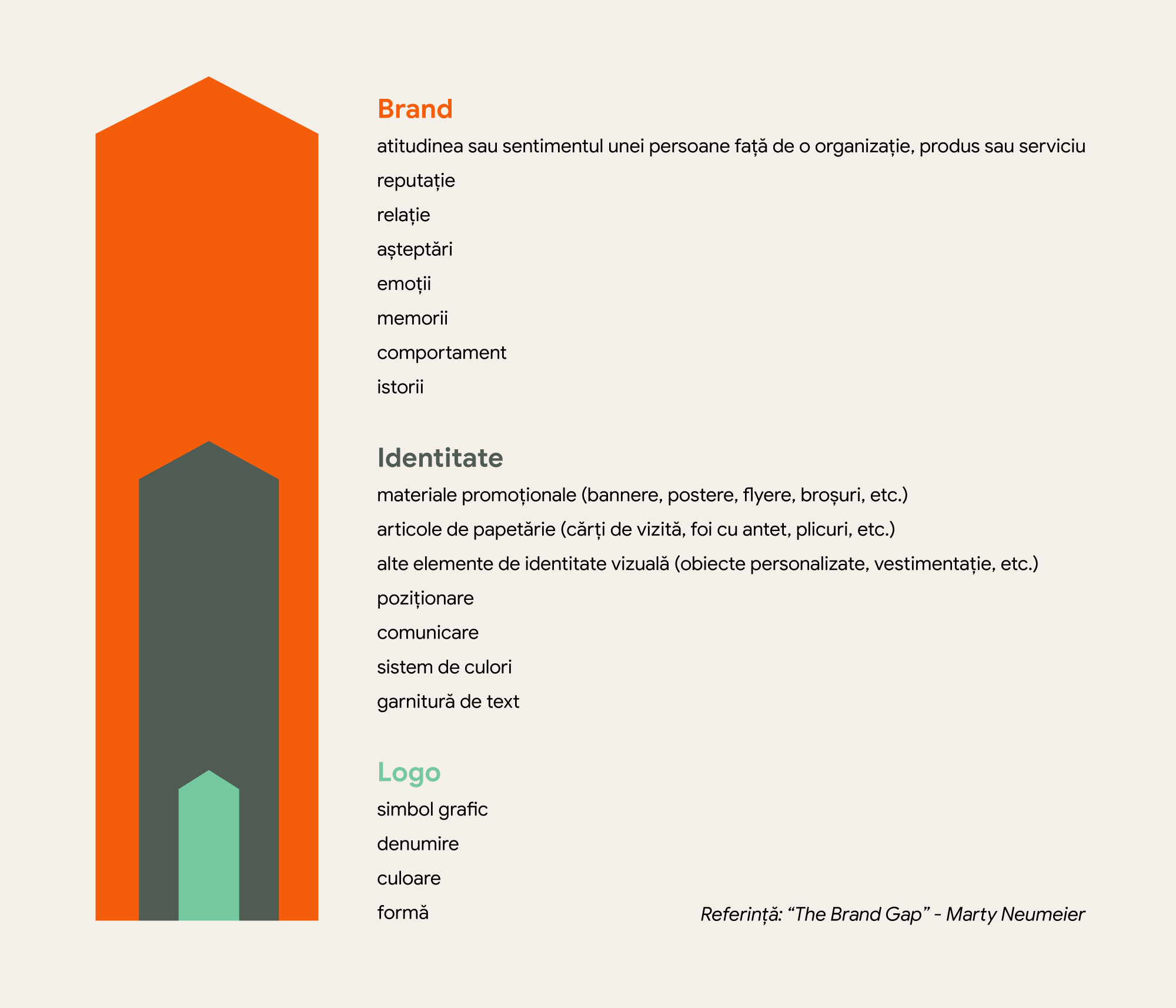
But back to the matter at hand: the process of designing a logo. To make it practical, we will run an exercise, so every stage has an example.
There are several stages to go through. Namely:
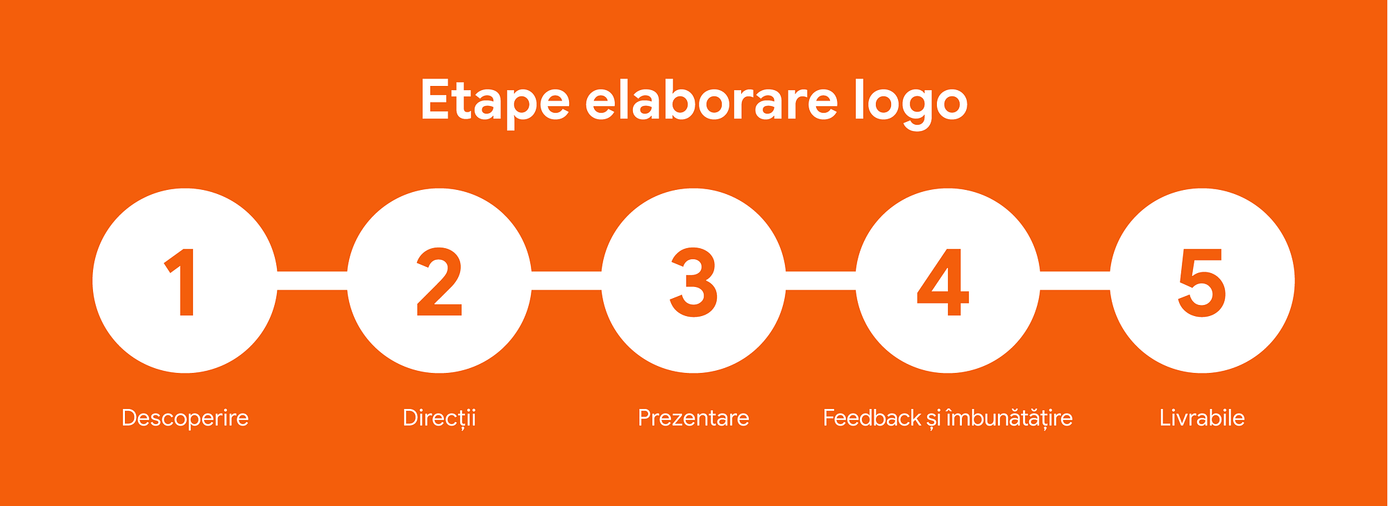
1. Discovery, alignment and analysis
In the first stage of the process we “listen”, understand the context and analyse.
There are many questions to answer. It helps to have a logo brief form that covers at least: brand name, industry, description of the product or service, target audience, values, tagline (if there is one), year founded, colours, style, examples they like, examples to avoid, and so on.
Other relevant questions:
- What do you need a logo for?
- What problem are you trying to solve?
- Which values matter to your brand?
- What is your brand’s unique value proposition? What does it offer that competitors do not?
- If the brand were a person, how would you describe them?
- What is the brand’s tone of voice? (friendly, formal)
In essence, this stage is about getting client and designer in sync and understanding each other better. It deserves enough time, because thoughts “put on paper” fall into order, and many directions that are no longer worth exploring drop out. So we invest time to save time and effort.
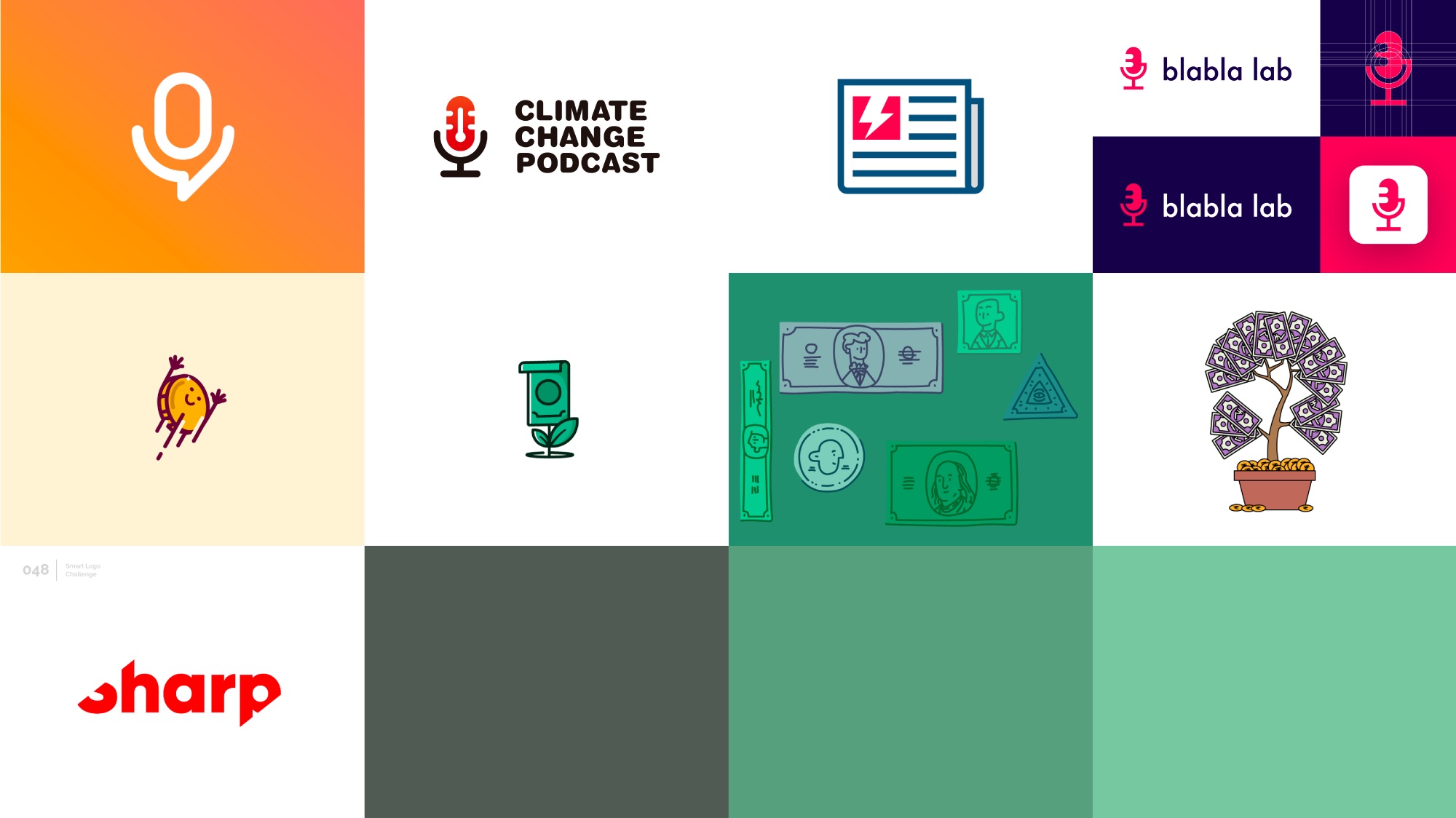
This is also the stage for gathering references. These days, almost anything you can imagine has already been done, at least as an idea. So time goes into a moodboard - a collage of images, text, colours, shapes, compositions, logos and just about anything that could serve as a reference or feels relevant for getting started.
The exercise brief
- Name: the economics podcast “De unde apar banii” (Where Money Comes From)
- About: a logo for an economics podcast
- Attributes: type-led, modern, mature, masculine, abstract, neutral tones
- Audience: students, journalists, the general public
Context
Let us see where the logo will be used:
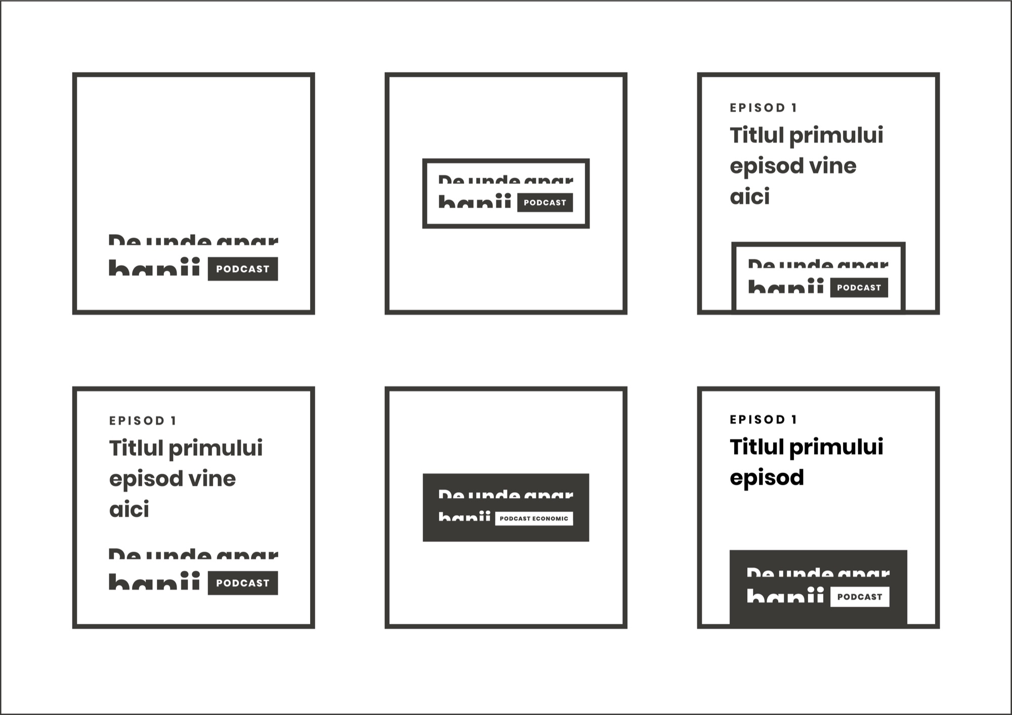
- on the podcast cover, which is square
- in the episode artwork, together with the episode title and number
- as a social media profile picture (usually a square with a round mask)
- as a sticker - on a laptop, a phone and so on
Analysis
Elements relevant to the podcast side: the microphone (the generic podcast symbol) and the newspaper (the old-school way of spreading information).
On the economics side: a banknote, a coin, the money tree (which also suggests growth and prosperity). And the side of study and analysis - what the podcast sets out to do: emergence (the sense of “where it comes from”) and revelation.
If the task is a full visual identity system for a more complex project, there are many more questions to answer, including long-term strategy, not just the graphic execution of the logo. That stage can also be given far more than a few days.
2. The first iteration. Directions.
In the first iteration we bring several directions. Three different concepts usually work well. One of them will be very easy to rule out - so the client has enough options, and the designer can see which direction to take forward.
2.a Sketches
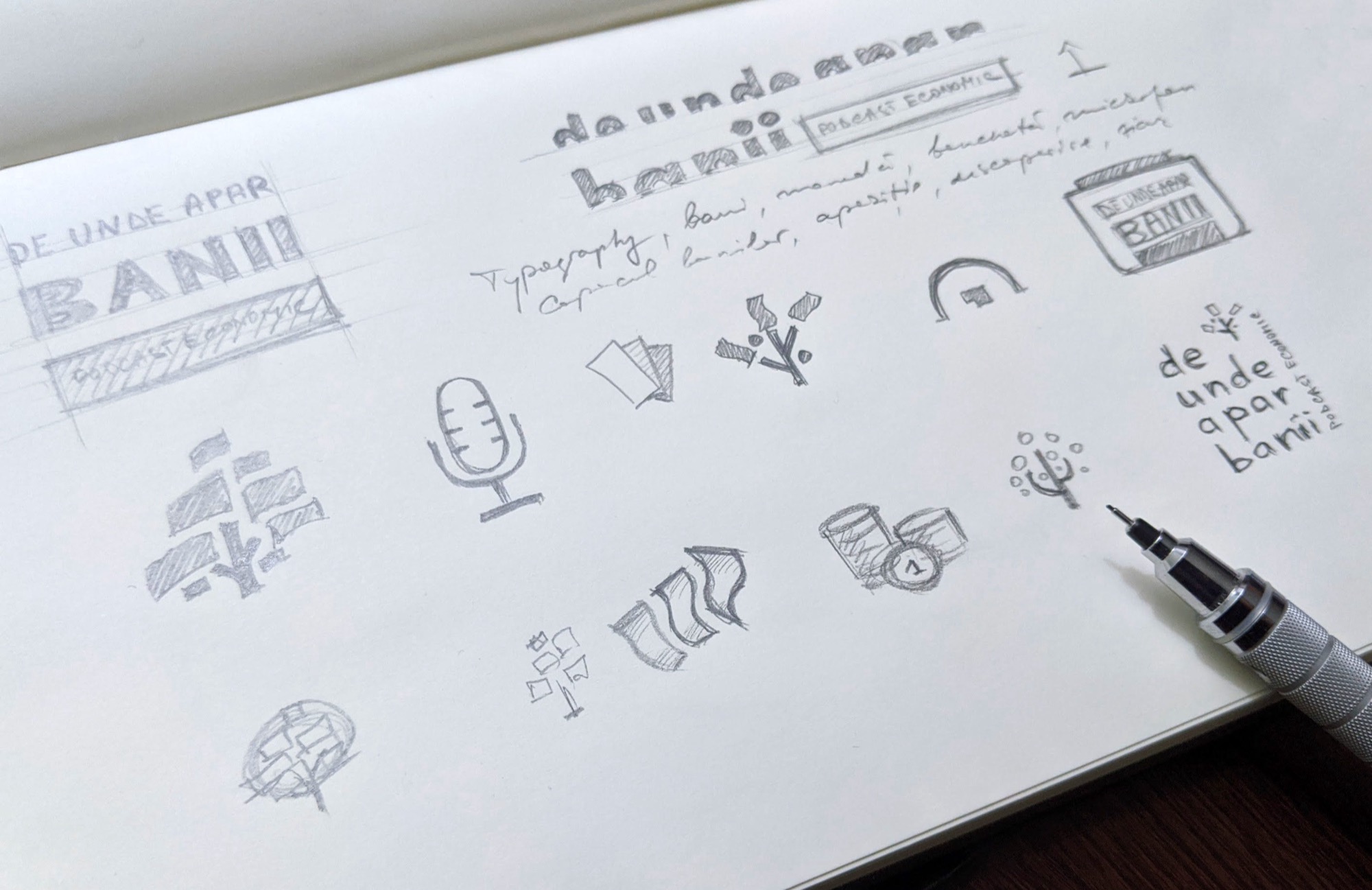
The moodboard and the list of relevant elements help us put the first directions and symbol concepts on paper - literally.
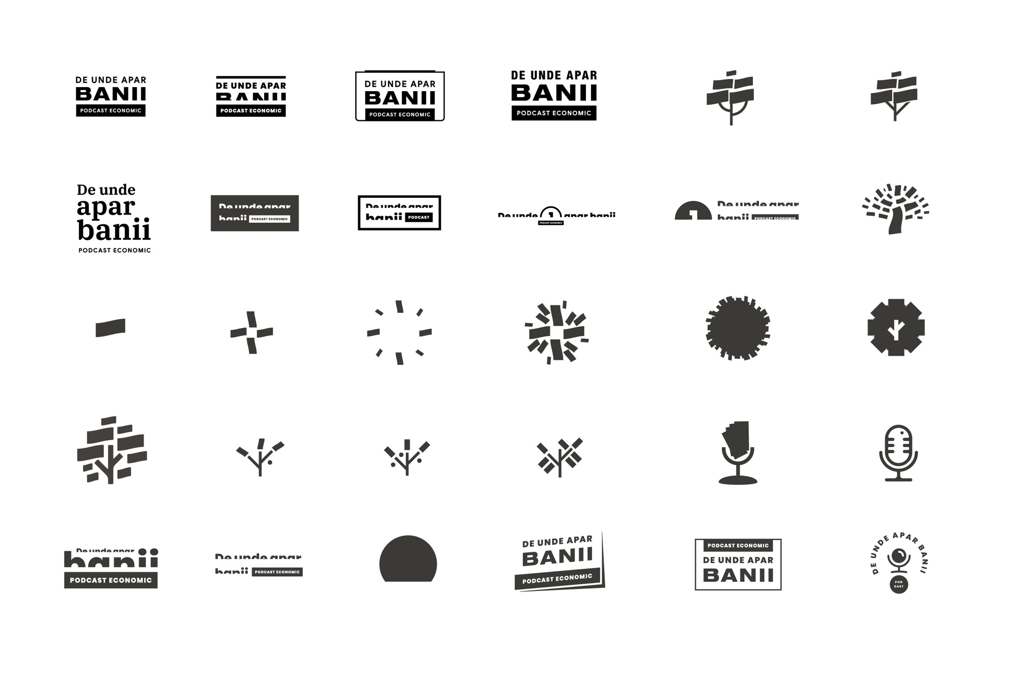
Why pencil and paper? Because it is the most natural tool we know. At the sketch stage, what matters is the idea, not the execution. Plus, it lets us quickly validate the concepts that stand a chance. All in a fairly short time. And time is money.
2.b Digital
Once we have a few concepts worth pursuing, they move to digital. A few points worth keeping in mind:
- Use a vector app. Vector artwork scales to any size without losing quality.
- Focus on geometry first. Build every concept in black and white at this stage. Colour is the last thing to add. If a logo looks bad in black and white, the geometry needs work - don’t rush to colour.
- Don’t copy. Make every element yourself - trace your own sketches or build from primitives (circles, rectangles and so on).
- Don’t rush. The next day, with fresh eyes, you will find at least some room for improvement. New ideas may turn up too.
3. The presentation
This step is often overlooked: full of enthusiasm, we quickly email screenshots of logo versions, hoping for fast feedback. That is unlikely to happen.
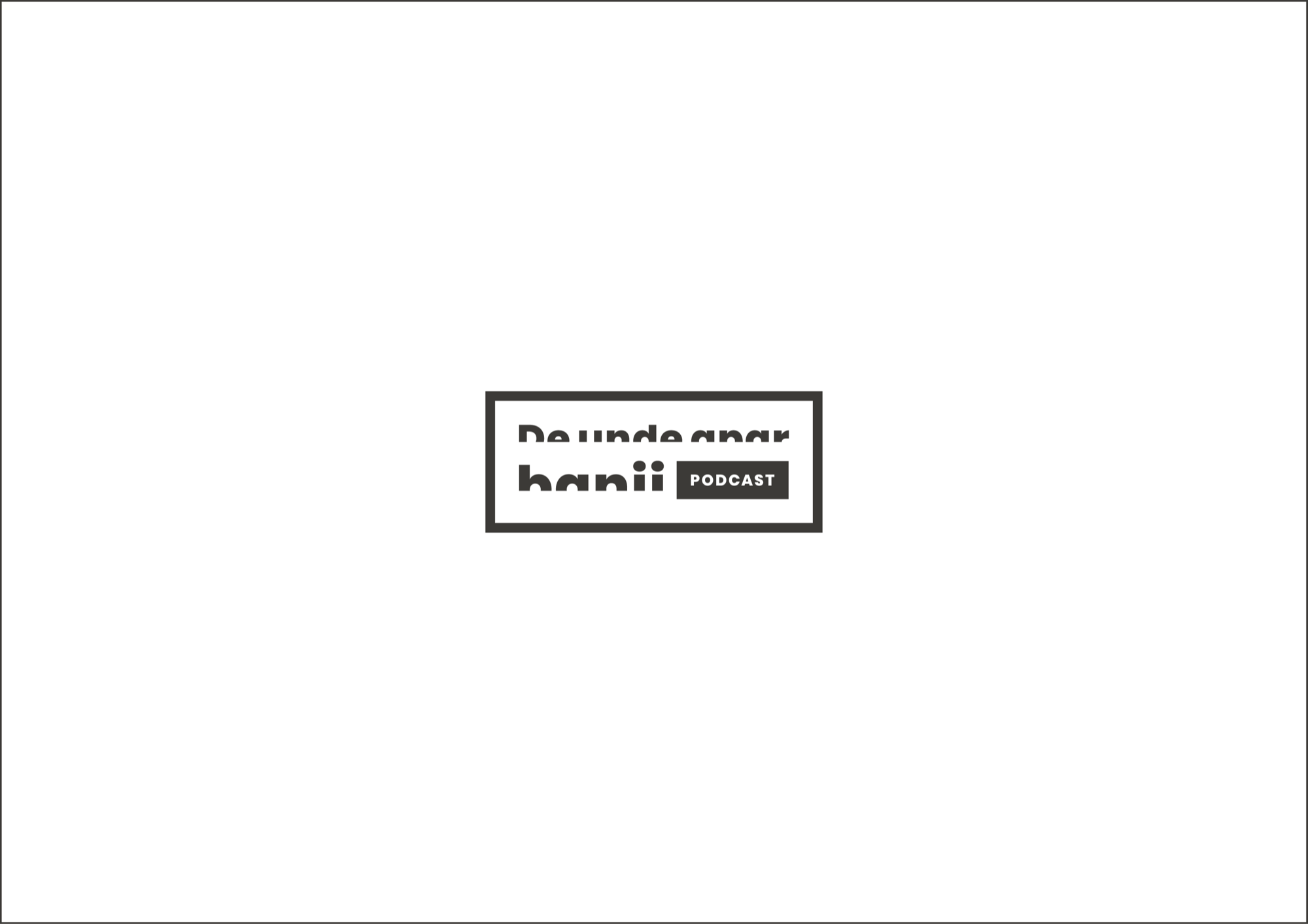
So we build a presentation, which includes: a cover, a few words on the role of a logo, what makes a logo well made, a short recap of the key points of the brief and a presentation of each logo version on its own - on white, then on black, plus vertical and horizontal lock-ups, the symbol alone and so on.
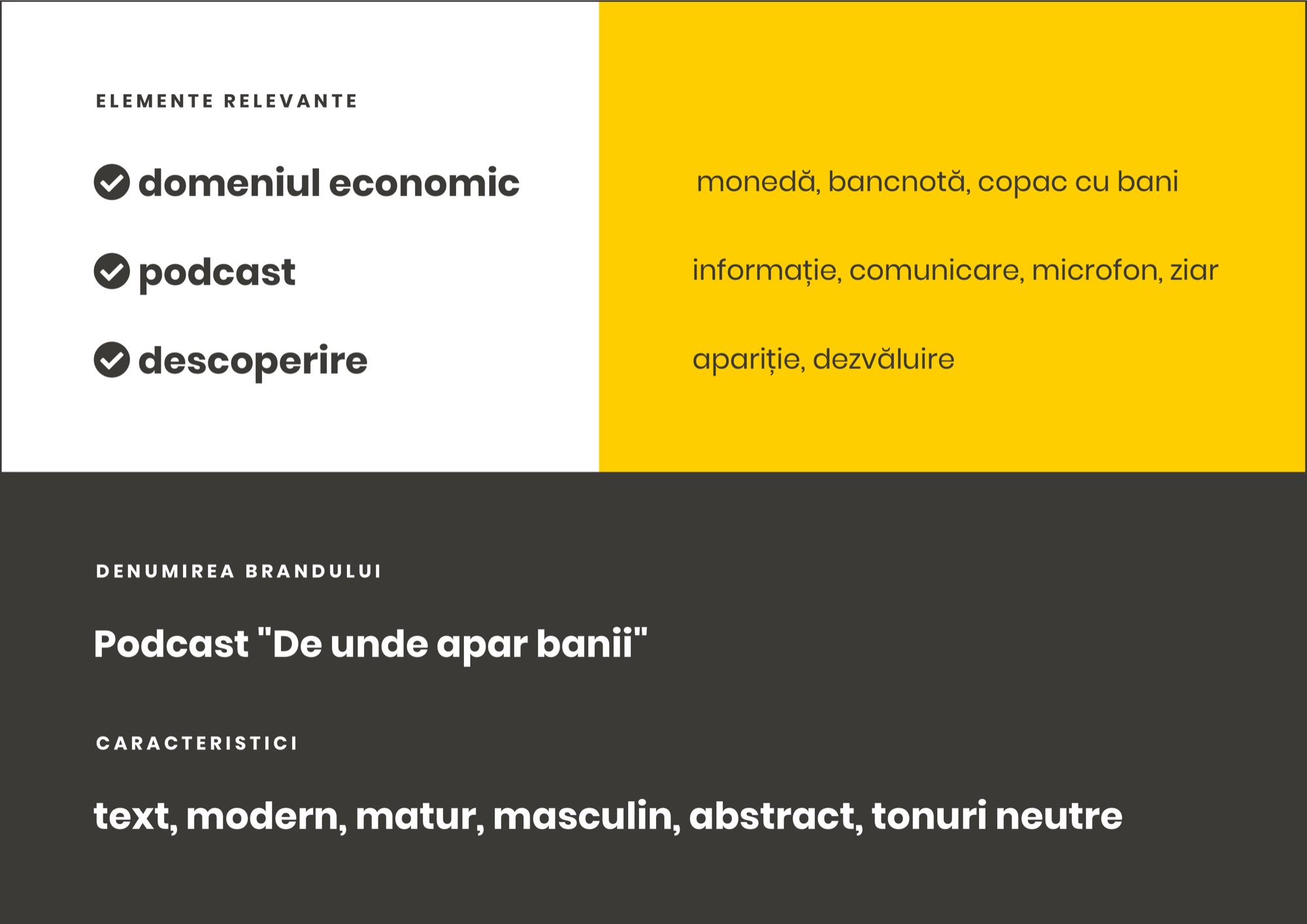
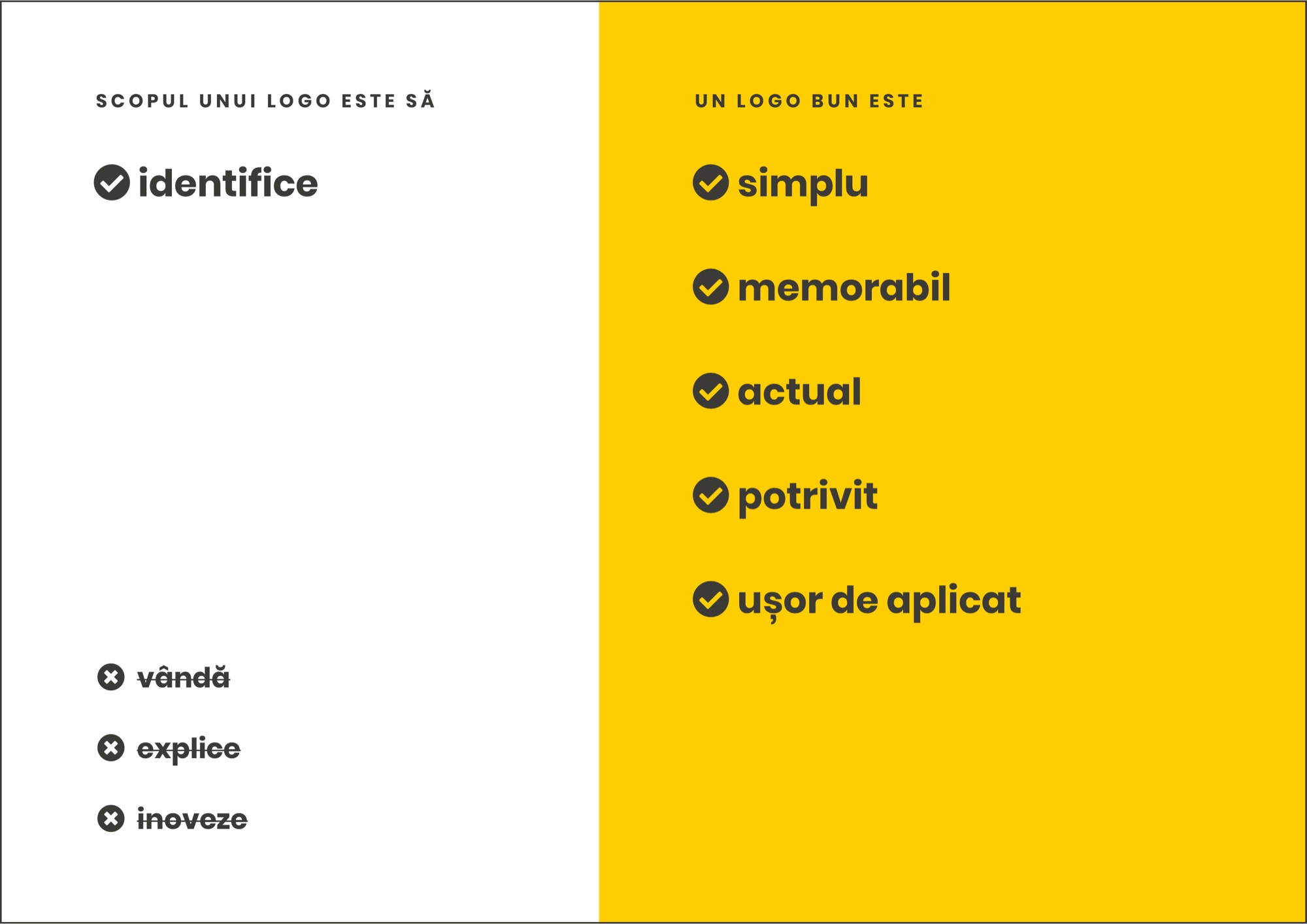
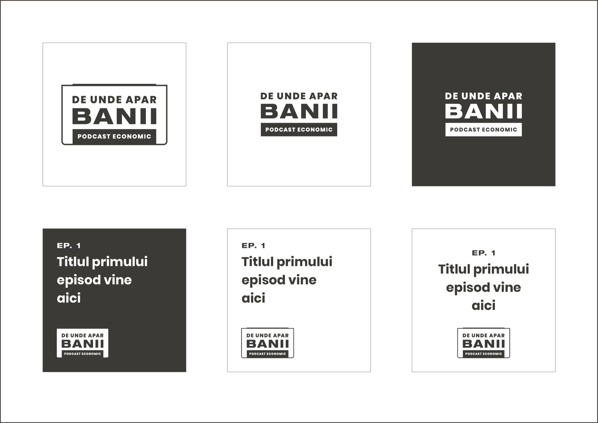
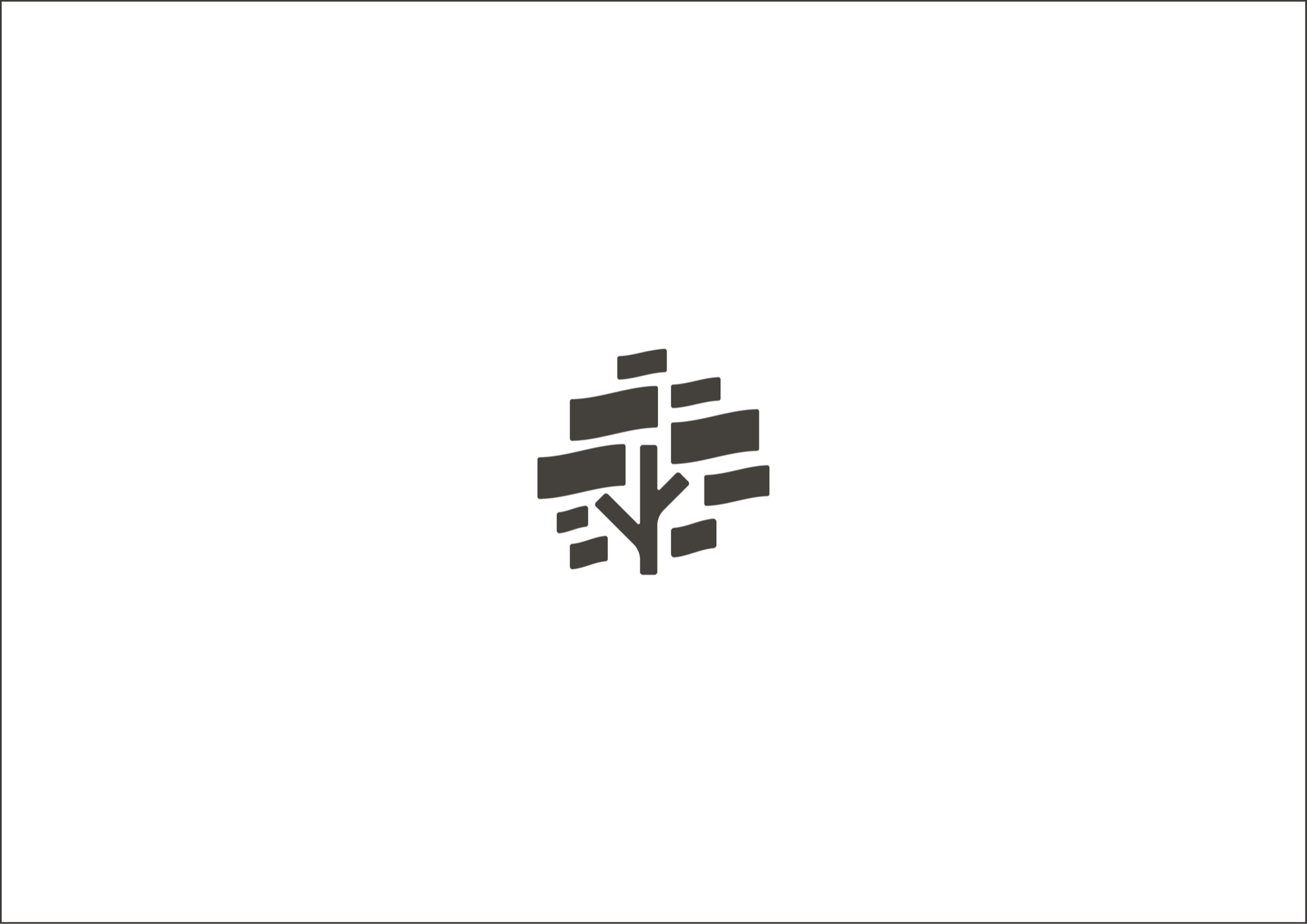
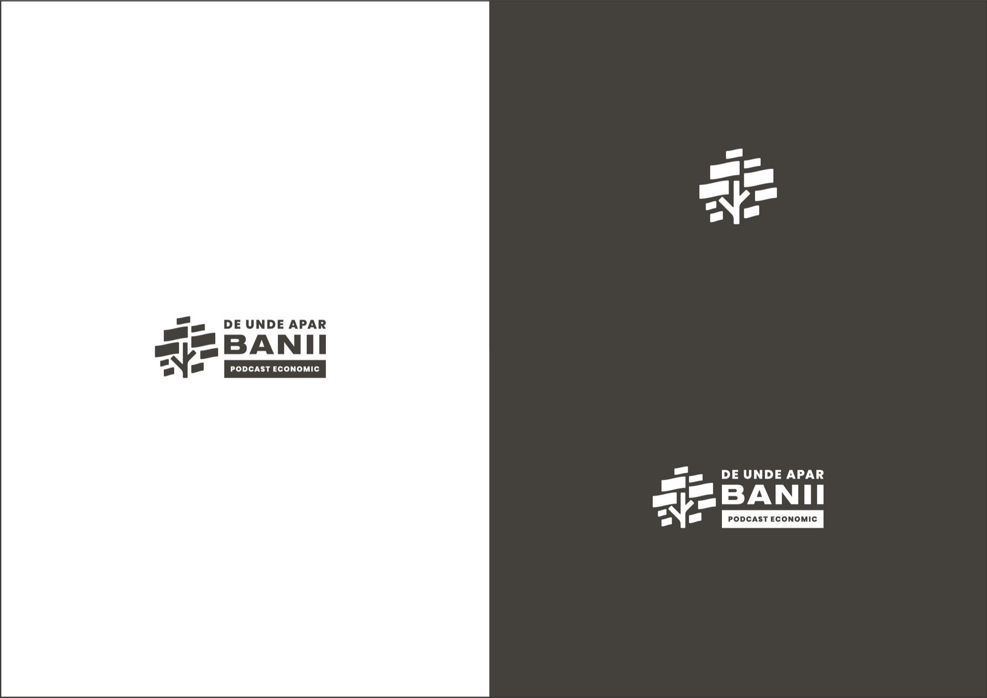
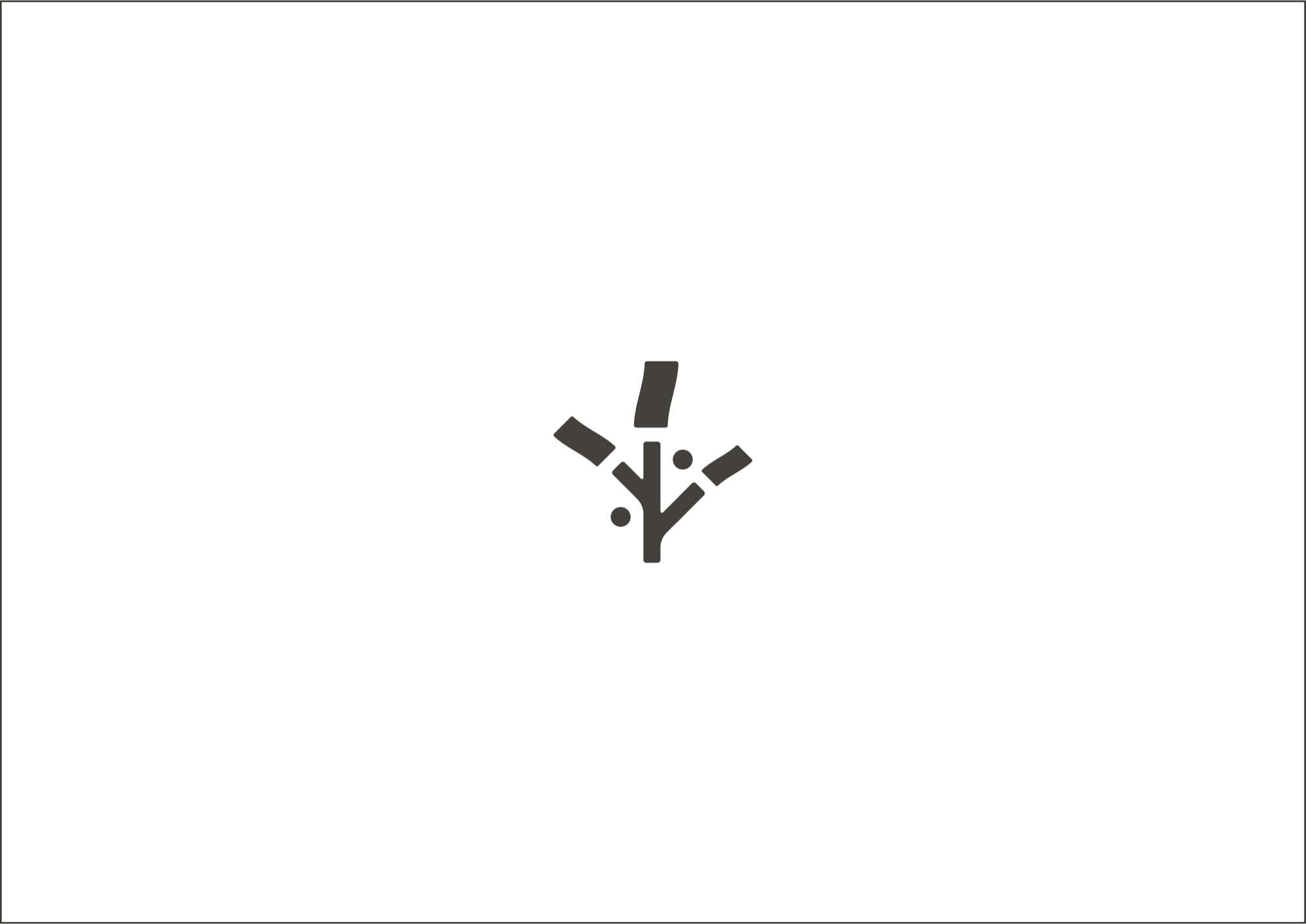
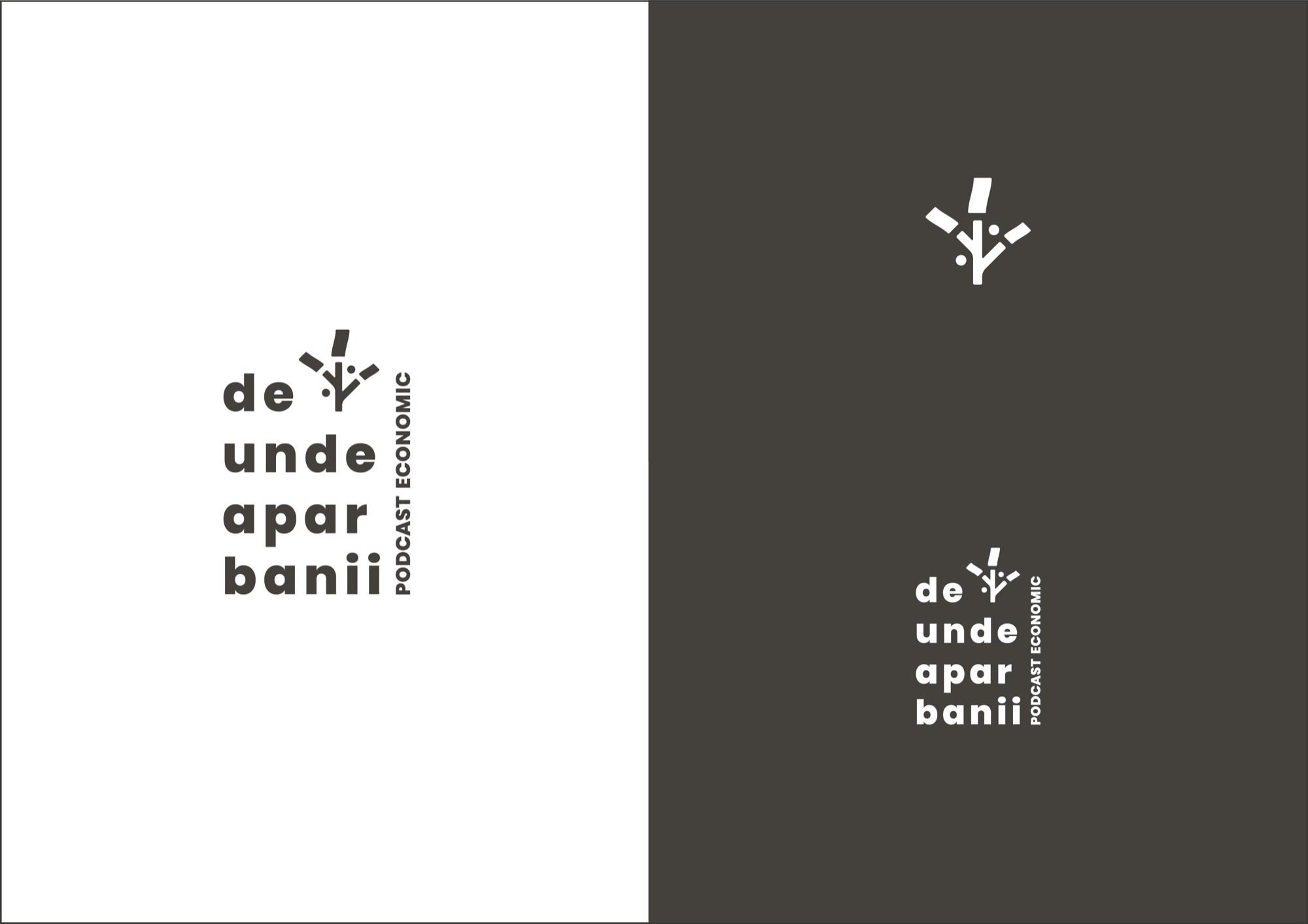
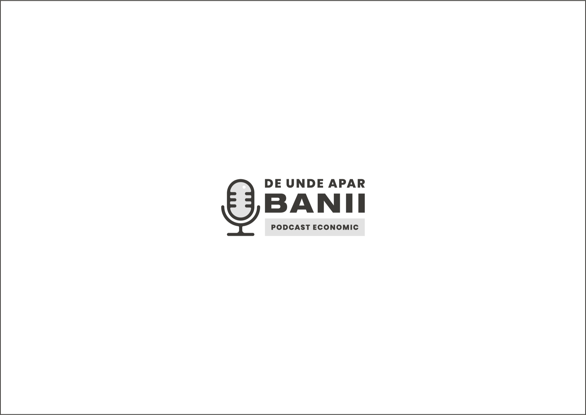
It is best to present in person, in a meeting, so each slide gets enough attention and the necessary comments. Only then can we be sure we are on the same page as the client.
What we talk about
The presentation recaps everything discussed with the client so far: directions, moodboard, relevant elements, the role of a logo and the principles behind it. When you move on to the concepts, take all the time you need to talk through the thinking behind each one. For every version you can mention strengths and weaknesses, opportunities and threats.
Once the presentation is over, it is time for questions, because the goal is to move forward.
The first question: Is this what you expected, or have we missed the mark completely?
And the answer here cannot be “you missed it completely”, because we have just recapped all the communication with the client, the key points, the brief and the relevant elements used in the creative process.
The second question: Which of the versions do you think best suits the brand’s audience?
Logos are not made to please clients but to suit their audience. And we stress this. In the early stages we identify a few profiles of people who would make up the brand’s audience - for example: he is 29, smart, likes topics around financial literacy, has a university degree, does not buy on impulse, earns above average, is socially active, reads a lot and his name is Eugen.
With all that in hand, the question might sound like this: Which of these versions would feel right to Eugen? Here we ask the client to step into the shoes of the brand’s audience rather than choose based on personal taste.
The third question: Of all the concepts presented, let us find at least one we can rule out. Which one is it?
This does not oblige the client to pick one they like - so we are not pushing them towards a decision they may not be ready for. Often the client is not one person but several who decide together. It is almost impossible for all of them to agree at once on what they like, but they are far more likely to quickly find common ground on the least suitable direction. That removes one direction and reduces the effort in the stages that follow.
And do not expect immediate feedback at the first presentation. Say that it takes time to think, consult and analyse. Finish by thanking them for their time and setting a deadline for the feedback you need. Talk about the next steps.
4. Refinement iterations. Presentation 2.
Back to our example. We get the green light to go with the money-tree concept.
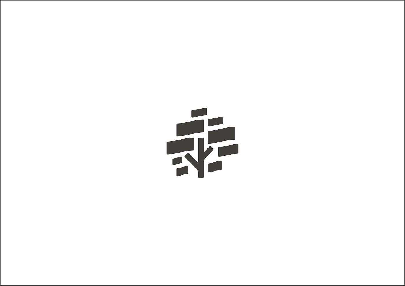
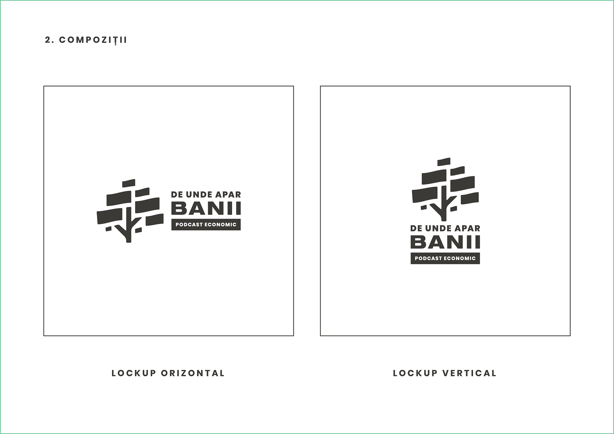
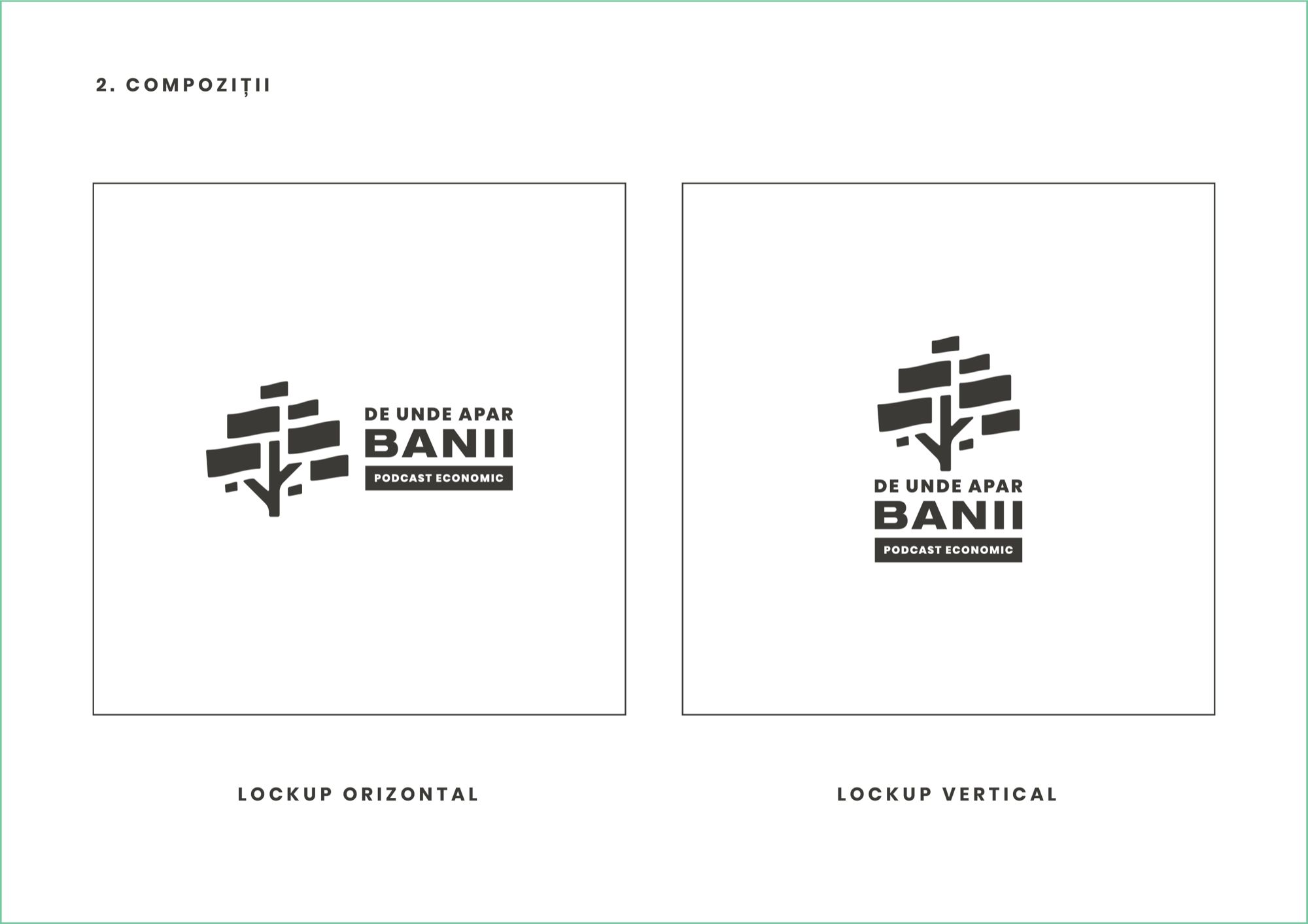
We keep refining the geometry of the chosen concept. We work on several logo compositions - vertical, horizontal, symbol only, single colour on a dark or light background and so on.
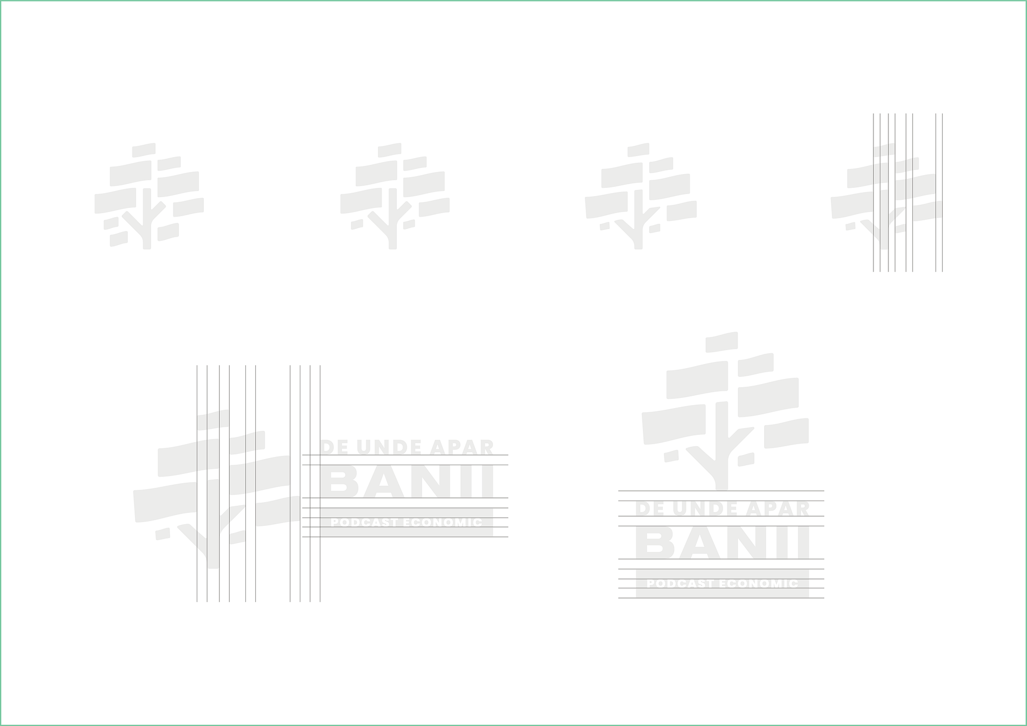
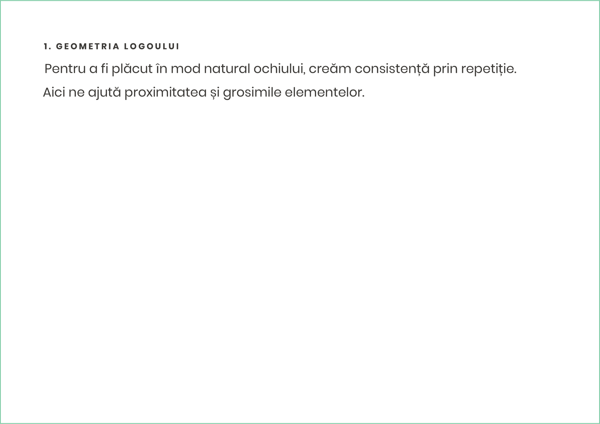
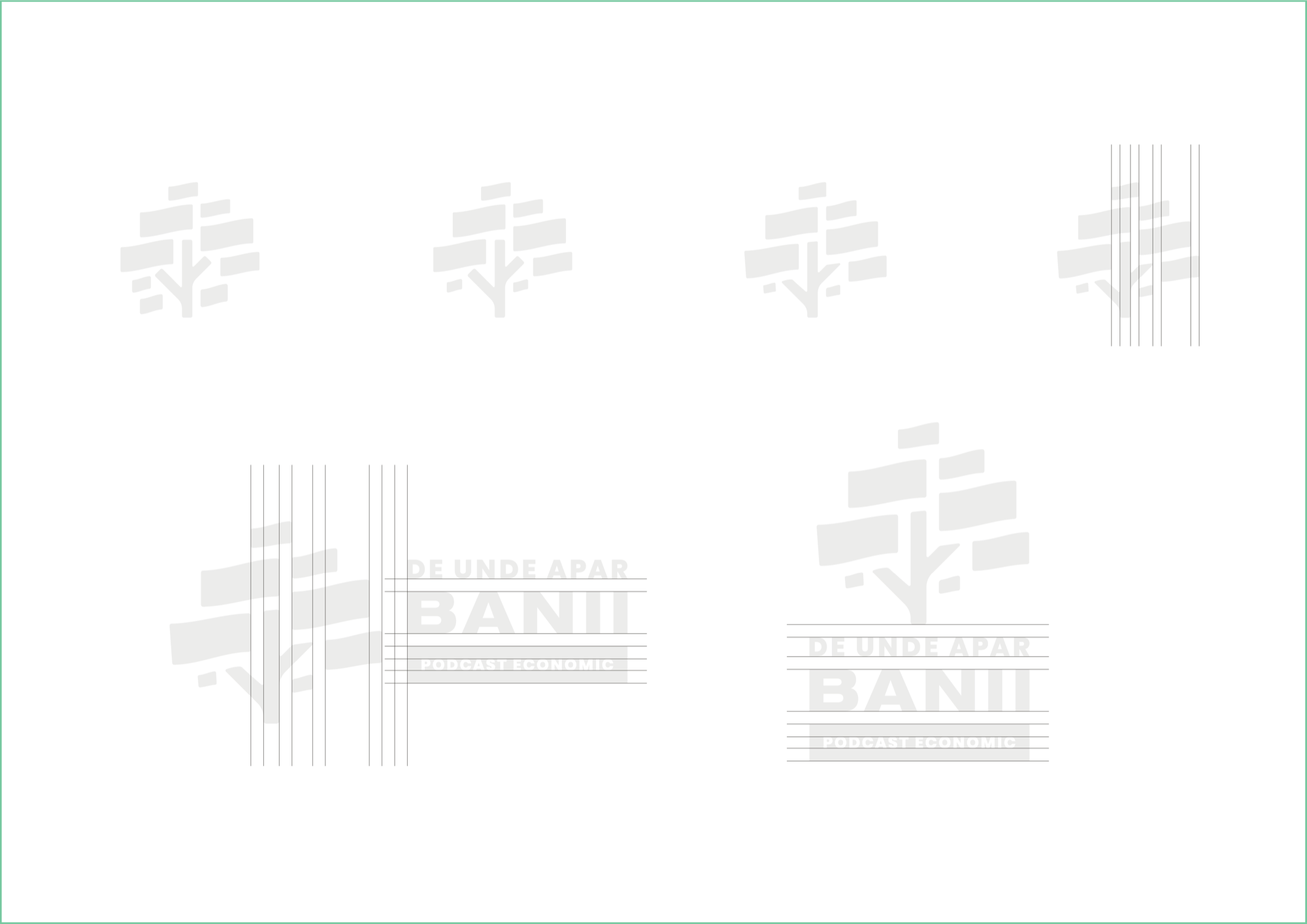
In practice: we change the bottom of the crown so that at small sizes it reads more clearly as the silhouette of a tree. We align the banknotes inside the crown - which creates a repeated, even spacing between the elements. We change the ends of the trunk and shorten its base, to suggest a more mature tree. Finally, we add the type and make two logo compositions.
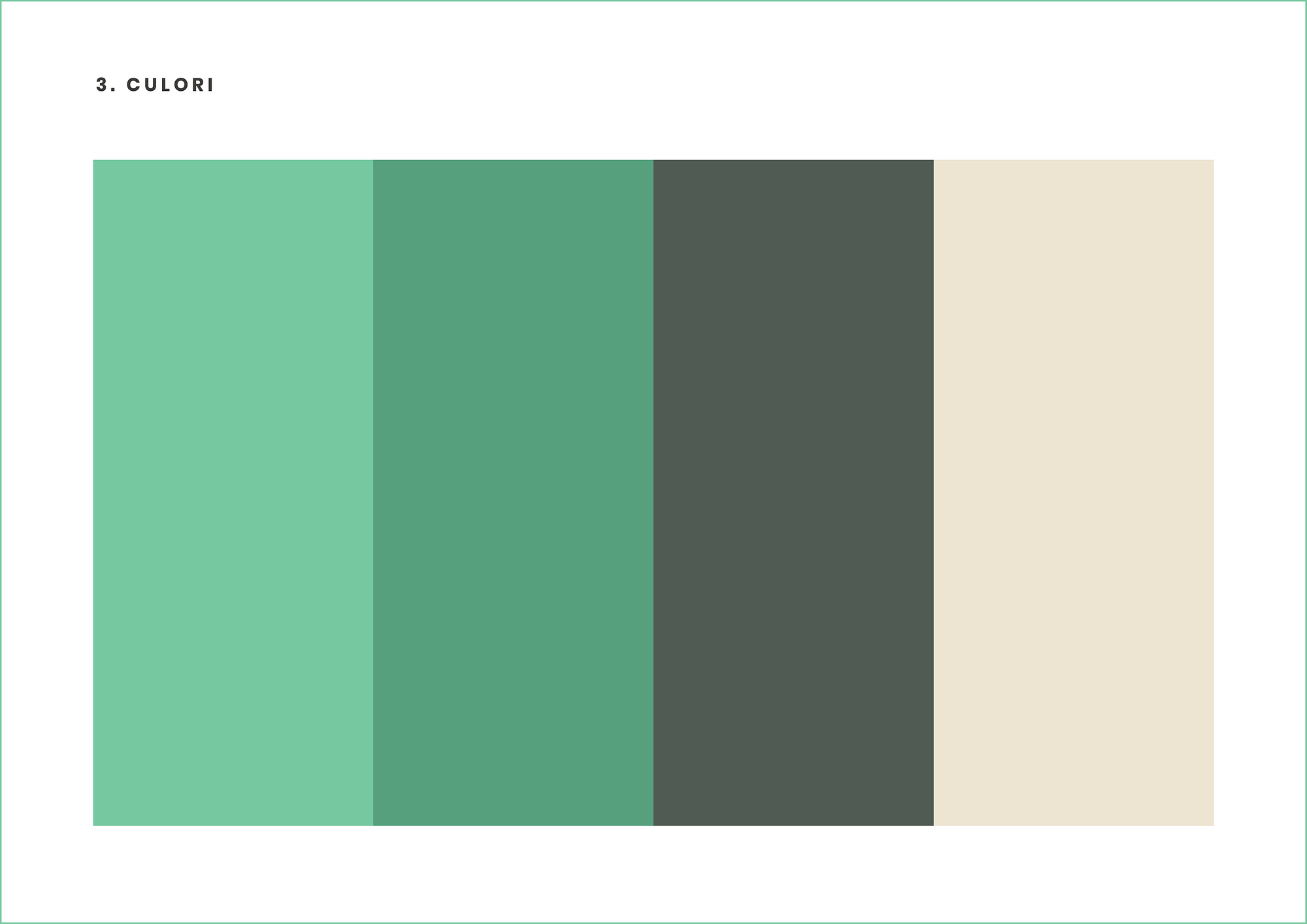
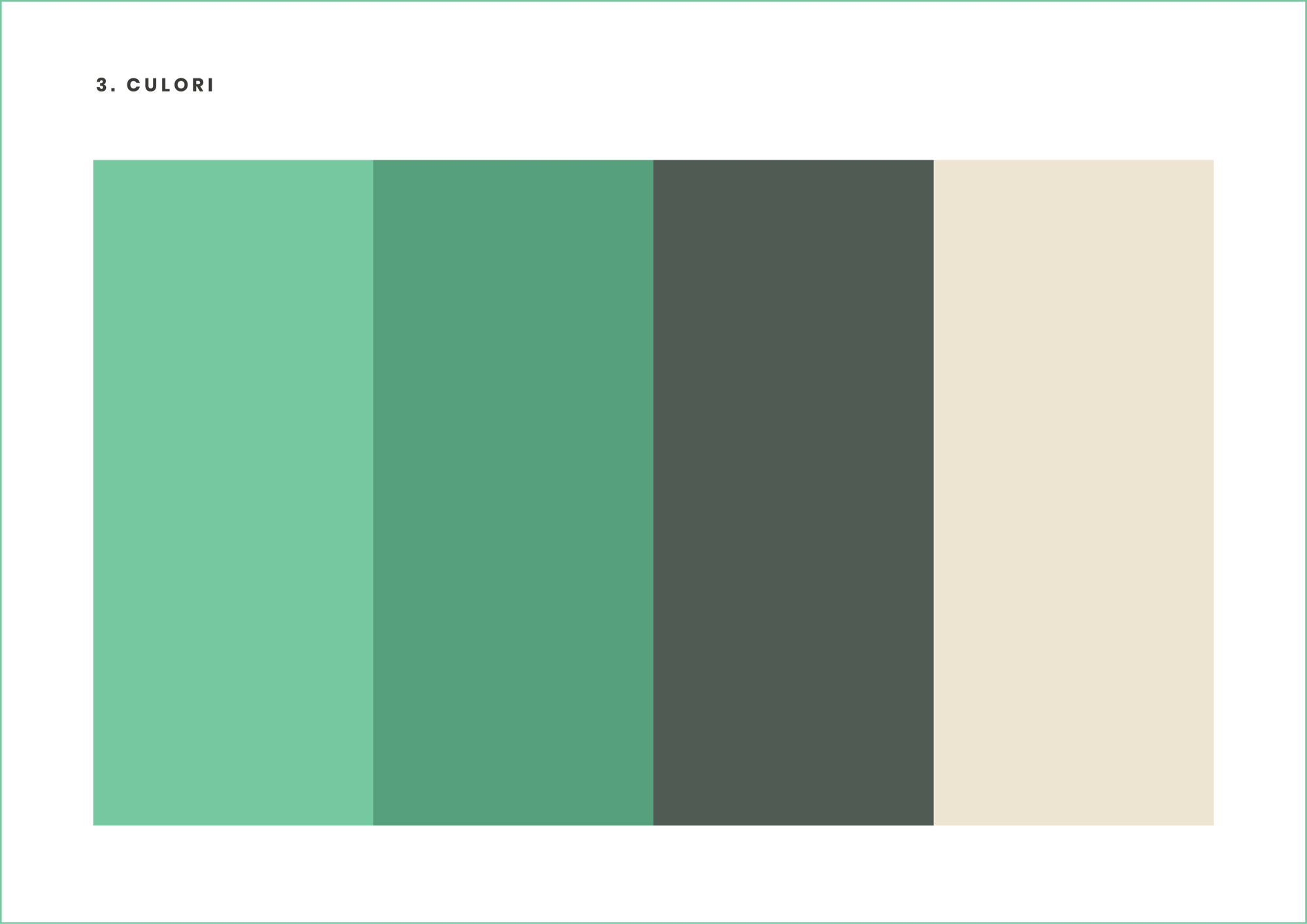
We add colour. We go for a palette that recalls a tree and the colours of the US dollar bill.
We study the logo in different compositions and situations. We generate a few mockups for more context. And in the end we gather all this material into…
Presentation 2
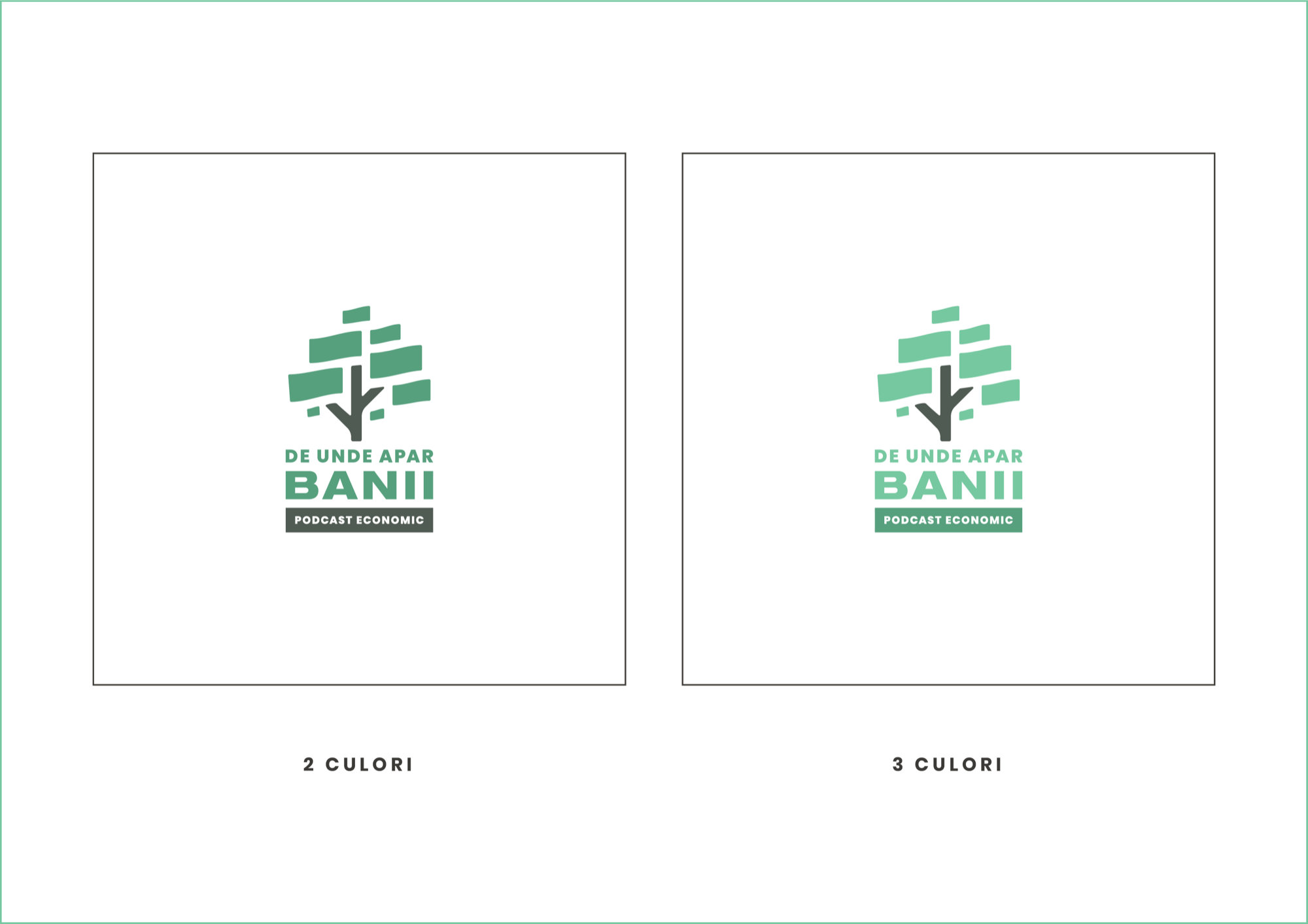
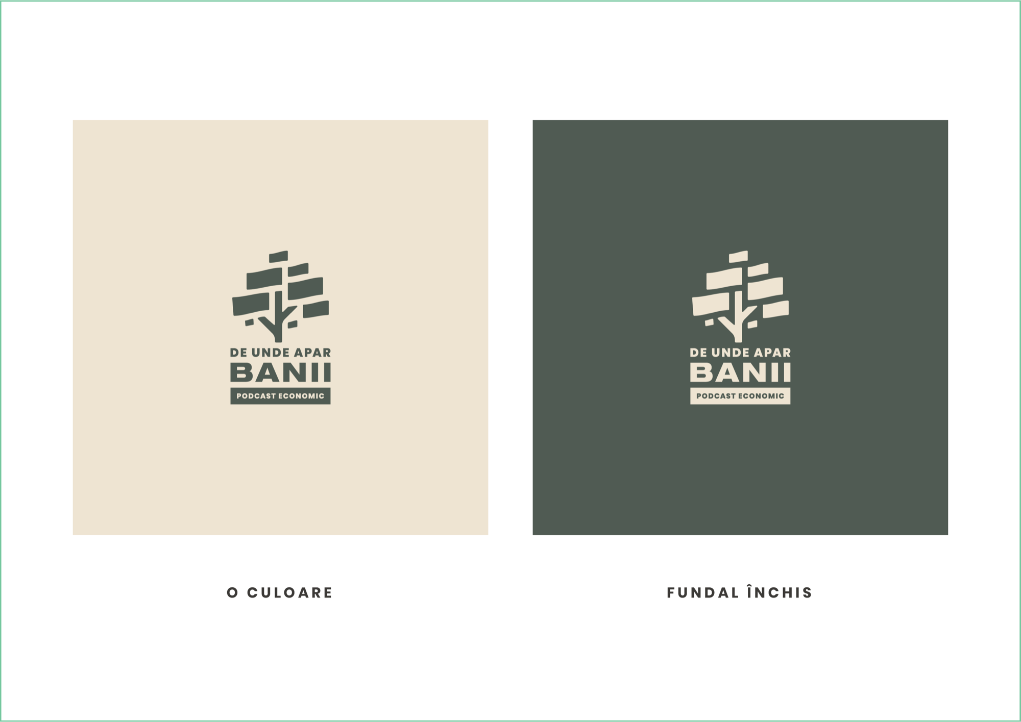
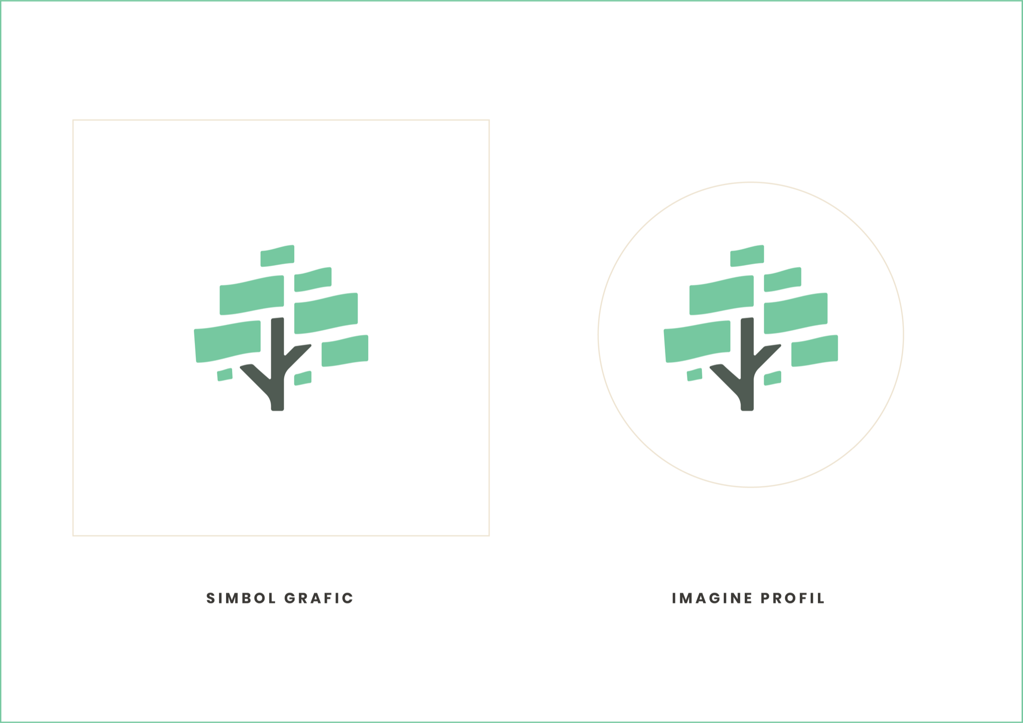
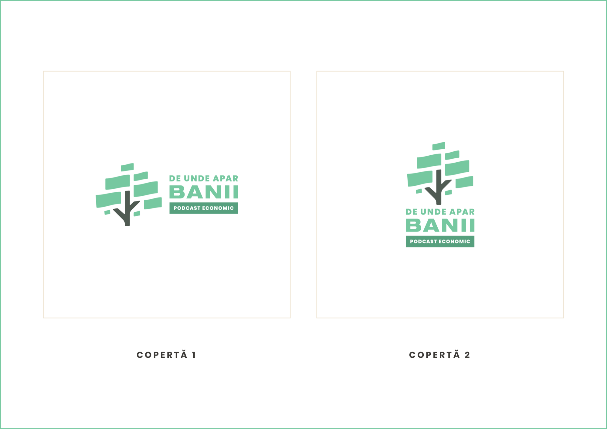
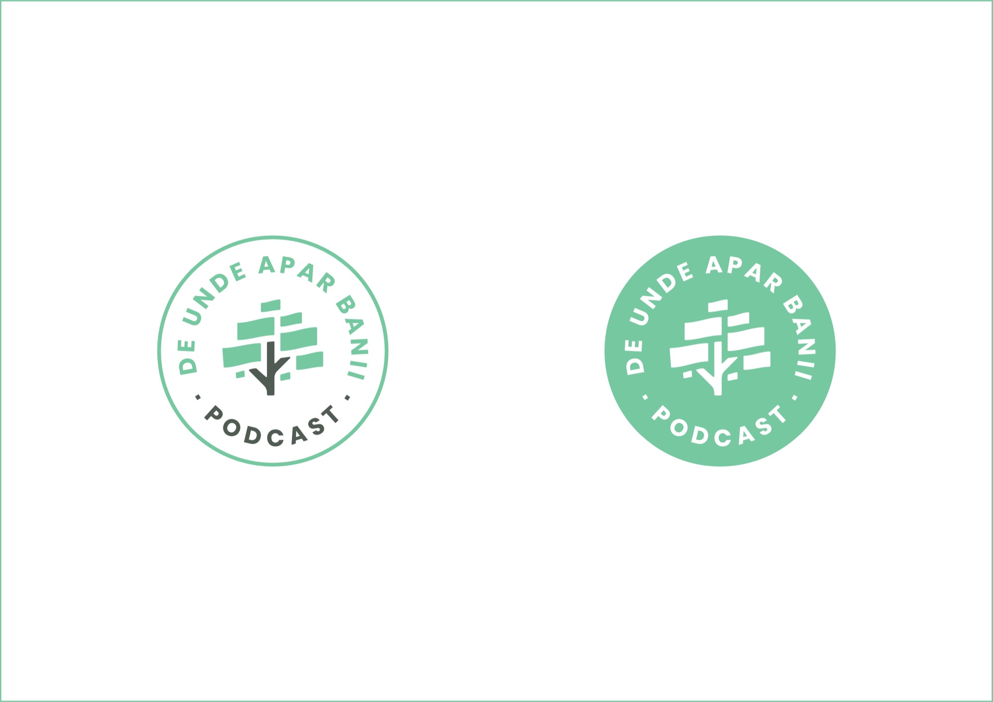
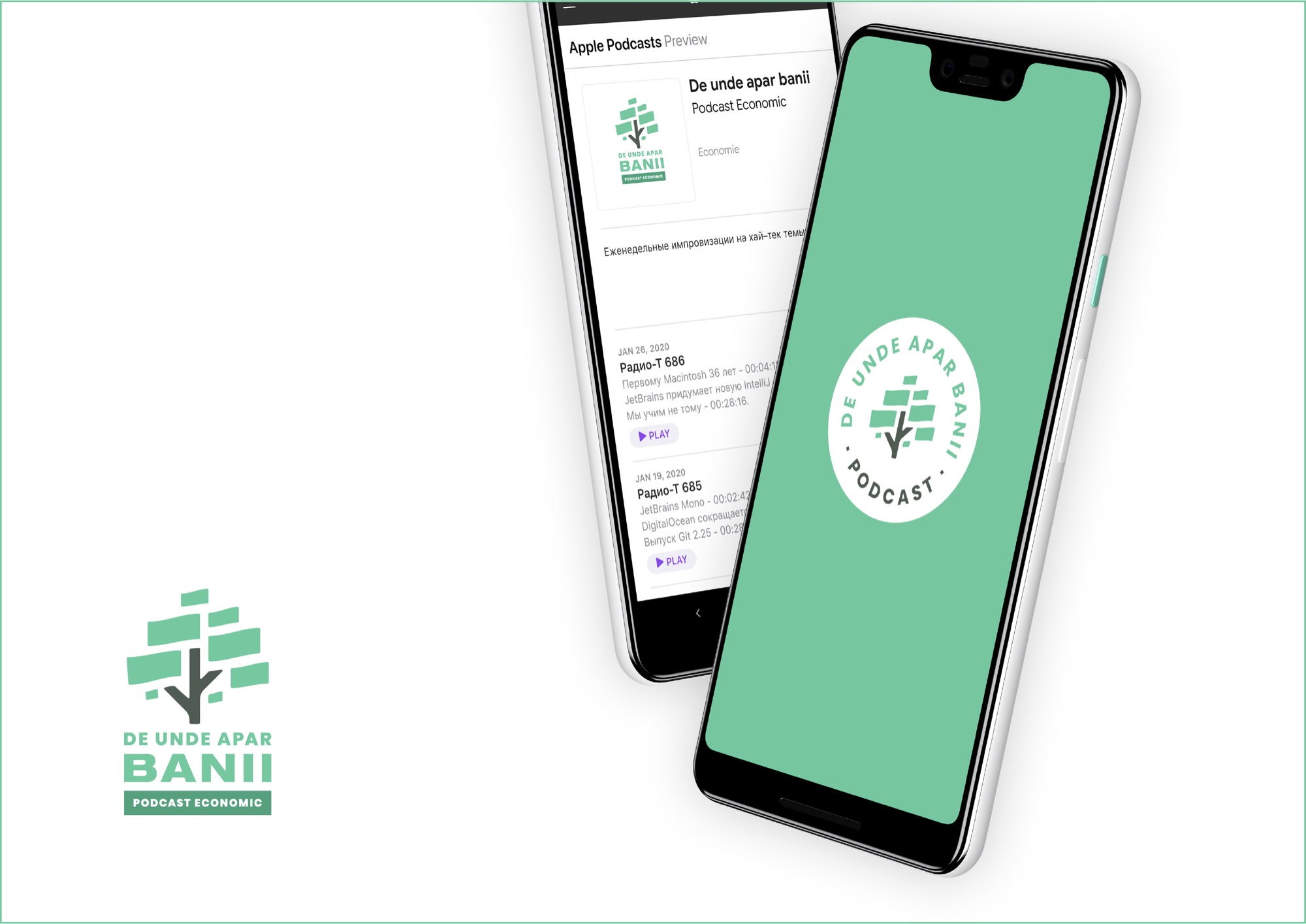
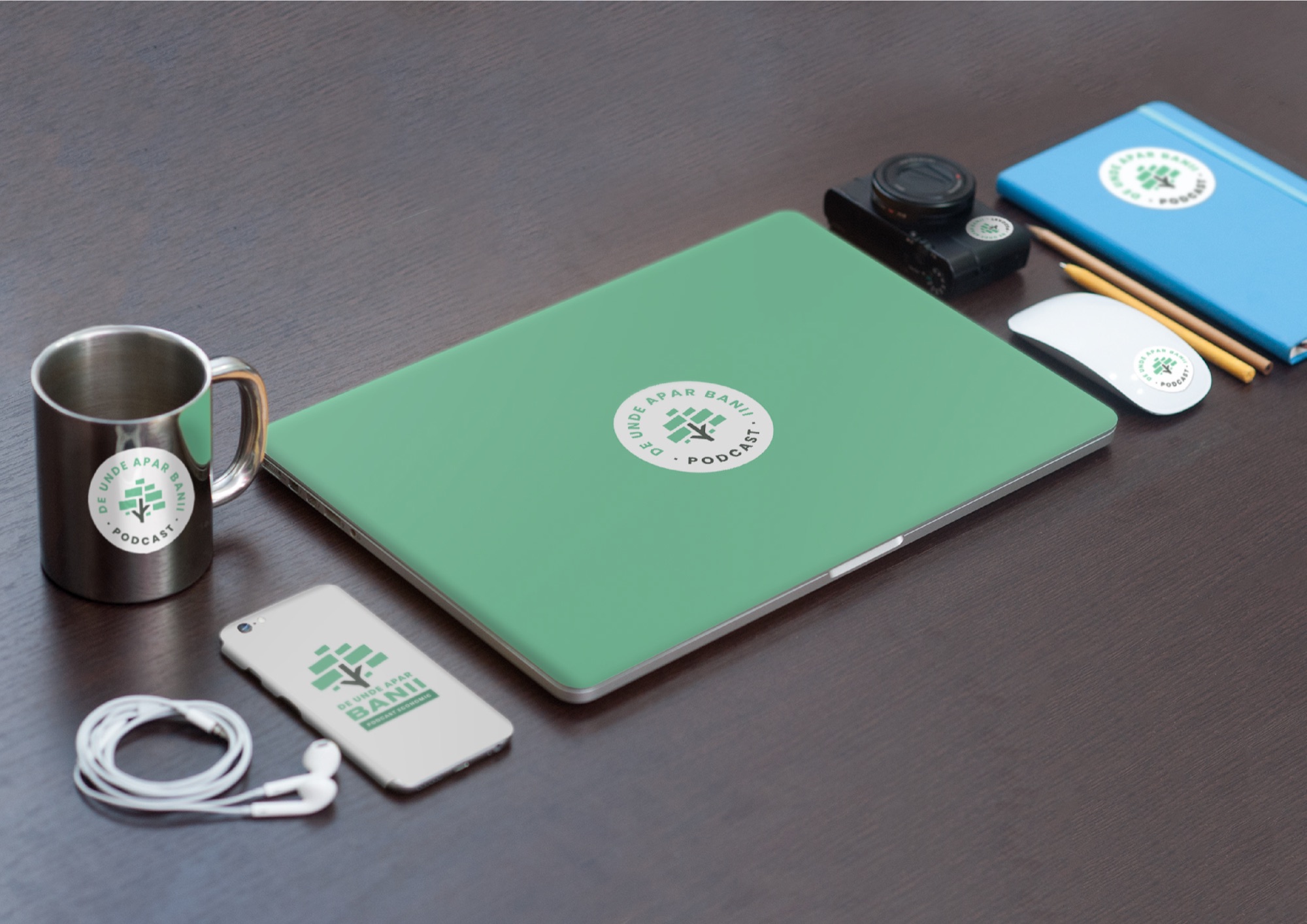
The second presentation again opens with a recap of the key points agreed so far, so that what follows is put in context. Again, a deadline is set for feedback.
In our case, after some consultation, the client comes back with this remark and request: let us drop the green altogether, to avoid any association with a political party’s logo. Use the neutral-colour versions. You can package and deliver.
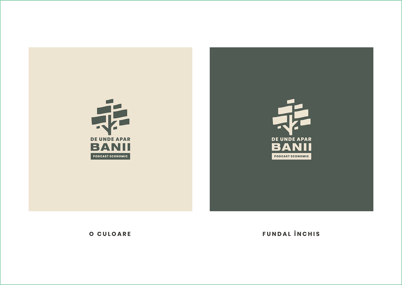
Fair enough.
Now you will probably say this could have been avoided if we had used colour from the start instead of bringing only the black-and-white version to the first presentation. Well, no - had we done that, this direction would have been killed outright. And there is more we can do to avoid association with a political party’s colours than abandon a direction entirely.
We have the option to deliver, or the option to keep developing. We choose to keep developing.
What we do in practice: for the geometry we use the silhouette of a coin (in other words, a circle), with its bottom cut off (which ties in with discovery, with emergence), and we integrate the tree into it. For colour, we use yellow / orange, which suits a coin.
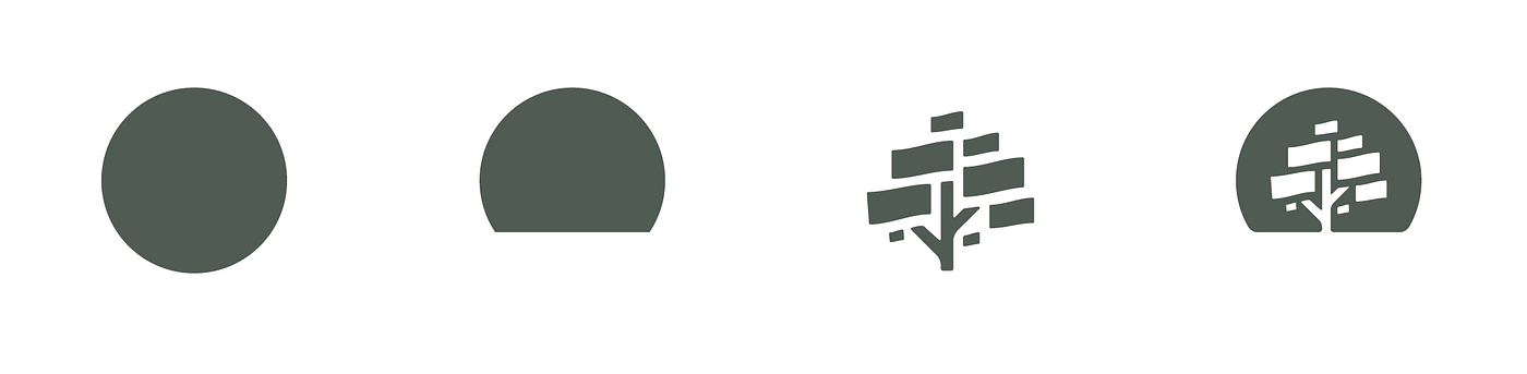
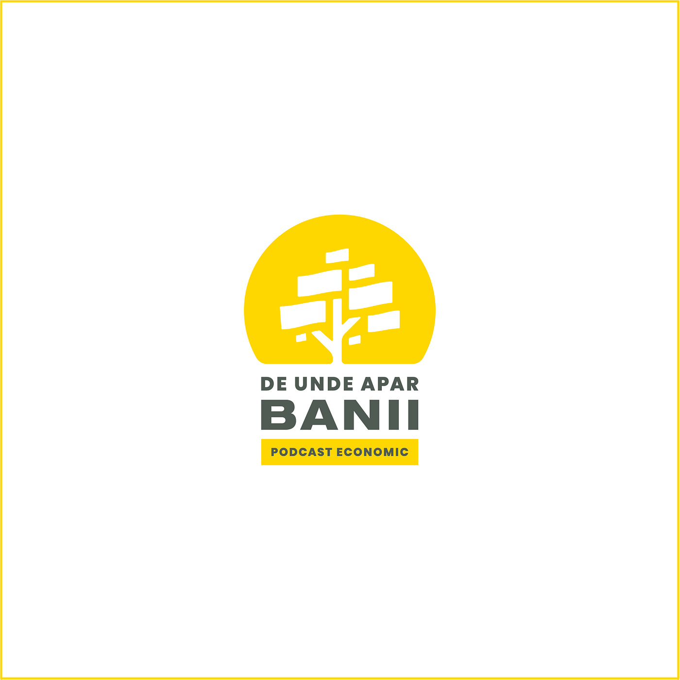
And here is the final approved version. Next, we prepare all the deliverables and… deliver them to the client.
5. Deliverables
But that, ladies and gents, is for another short piece, because this one is long enough already.