There was a time in Moldova when companies were given names built from abbreviated words, and the result was a company name that was… looong.
Same with graphic symbols… the more elements, the better it seemed. The “richer”.
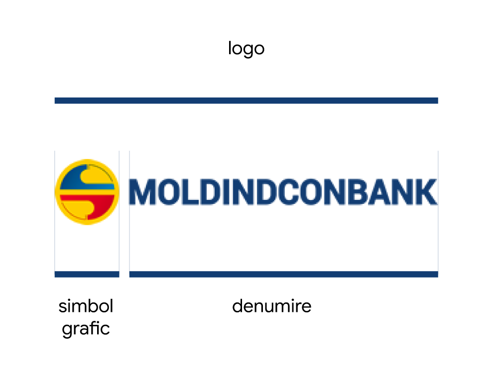
The name
What can be done here? Well, we have two options:
- Come up with an abbreviation - MICB, for example
- Start a naming process
We will go with the abbreviation MICB, obviously. Because who knows where a naming process might take us…
The symbol
That leaves the graphic symbol, and here we look at how we could work on an evolution of it. We notice that the symbol has already been through one round of simplification:
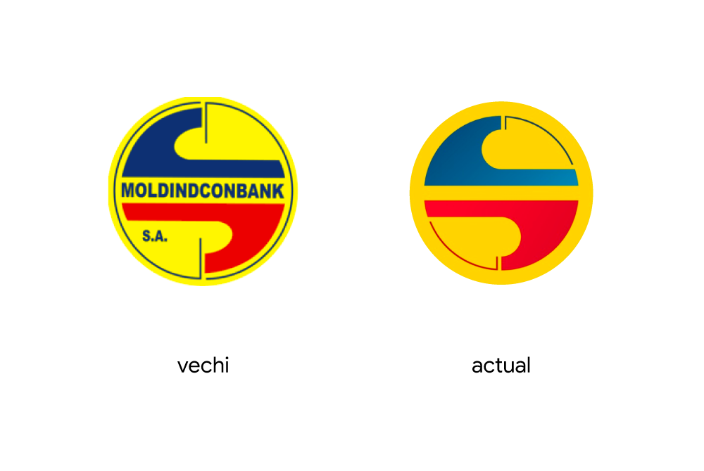
Now let us see what observations we can make. A quick look at the geometry.
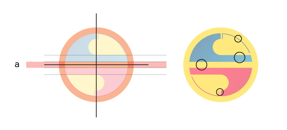
Besides the relative complexity, there is also a lack of consistency.
On the one hand, symmetry is attempted to achieve something visually balanced; on the other, elements of different stroke weights and masses are applied. Too different. They will get lost at small sizes. And if we look at proximity, the distances between the elements vary too.
The colours are the ones found in the national tricolour. Primaries. That was probably the original intention. A few useful things about colour:
We will keep the same colours. But before colour, let us work on the geometry a little.
The geometry
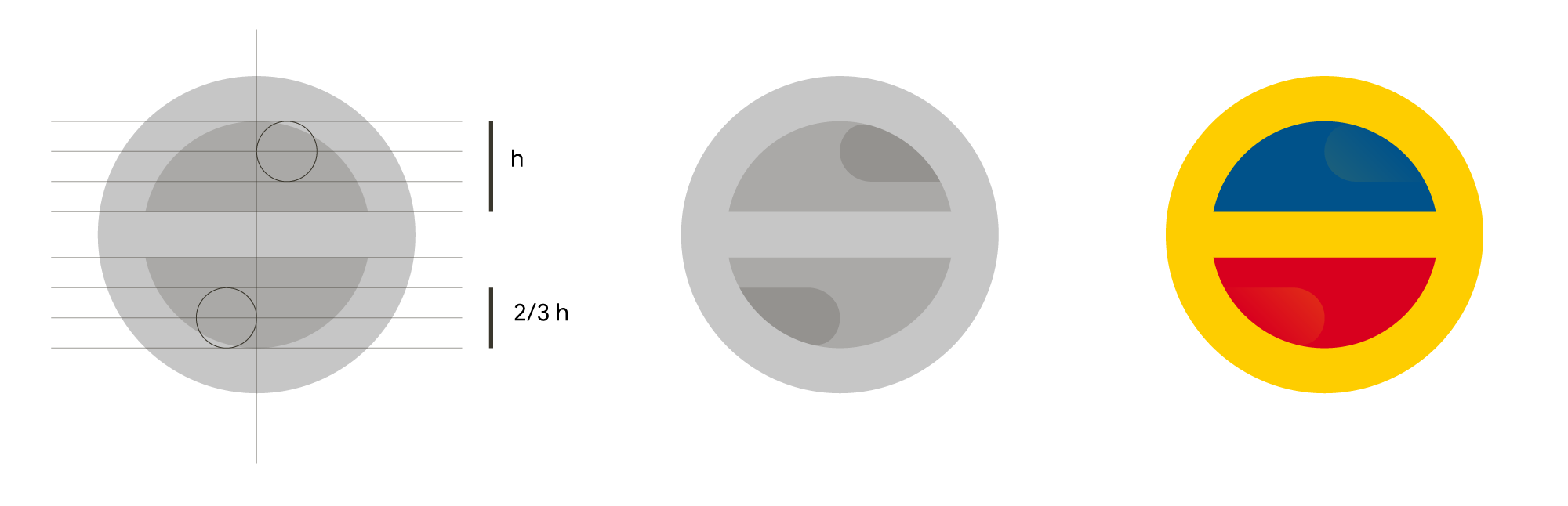
We start with a grid with an odd number of columns (we will use the centre column for symmetry). Say, 7 columns.
We draw a circle 7 columns in diameter and a second one of 5. When we subtract the second circle from the first, and then cut a horizontal band one column high through the middle, from edge to edge, we arrive at the following. We add a little colour and get the most simplified graphic form that still shares enough features with the current symbol.
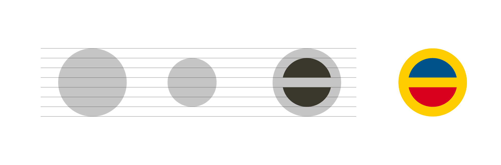
Now we very subtly try to add the extra semicircles.
And now let us see where we end up if we add the wordmark as well:
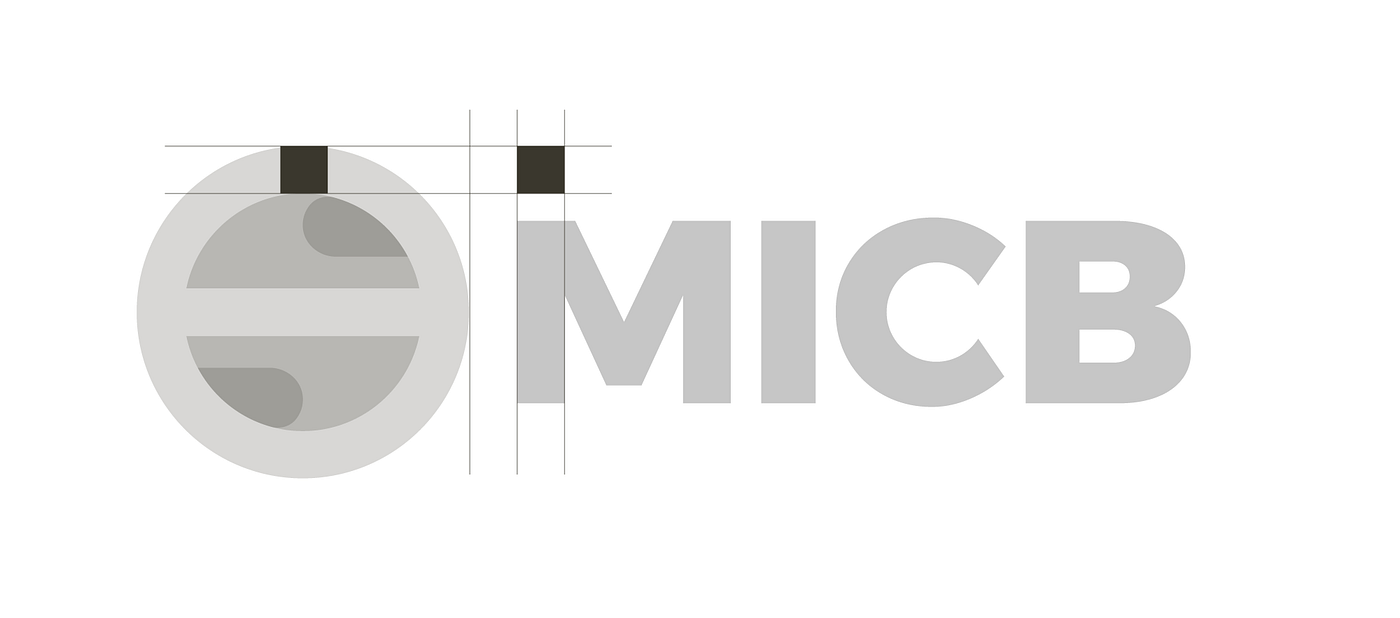
Here, again, we try to carry the stroke weights of the letters into the symbol to add consistency.
We add colour.
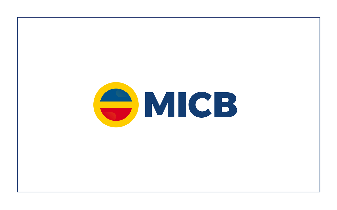
Would the hypothetical logo do its job better?
- it is simpler (it has fewer geometric shapes)
- it is more consistent in size and proximity (so easier to perceive and friendlier)
- it is easy to recognise next to the logos of other Moldovan banks
- it keeps the same colour palette
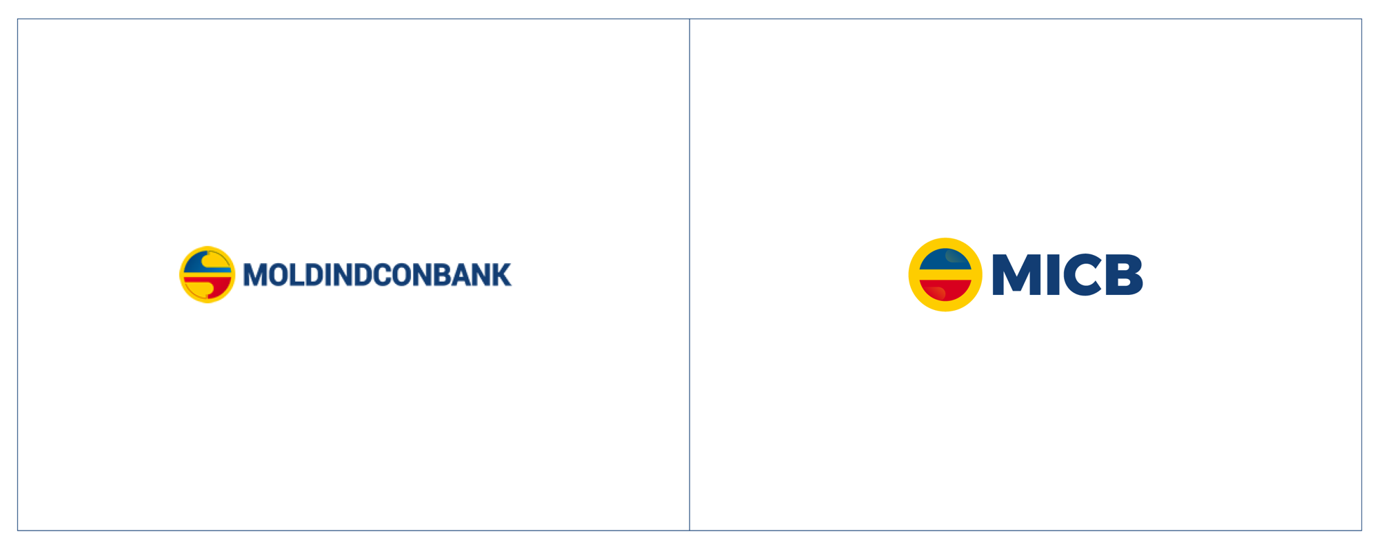
So we see that more complicated does not always mean better. Quite the opposite. Every element or shape has to have a meaning, and the ones that do not - we leave out.
And that is about it for this exercise.