A golden story, told in a whisper
Pelican Negru is a brand with a story few wineries can tell. It was founded in 1999 in Olănești, in the Purcari area, by a French-Moldovan duo: Nicolas Dirand, an Alsatian winemaker, and Gheorghe Arpentin - president of the Union of Oenologists of Moldova and the first Moldovan ever elected to the governing bodies of the OIV, the International Organisation of Vine and Wine. Devoted to biodynamics since the 1990s, Arpentin makes Moldova’s only biodynamic wine here, on 25 hectares of clay-limestone chernozem on the banks of the Dniester. His personal wine. His signature wine.
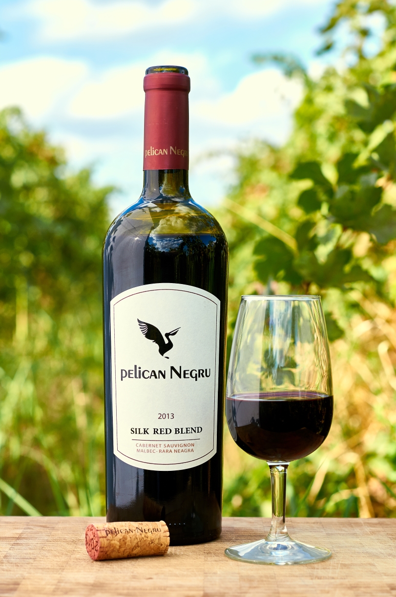
The name has a rare hook too: the black pelican does not exist in nature (pelican negru is Romanian for “black pelican”). It is a beautiful paradox - but one with a graphic condition attached: if the bird in the logo is not unmistakably a pelican, the whole game is lost.
What we set out to solve
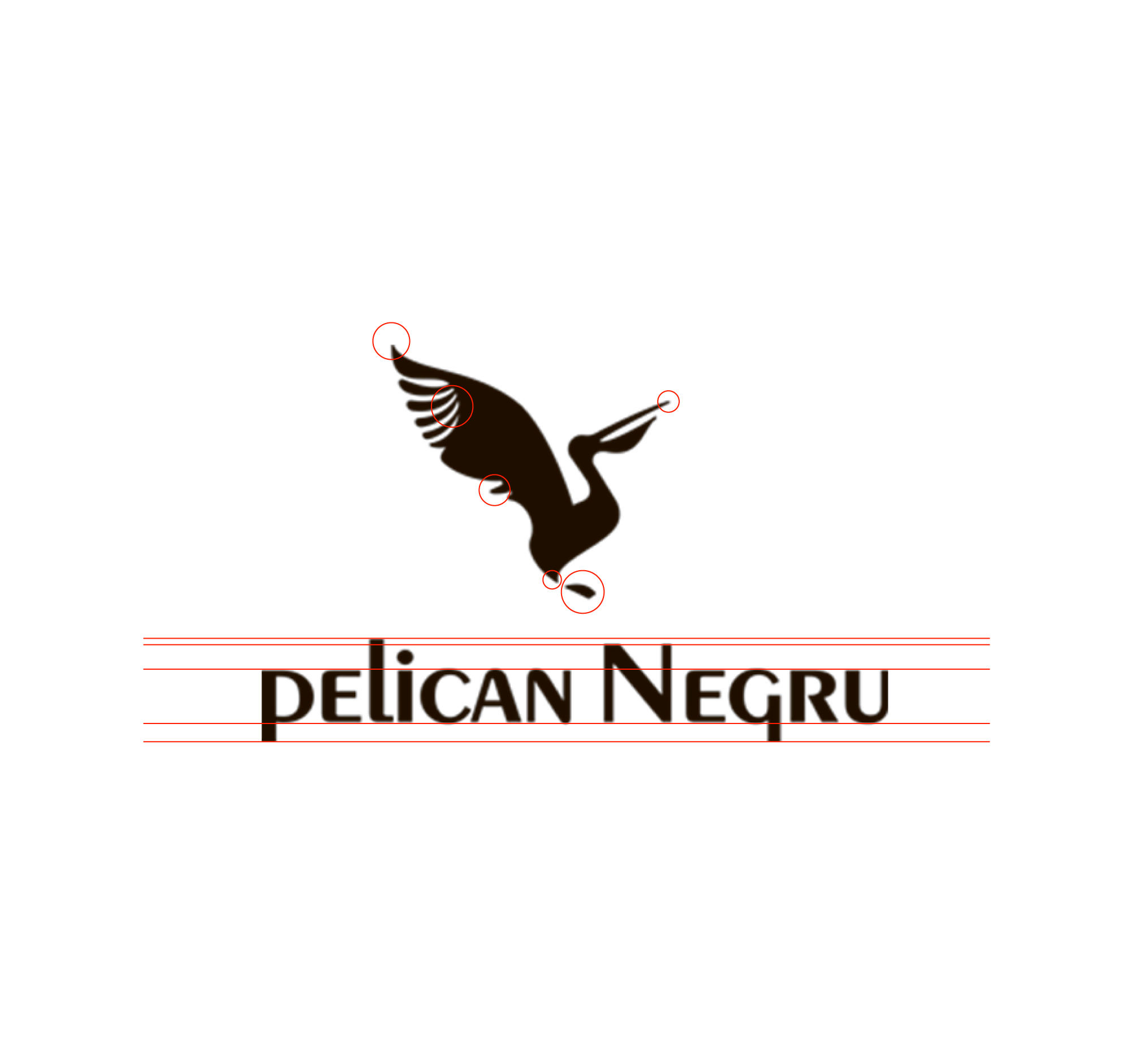
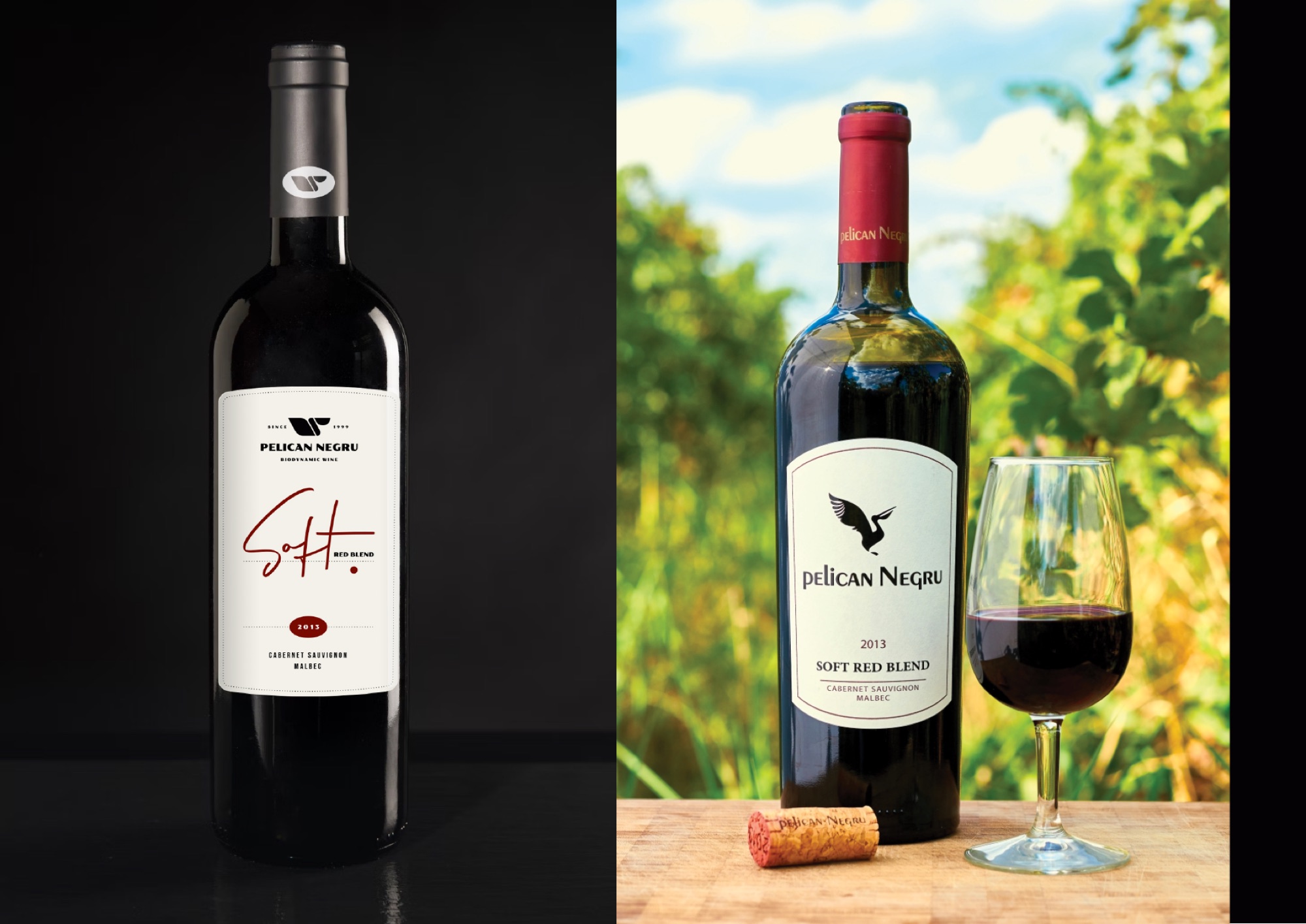
To be clear: the bird reads - the pelican is there, with its pouch and raised wings. The problem is the execution. The silhouette gathers a great many elements that never repeat one another - fine hatching in the wing, a solid body, thin, sharp terminals at almost every end - each at a different weight. Without repetition there is no consistency; at small sizes the details drown and the silhouette turns into a smudge on the bottle’s capsule.
- The “pEliCAN NEgRU” wordmark mixes lowercase, small caps and enlarged capitals - three different heights in the same word, a convention of the 2000s;
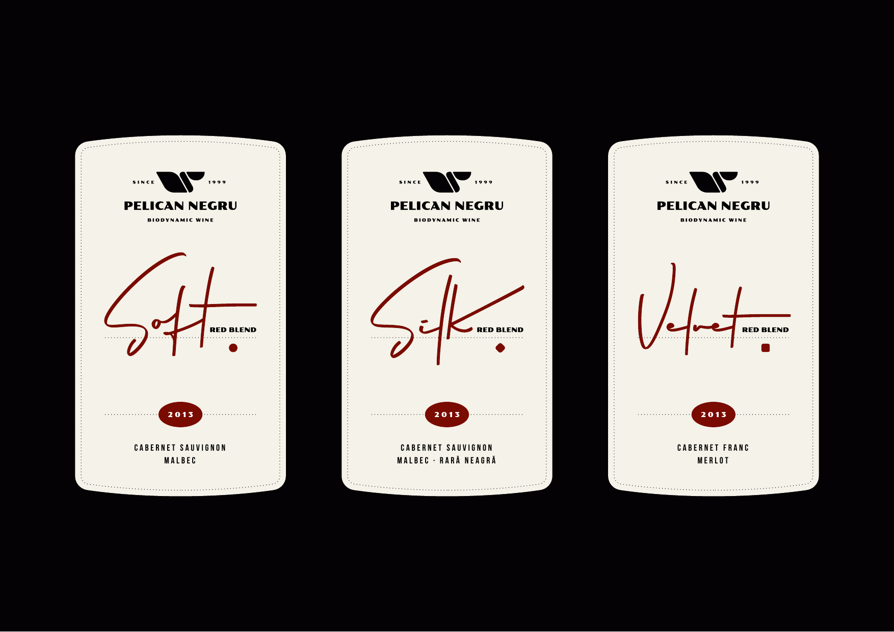
- the classic label range is clean but generic: a frame with an arch, everything centred - it could belong to any winery in the region;
- the Exclusive range breaks the system entirely: painting labels, each bottle a different world, and the pelican gone from the front.
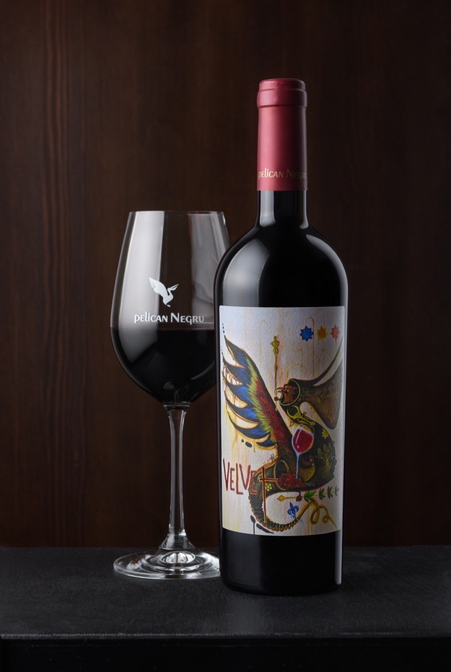
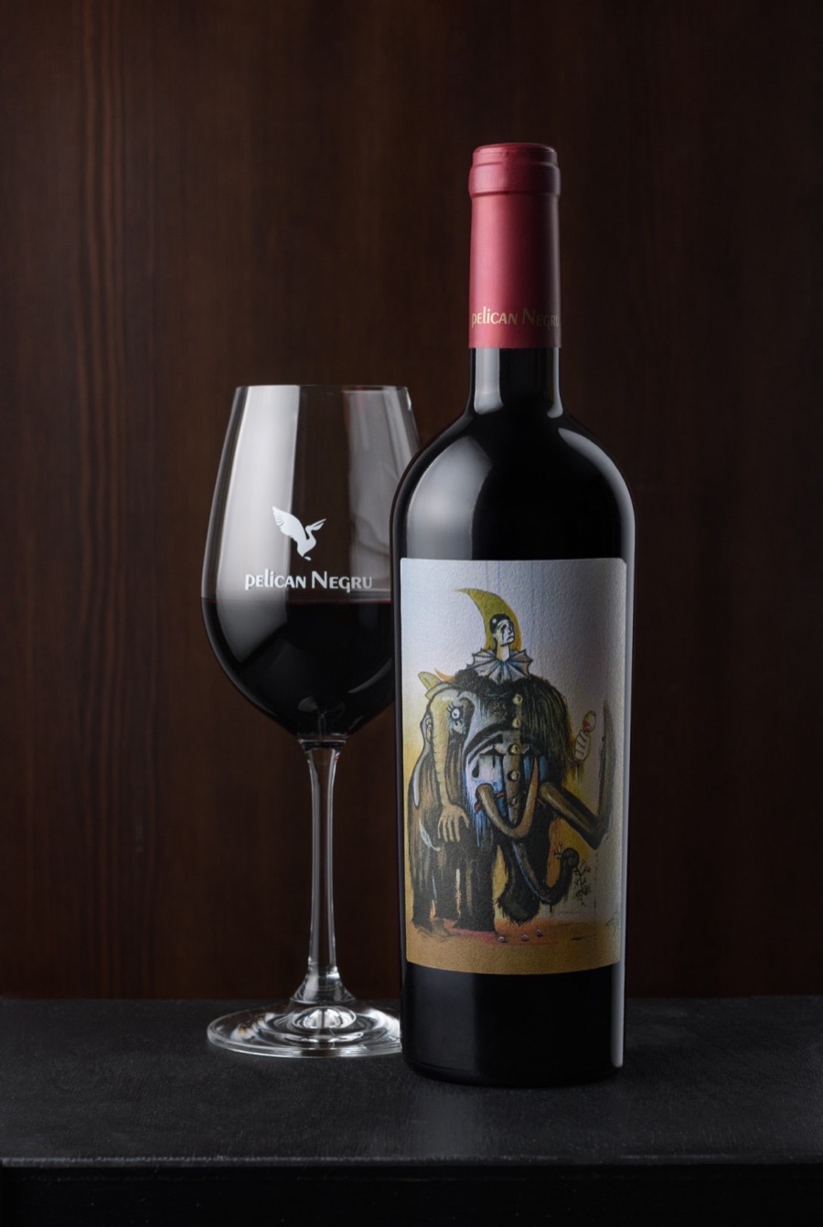
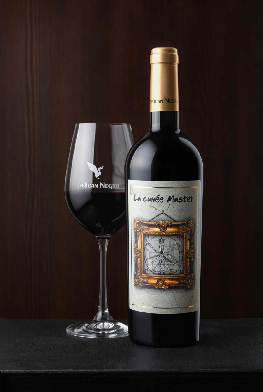
And one detail that says a lot: the range names - Silk, Velvet, Soft, Lace - are an excellent idea, a whole system of textures. Visually, completely unused. Nothing silky on Silk, nothing velvety on Velvet.
First attempt: geometry
The first redesign went straight at what bothered us: consistent shapes, close weights, construction on a grid. The result was a solid symbol, with lock-up variants, a round badge, even merch mockups.
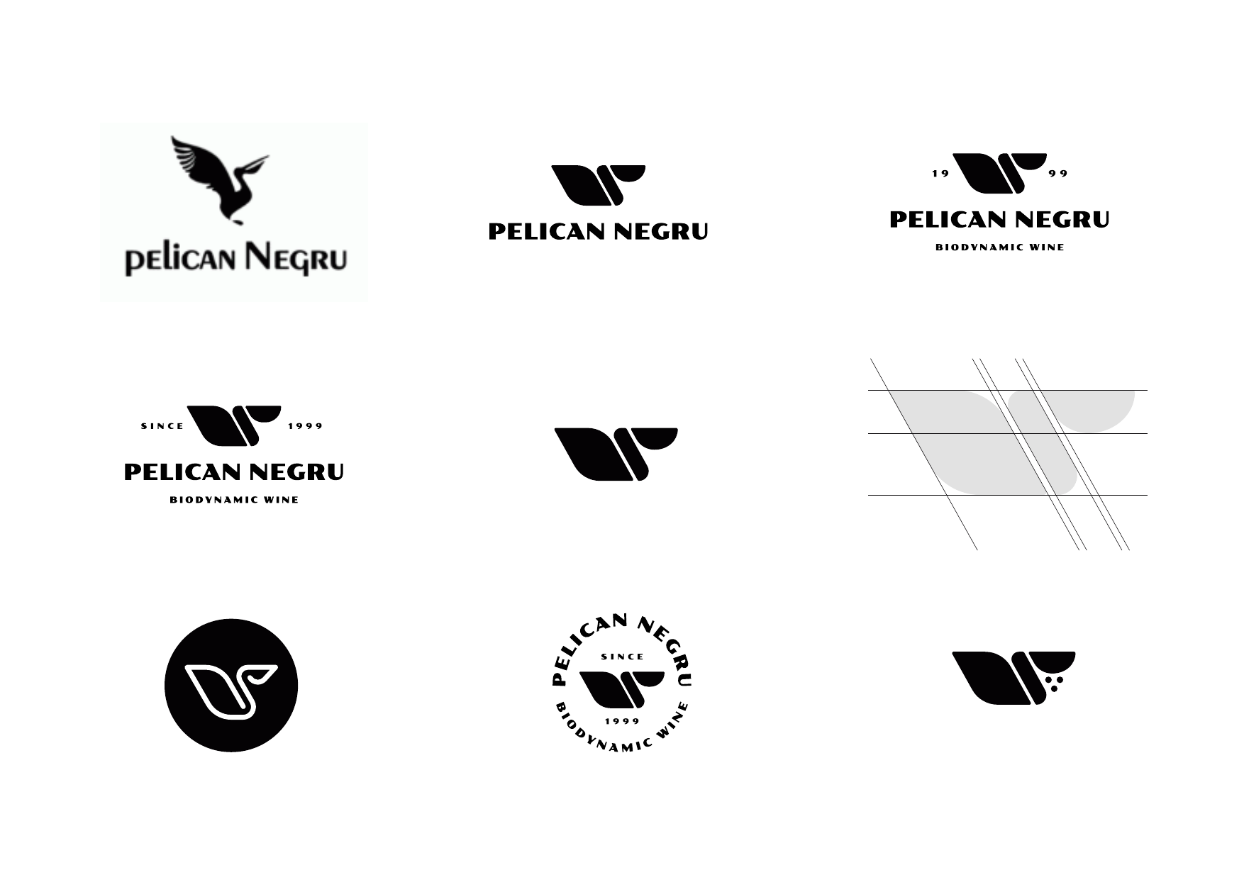
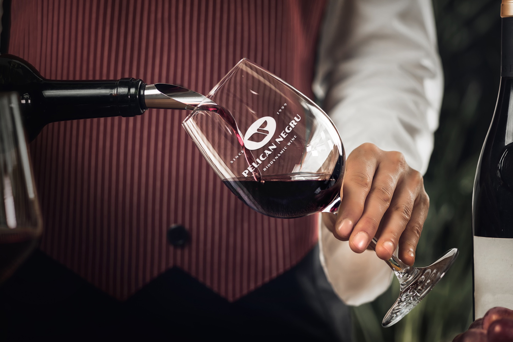
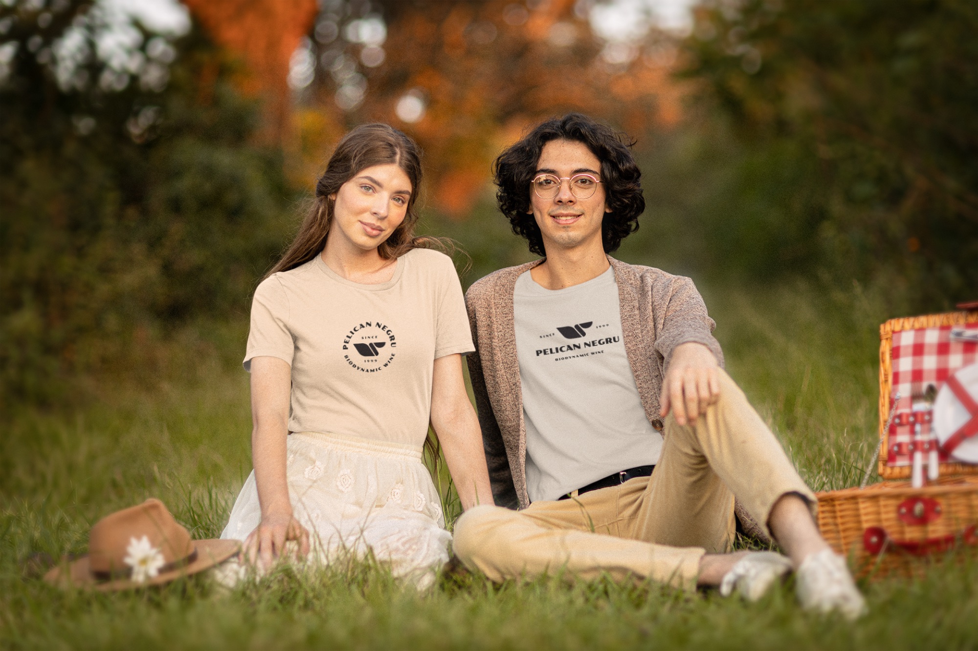
And yet we stopped it. The geometry had erased exactly the features that make a pelican a pelican - what remained read as a wing, a feather, anything. The temperature was wrong: cold geometry plus letterspaced caps = fintech, not biodynamic wine. And on the label, the warm script signature and the mechanical symbol lived in two different worlds.
The lessonBetter execution is not a reason to rebrand. To be worth even proposing, a new identity has to be considerably better - otherwise you swap one for another and burn years of recognition for a gain nobody sees.
It is the same lesson as in Basconslux, part 1: we executed well and discovered that good execution is not enough.
The idea: the signature
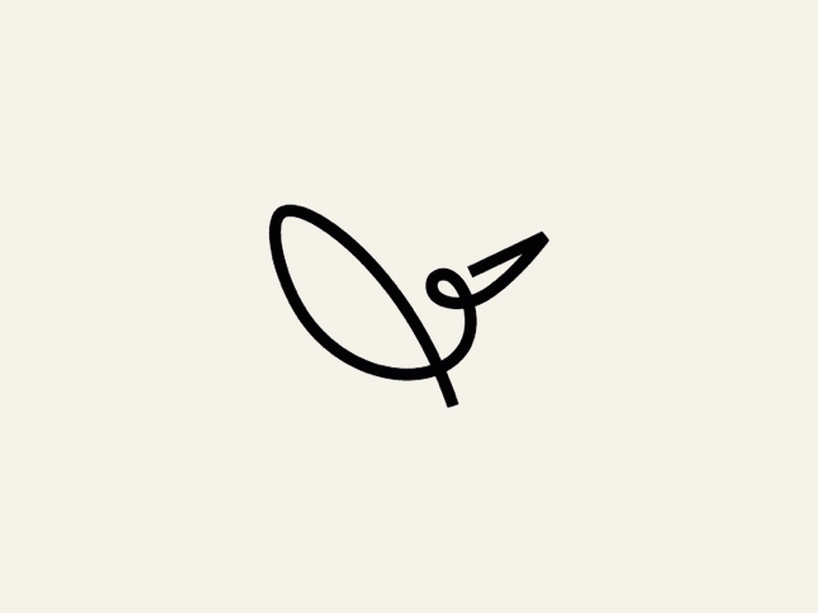
The answer came from the story, not from geometry. If Pelican Negru is the signature wine of Moldova’s most decorated oenologist - then the pelican is the signature. A bird drawn the way you sign your name: in a single stroke of the pen, without lifting the nib from the paper.
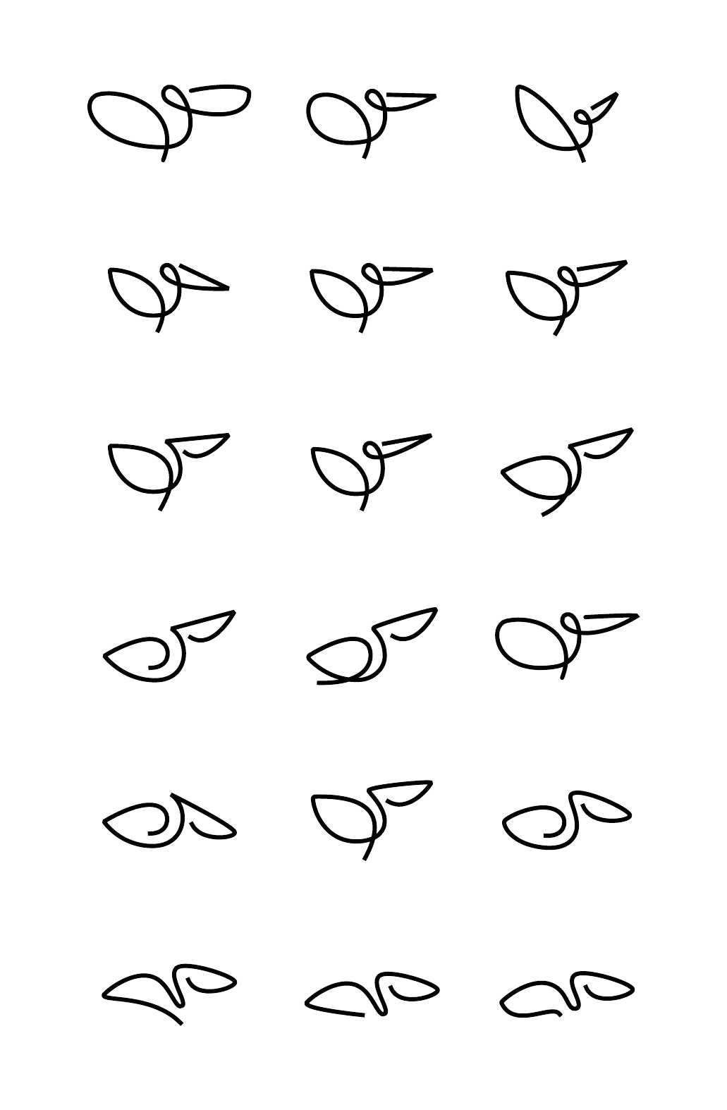
We drew dozens of variants and chose the one that met two criteria:
- it looks most like a signature - the loop at the head is exactly the gesture of a signature;
- it keeps the original angle: the raised wing and the beak pointing up and to the right, at the same visual angle as the current logo. The market has memorised that gesture for years - we change the hand that draws it, not the gesture.
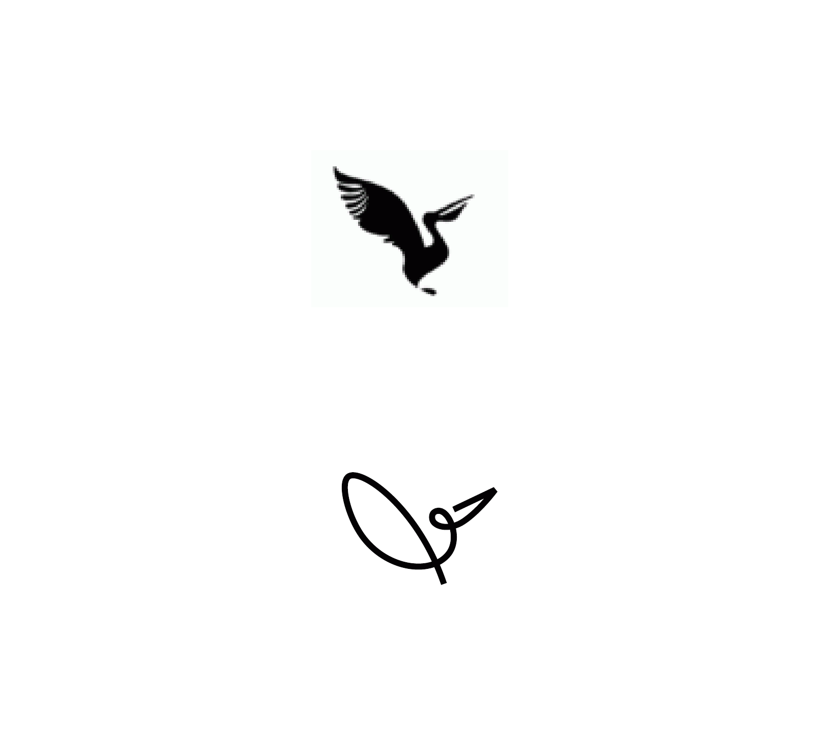
One line, one weight
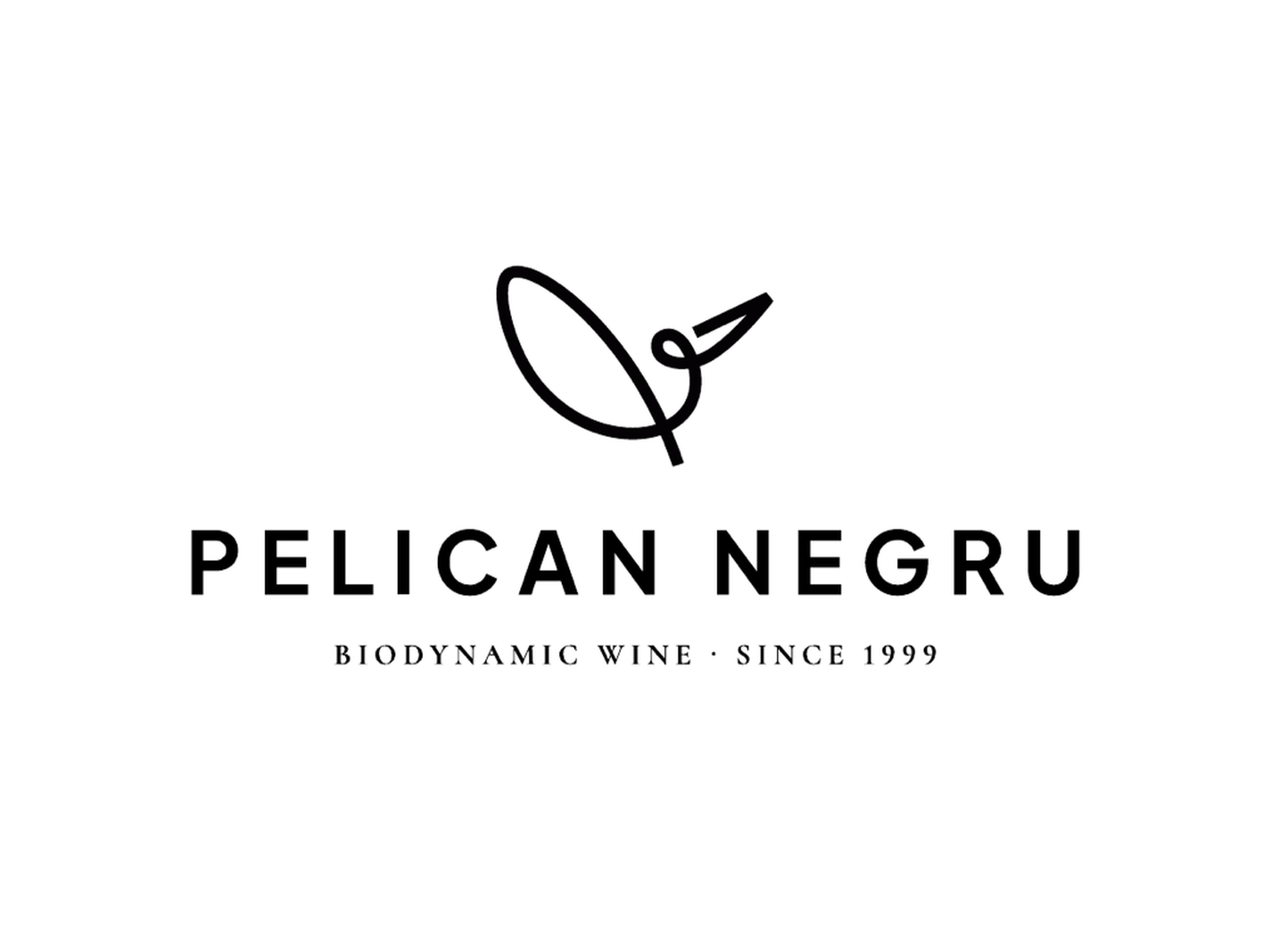
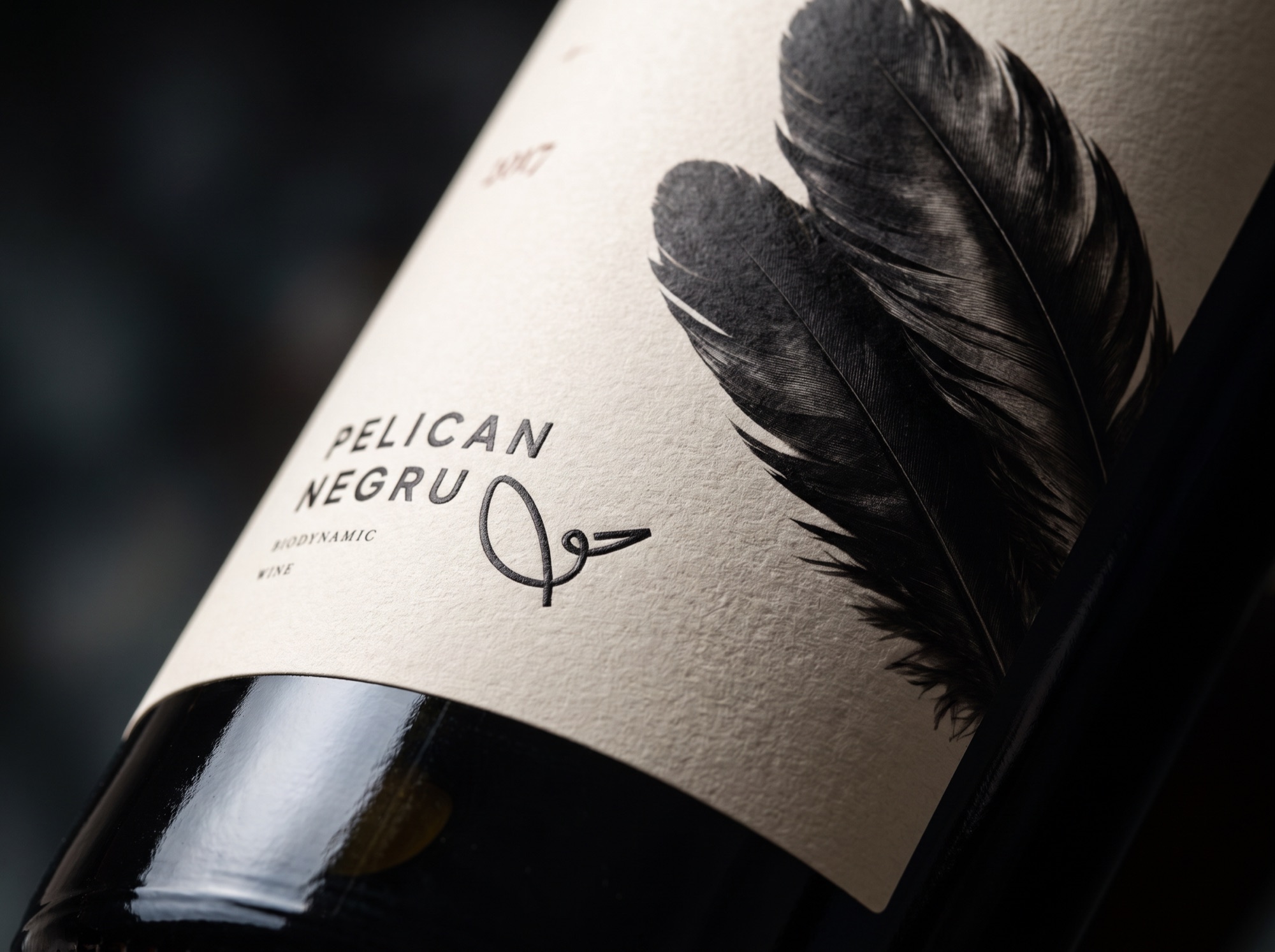
The symbol is calibrated to the same stroke weight as the typeface in the wordmark - symbol and letters look written with the same pressure of the nib. The exact antithesis of the old logo: a single line, a single weight, no sharp points.

Bonus: the label that signs itself
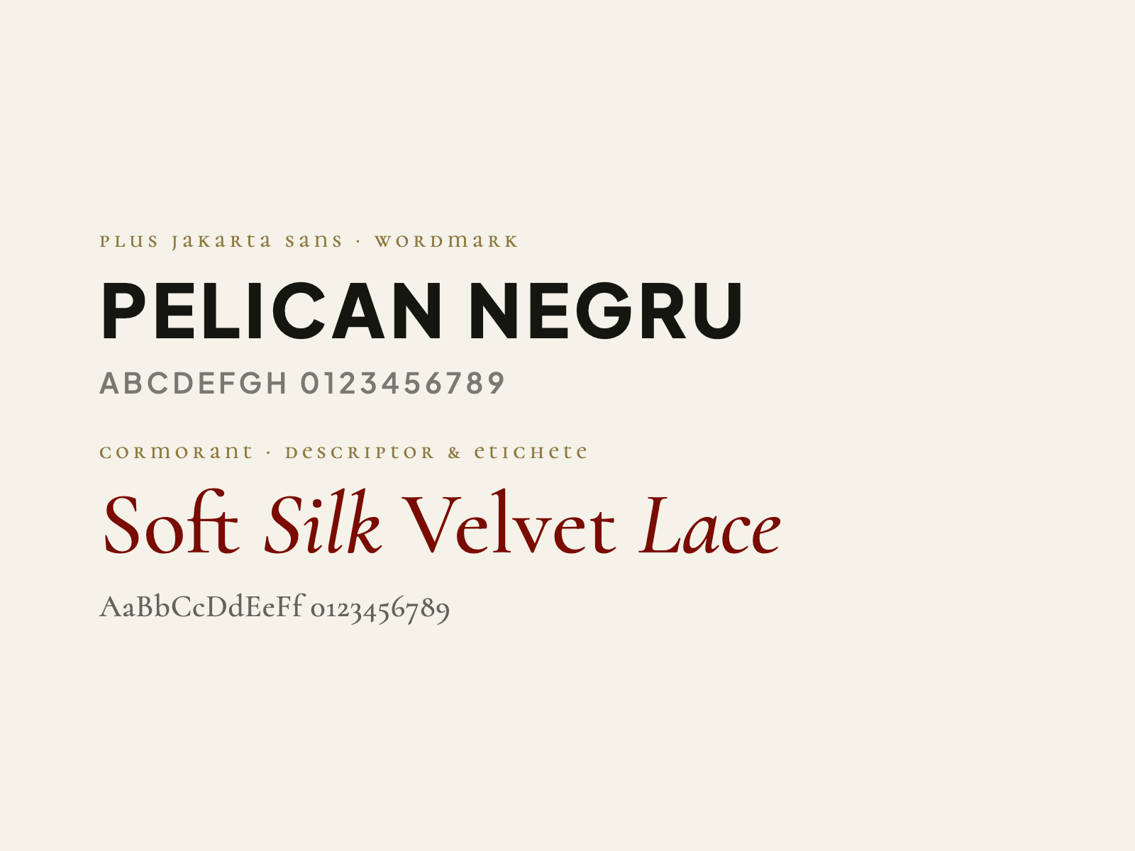
We first tried the classic route - an elegant serif, a centred composition, a wavy line whose number of waves encoded the number of grape varieties in the blend. The serif (Cormorant) was no accident: it keeps the play of the original logo - capitals mixed with lowercase - but in a logical order. P and N are large, and the remaining letters, even though they mix uppercase and lowercase forms, all sit at the same height:
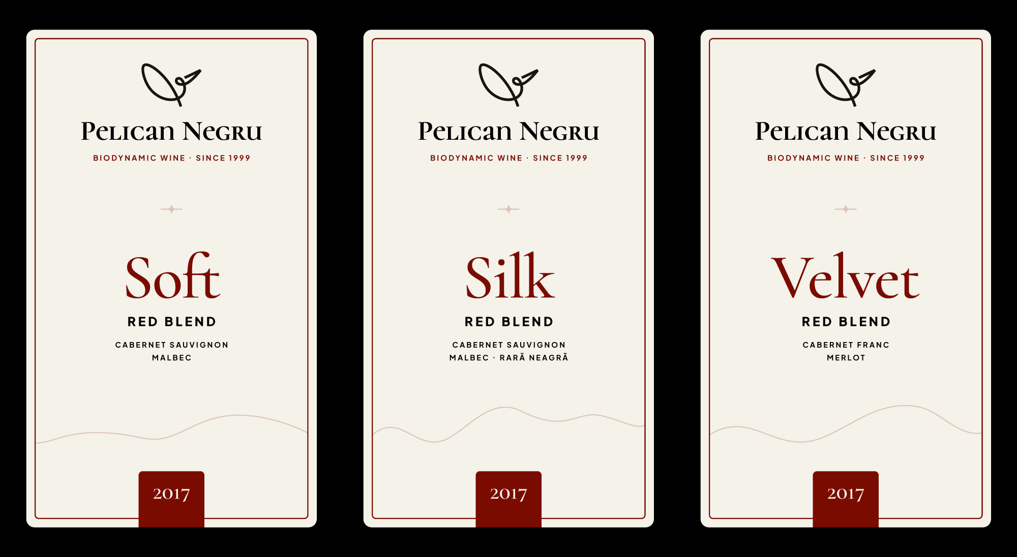
This is where it helps that we have been customers for years. More than once, on an evening out with friends, we ordered Pelican Negru and saw the problem first-hand: on the wine-shop shelf, Silk, Soft and Velvet were hard to tell apart - the wine’s name sat small, lumped in with “red blend”, on three otherwise identical labels. And when we asked for “that Pelican with three varieties”, the label was no help either: the blend was a single line of small type. We would look at each other: which one was it?
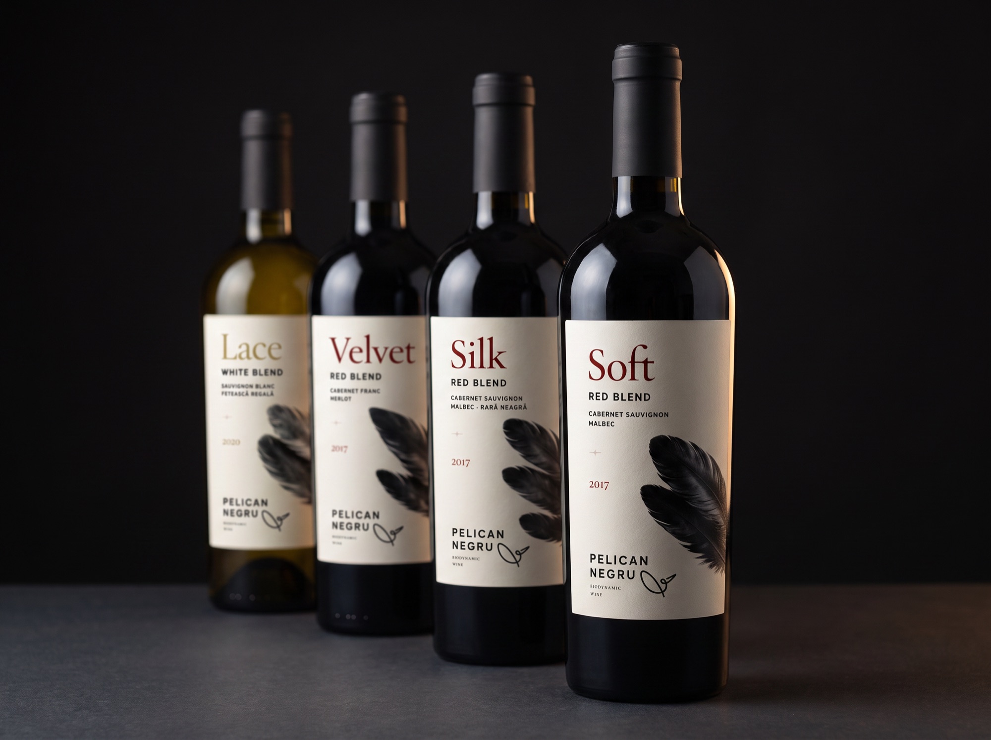
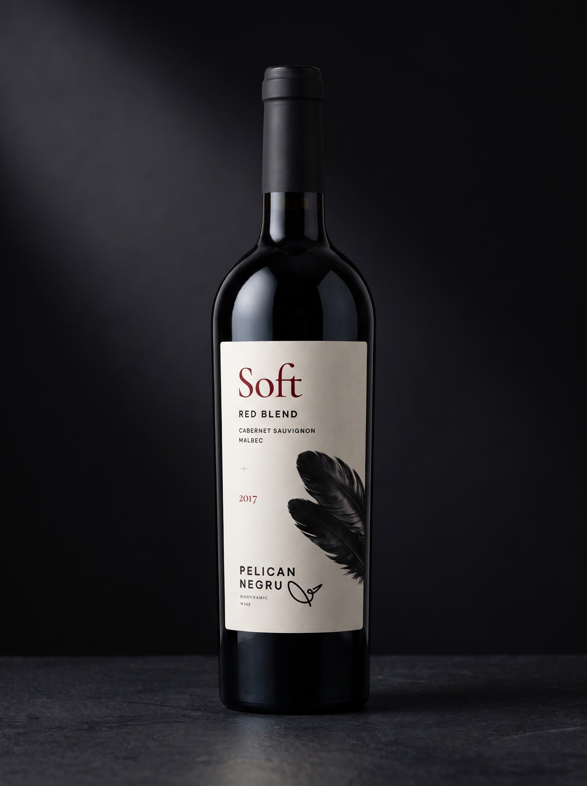
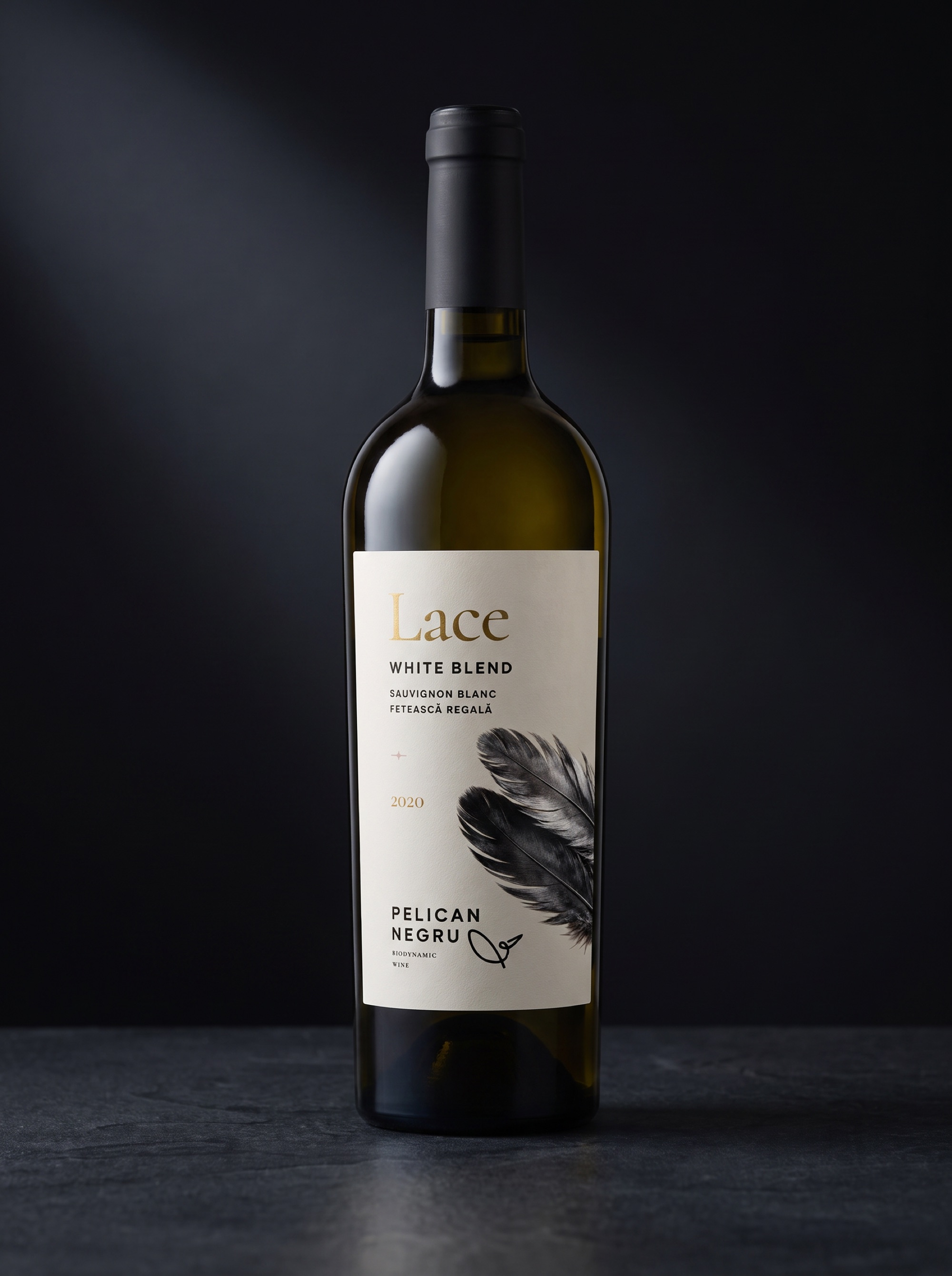
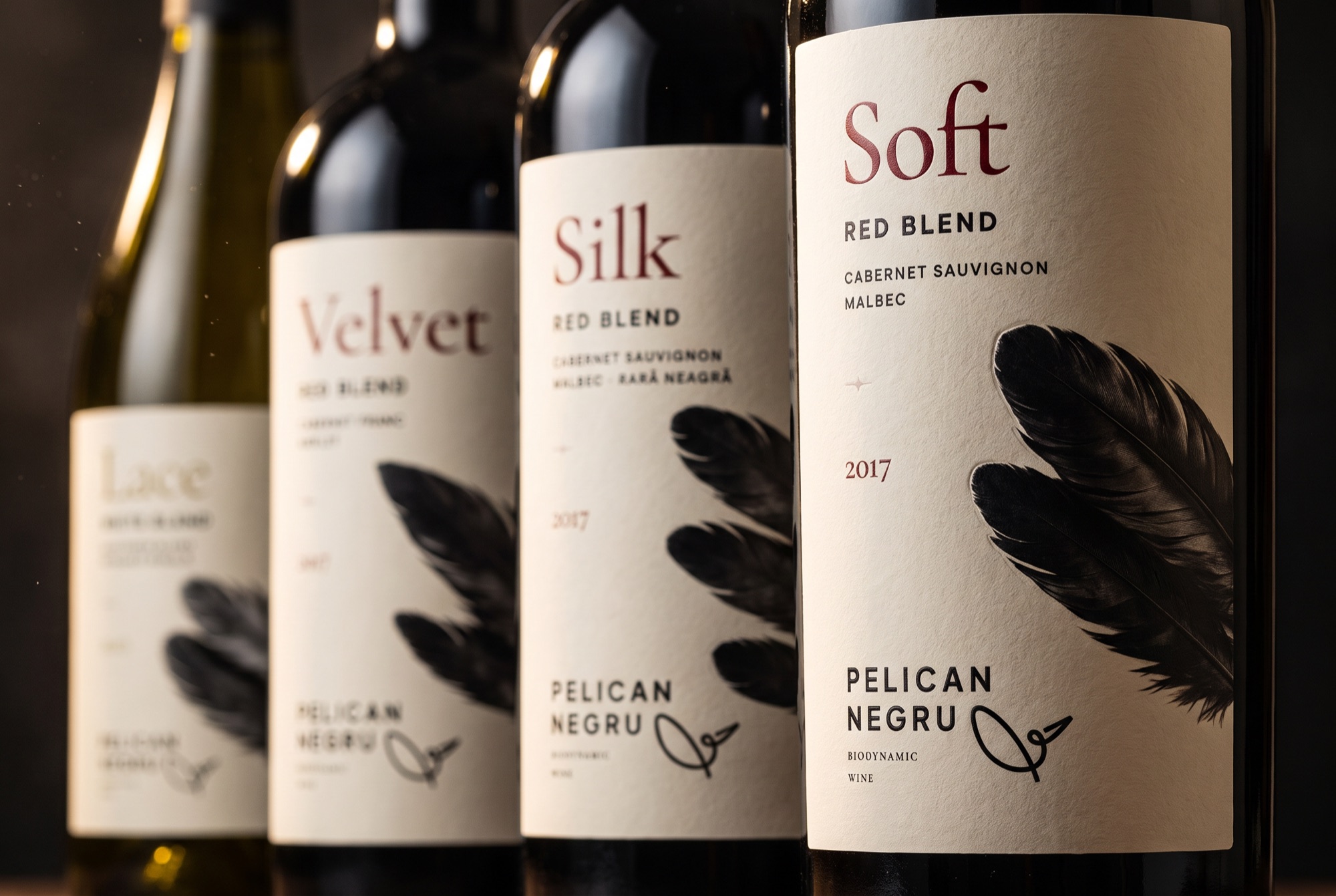
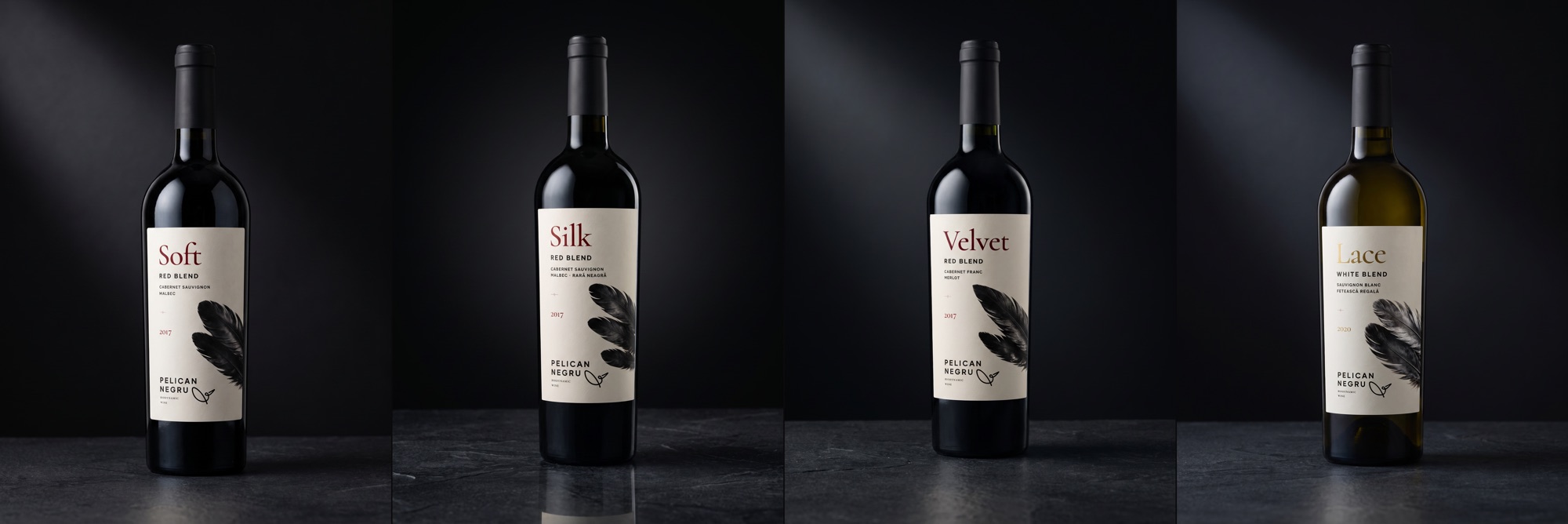
The decisions on the new label come straight from there. We flipped the hierarchy: the wine’s name sits at the top, large, as the hero - so you can spot it from a shelf away - because on the shelf it is the variant that sets a bottle apart. The brand moves down to the bottom, where a document is signed: “Pelican Negru” plus the signature pelican, exactly in the corner where an author signs their work.
And the surprise element: the feather. You do not expect a photographic feather on a wine label - it draws the eye and stays in the memory. But the feather is not just spectacle; it is the concept closing in on itself: pelican → the pelican’s feather → the quill that writes the signature → the signature in the corner. And the black pelican, which does not exist in nature, exists here through its only plausible trace: a black feather.
- number of feathers = number of varieties in the blend: Soft and Velvet two each, Silk three - so next time someone asks for “the one with three varieties”, the label answers for itself;
- the texture name in a serif (Cormorant) - the sensory voice; the information in a geometric sans - the technical voice;
- Lace, the only white, gets silver feathers and a gold title - the same scheme, a different register.
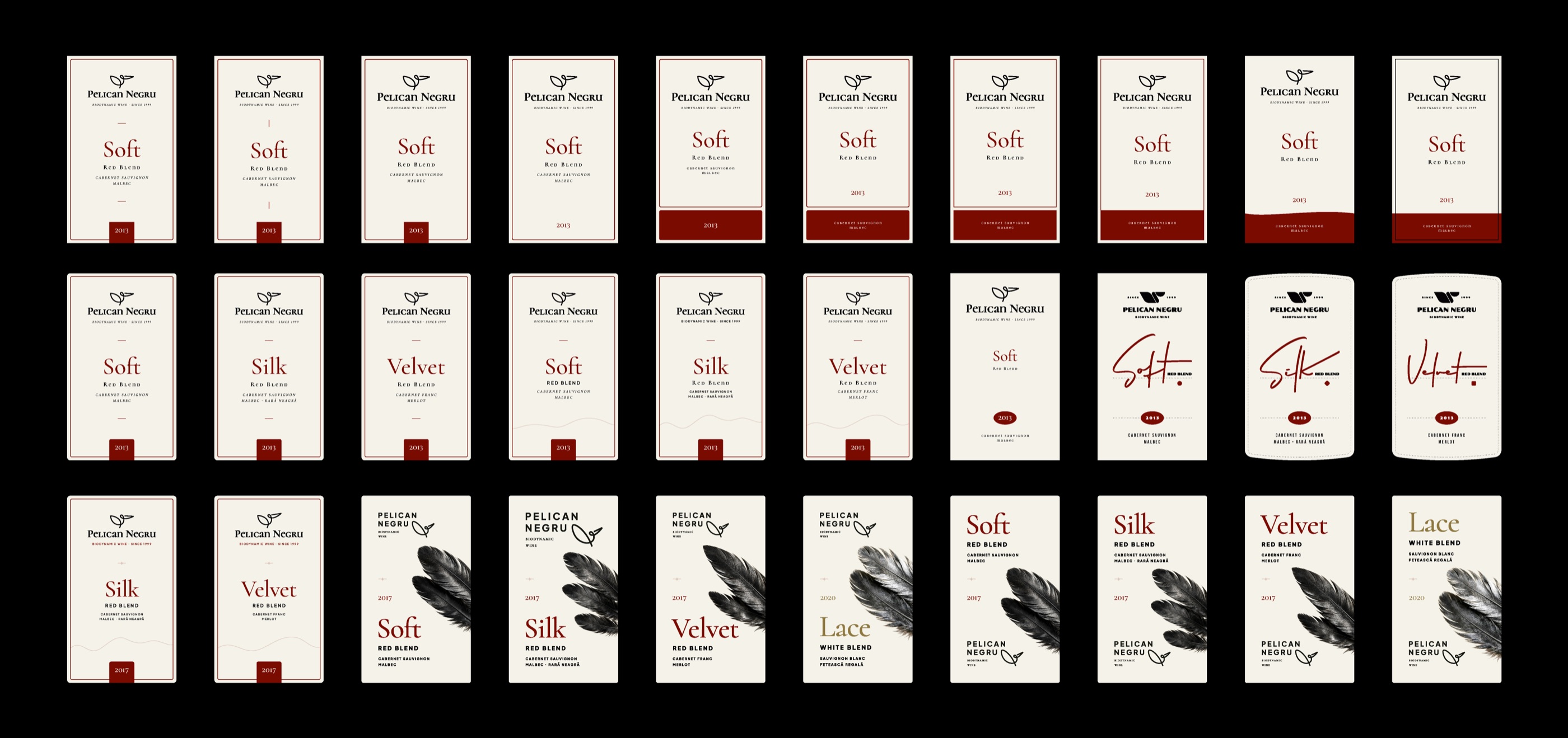
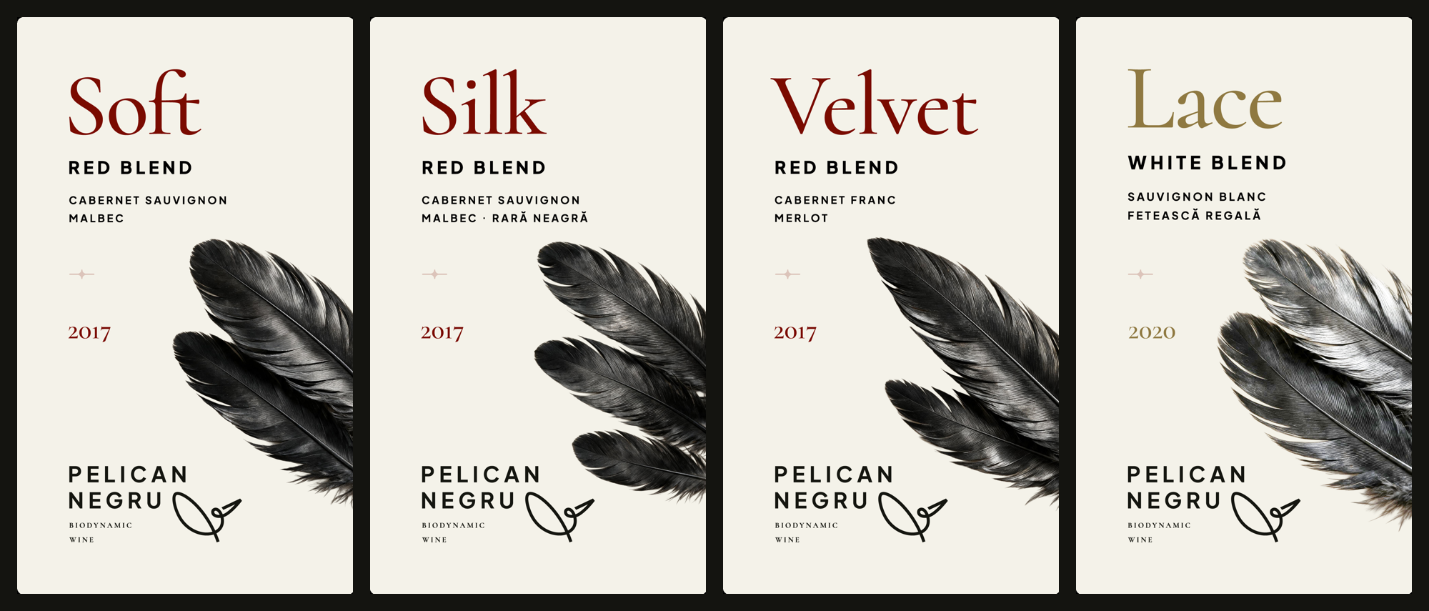
Where does this place us in wine-label theory? The feather is a textbook case of moderate incongruity: you do not expect it on a wine shelf, but it decodes in a second - and that exact combination, research shows, captures attention and stays in memory. The metaphor resolves in the name beneath it: feather → pelican → signature. More in the postscript.
The system, in brief
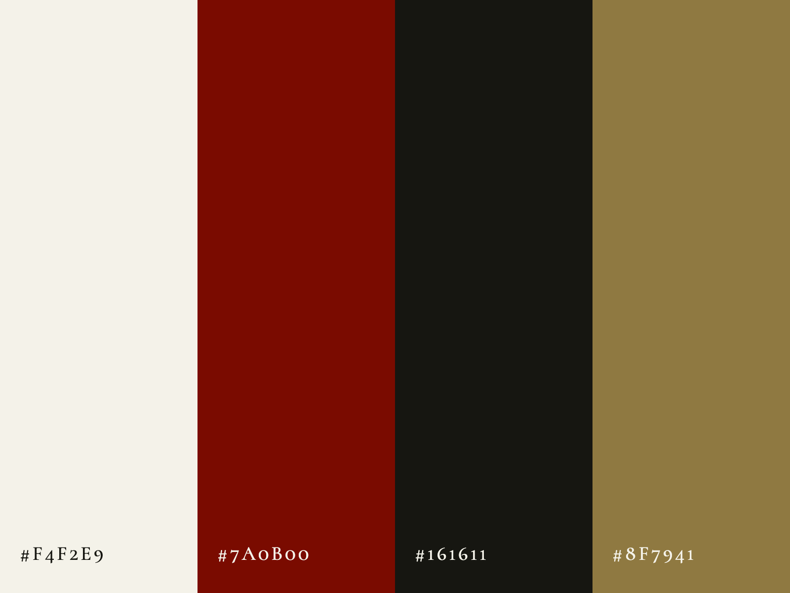
Before the context, the identity panel - lock-ups, symbol, reversed versions, typography and the palette taken straight from the labels:
The result, in context
The signature, out in the world
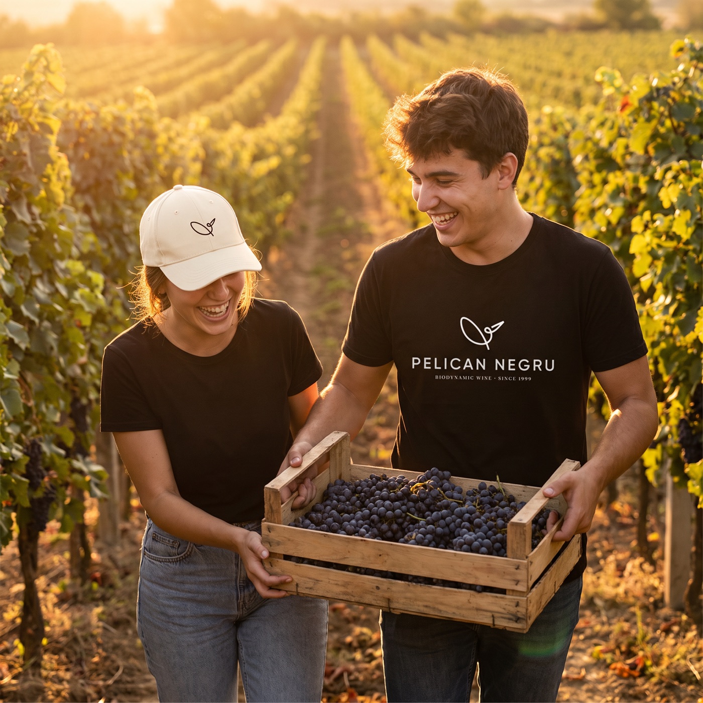
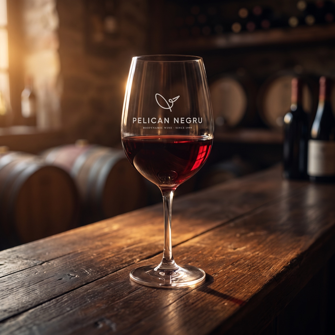
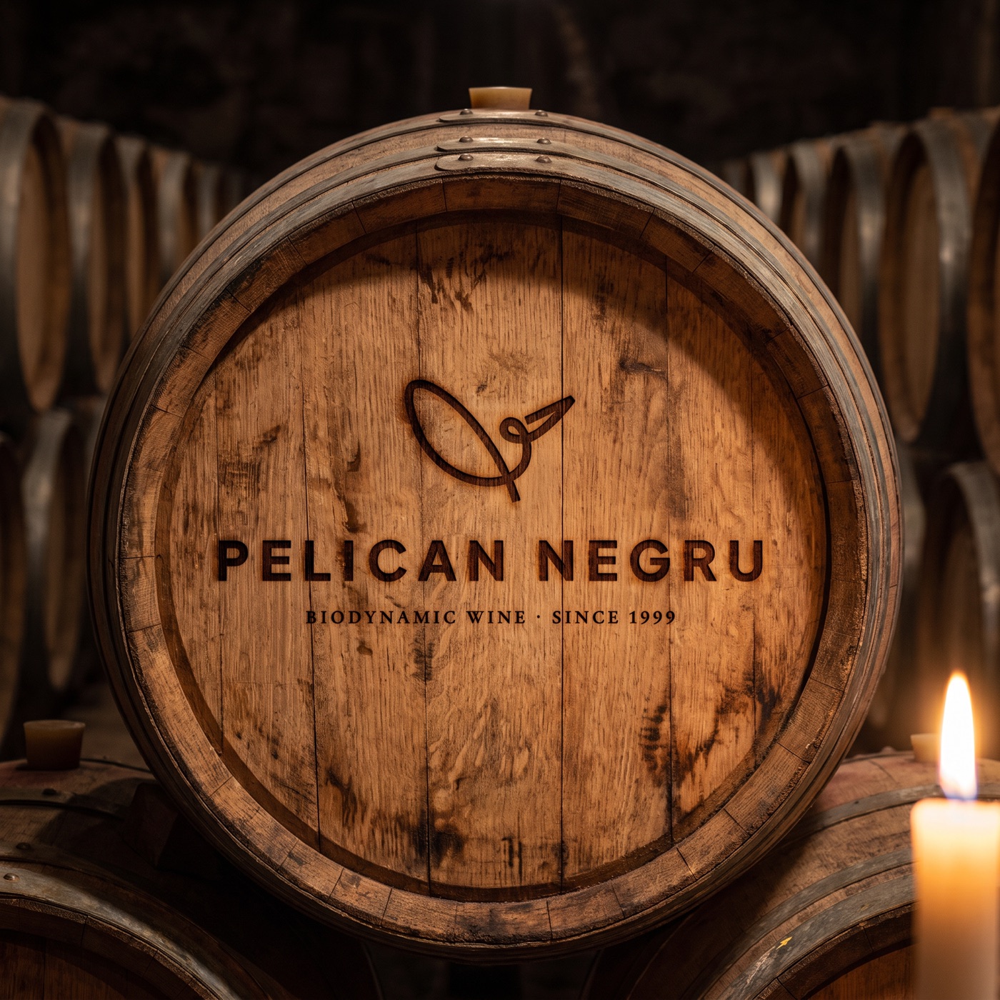
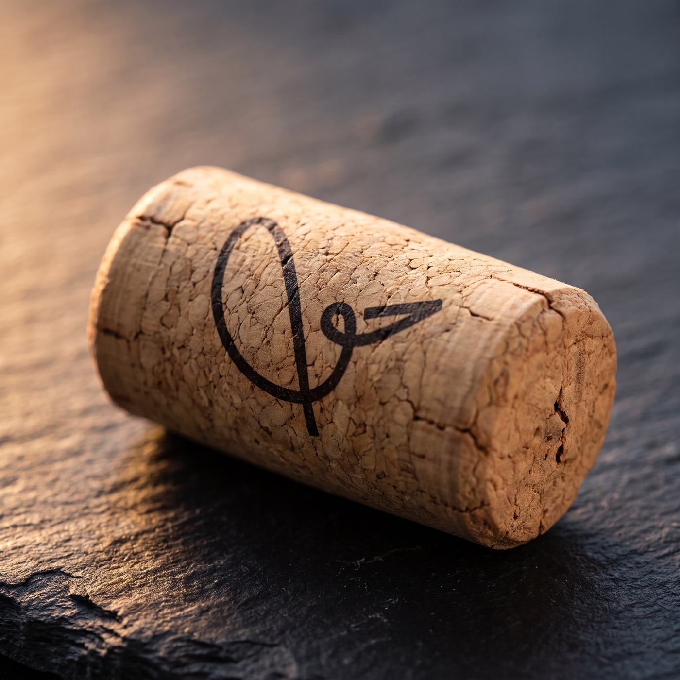
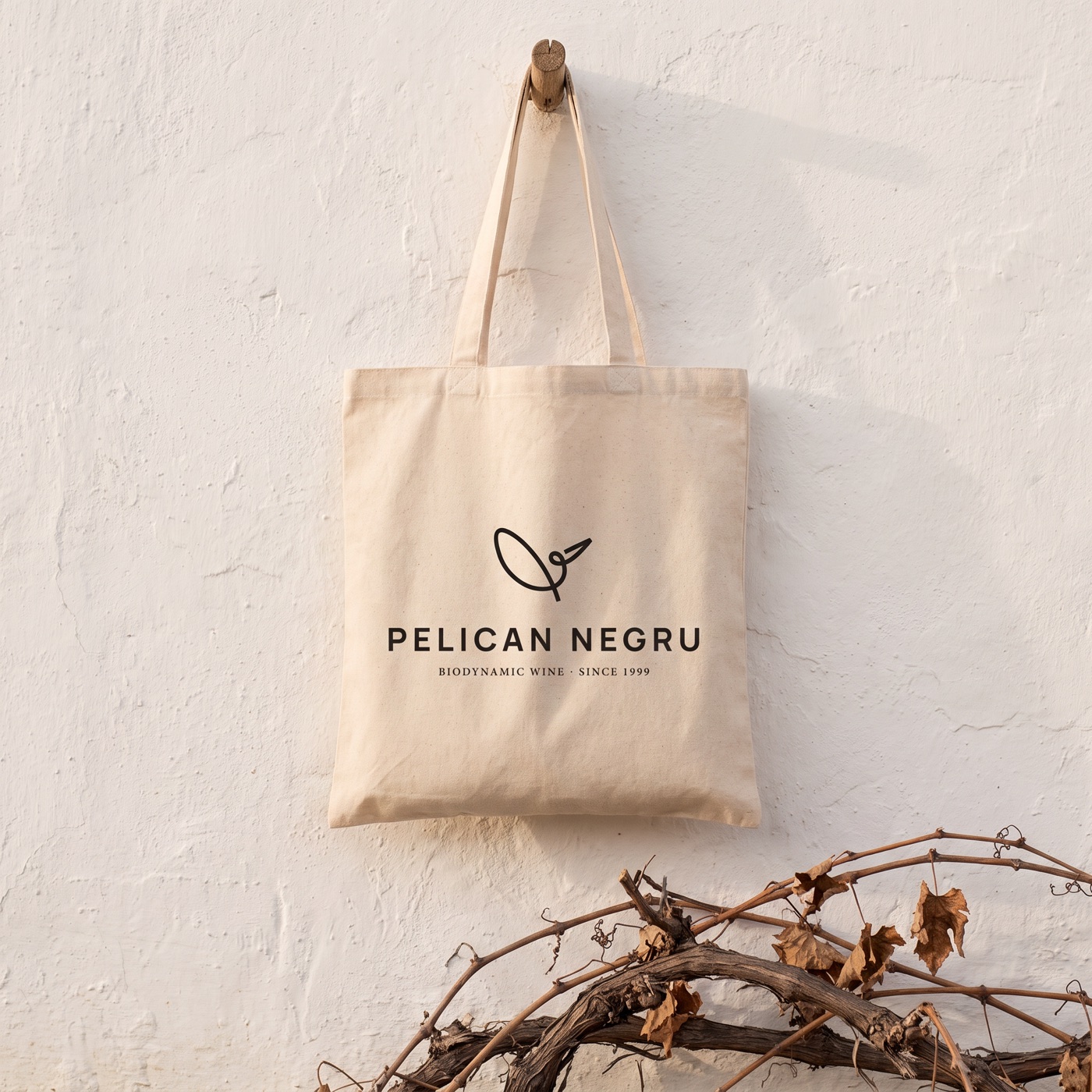
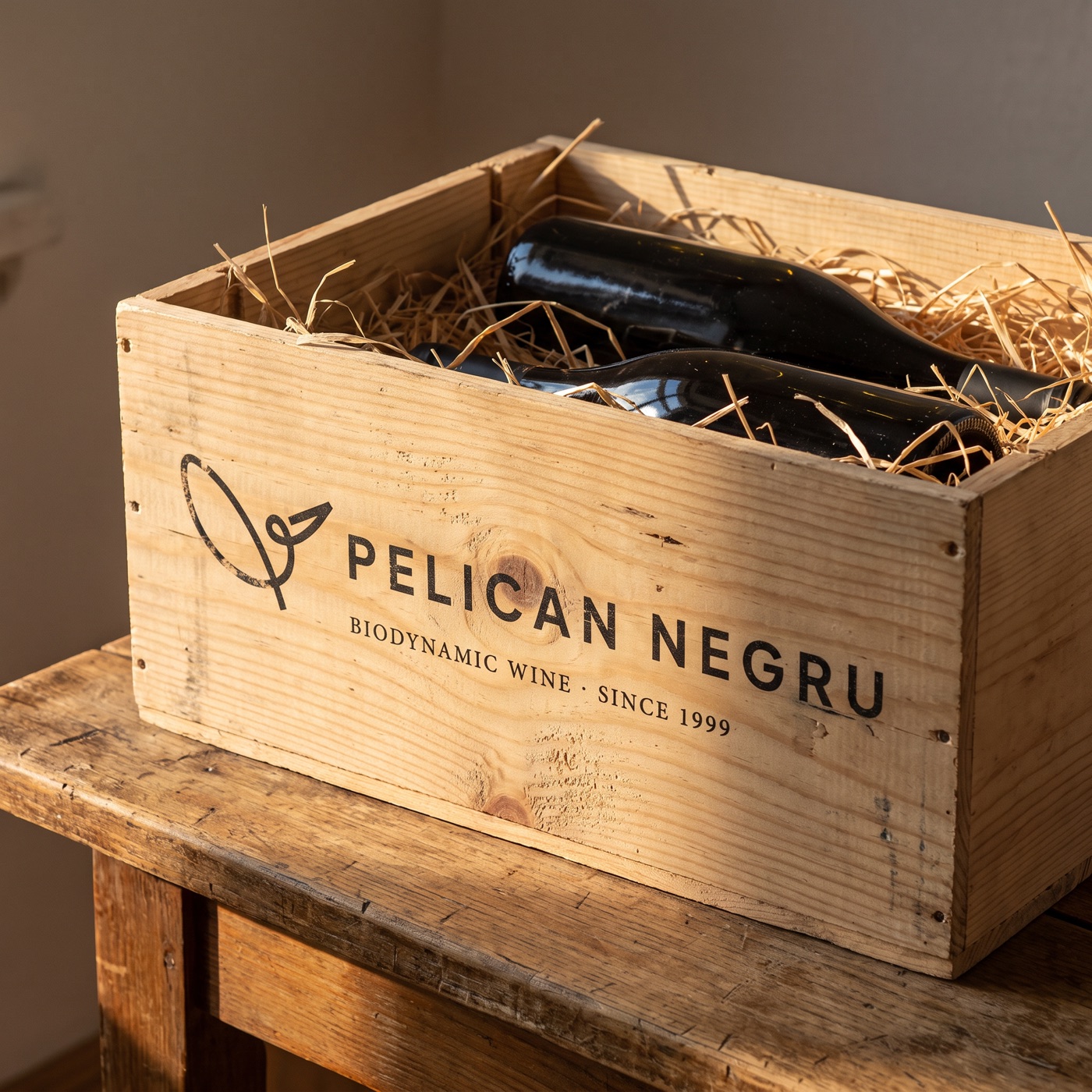
And because a logo lives beyond the label too - the same line, on a glass, on a barrel, on a cork, on canvas. And on the people who pick the grapes.
Instead of a conclusion
The difference between the first version and the second is not one of craft - both are carefully made. It is one of belonging: the geometry could have been anyone’s; the signature can only be Pelican Negru’s. That is the test we take away from this study: a redesign is worth proposing only when it tells a story only that brand can tell.
And the golden story is no longer told in a whisper. It is signed.