Before we go any further - worth watching:
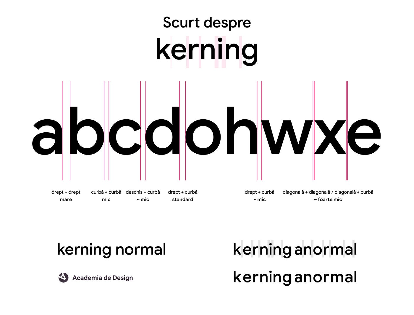
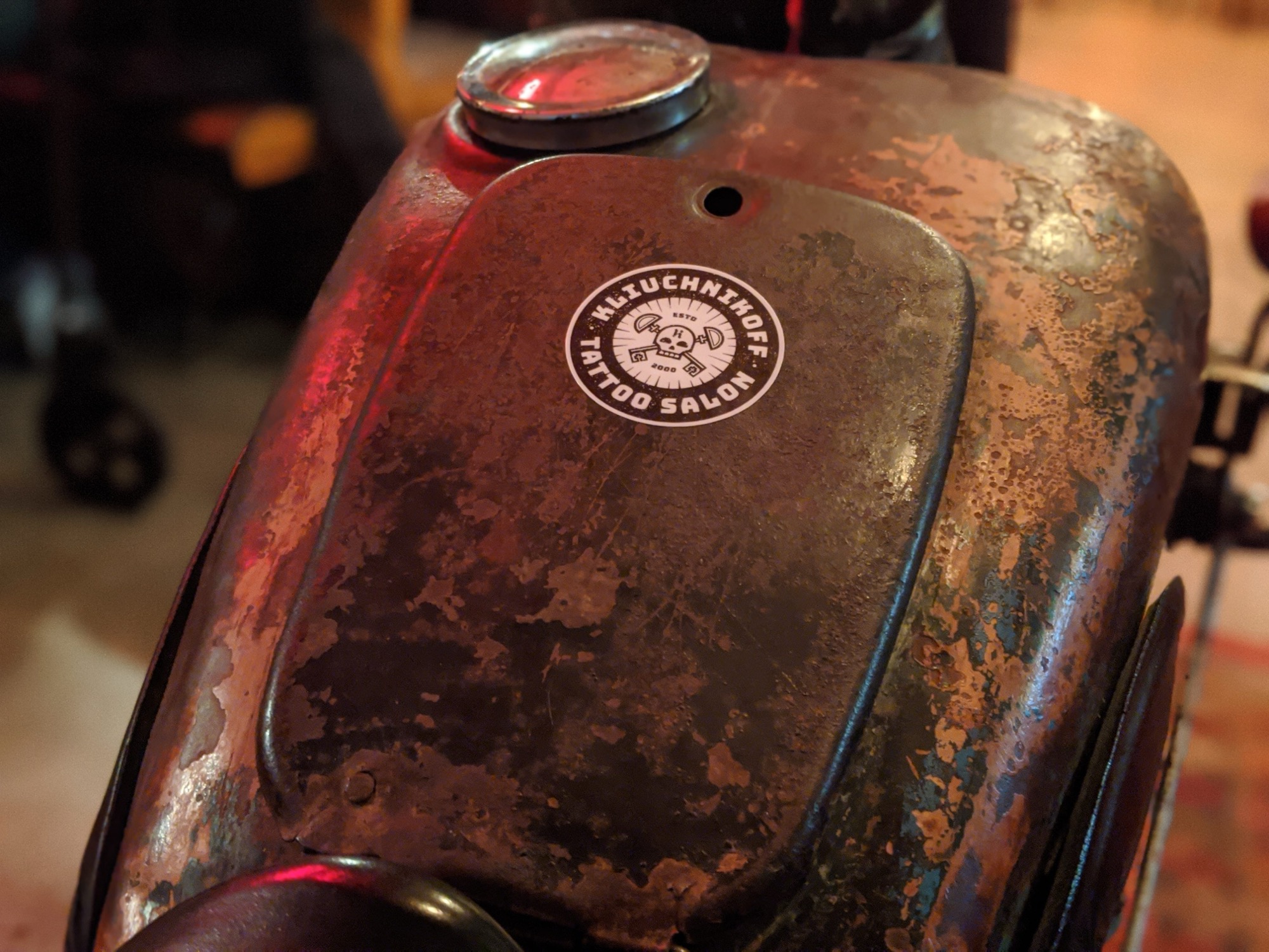
We chose the logo of the by Kliuchnikoff salon, one of the first in Moldova in this field. We have covered what a technically well-made logo means in other articles, so let us go straight to the analysis.
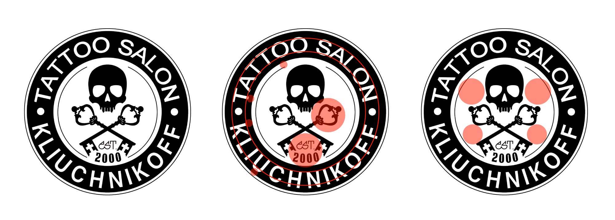
Observations
The typeface
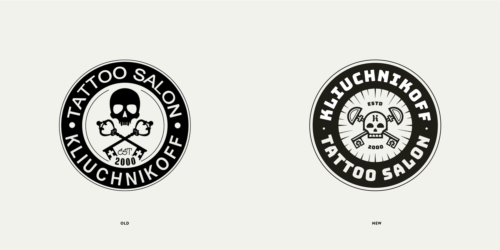
One of them is fairly modern, a sans-serif. All capitals. The first thing we read is Tattoo Salon. Then Kliuchnikoff. The abbreviation est. comes from another type family, and so does 2000.
Look more closely at the text on the circle and you notice it actually comes in different sizes and is not centred on the black ring. There are kerning problems too (compare the space between K and O with the other gaps).
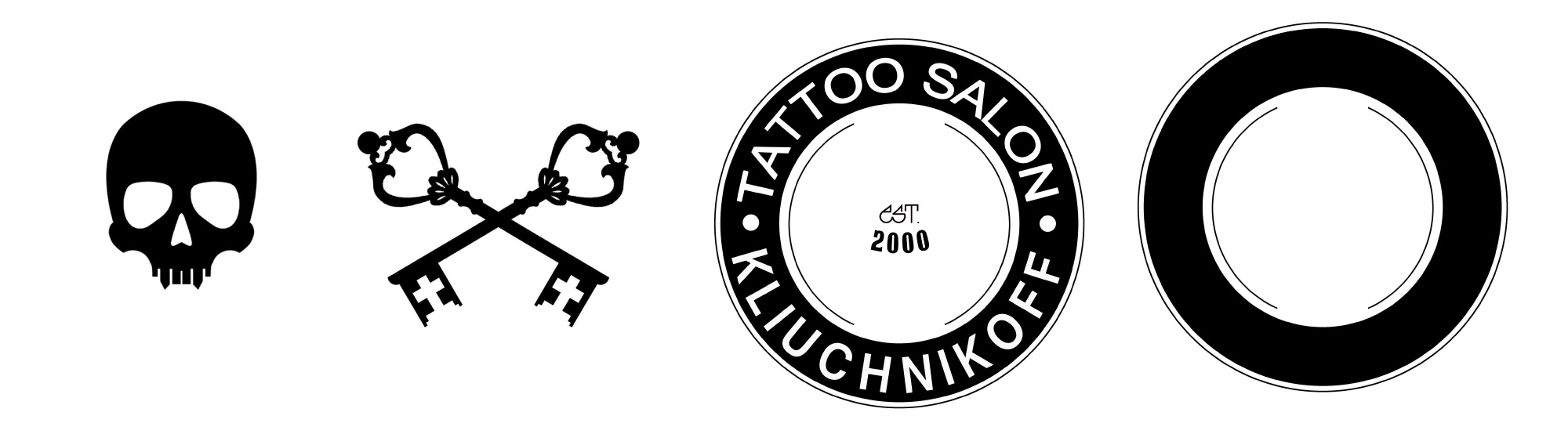
Look closer still and you see that Tattoo Salon and Kliuchnikoff are in fact set in two different typefaces, or at least two different styles of the same one (compare the O at the top with the O at the bottom). The letter spacing differs between them as well. So we have too many type families and sizes to get consistency through repetition.
Solution: use two typefaces at most, perhaps just one.
Inconsistency and level of detail
The elements (the skull, the keys) are drawn in great detail (look at all the ornament on the keys, for example), which says nothing but adds needless complexity. When the logo is used at small sizes, all that detail will be lost. The silhouettes of the keys and the skull use a range of stroke weights, with no relationship between them.
The visual weight of the elements varies too - compare how much black sits in the skull’s forehead with the hairlines in the ornament of the keys. In other words, these elements do not belong together.
Solution: simplify every element as far as possible and keep only a few stroke weights, so that everything sits more naturally in one composition.
Proximity
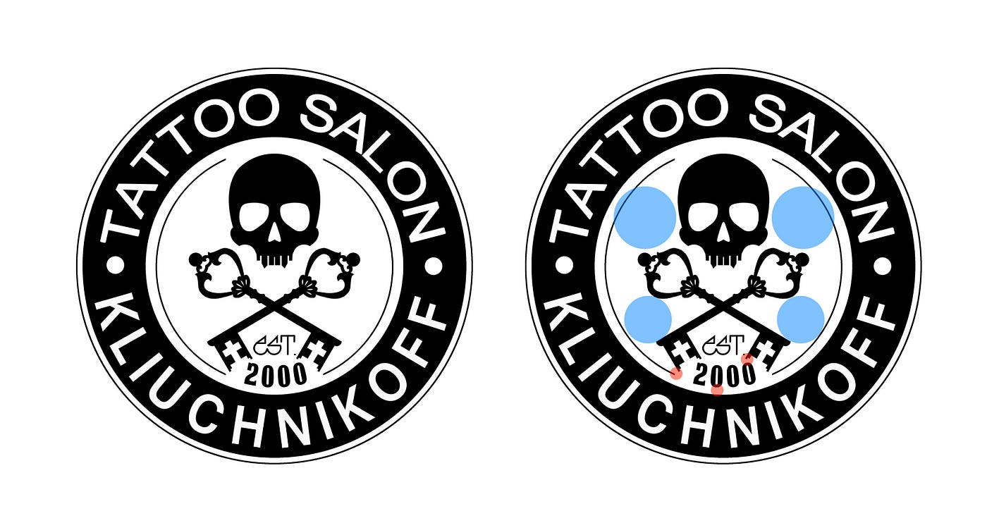
The distance between elements, or the space around them (white space, or negative space), also has to be consistent if it is to feel naturally pleasing to the eye. We are not doing well here either. Notice how many elements are crowded at the bottom, between the keys, compared with the large empty areas to the left and right of the skull.
Let’s see what we can do
The skull will be easier to recognise if it is white, with the eyes and nose in black.
To get a shape closer to a circle, we lay the skull over the crossed keys, so that the white space around the composition is more even.
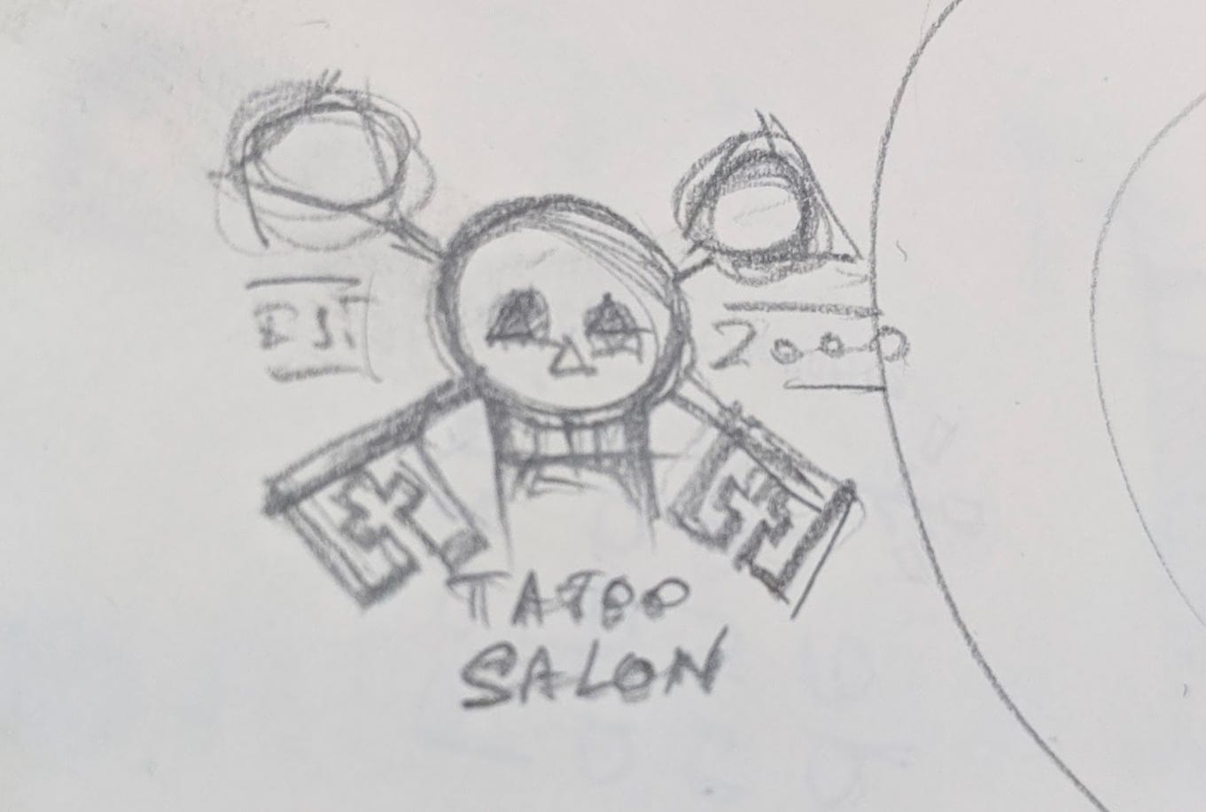
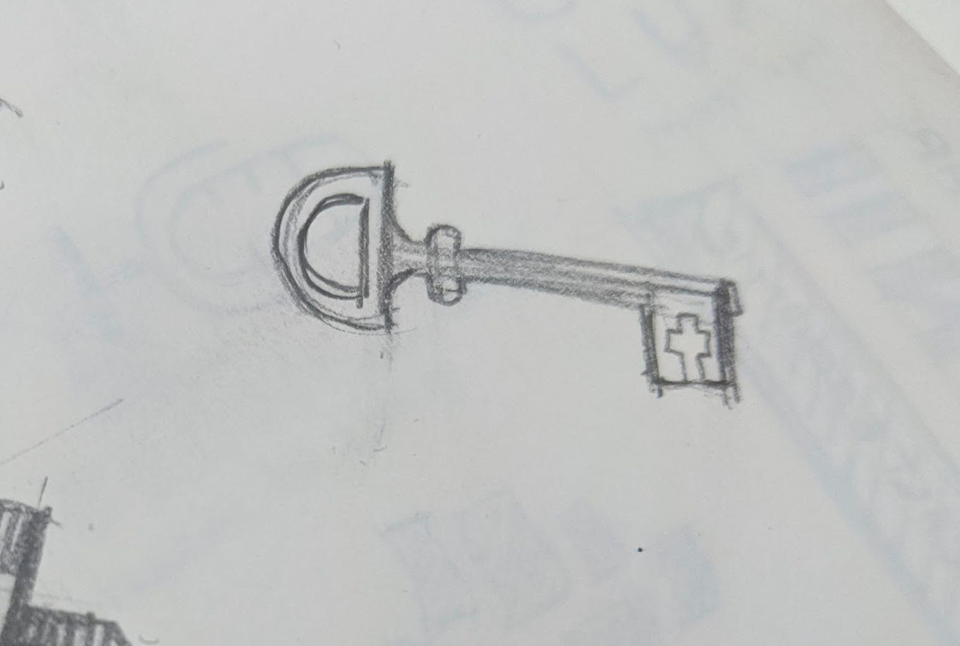
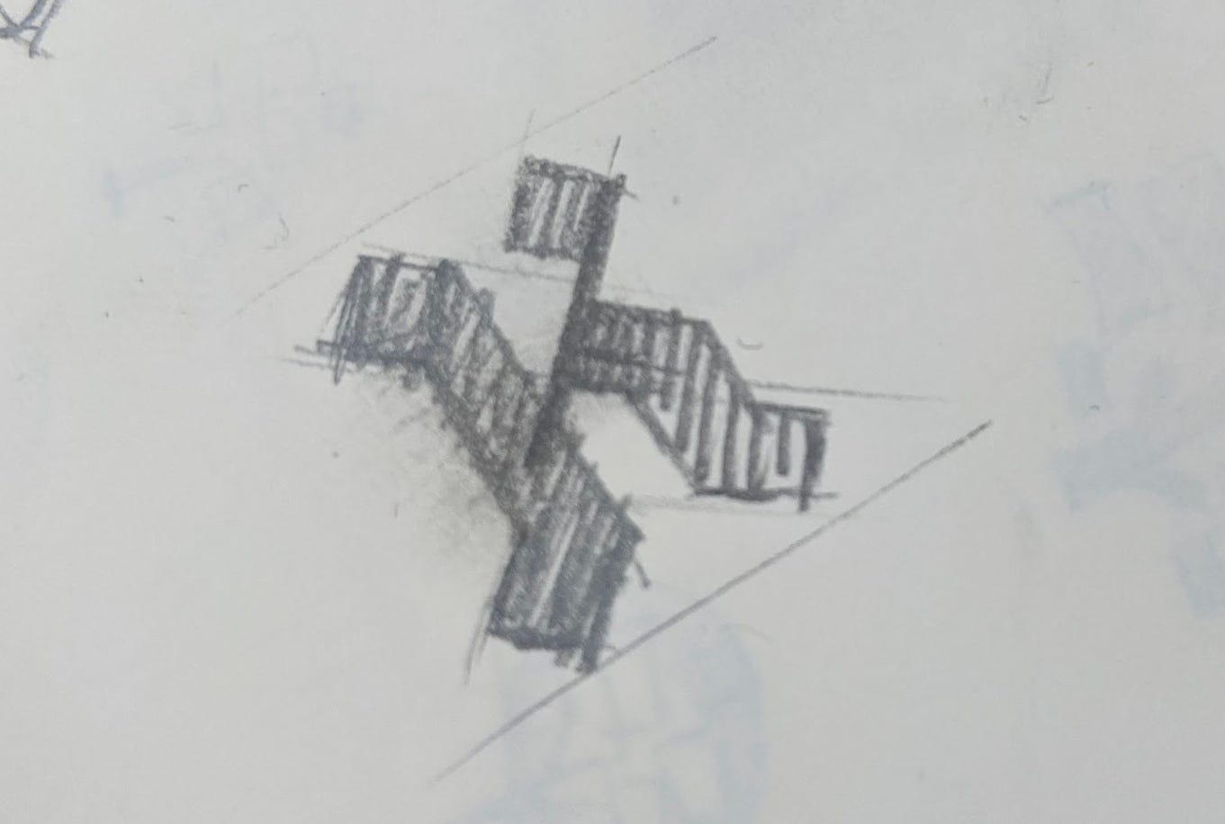
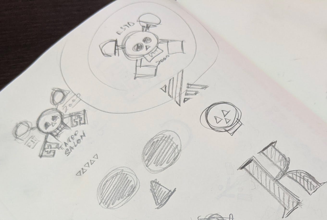
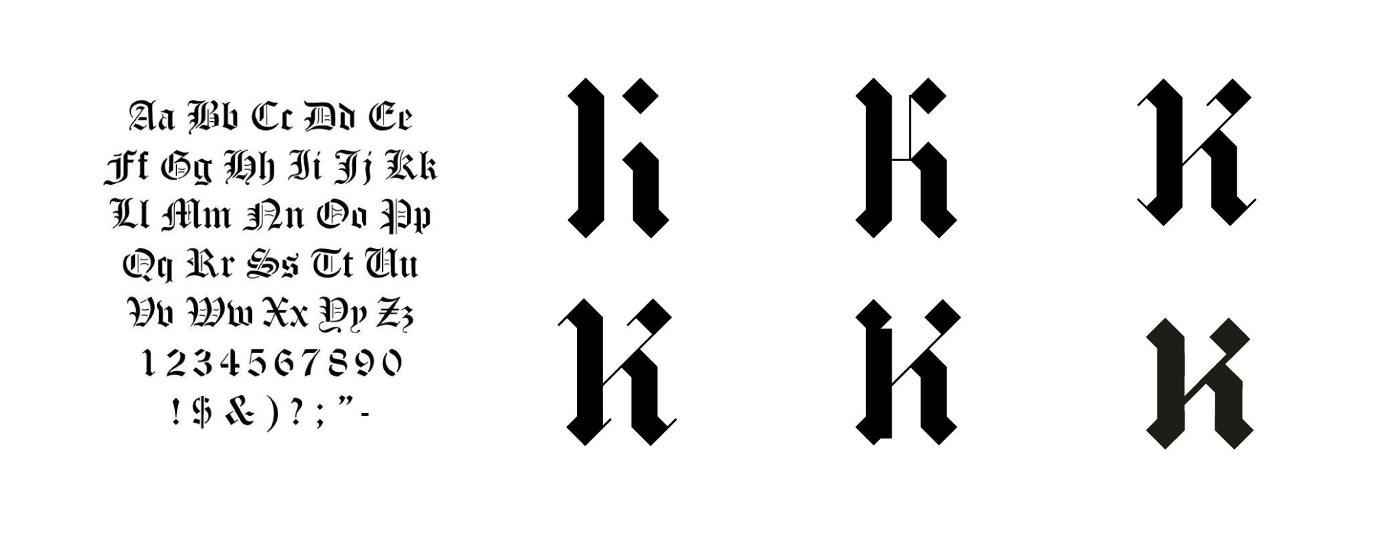
We also add a calligraphic K, to make the symbol more distinctive.
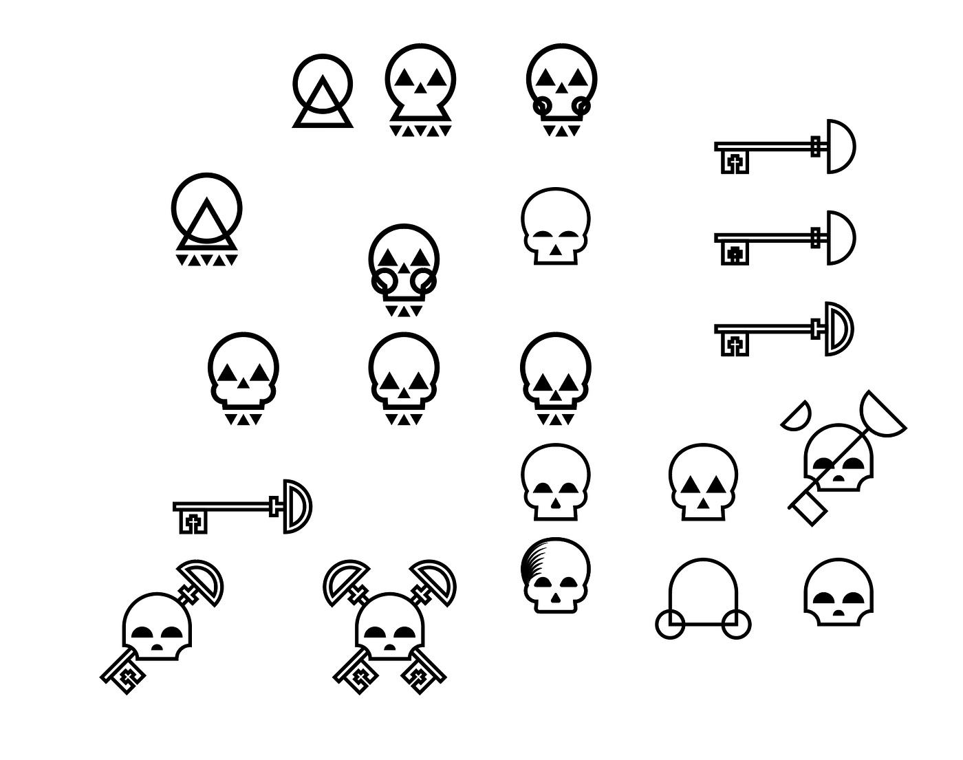
We draw the elements - the skull and the keys. We limit ourselves to just a few stroke weights to define the shapes, so that, once again, there is some consistency.
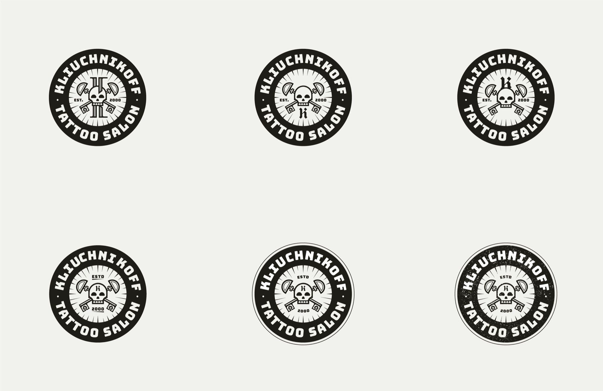
After many versions, compositions and adjustments, we arrive at a formula.
What we have
- Consistent typography. Priority goes to the salon’s name, then to the descriptor - Kliuchnikoff at the top, Tattoo Salon at the bottom.
- The whole composition is circular. To create contrast and consistency, we combine round shapes with sharp angles.
- Better proximity and white space. The stroke weights of the symbol repeat throughout.
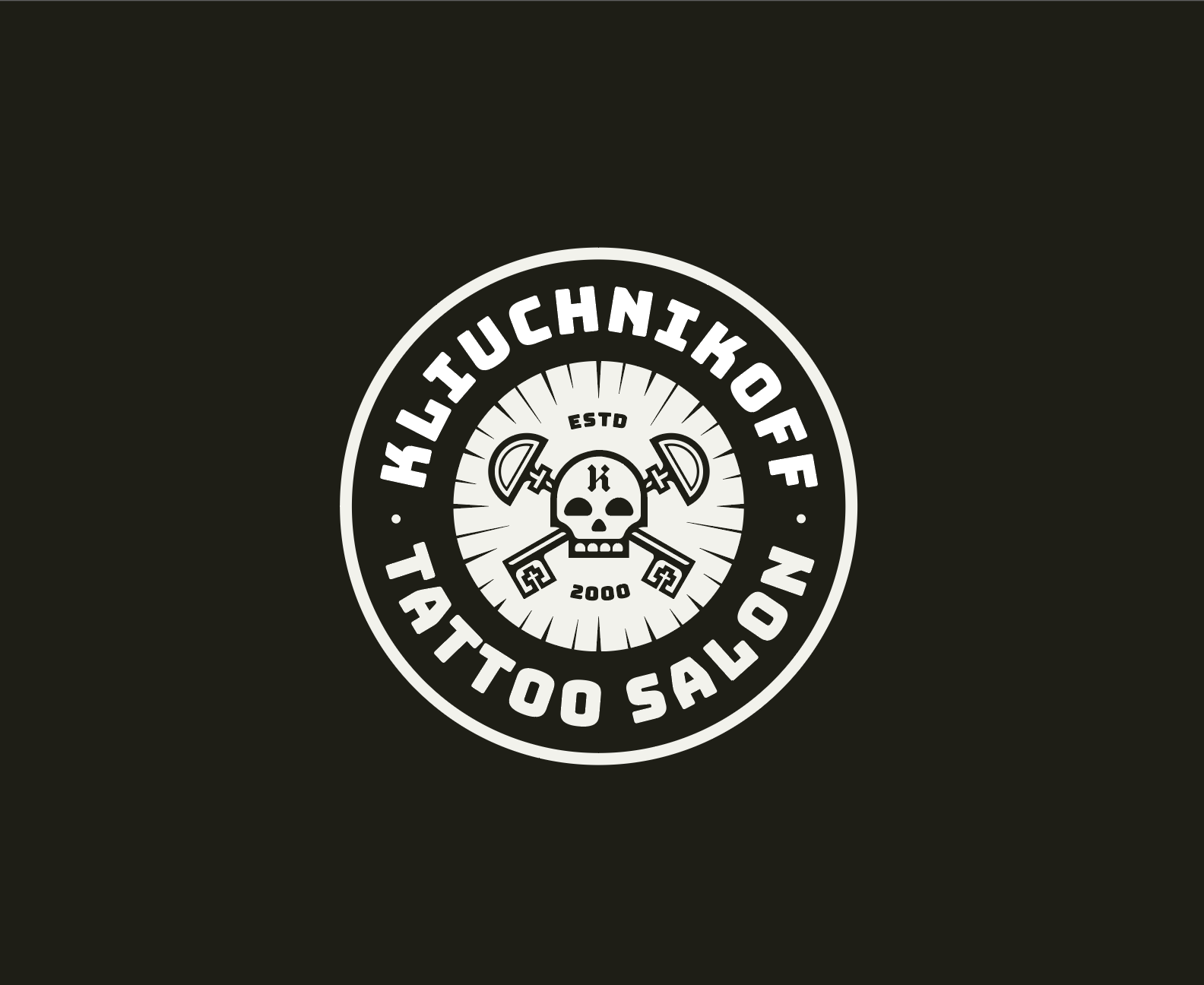
We could go further and give it a drawn, handmade feel with imperfect edges. We could also apply a texture to convey the company’s age (which would be an advantage). Wherever the logo is used at smaller sizes, the simplified version can take over.
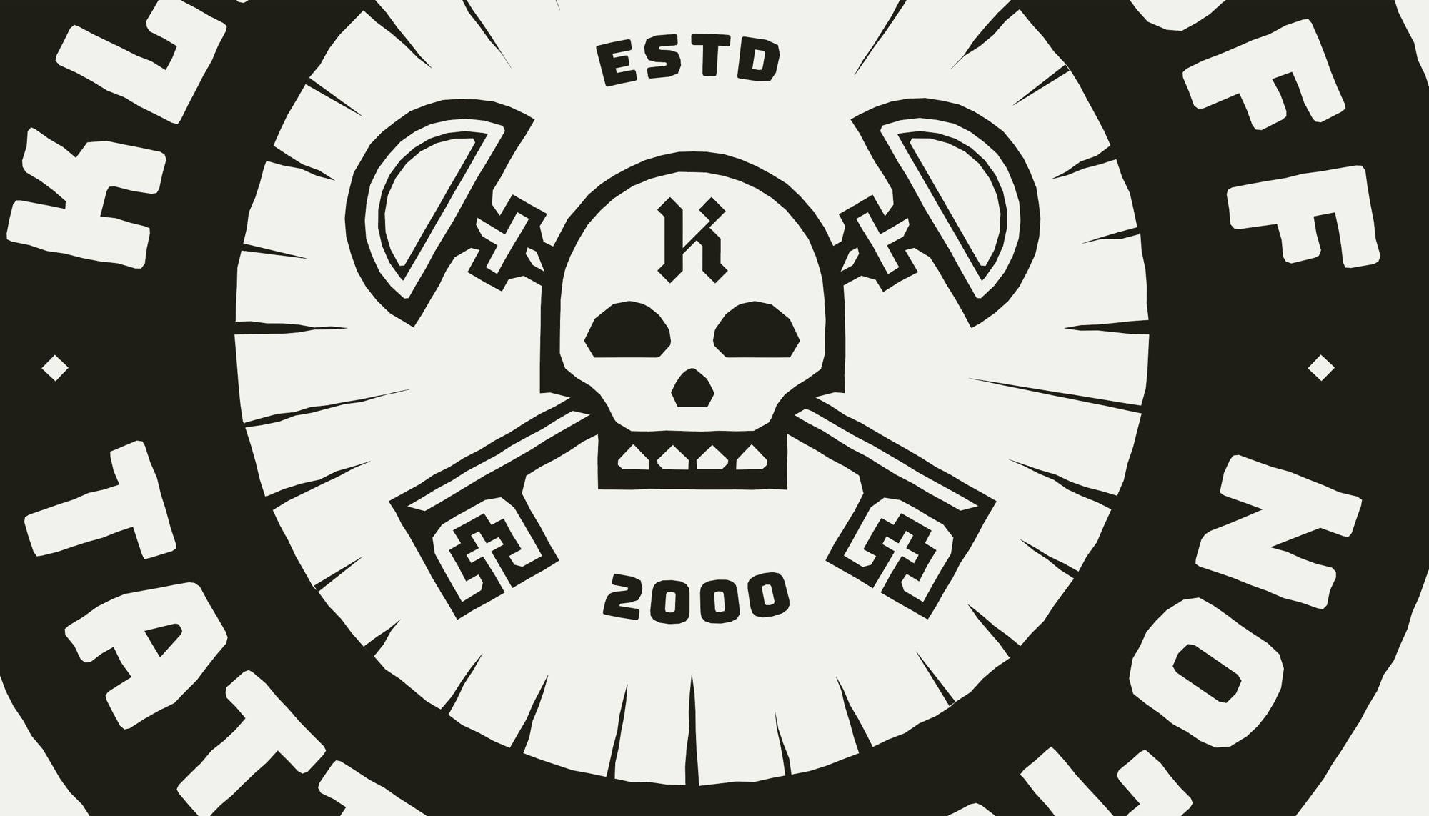
Something like this.
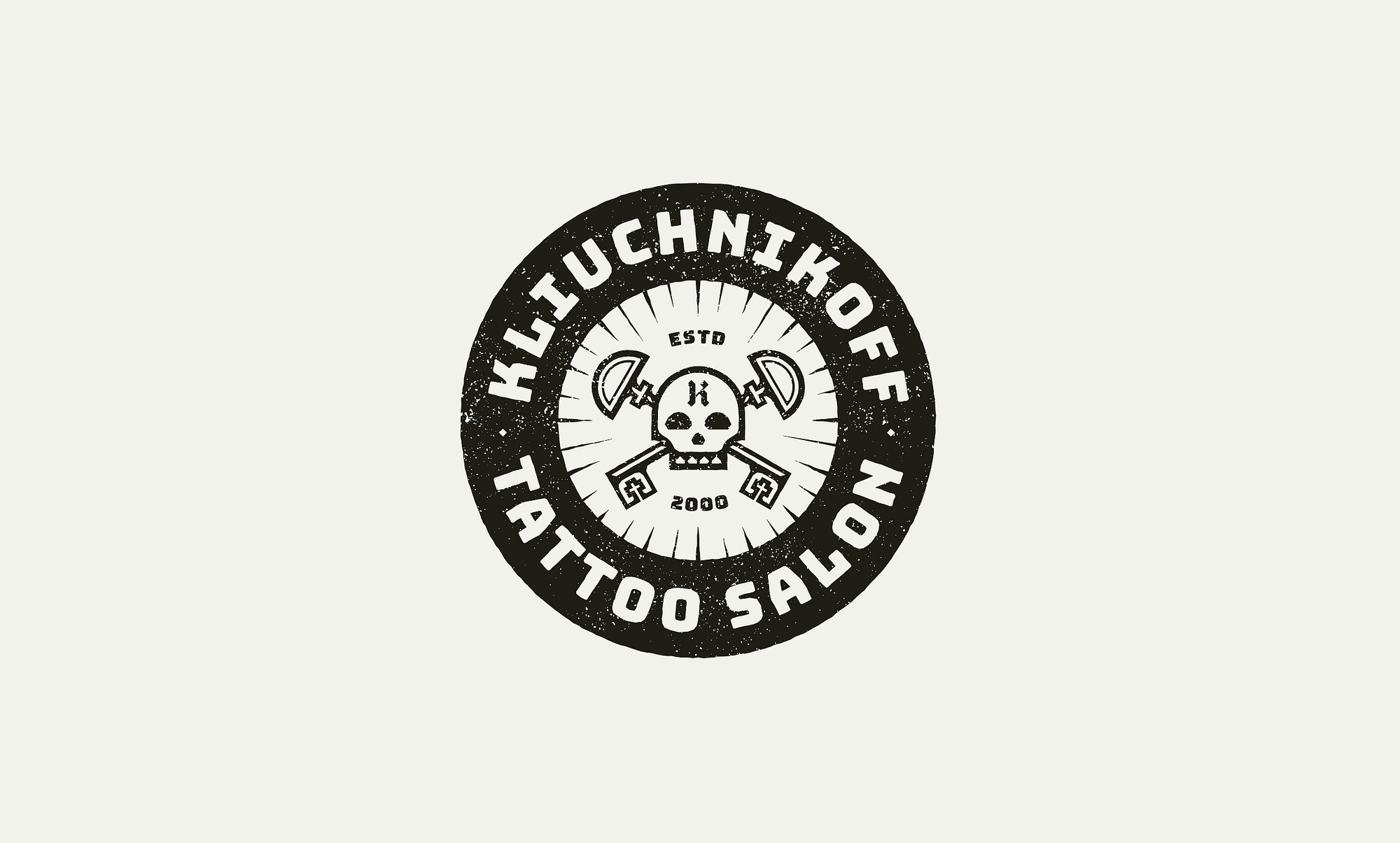
Now, this does not necessarily make it a better logo. A good logo should be both simple and distinctive enough to be memorable (rather than generic). All we have done in this exercise is re-execute the same elements, with a few design principles in mind.
To sum up: we kept the same elements of the logo - the text and the graphic elements. We changed the composition and the execution slightly to create consistency. By repeating shapes (circles and corners) and stroke weights, using a single typeface and respecting the proximity and hierarchy of the elements, we reached a result that is more naturally pleasing to the eye.
That’s about it.