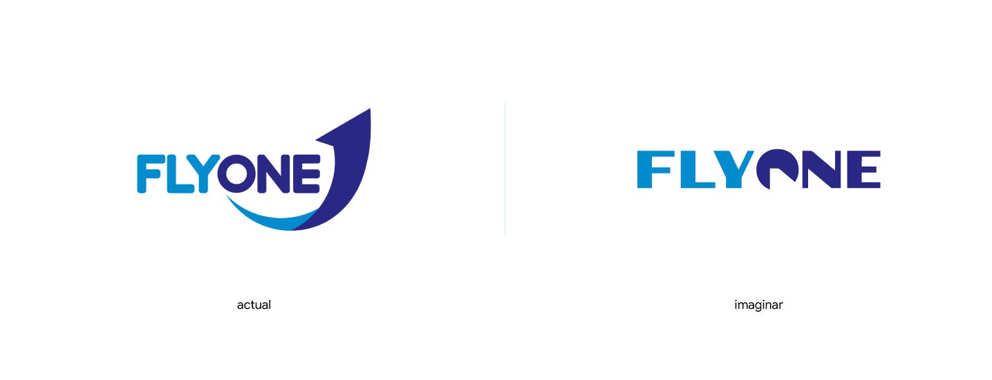
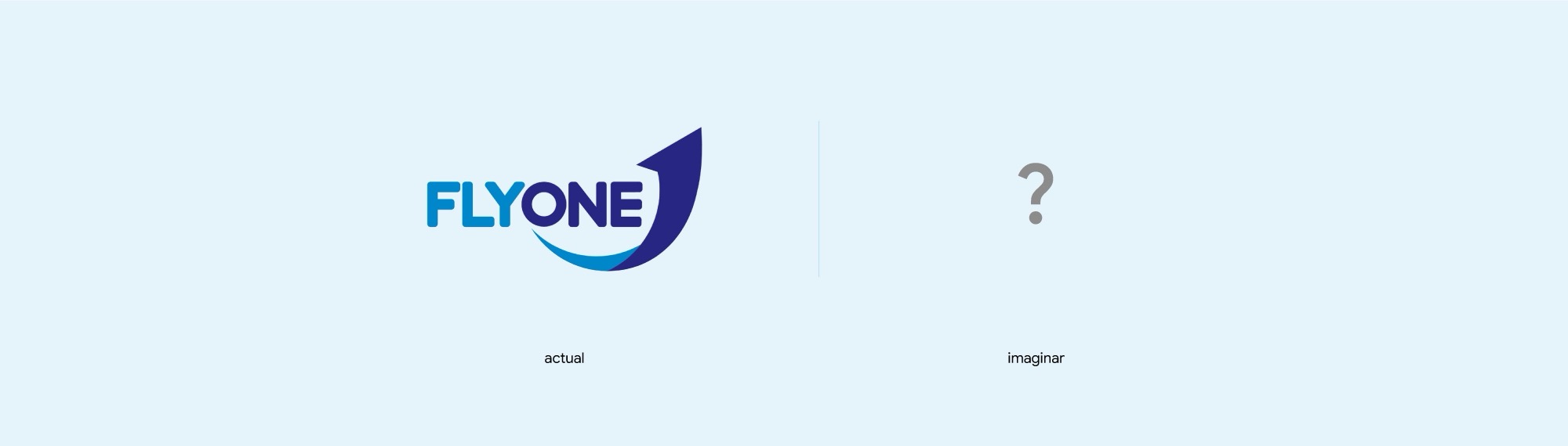
The current logo
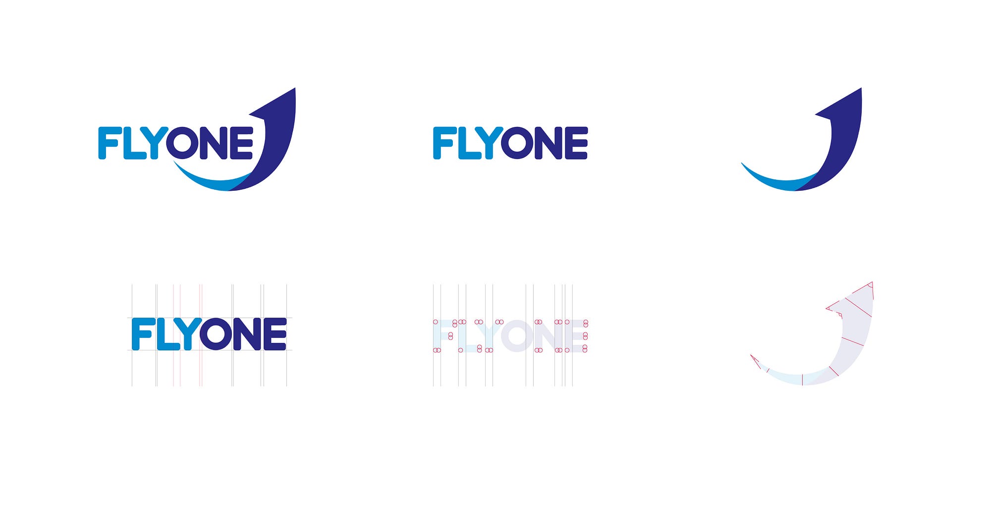
Let’s take a quick look at what we have. At least at what we see on the surface:
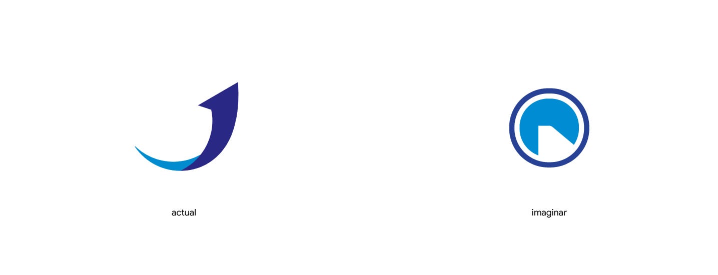
- It is made up of a symbol, probably meant to suggest an arrow, flight, movement and so on, and a wordmark
- It has two colours
- The symbol has several sharp angles
- In the wordmark, almost every corner is rounded and the letters are monoline
- The symbol is asymmetrical, and its stroke weight varies considerably
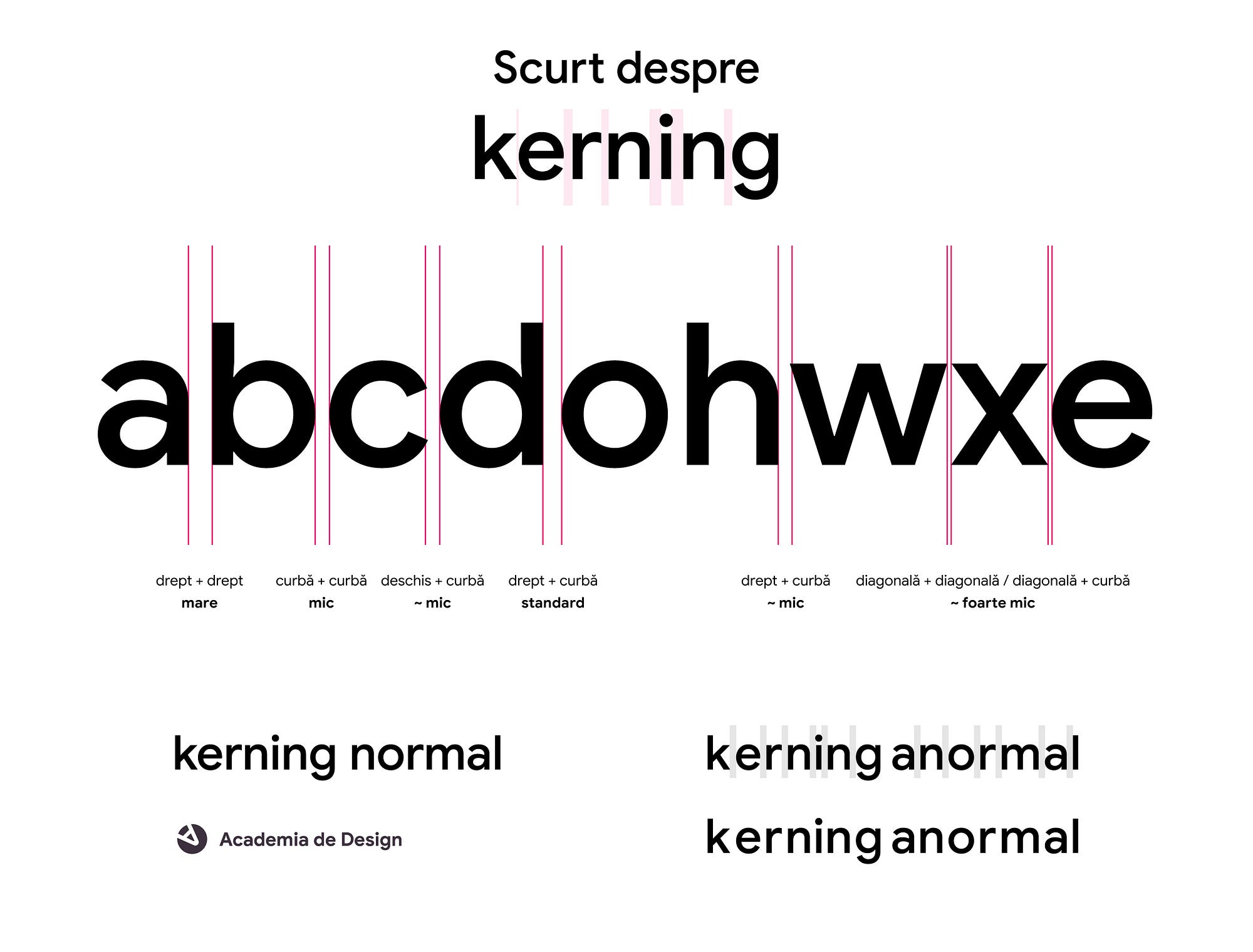
- The kerning is fine, although the O could be slightly larger
In other words - as logos go, it is decently executed, with a little conflict between the symbol and the wordmark. Nothing criminal, though.
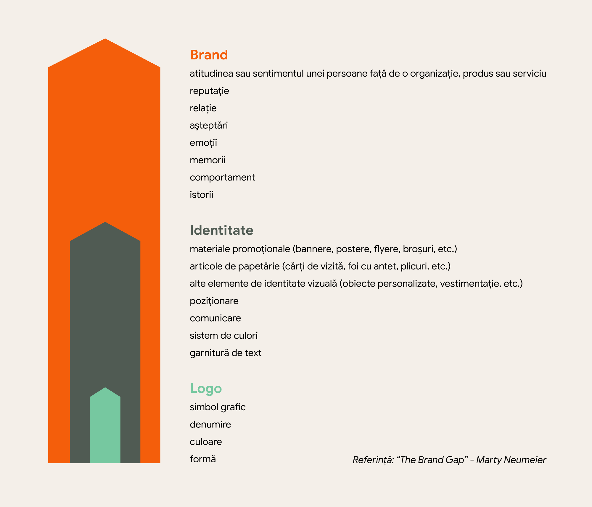
First, a quick reminder of the differences between brand, visual identity and logo. And a word or two about the Gestalt principles:
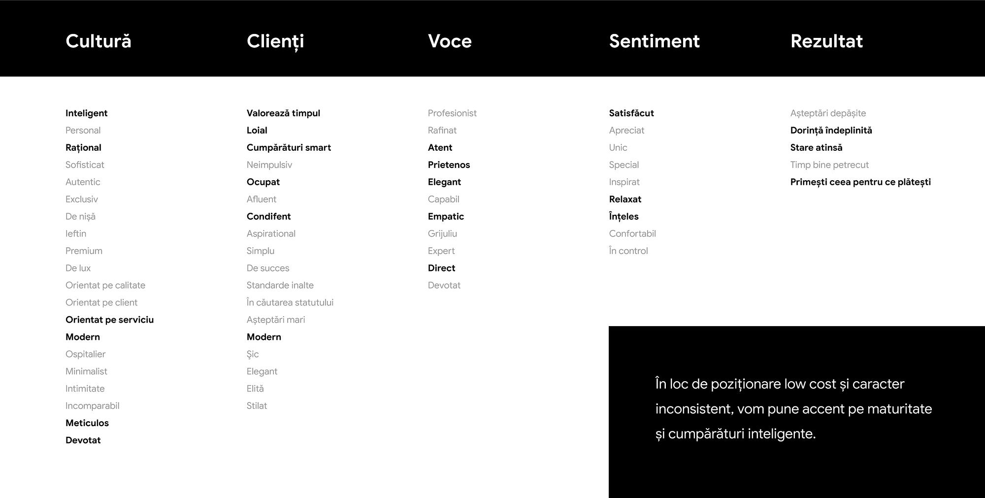
We draw up a list of qualities we would like the new visual identity to reflect. Starting with the logo itself.
The colours
We keep them. The new imaginary logo will keep the same two colours, to preserve some link with the old one.
Logo
A logo is not there to sell, explain or advertise. A logo’s job is to identify. A well-executed logo is simple, memorable, appropriate, adaptable and built to last.
The symbol
We think of a simplified graphic representation of something that is part of every flight.
We steer clear of generic elements such as an aeroplane silhouette, a globe and so on, and focus on something that is part of the passenger’s experience during the flight (that is, in the first person). We avoid check-in, which could carry negative associations, and concentrate on the experience of flying itself.
What is unique about flying?
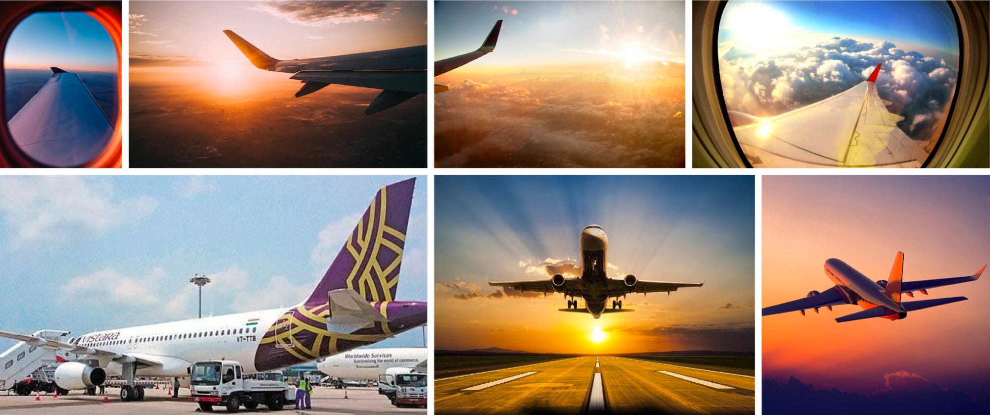
- It is much faster than other means of transport. How does a passenger notice the speed? By looking out of the window during the flight.
- It is one of the few experiences lived at altitude (literally).
We try to capture the symbol of this experience with the simplest possible geometric shapes. The window becomes a circle, and the aircraft wing is cut out of that circle.
The brand name - the typeface
We use two weights instead of one, to give it a slightly more refined and mature character. But no serifs, so as not to drift too far into premium territory.
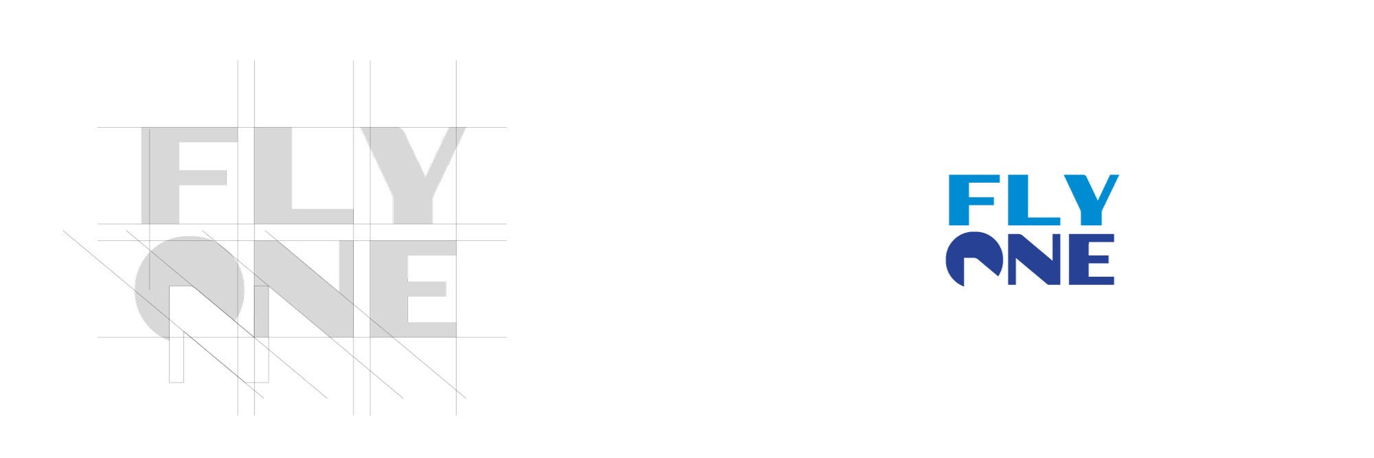
The letter O becomes the visual representation of the wing seen through the window. To build consistency through repetition, the shape of the wing is identical to the top-left part of the N.
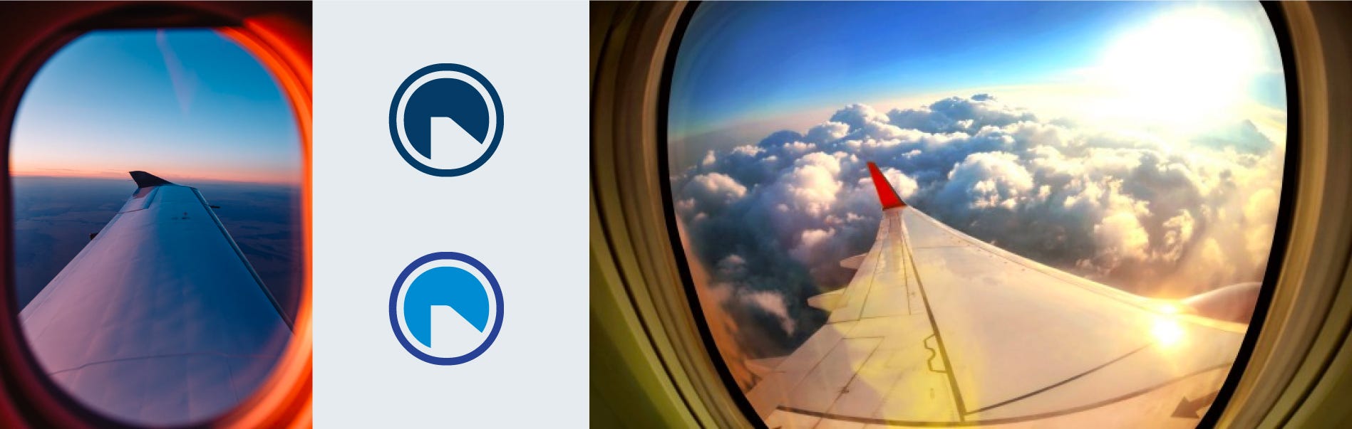
The wing brings movement to the whole composition. From left to right - which feels entirely natural (we are used to reading and scanning visually from left to right).

We also create a vertical lock-up, adjusting the letter sizes for better balance.
Pattern
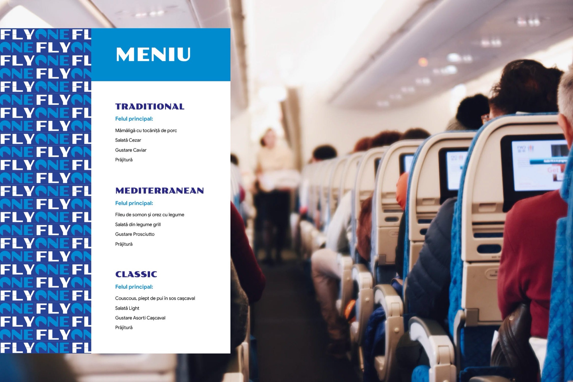
Let’s see what we can do with a pattern: for FLY to be read first, it needs contrast. Hence FLY = white and ONE = blue.
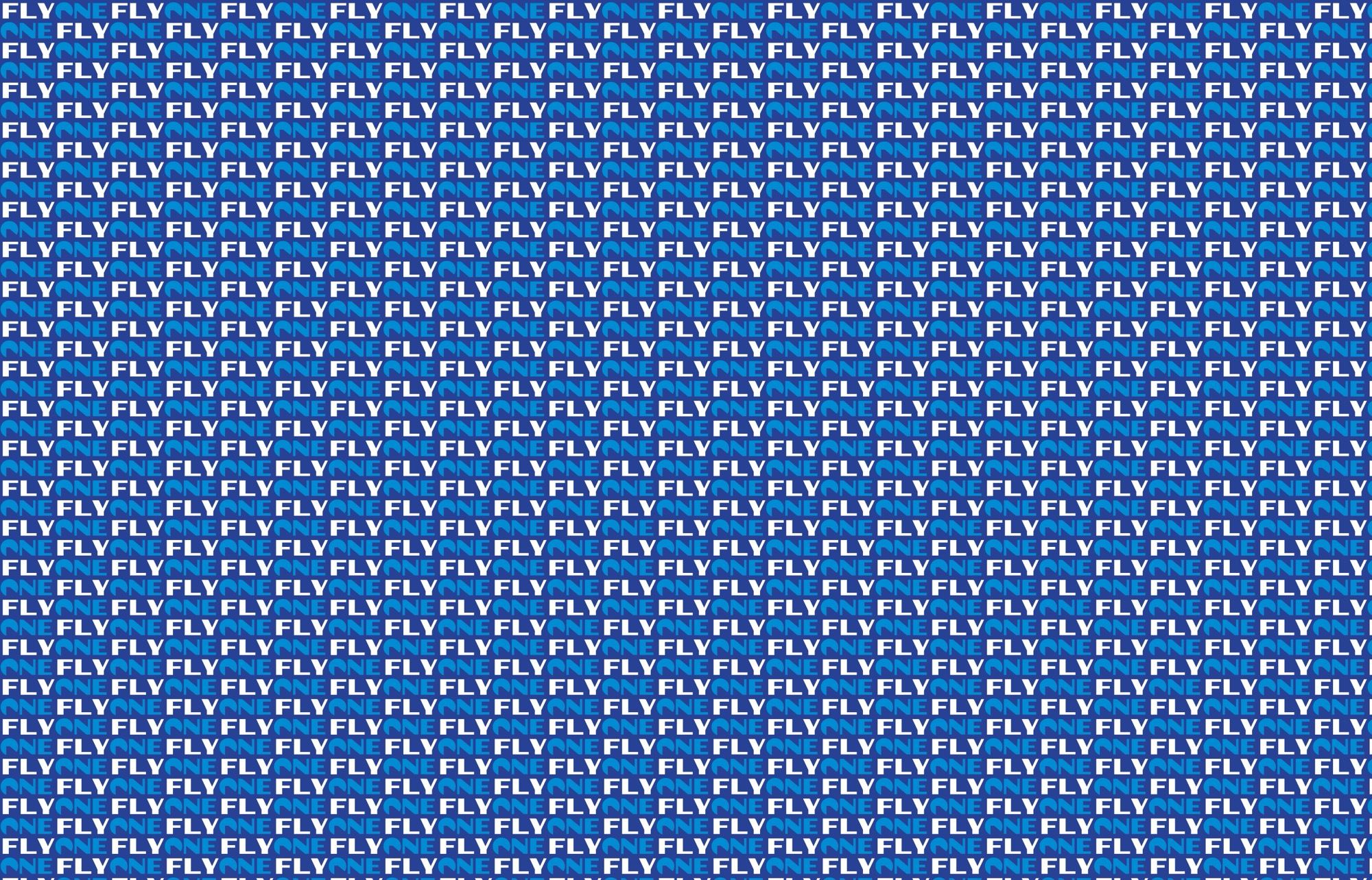
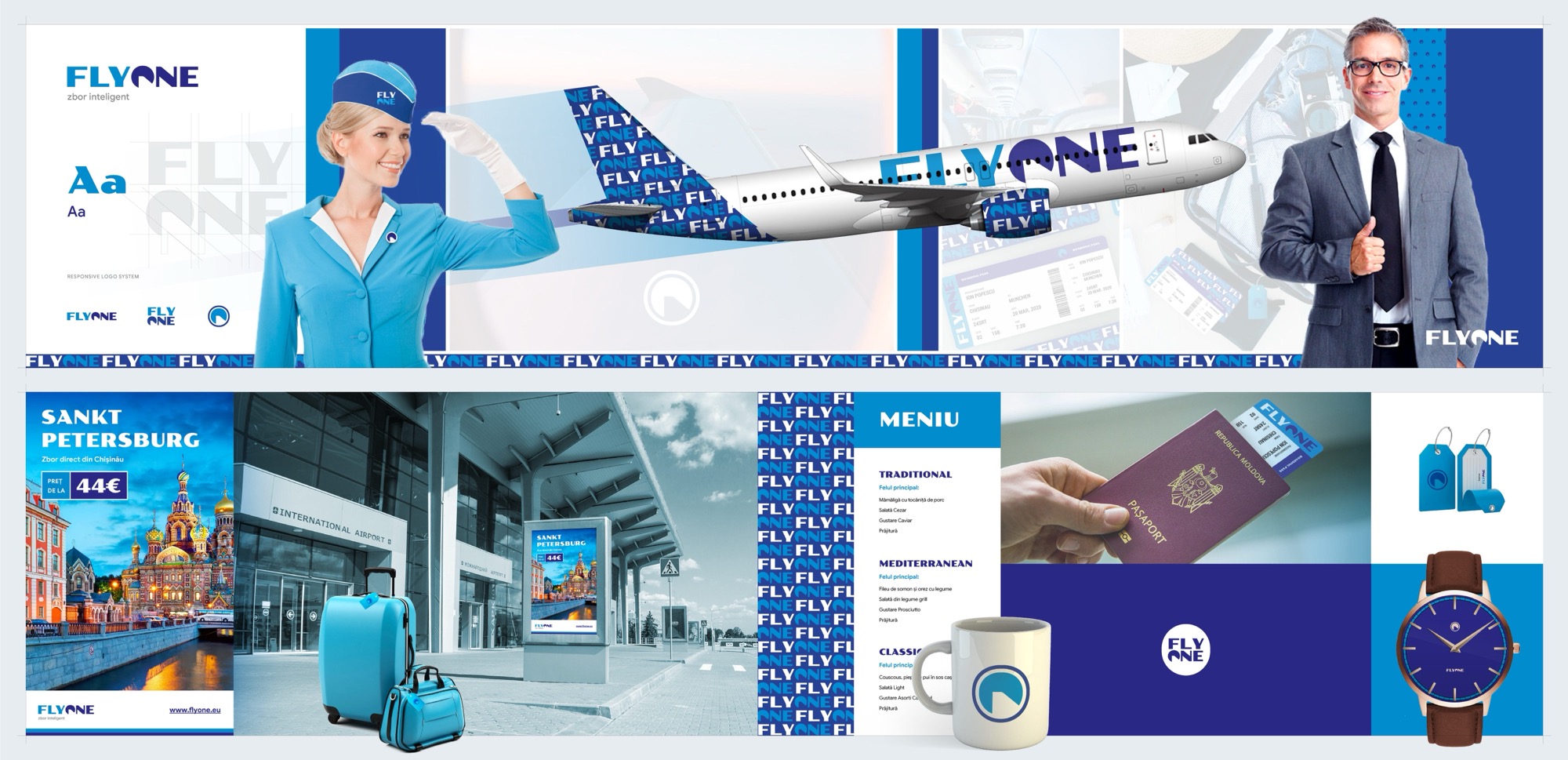
Good. We outline a whole system of visual elements that will eventually form the visual identity. Colours, typeface, pattern and so on.
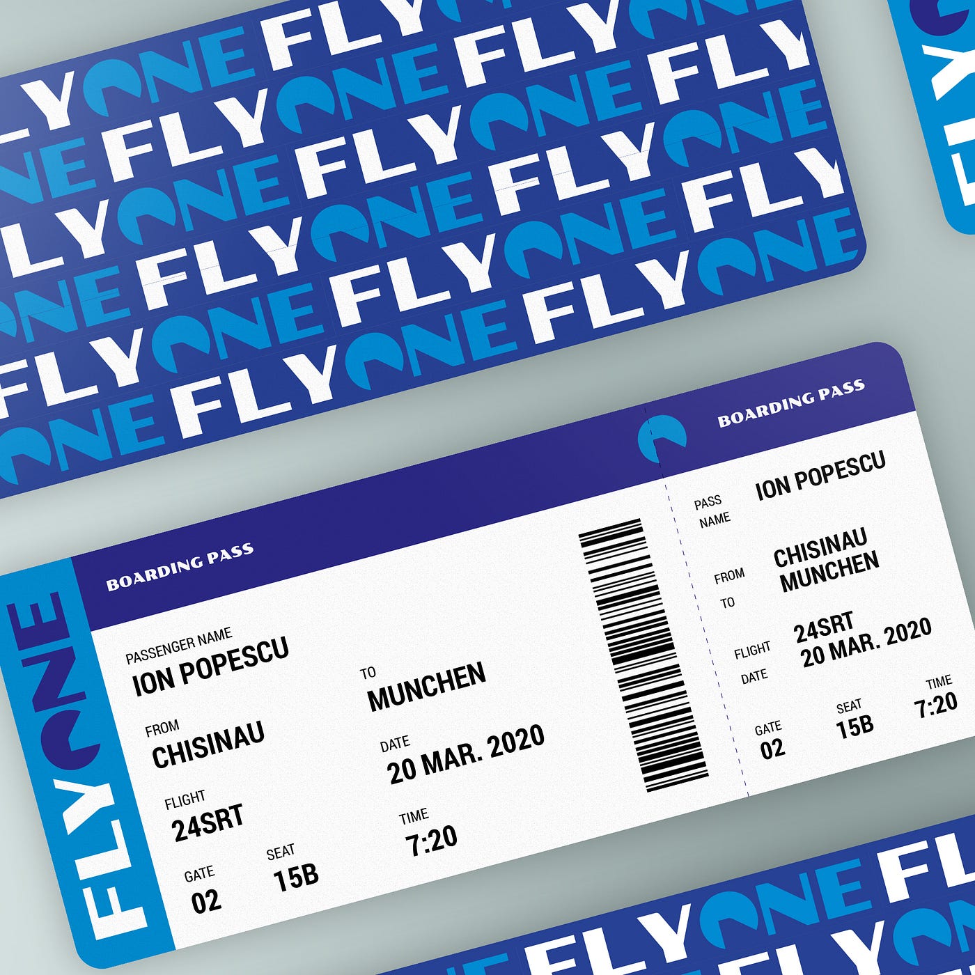
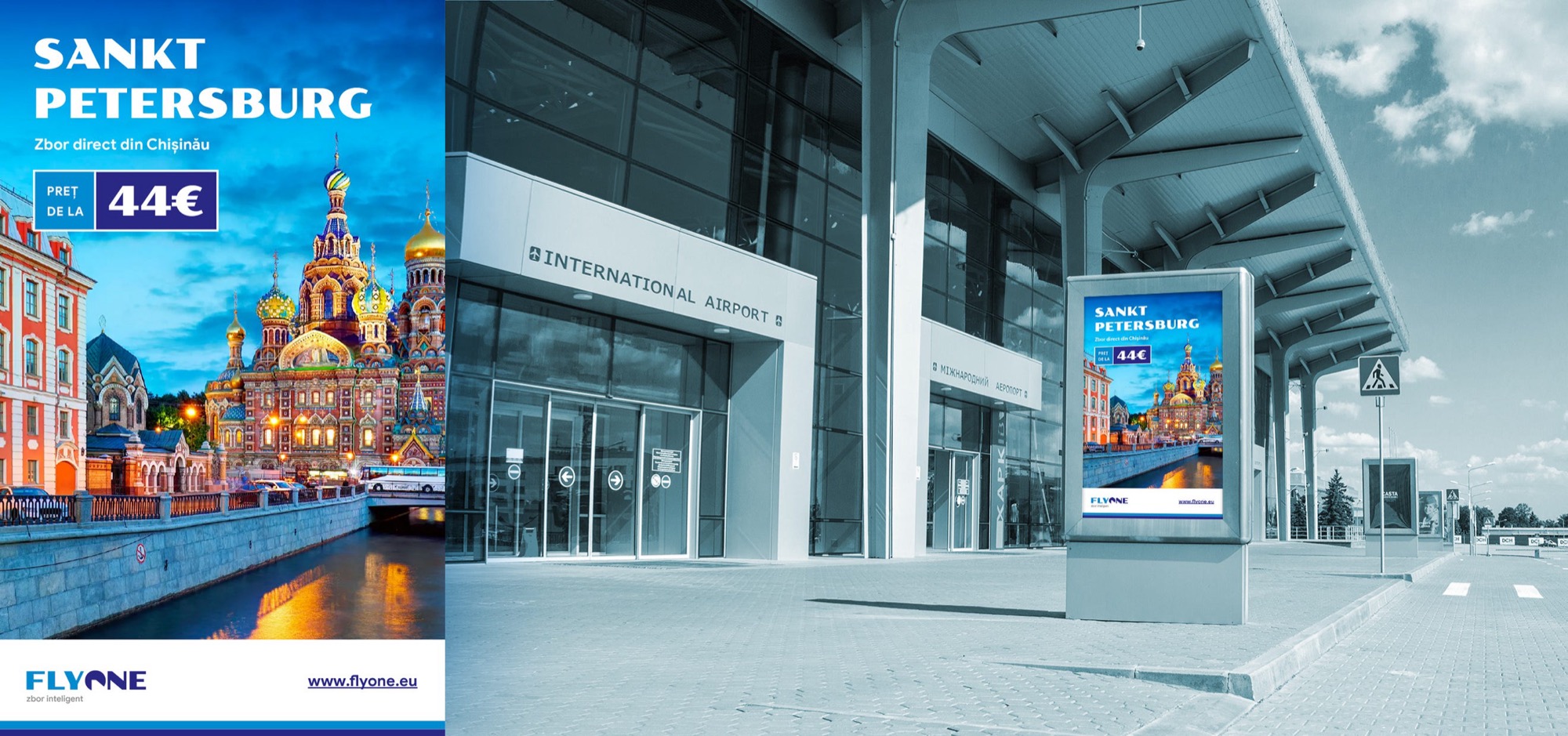
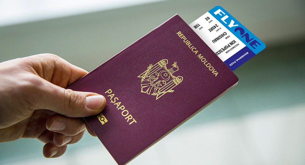
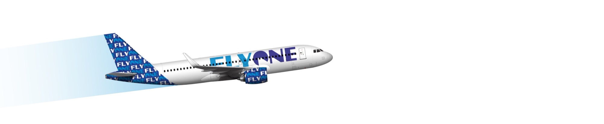
And here is a stylescape, which puts things in context for a better sense of the direction.
But branding…
Branding hides in the details. A logo, together with all the materials, well-crafted identity guidelines, strategy, communication and so on, still does not make a brand.
A brand is, in fact, the audience’s perception of the company. The company can only use the elements above to influence that perception.
But visual identity materials alone are not enough. You also need a communication strategy, service, customer care, quality of service and more. It takes years of consistent work, with every department of the company acting in unison. Consistency in message, attitude, actions and service.
But we will leave that for another time.
PS: About the imaginary logo. Of course there will be associations, and maybe memes about how the symbol looks like Pac-Man :) (especially now that we have mentioned it). Others will say it doesn’t. There will probably be reactions. Is that really a bad thing?