Every study so far has had a visible drama: a logo that needed replacing, a label that failed to tell the story, a website that deserved rebuilding. This one is different. Nothing here looks wrong. And that is exactly the point.
A logo you know even if you don’t drink wine
Purcari stopped being just the winery at Ștefan Vodă a long time ago. It is the largest wine group in Moldova and one of the leaders in Eastern Europe: revenues of RON 437 million in 2025 (roughly €88 million, up 14% on the previous year), six core brands - Purcari, Crama Ceptura, Bostavan, Domeniile Cuza, Bardar, Angel's Estate - seven production sites in three countries and exports to around 40 markets. The company is listed on the Bucharest Stock Exchange, and since 2025 its majority shareholder has been the Polish group Maspex.
For our study, only one figure matters, and it appears in no annual report: the seven letters of PURCARI are, very probably, the most printed serif letters in Moldova. Millions of bottles a year. Labels, capsules, boxes, foil, embossing, illuminated signs, screens. At this scale, microtypography is no longer an aesthetic whim - it is production engineering.
The necessary disclaimer: this is an internal study, done out of passion - started in 2020, left to rest, revisited now. We are not criticising the Purcari logo; on the contrary, we respect it enough to repair it only where the flaws show under a microscope. Perhaps one day it will land on their desk too.
The diagnosis
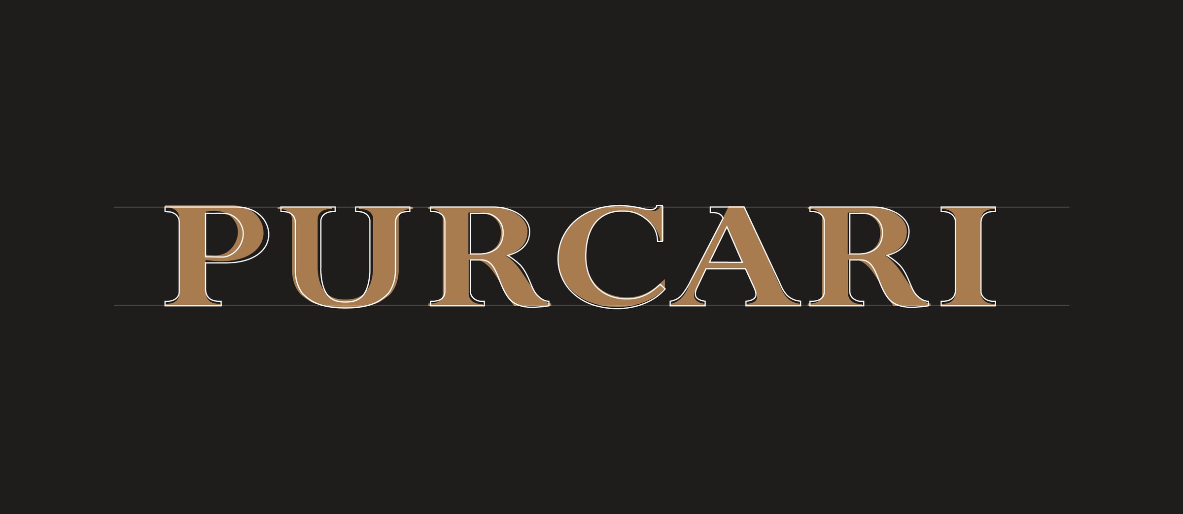
A classic serif with strong contrast between thick and thin strokes - a Didone* construction, elegant, right for a premium wine. The problems only appear once you put the dots on the map:
* “Didone” - a term from the Vox-ATypI type classification (Maximilien Vox, 1954), formed from Didot + Bodoni: the category of serifs with extreme contrast, hairline unbracketed serifs and a vertical axis. References: Didone and the Vox-ATypI classification on Wikipedia, plus the Google Fonts glossary.
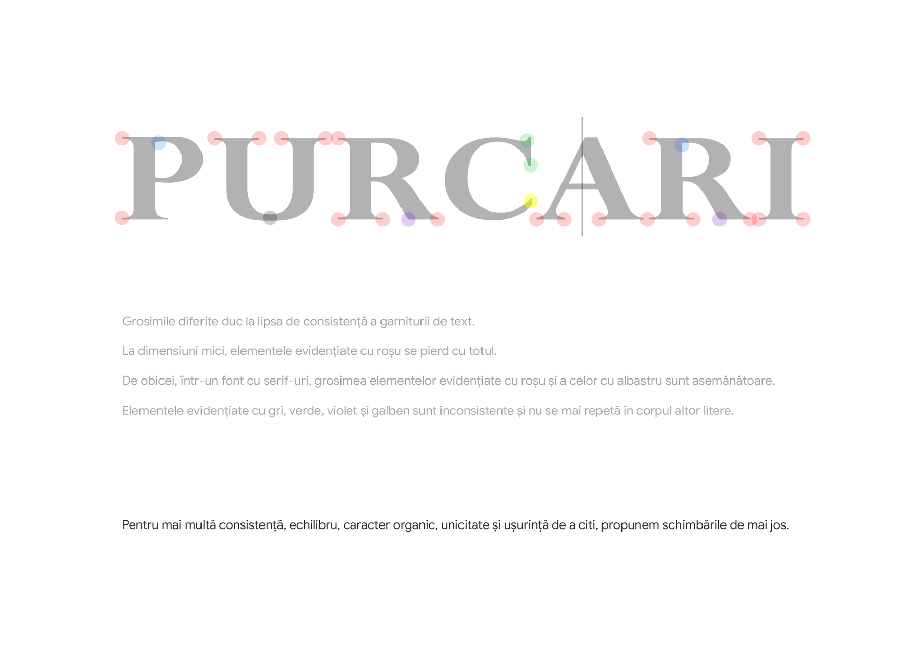
Three findings
- Stroke weights vary from letter to letter - and that undermines the consistency of the whole word;
- the elements marked in red - hairline serifs and terminals - vanish entirely at small sizes;
- there are one-off details that appear only once in the whole word and nowhere else - in a healthy type system, every form repeats and is confirmed in the body of other letters.
Why thin strokes die
A short theoretical aside, because this is where the whole game is played. High-contrast typefaces - the Didones, led by Bodoni and Didot - were drawn for a single situation: large sizes, quality printing, smooth paper. There, they shine. But scale them down on absorbent paper and two things happen: the ink spreads (a phenomenon called dot gain), and the thin strokes either fill in or disappear altogether. That is why newspapers abandoned Didones as early as the nineteenth century - and why the great type families have “optical sizes”: the same letter is drawn differently for 6 points and for 60.
A wine label is the hardest case of all: textured paper, metallic foil, embossing, and a logo about 20 millimetres wide. At that size, a 0.1-millimetre line is not a line - it is a hope.
The repair, letter by letter
The general rule, valid for all seven letters: we bring the weight of the thin elements (red) closer to that of the reference elements (blue). The typeface does not get bolder - the average stroke weight stays practically unchanged; only the serifs and terminals become visible and consistent. Then each letter gets its own correction.
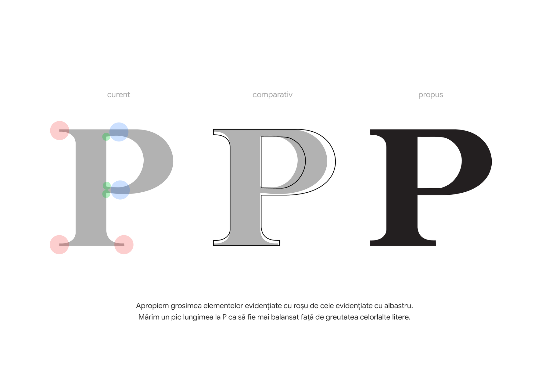
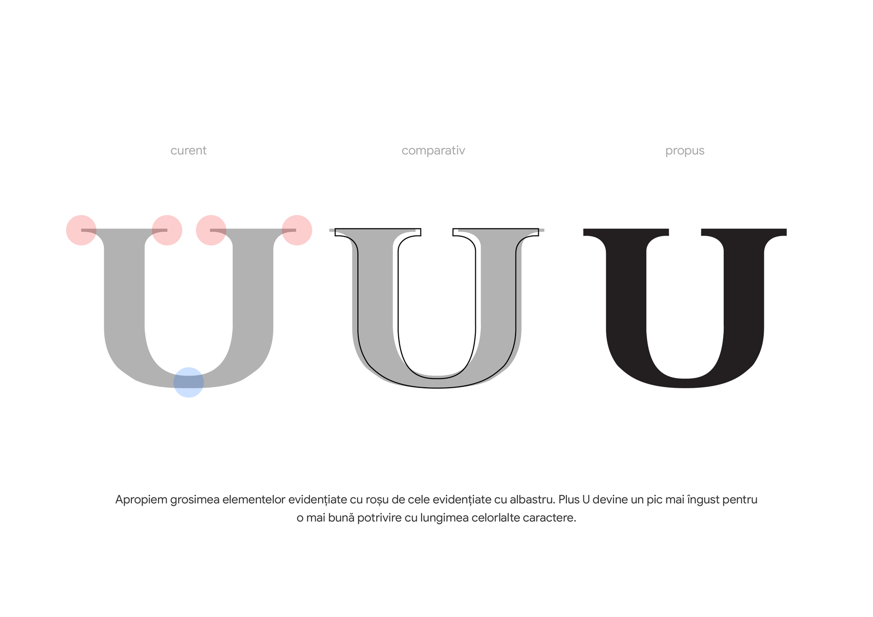
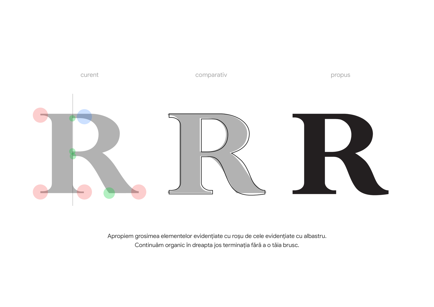
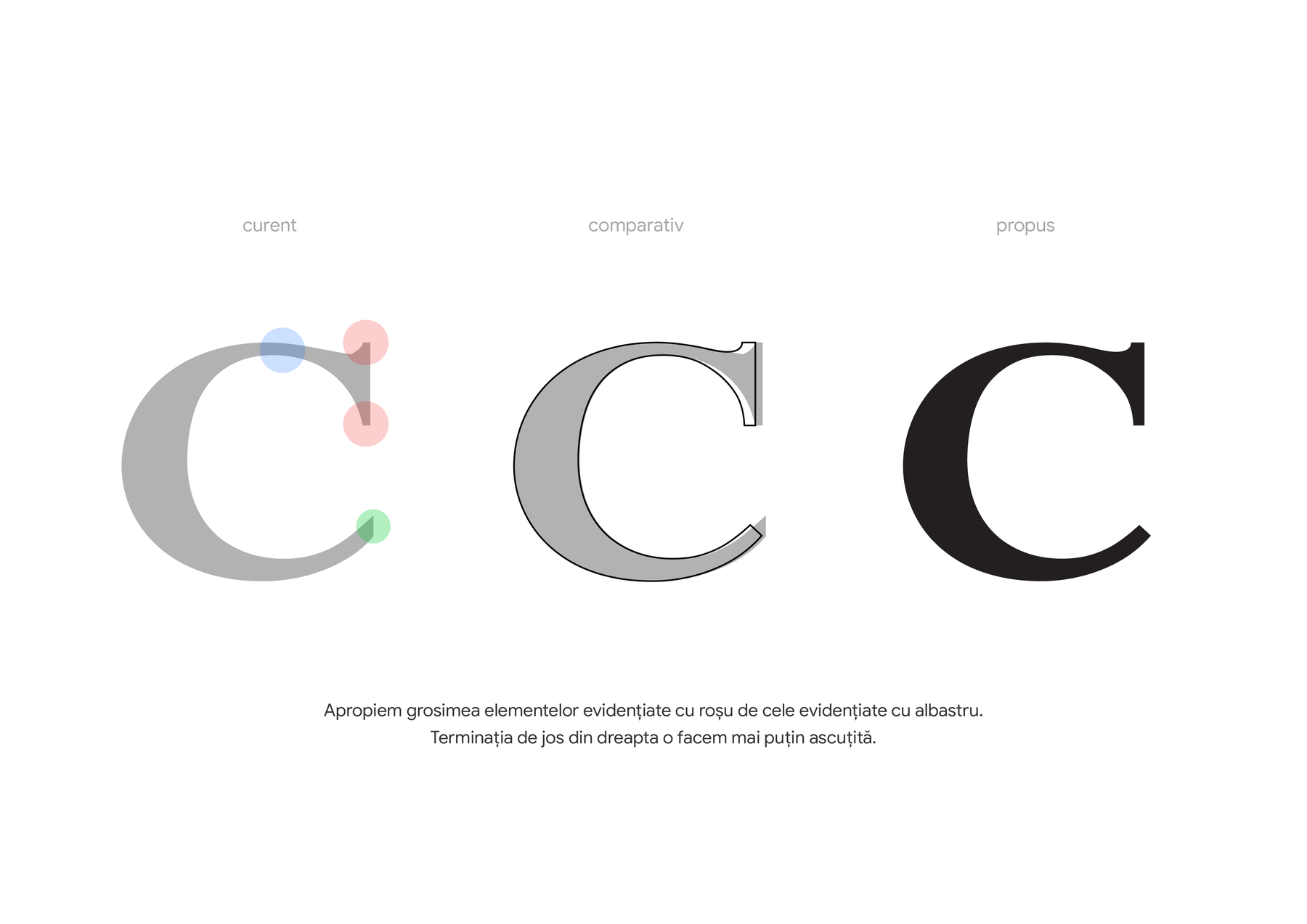
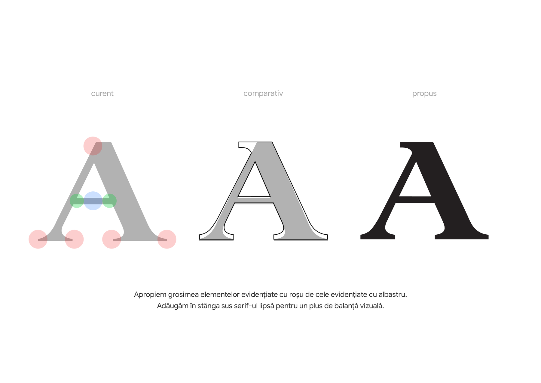
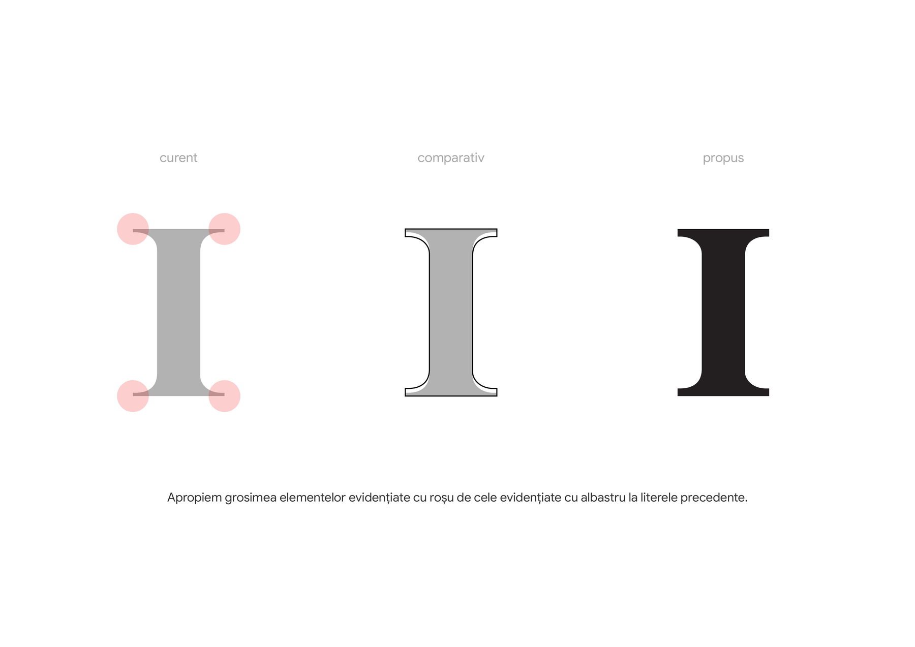
And one detail you will not see in the plates, but will feel in the word: the kerning has been revised. The old wordmark breathed unevenly - wide gaps between P-U and U-R, a squeeze at C-A. Now the spacing is optically even, and the word flows as one piece.
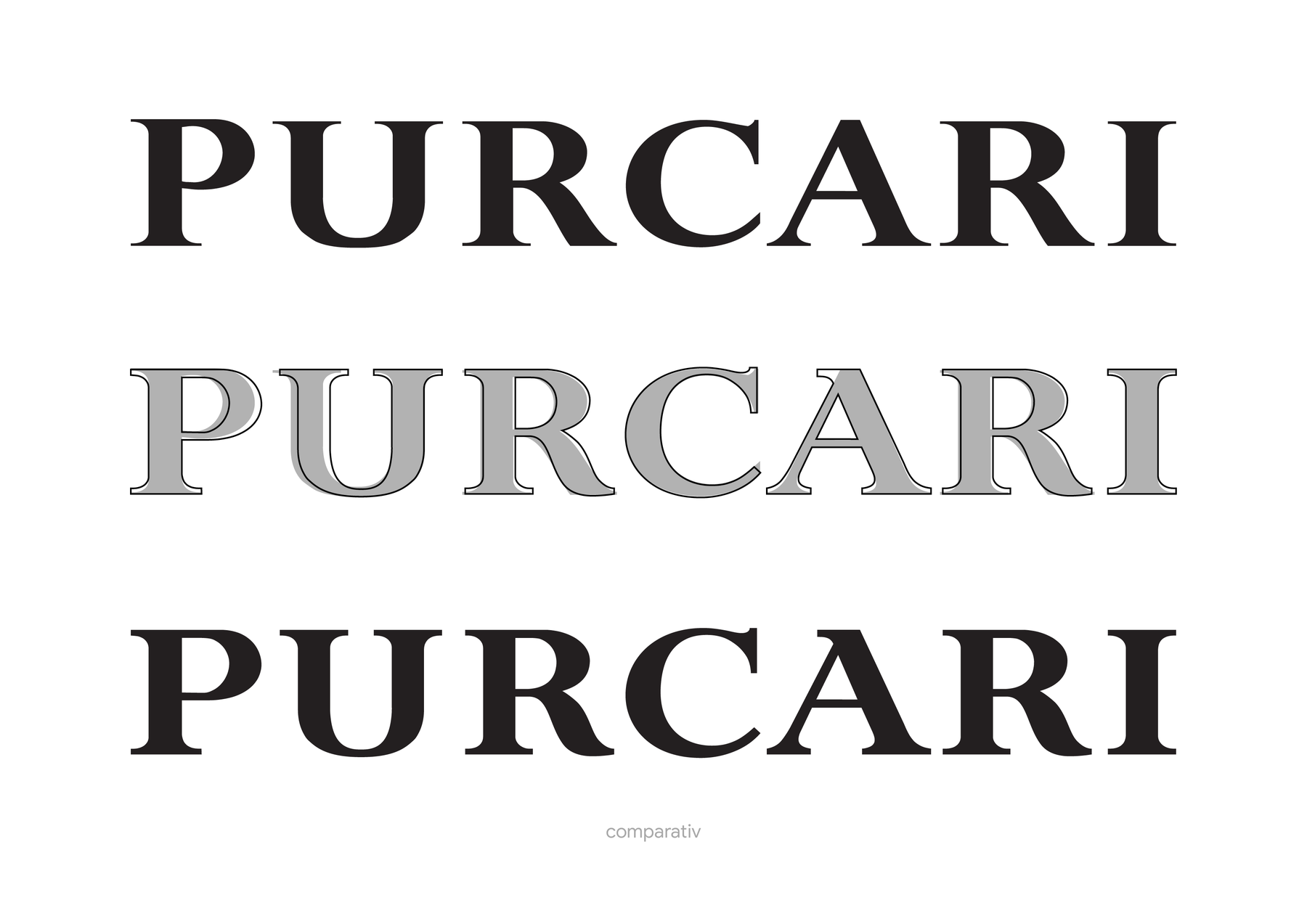
The 20-millimetre test
The final proof is not made at zoom, but the other way round: at the real size on the label, printing imperfections and all. Below we simulated exactly that - both wordmarks at about 20 millimetres, with the ink spread of ordinary printing:
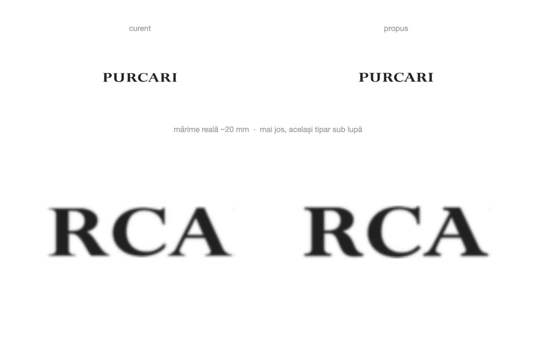
In numbers: the thinnest stroke in the wordmark grew by roughly 45% - from a weight that simply vanished in small print to one that holds up. The median stroke weight of the letters? Unchanged. That is exactly what “we didn’t make the typeface bolder - we made the serifs visible” means.
The result
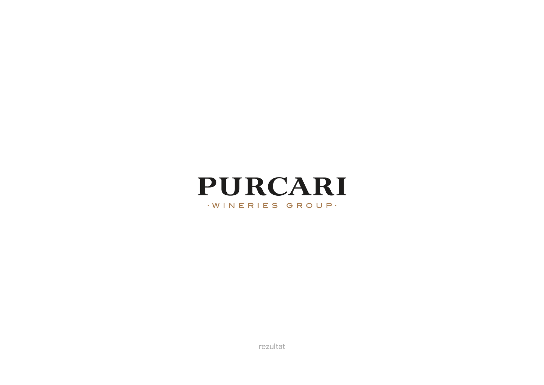
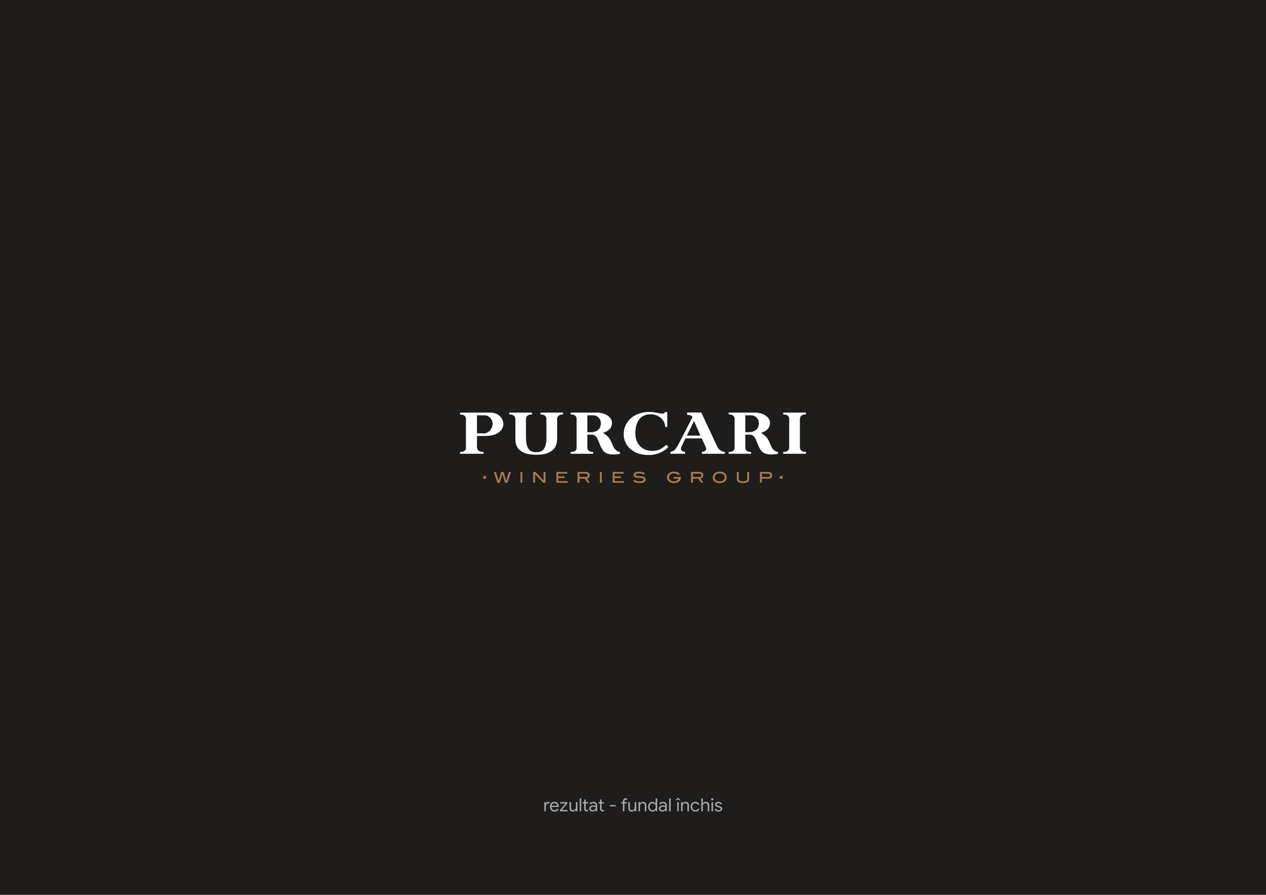
Nothing changed. Everything changed.
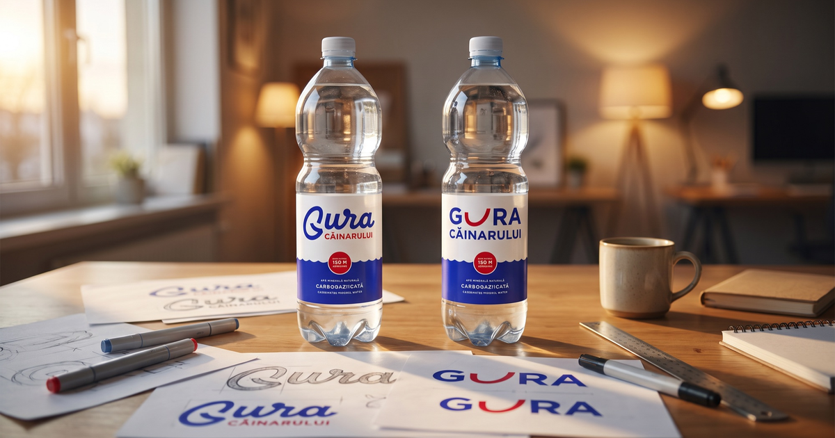
With Gura Căinarului we were looking for a new sign, because the brand had not built up memory in any of its old ones. Purcari is the exact opposite: a brand with real equity, built over decades - and the last thing such a brand needs is a new idea. What it needs is for the sign people trust to be executed flawlessly, at any size, on any surface.
This is the kind of design nobody makes spectacular presentations about: no one will post “wow, what consistent serifs”. But every time the logo prints cleanly on a 15-millimetre capsule, somewhere a printer will nod in respect. Craft, at this level, is invisible - and that is exactly how it should look.