Case studies are usually written backwards: first the polished result, then a process reconstructed after the fact so that it seems to lead there inevitably. Real design does not look like that. Real design is full of dead variants, U-turns and “hmm, not quite” - and that part is almost never published. Today we publish it.
The context: the August 2026 rebrand
On 19-20 August 2026, Gura Căinarului - the Rusnac-MoldAqua brand - returned to the shelves with a new identity: “Aceeași apă. Trăită altfel.” (Same water. Lived differently.) The symbol is a heart built from traditional ornaments (the stone flower, the rose from Moldovan carpets), the wordmark becomes “gura” (Romanian for “mouth”) in rounded lowercase, and the campaign is serious: a “Paparuda” remix with Andrew Rayel and the Osoianu Sisters, clips with hundreds of thousands of views, a hora announced for October.
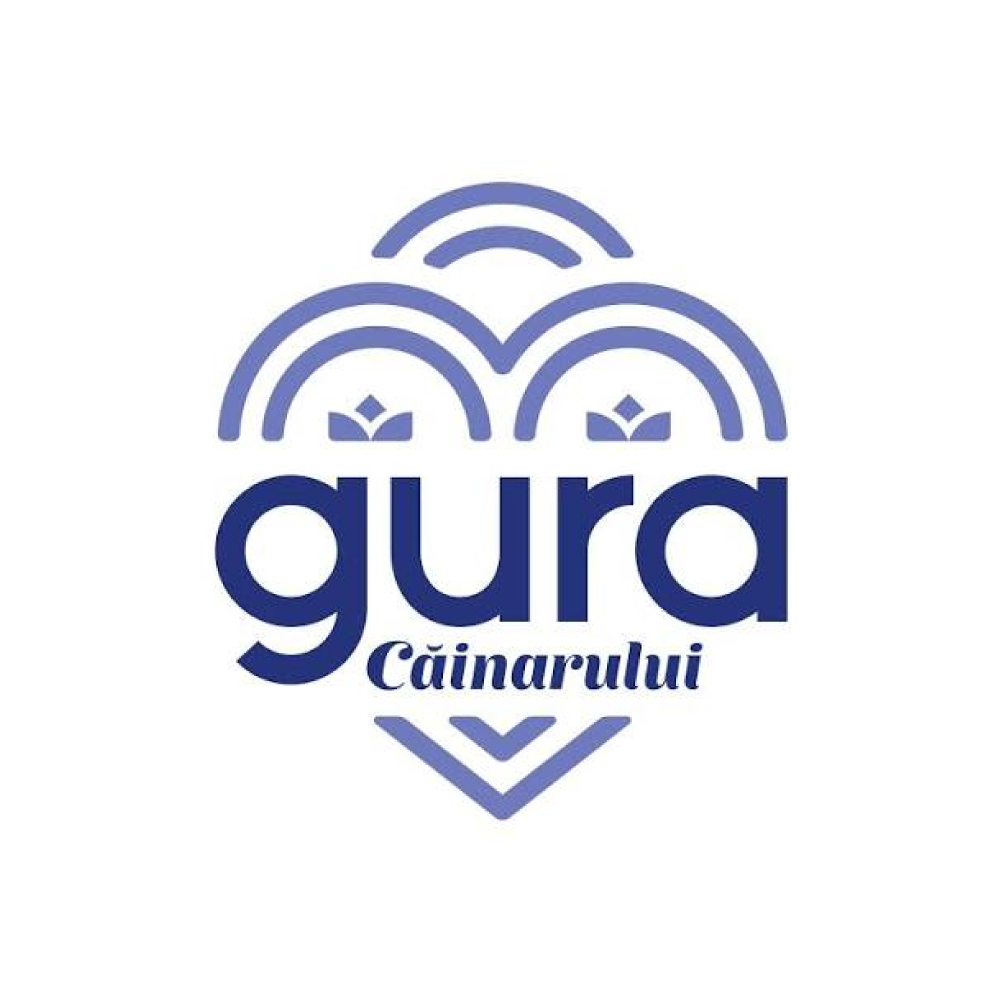
The public reaction is warm - but the liveliest conversation on TikTok is not about design. It is about the bottle: in Moldova, the Gura Căinarului bottle is the canonical vessel for homemade wine, and clips along the lines of “another childhood legend gone” have racked up hundreds of thousands of views. Keep this detail in mind - it comes back below and changes everything.
Five bottles, four identities
Before you draw anything, you look back. And looking back reveals a story few brands have - unfortunately, in the wrong sense:
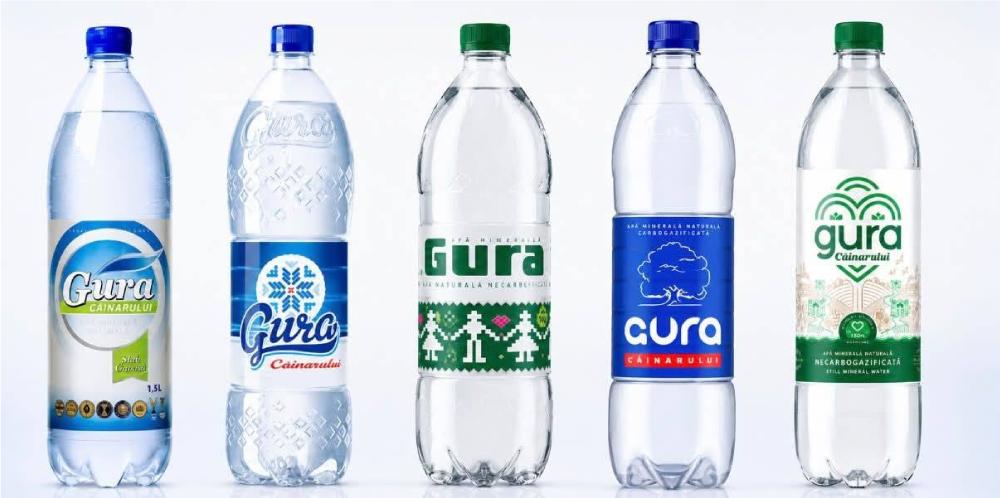
Four different identities in about 25 years - so the brand never built equity in any single symbol. The only constant has been the name. And when we asked ourselves which of these logos was the most memorable, the answer led somewhere unexpected: the second one, the handwritten script. Not just because it lived on the shelves for a long time - but because the script was also embossed into the bottle itself. And this is where the legend comes in: bottles living a second life with homemade wine lose their labels - they peel off, they get damp in the cellar. What remains is the embossing. A whole generation memorised the brand from their grandparents’ wine bottles - in other words, they memorised the script moulded into the plastic, not the label.
Step 1: repair before you propose
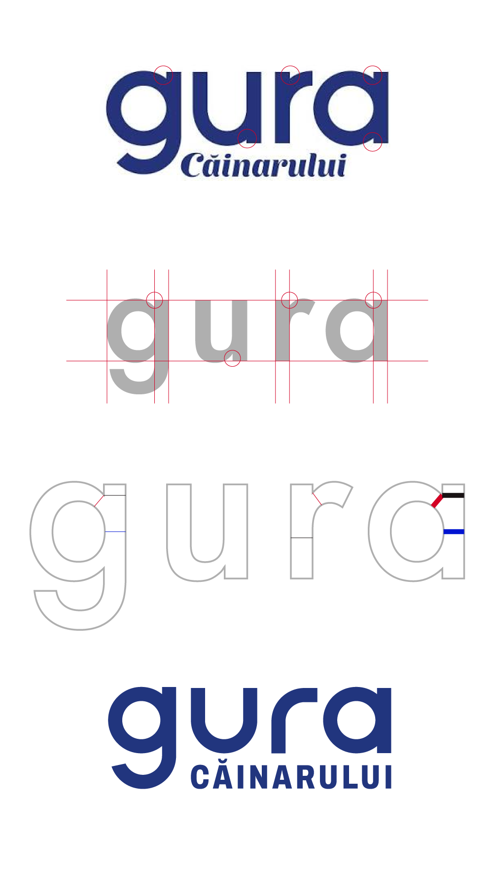
The first move in the process was the least spectacular - and the most disciplined: we took their official logo and repaired only the typography. The “Căinarului” script, hard to read at small sizes, becomes letterspaced caps, cleanly aligned under “gura”. No new idea, zero ego - just craft applied to what already exists. It is the old lesson from the Academy’s first study: before revolution, try evolution.
And since this is where you can best see how letters are built, a short theoretical aside. Typefaces are not “written” - they are drawn, and their invisible rule is optical compensation: where a curve flows into a vertical stem - at the bowl of the g, the closing of the a, the shoulder of the r - ink would pile up and create dark spots. That is why classic typefaces thin or notch exactly these joins - the red circles in the analysis below show the points where stroke weight traditionally varies.
We took the logic one step further: we removed the vertical extensions of the u and r altogether. The letters stay a clean monoline, reduced to their essential gesture - and the word becomes easier to recognise, because the drawing belongs to it alone.
Step 2: look for the idea in the name
Then the real search began - starting from the one asset nobody else can claim: the name. “Gura” is the mouth of the spring and the mouth of the person who drinks, smiles, speaks. No other water can play this game. We drew in every direction:
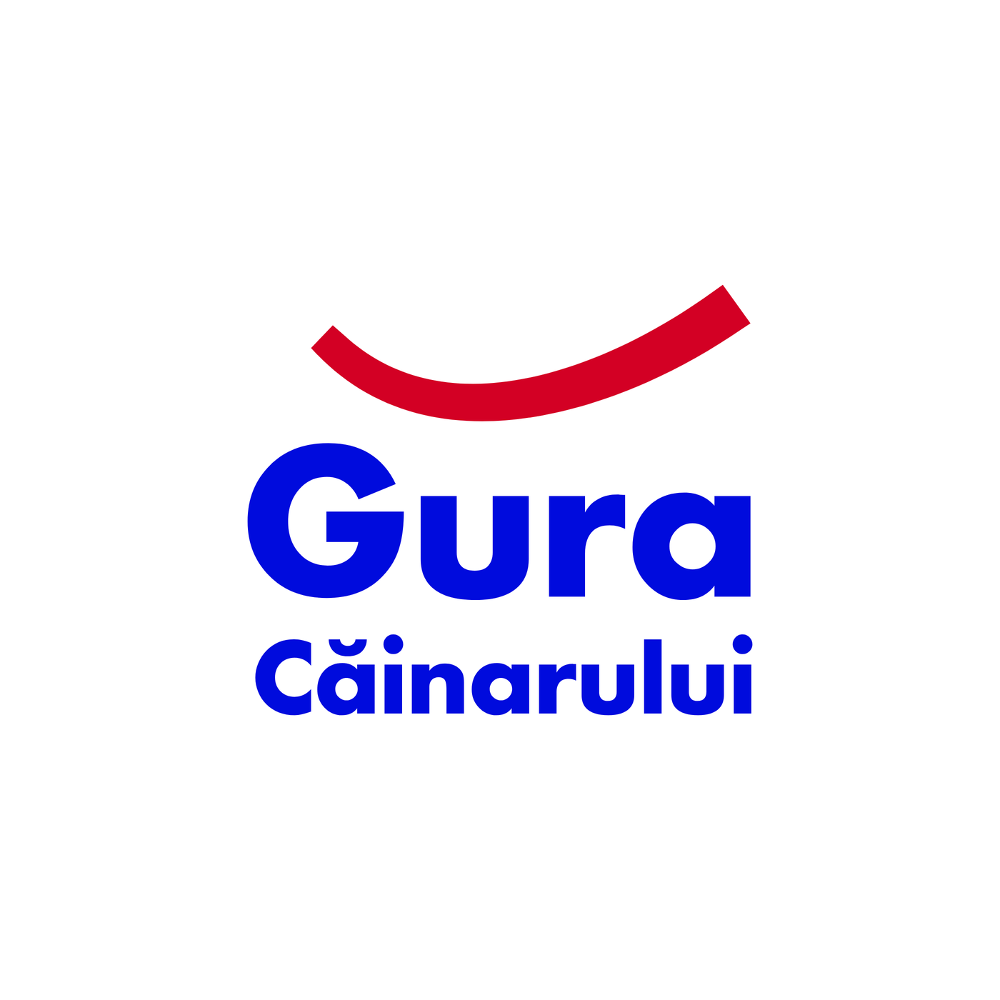
Its arguments are solid: bold, extremely easy to read and recognise; “Gura” with a capital G means “Căinarului” runs underneath edge to edge, without getting tangled in the descender of a lowercase g; and the smile is deliberately shifted to the right - the G holds mass at the top left, the red arc counterbalances it. Small details, but thought through.
Even so, two reservations stayed on the table: the arc floats above the word, not structurally tied to it - and a detached red curve next to a wordmark strays dangerously into Amazon’s semantic territory.
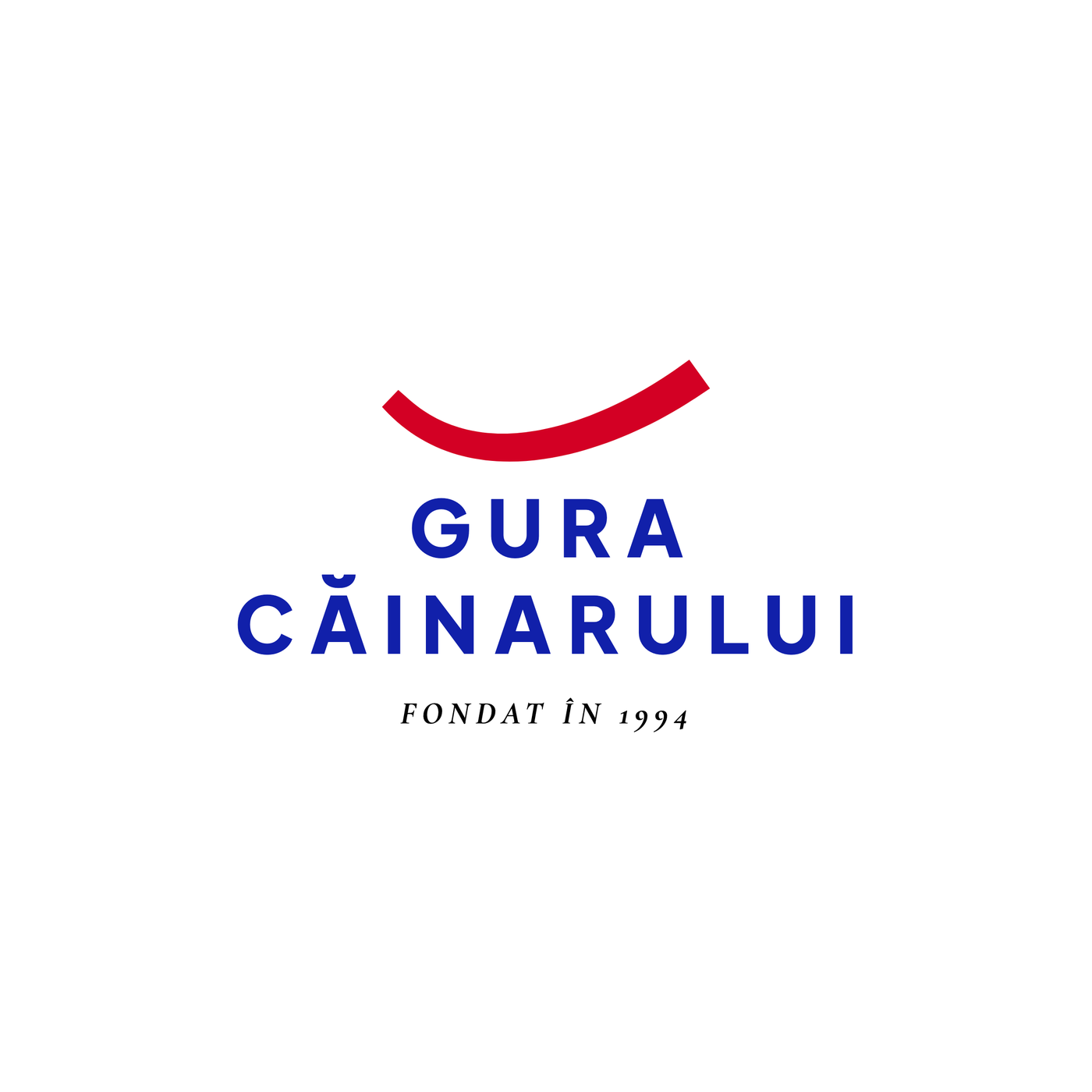
Here the verdict came quickly: more mature, calmer, less shouty - but at the same time more generic and less memorable. It is the classic trade-off of well-behaved design: you pay for quiet with personality. And the dilemma of the floating arc remains untouched.
The next attempt inverted the hierarchy:
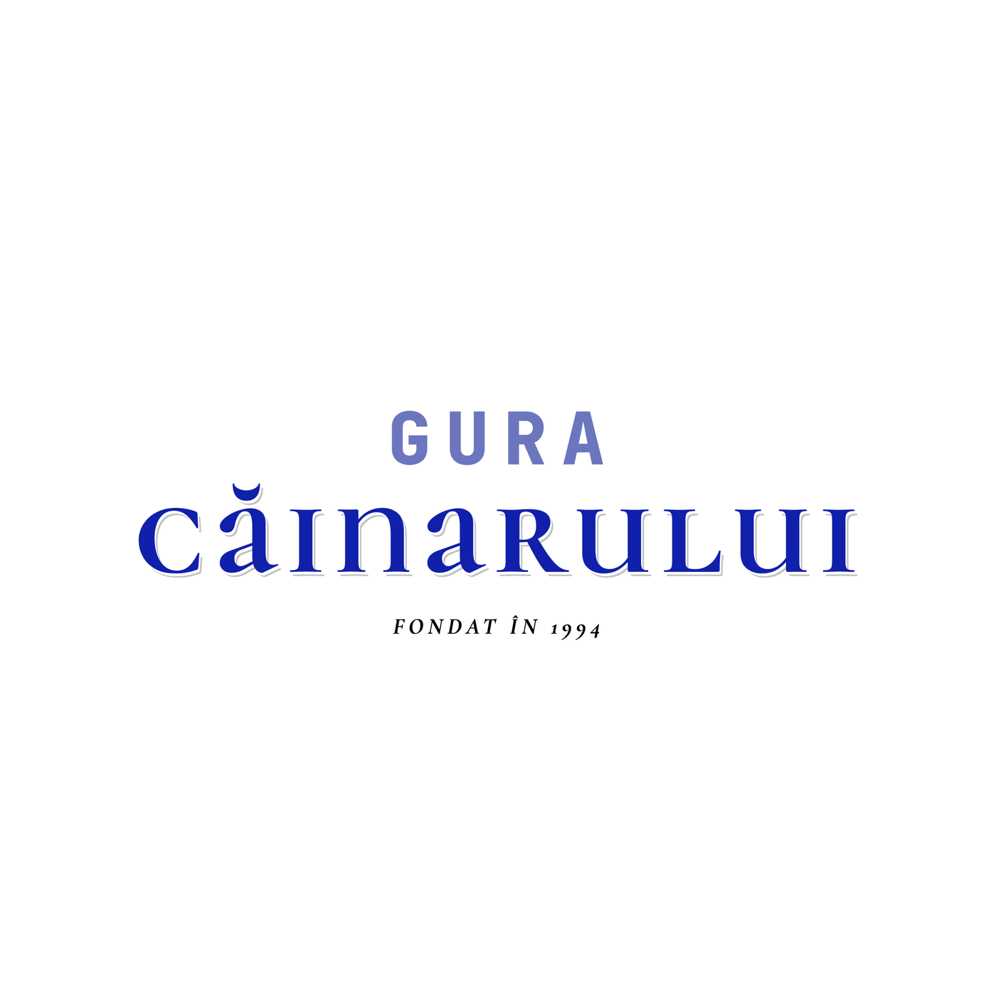
Strategically interesting, but the execution read more like an editorial winery than water. We set it aside - with a note: the idea of elevating “Căinarului” is worth keeping for another life, perhaps a premium line, in glass.
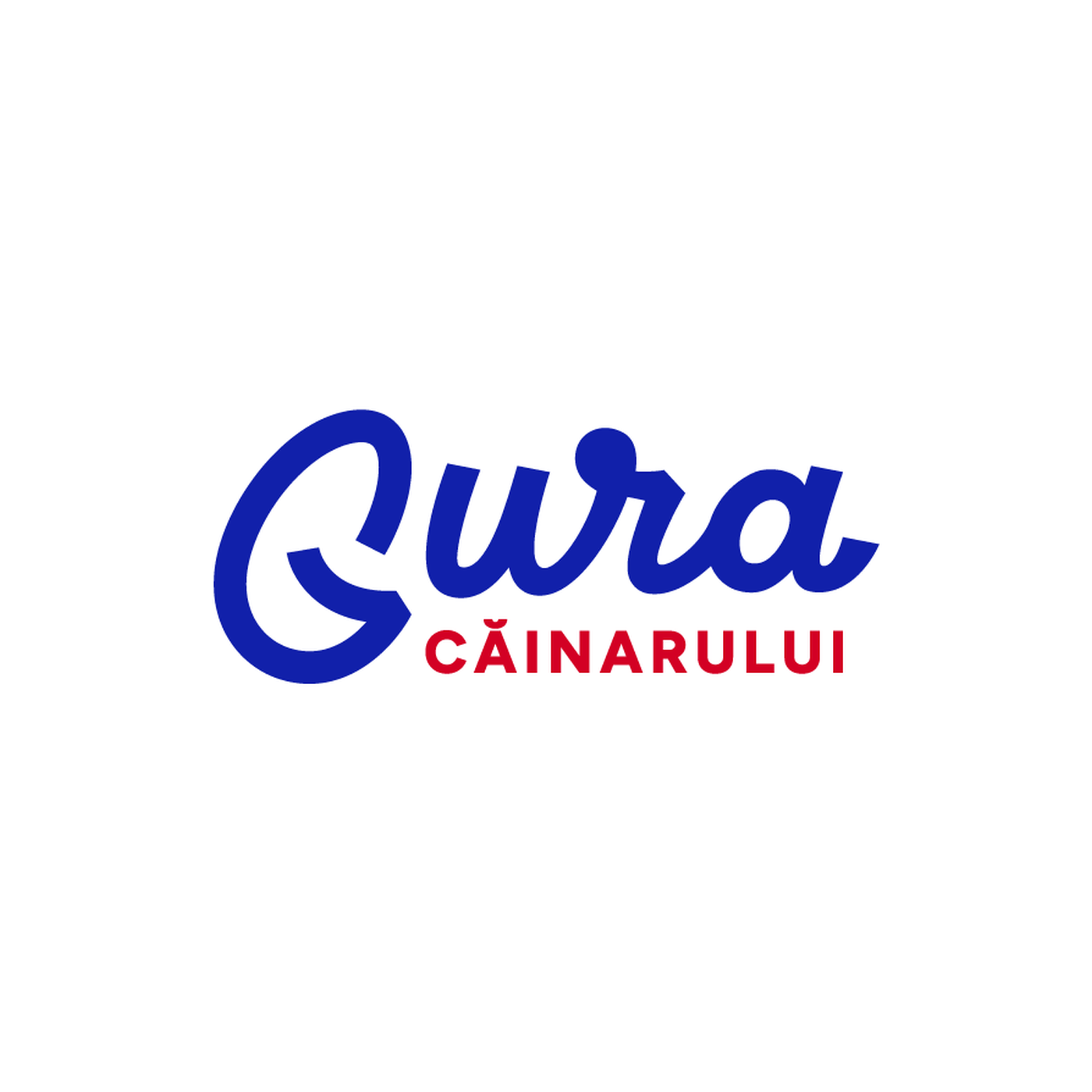
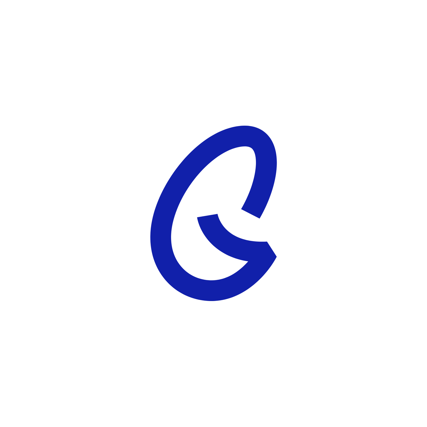
Before the finalists, the script’s journey deserves to be shown in full - because it did not start from zero, but from the source: the historic snowflake label, the most memorable in the brand’s history. From there, dozens of iterations - the loop of the G, the u-r join, “Căinarului” in script or caps, in red or blue - eventually settled into two main sub-directions: one with the generous horizontal line springing from the G, the swash inherited from the original; and a cleaner one, without the line, where the smile moves inside the G and “Căinarului”, freed from under the swash, can grow. Evolution with a source, not invention.
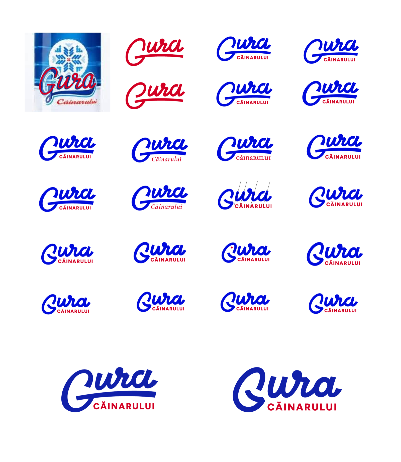
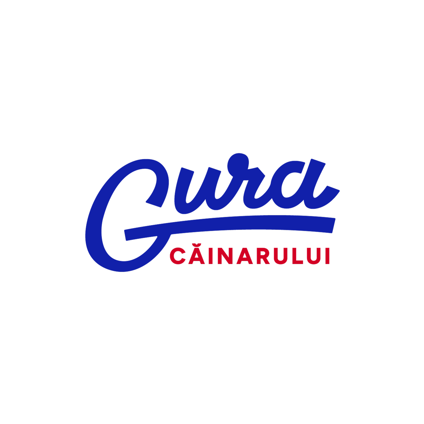
And then, the two directions that survived every round:
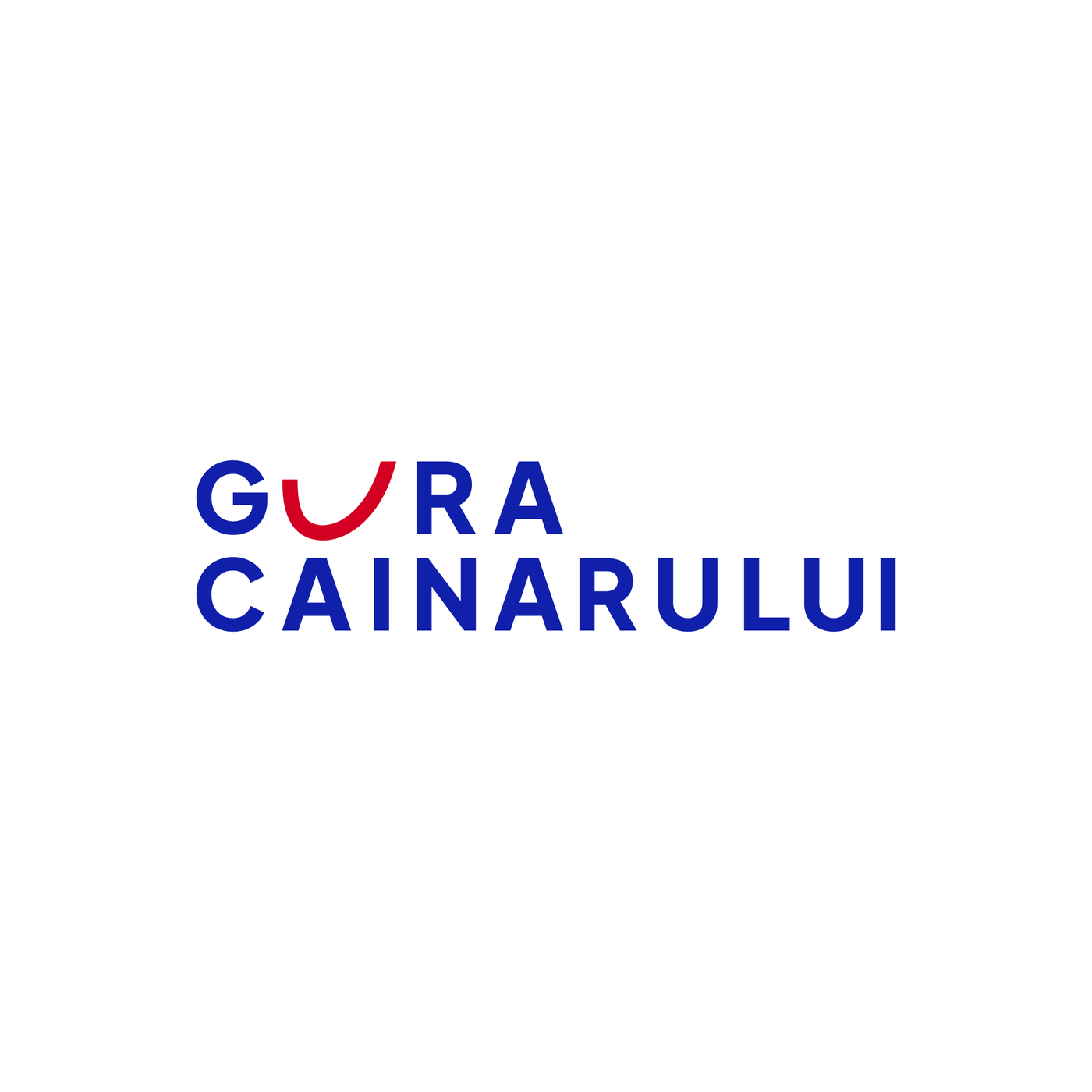
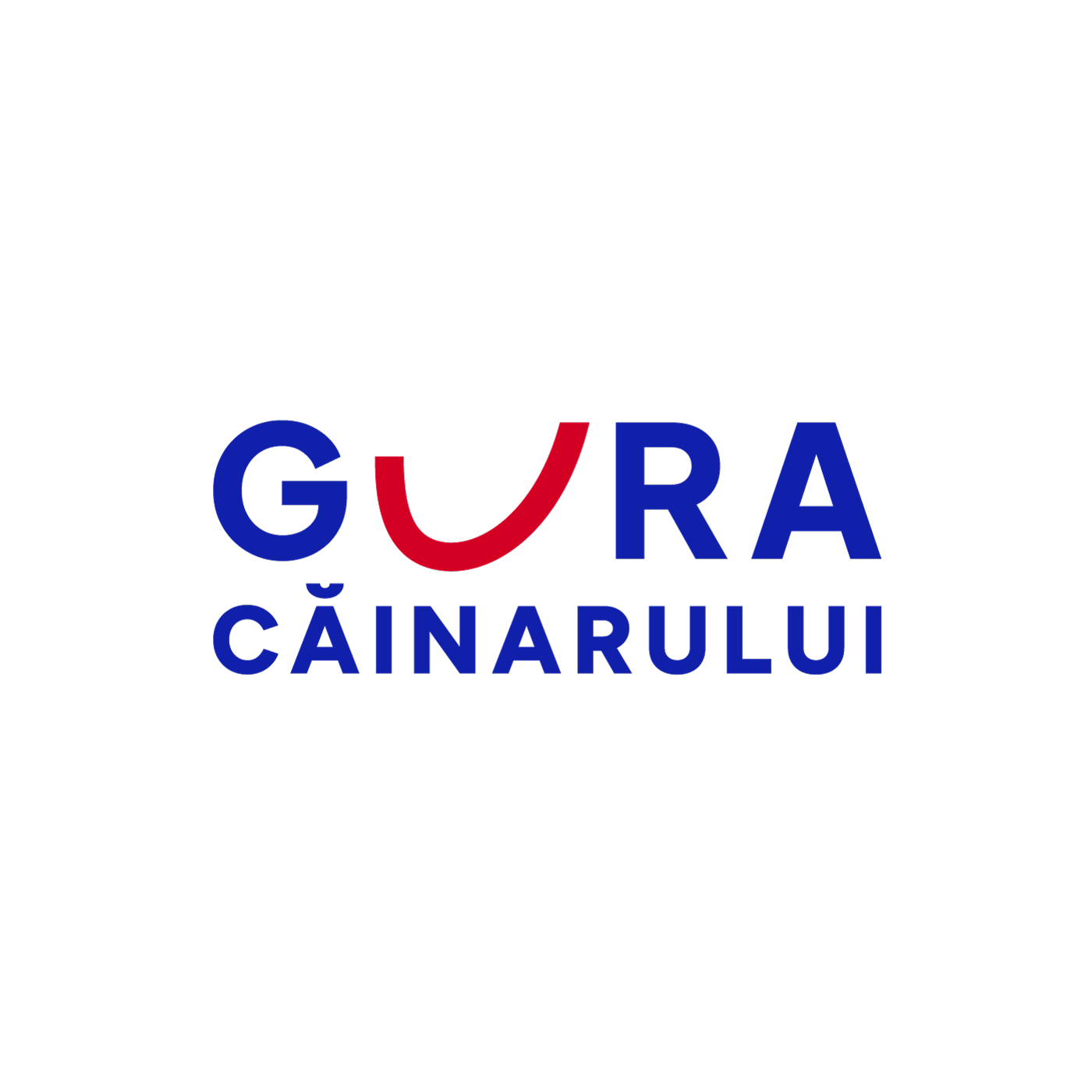
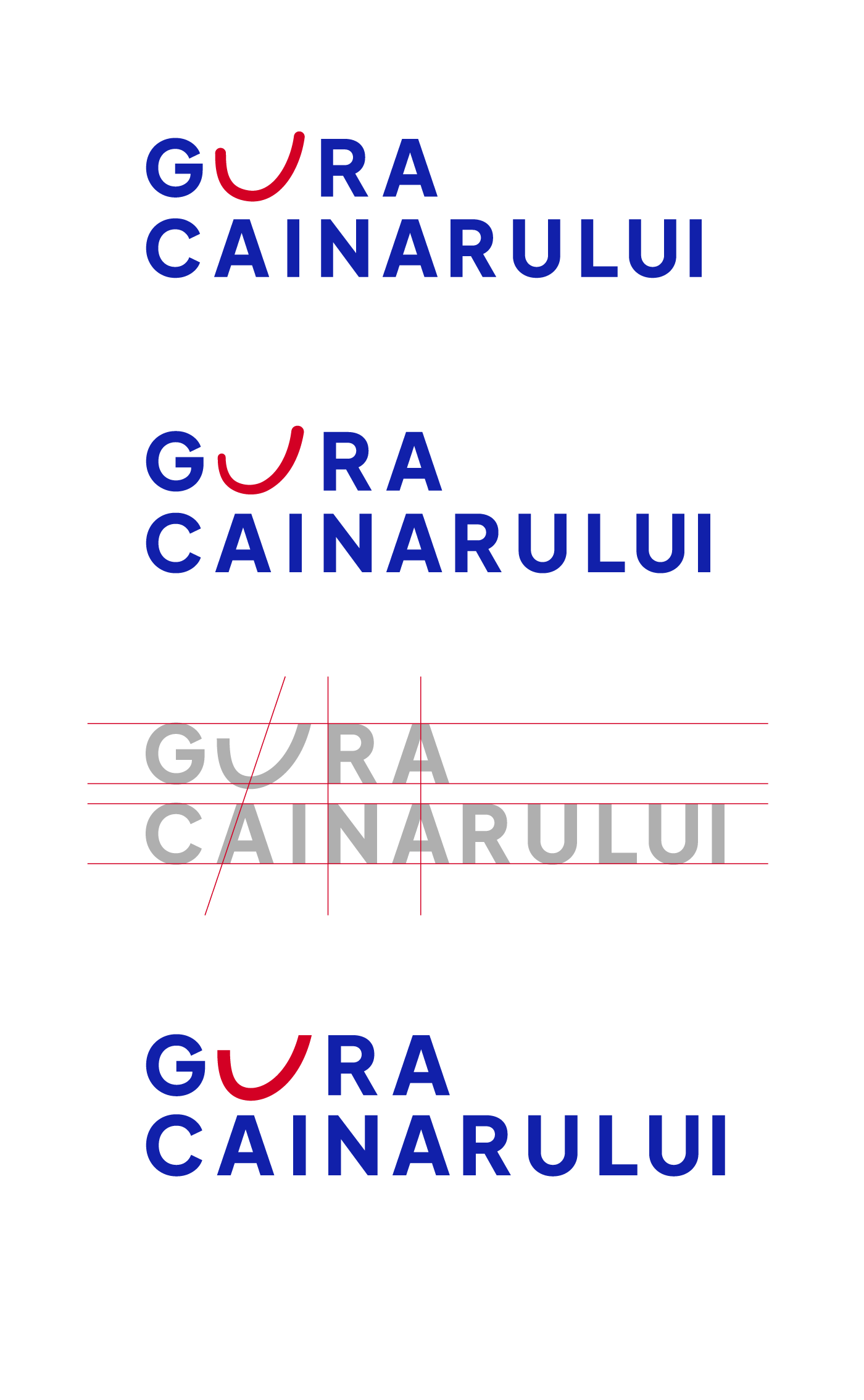
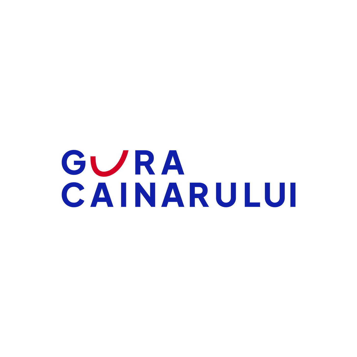
This variant deserves more words, because almost everything important about it is invisible at first glance. The U plays two roles at once: it is the smile in “GURA” and, at the same time, the breve over the Ă below - which is why the arc is slightly tilted, its tip dipping towards the A on the bottom line, as if nodding to it. One element, two jobs - and the reason “CAINARULUI” carries no breve: the breve is there, it just lives one line up. The alignments between the lines are also worked letter by letter: the R aligns with the N, and the top and bottom A are centred on each other. The remaining decisions follow the same economy: a single colour accent, a single gesture, everything built into the letterforms - nothing stuck on the side.
One clarification: finalist 2 actually exists in two hierarchy cuts. The equal one, above - pure economy, where the U doubles as the breve. And the hero cut, with a large “GURA”: a more compact block, stronger shelf presence, a wider smile that confidently drops below the baseline - while “CĂINARULUI”, now a descriptor, gets its own breve back.
The script brings memory; the U-smile brings the idea - the smiling mouth is right there in “GURA”, not stuck next to the word. From here on, their paths diverge only in the debate.
The debate. For real, not reconstructed
From this point on, the process became a dialogue - and we reproduce it as it happened, objections and all, because this exchange of arguments is exactly the part of design that never gets published:
Objection 1, to the U-smile: the lock-up is too horizontal - CĂINARULUI, with 10 letters, dictates the width, so on a label the logo will always sit smaller than one with a near-square ratio.
The round of corrections: we deepened the smile to tie the two lines together visually - and a new risk appeared: the deep arc started to read as a J. Or, with rounded ends, as a chilli pepper. We froze the depth. We tested GURA enlarged to the full width - it then needed a breve on the Ă, and suddenly we had two arc-breves side by side plus an extra font weight. We took a step back for the main lock-up: both lines the same size, no extra ornaments - with the hero cut surviving as a secondary version, with its own logic. Sometimes the process means going back to where you started, but with reasons.
Objection 2, to the script: the first draft had an eye and an open mouth in the G - charming, but too much of a mascot for the parent brand. The eye went; what remained was the G with a horizontal bar that only whispers “open mouth”. More mature. The eye did not die: it waits patiently for the lemonade line, where that kind of personality is exactly right.
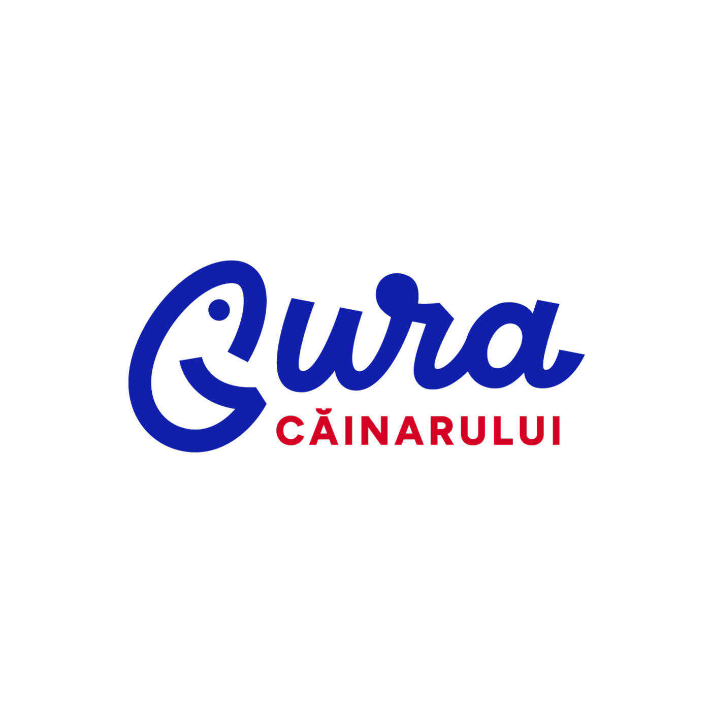
Objection 3, also to the script: the u-r join creates three arches in a row - a small risk of reading “Gwa”. The flag of the r was articulated. And the geometry - parallel slant lines, aligned verticals - shows that the script is not “nicely drawn”, it is constructed:
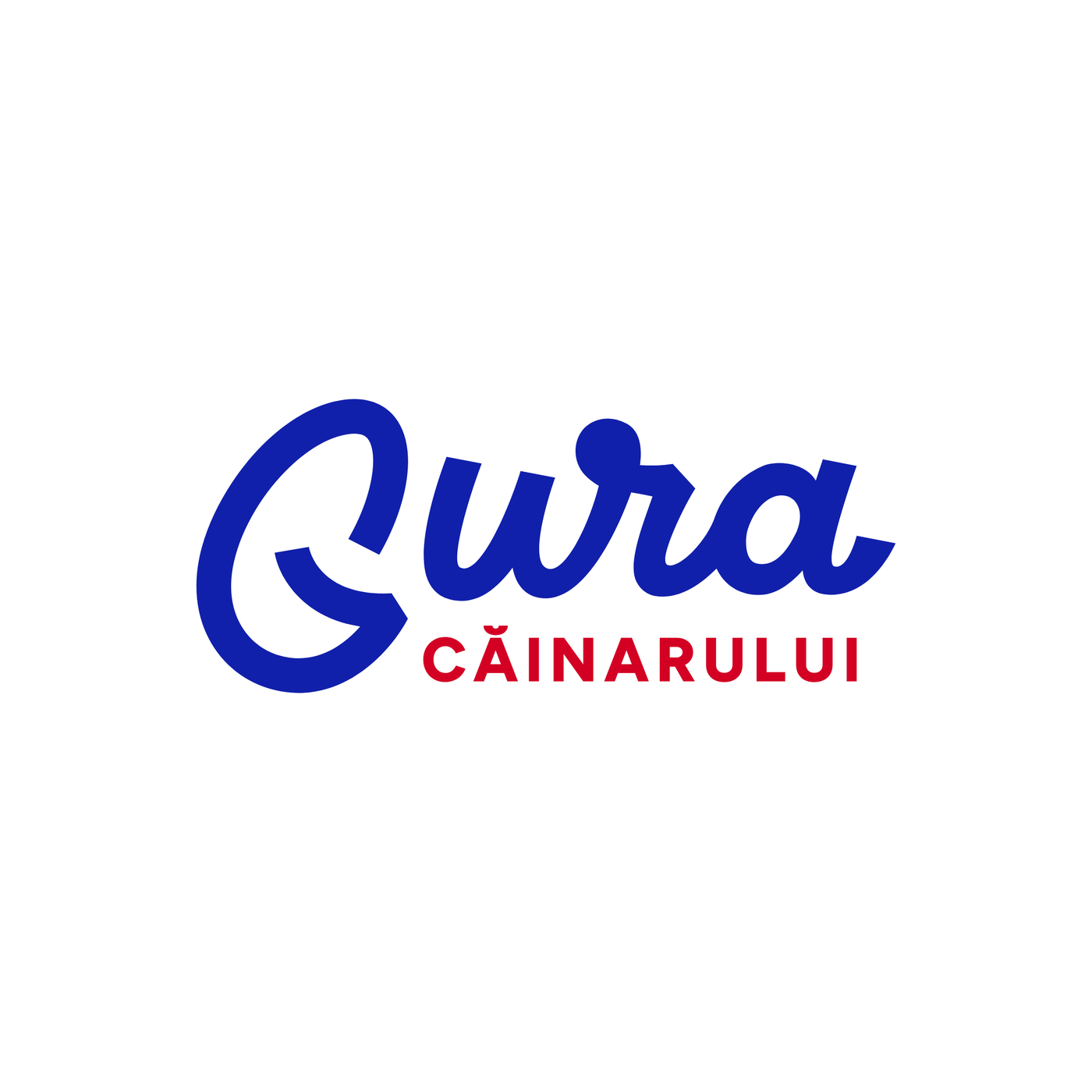
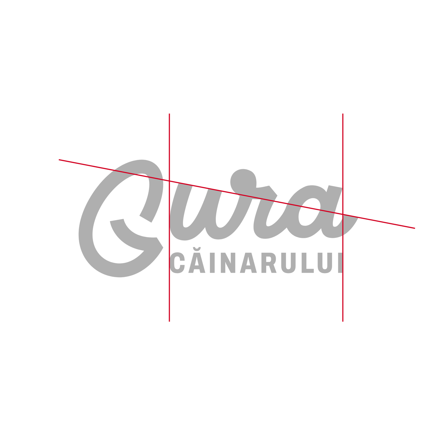
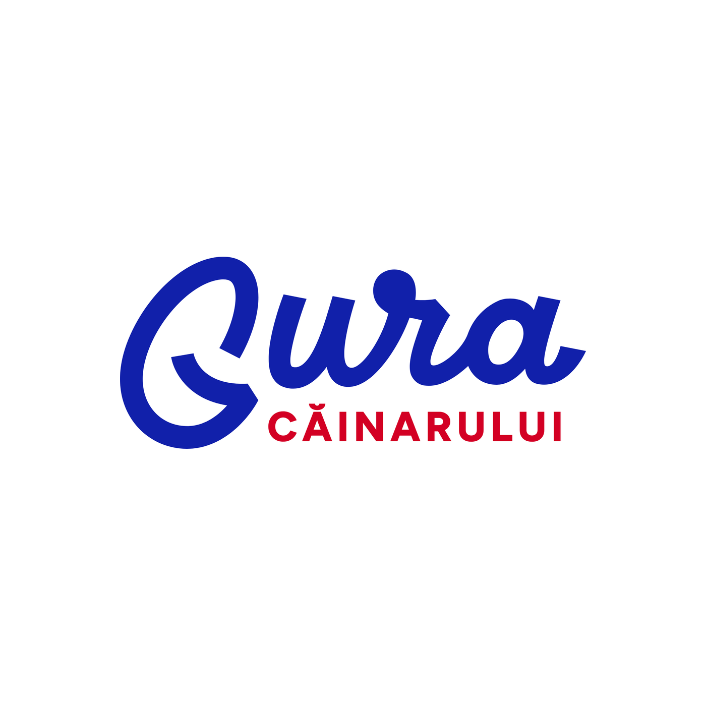
And the decisive correction came at the end: the u no longer drops on the same line, and the spacing between letters grew - breathing room solved what the flag alone could not. The result is exactly the clean version you saw among the finalists.
And the underlying debate, running through all of them: what matters more for this brand - the idea or memory? The case for the idea says: the U-smile is integrated, modern, works on a cap and a favicon, and the punchline is in the name itself. The case for memory answers: after four spent identities, the last thing this brand needs is yet another new idea - it needs to return to the only sign in which it ever built up memory: the script. The one that lived in the embossed bottle and in the wine cellars. A logo that can be embossed back into the plastic, right where a generation memorised it.
The duel, in context
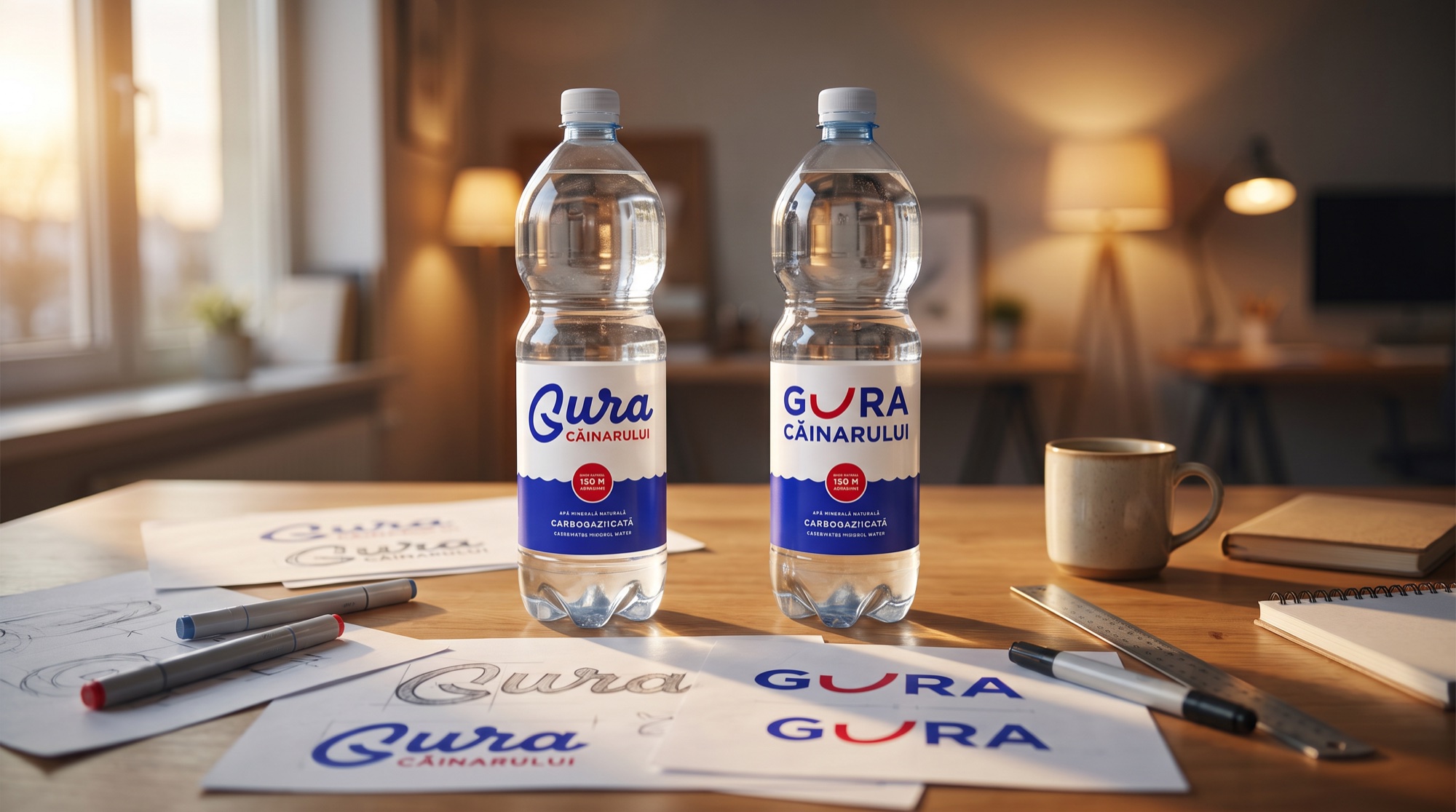
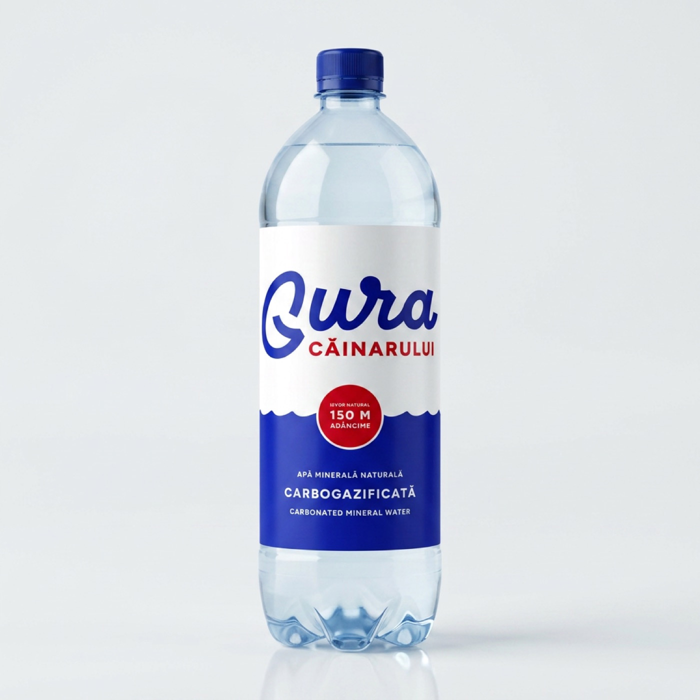
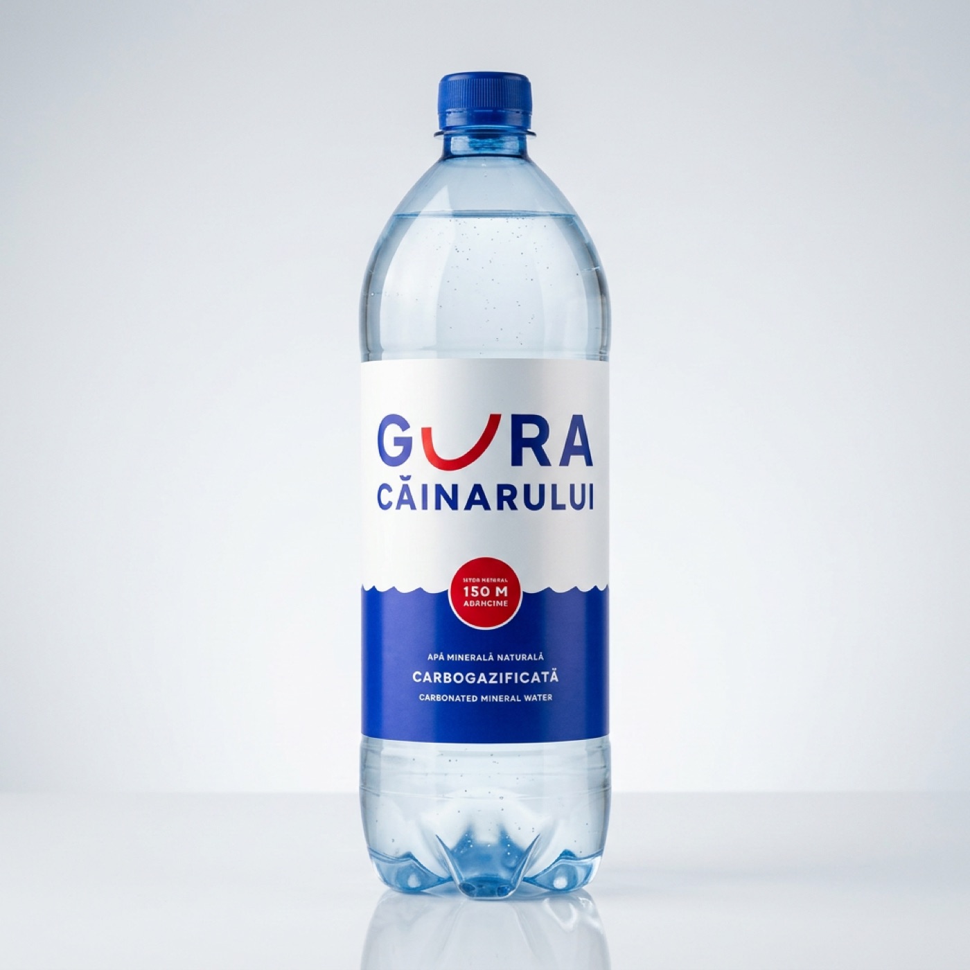
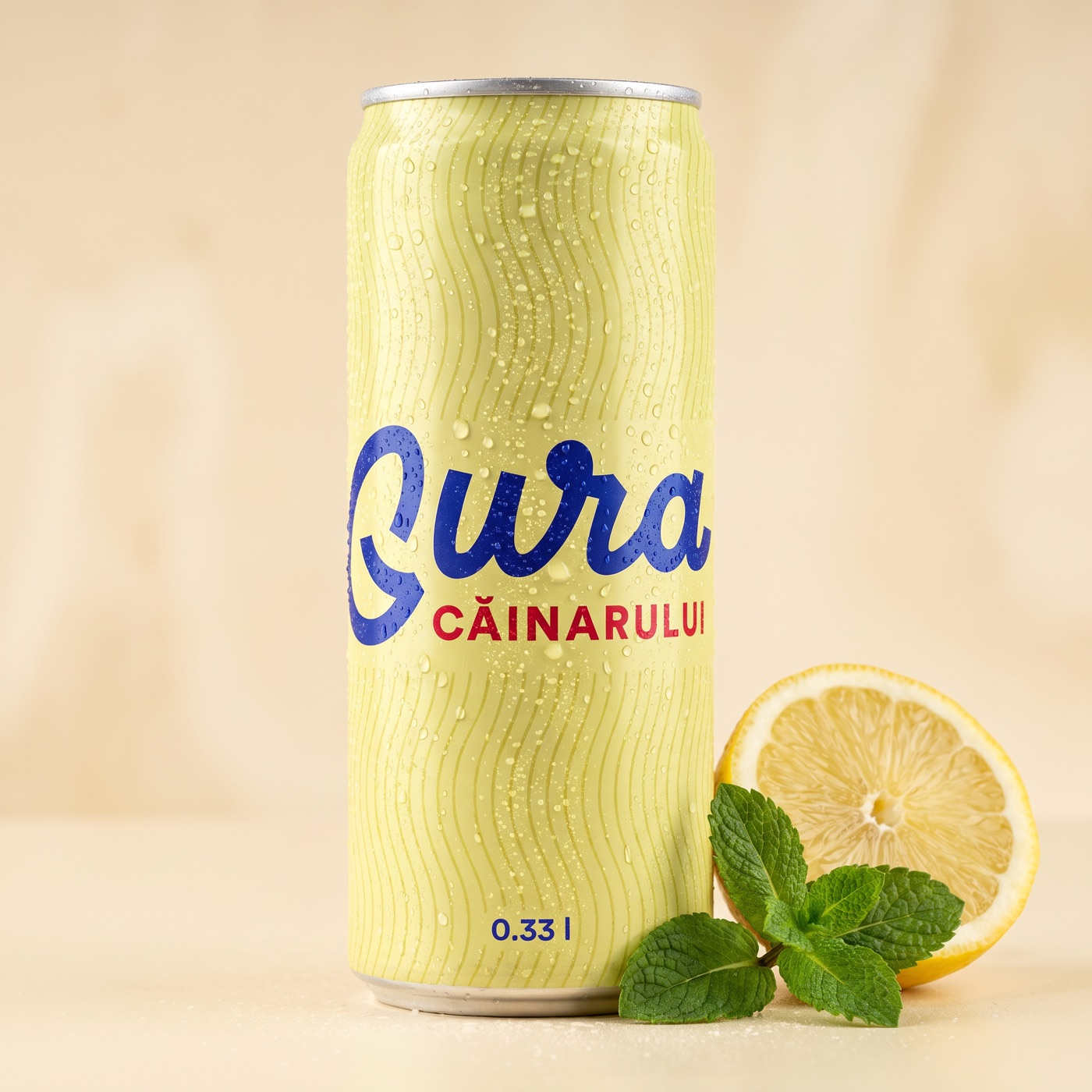
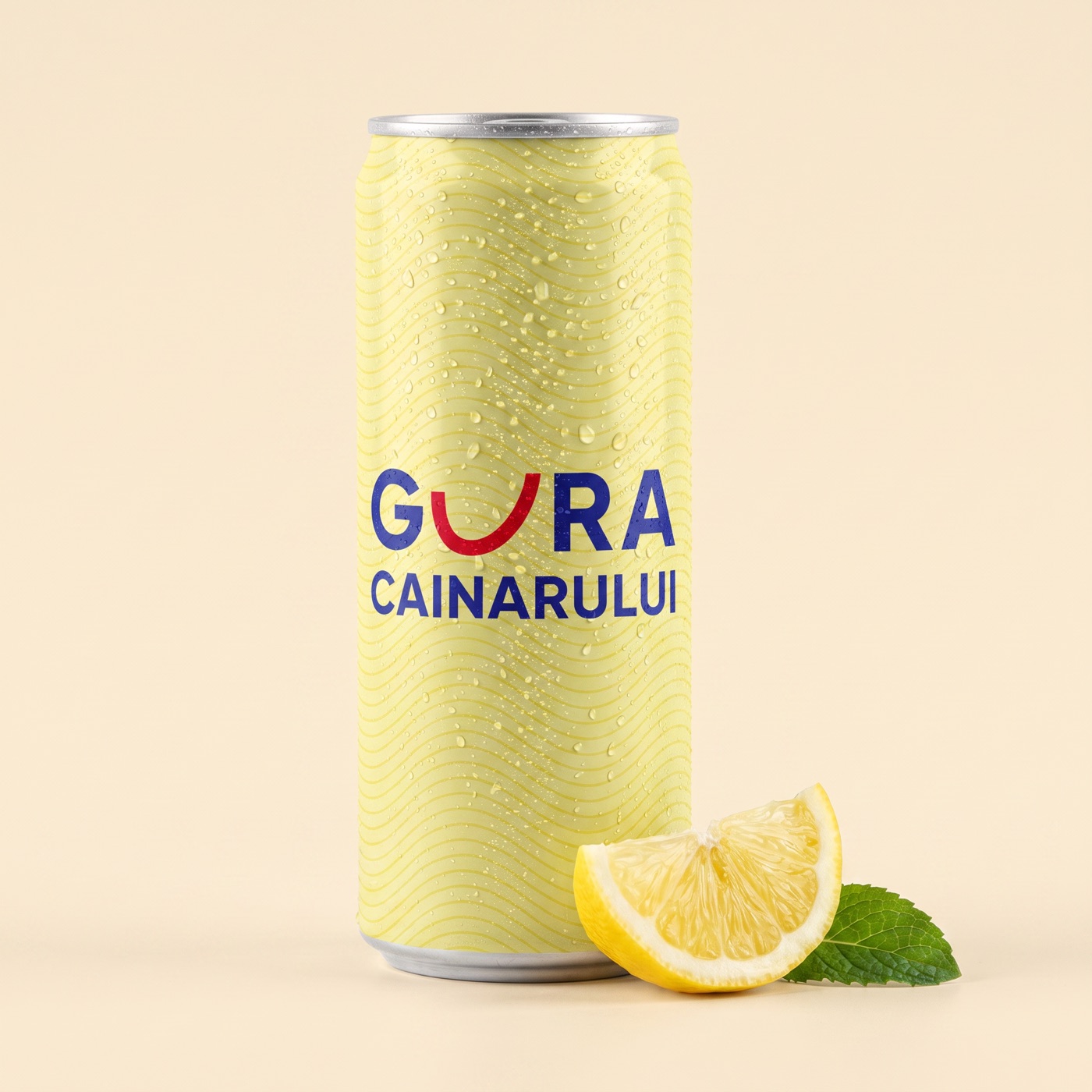
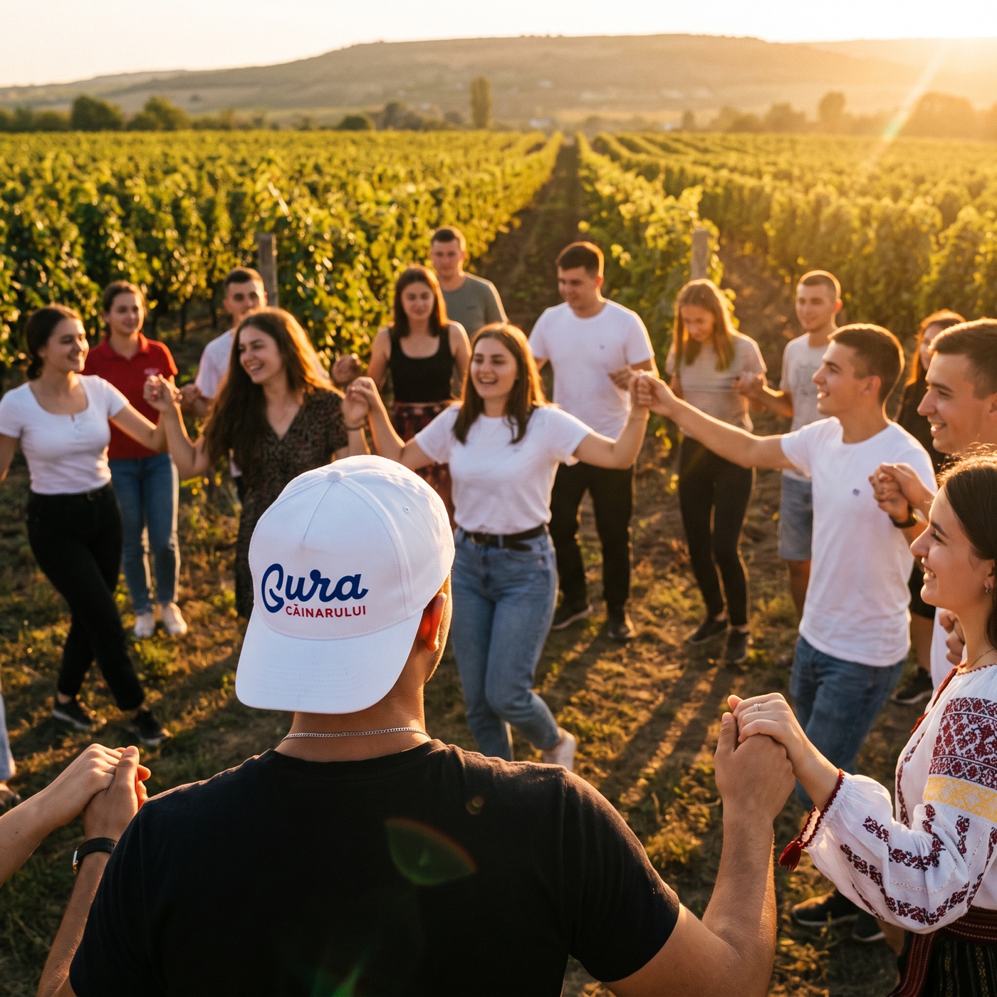
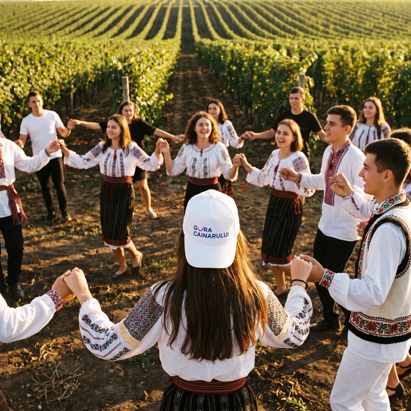
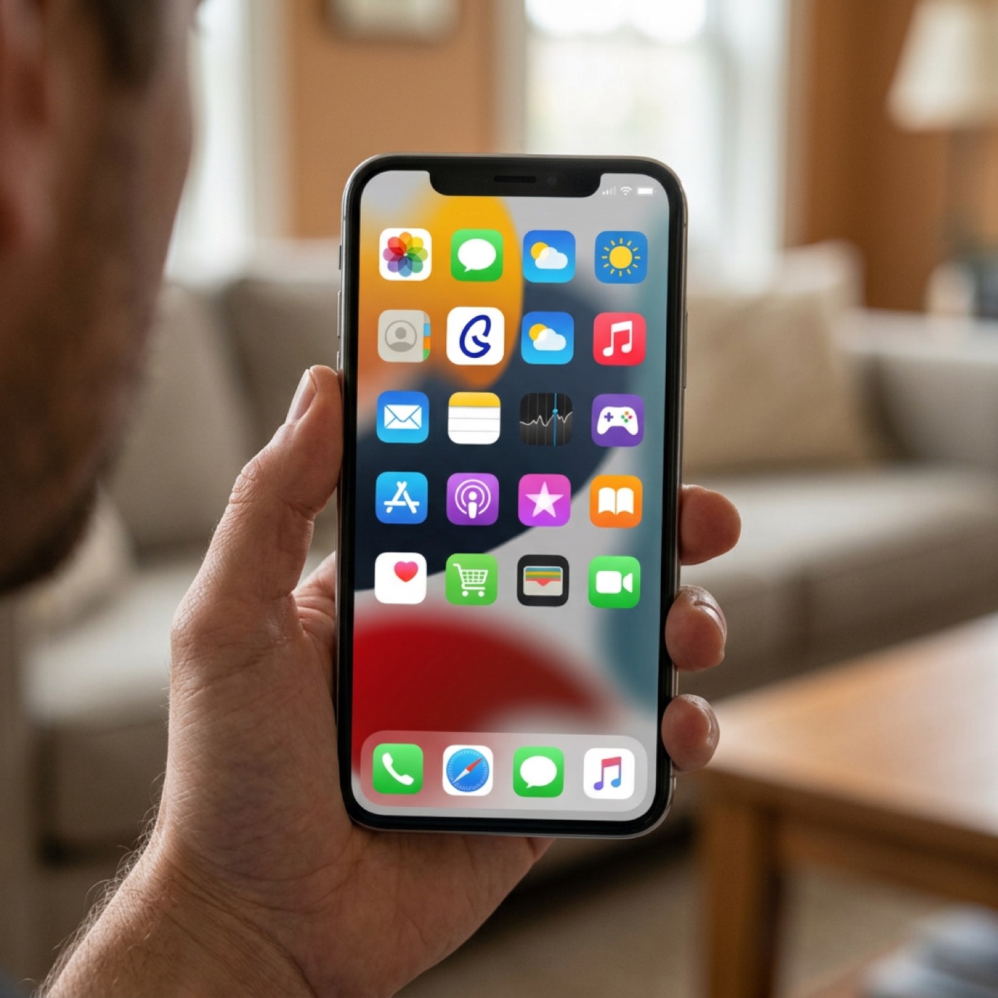
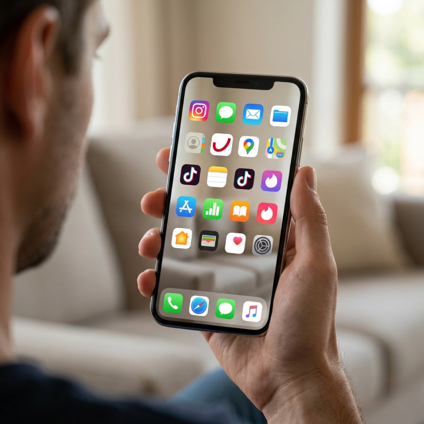
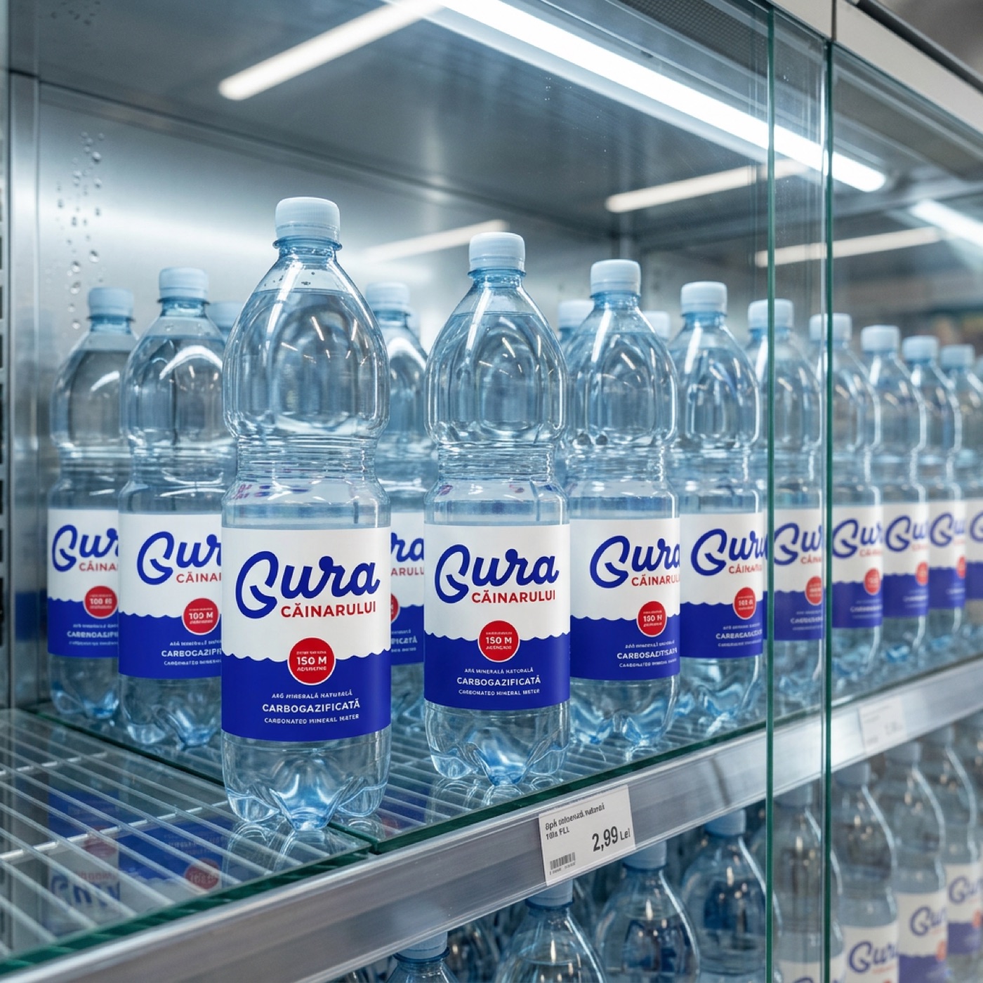
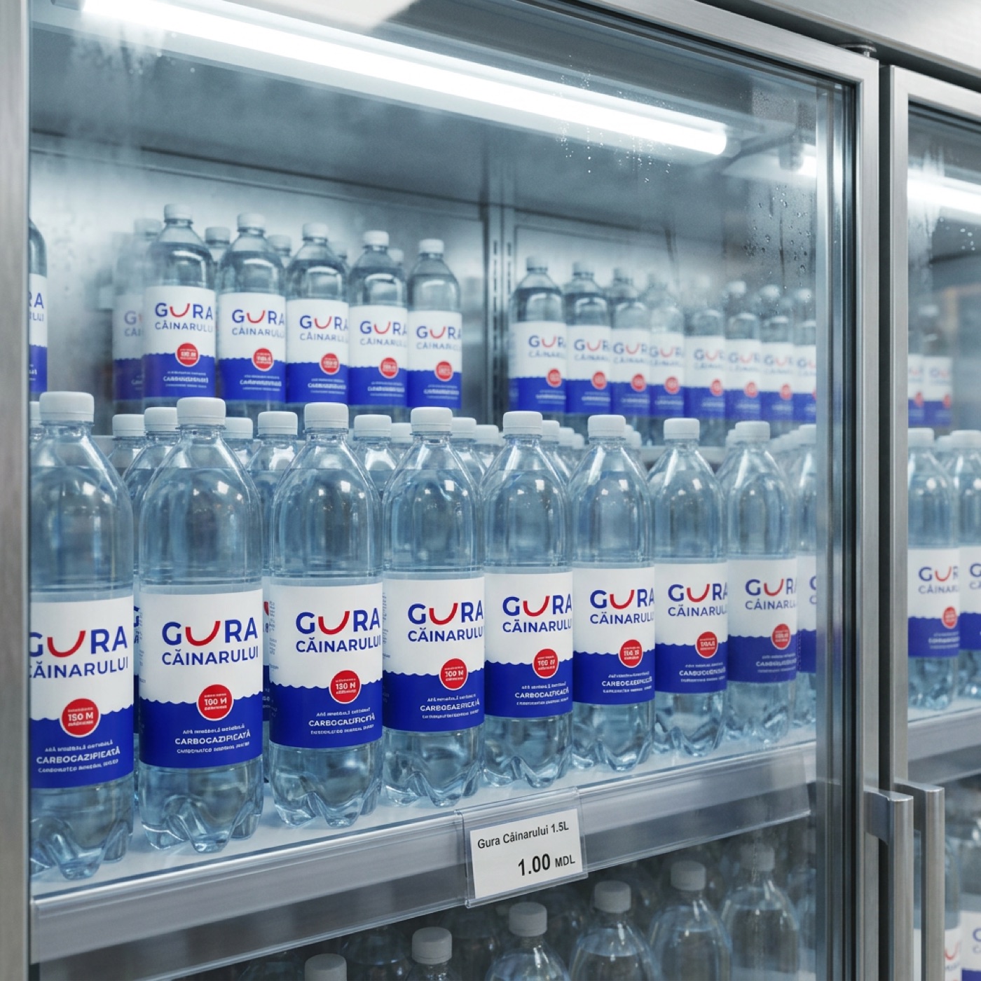
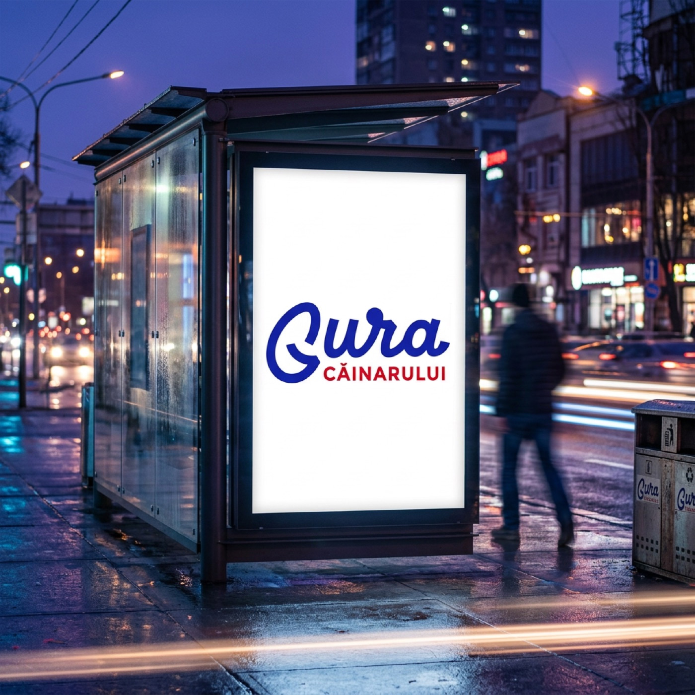
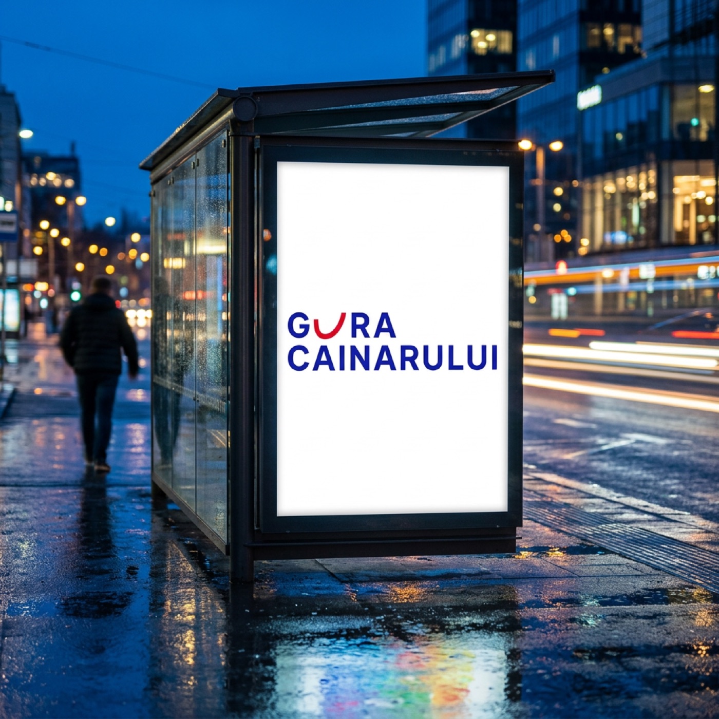
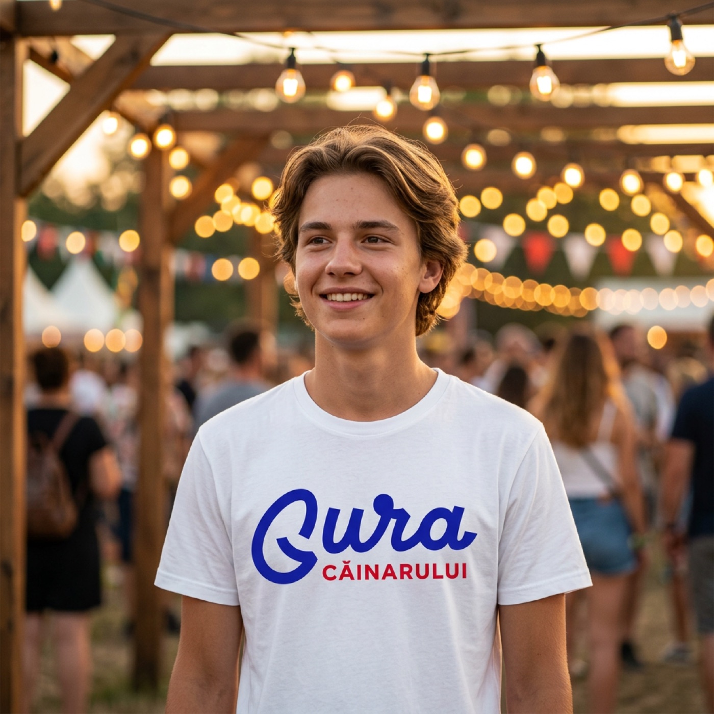
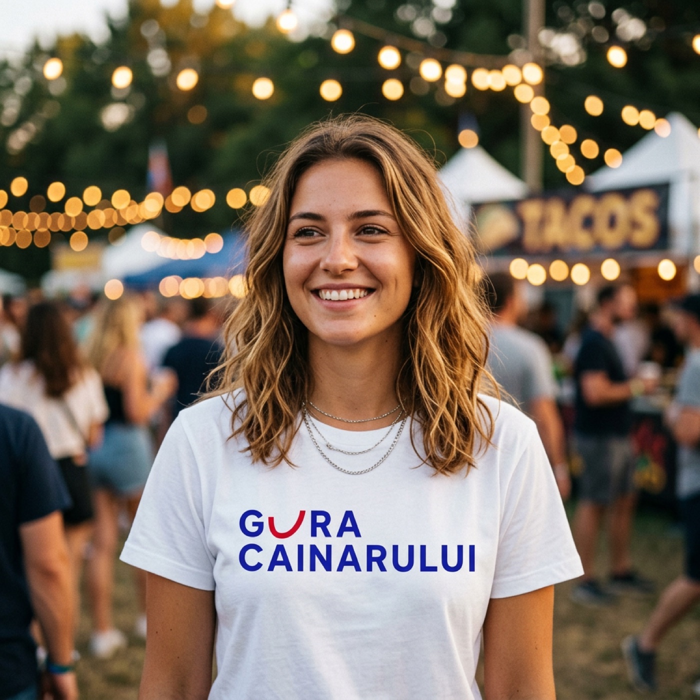
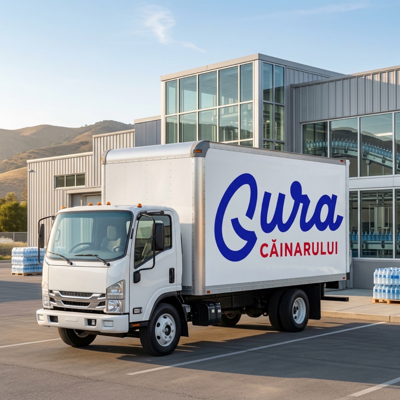
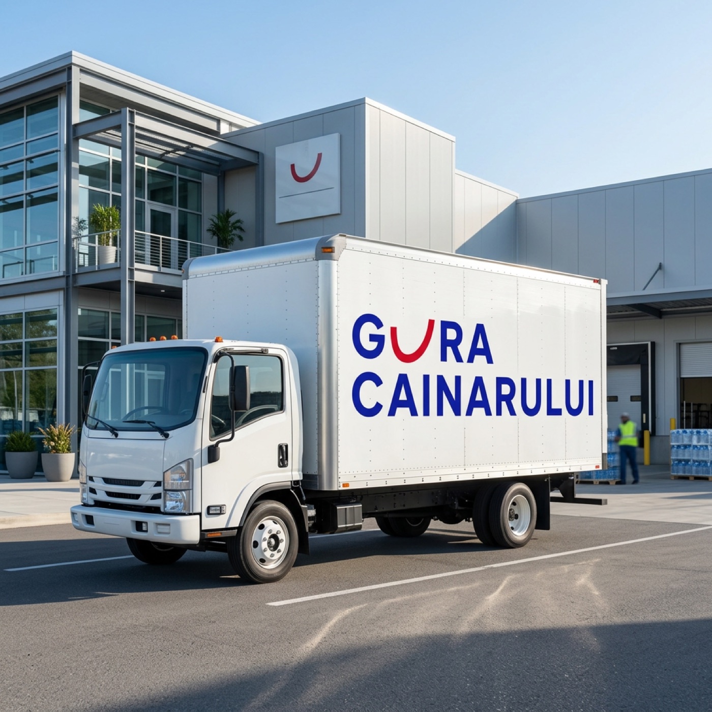
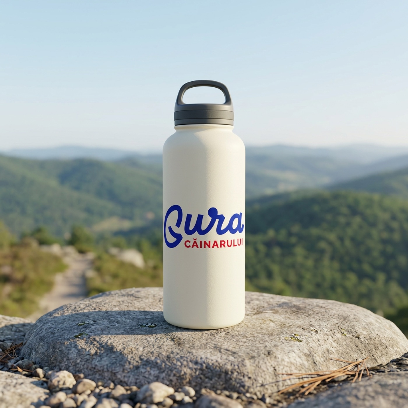
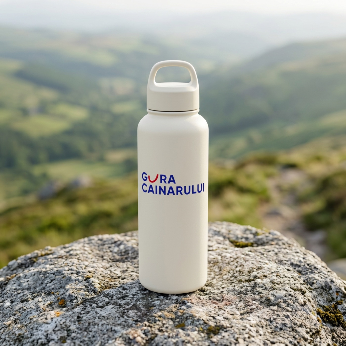
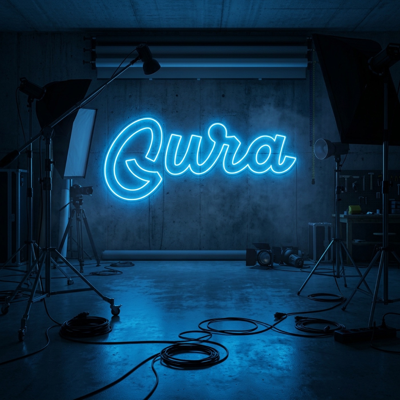
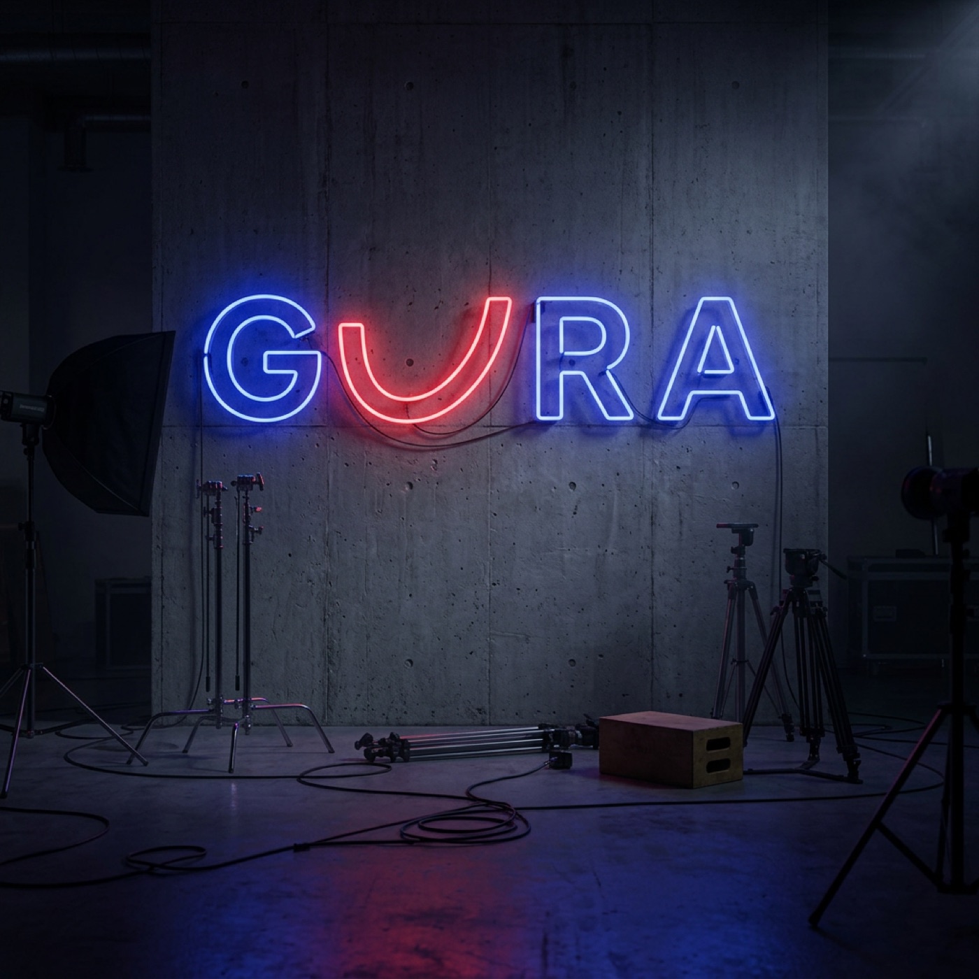
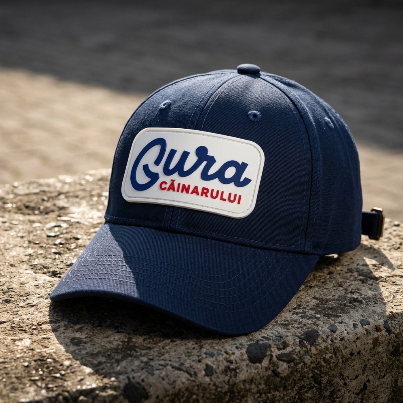
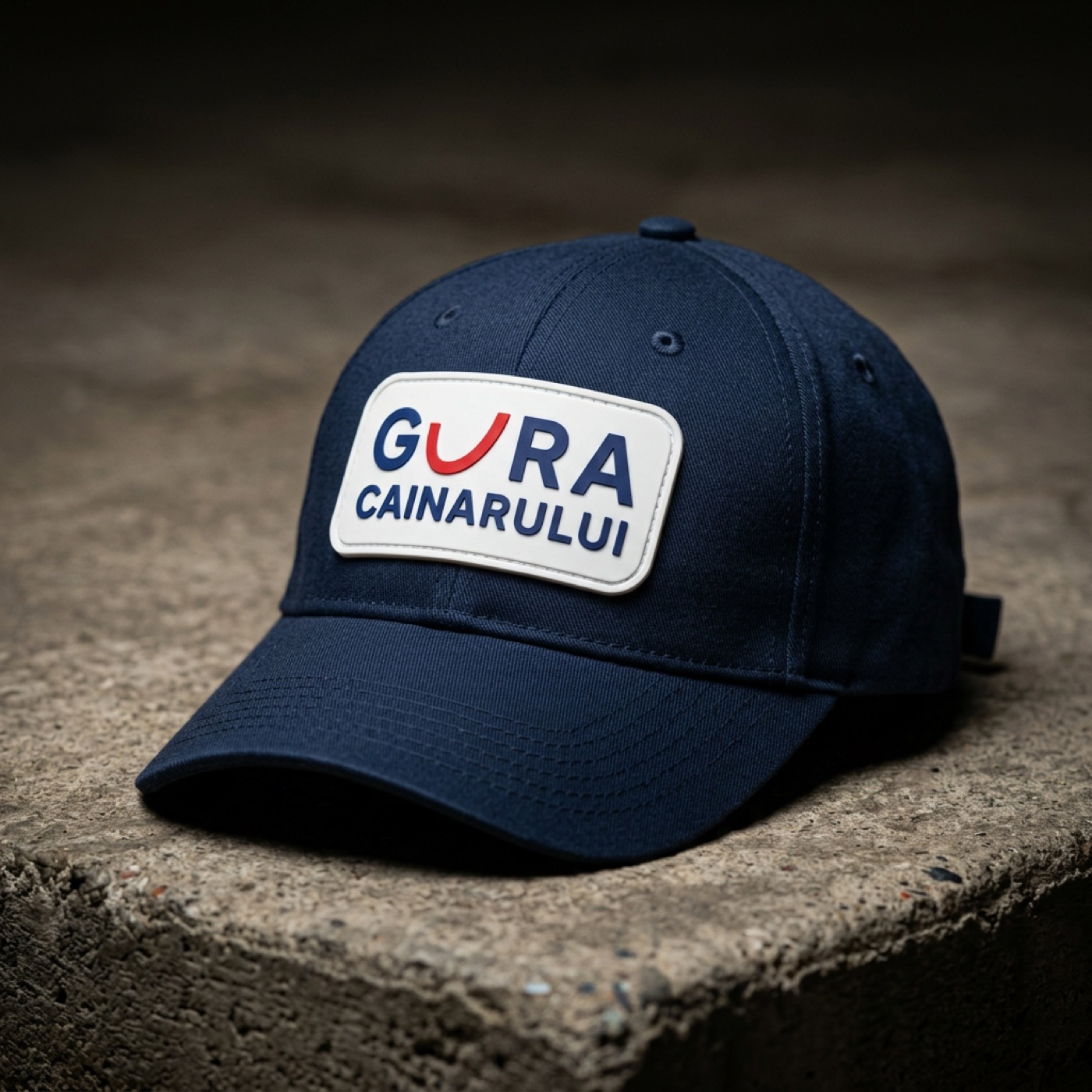
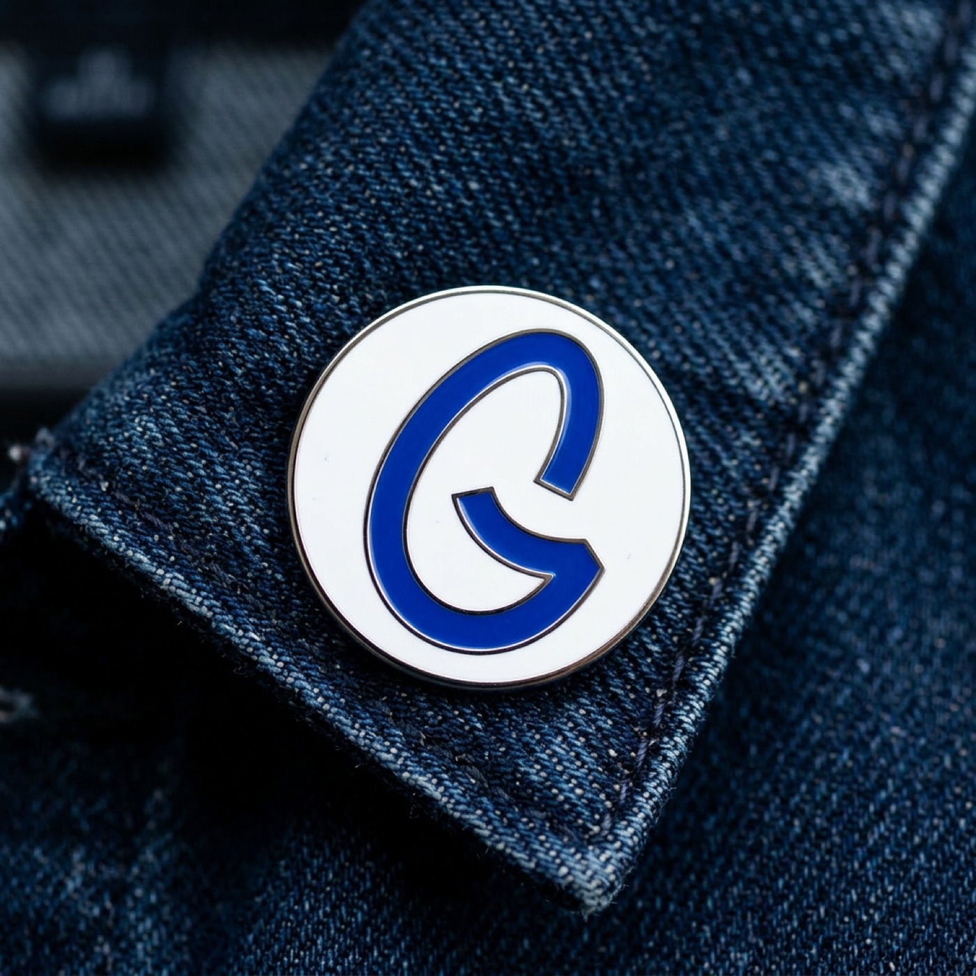
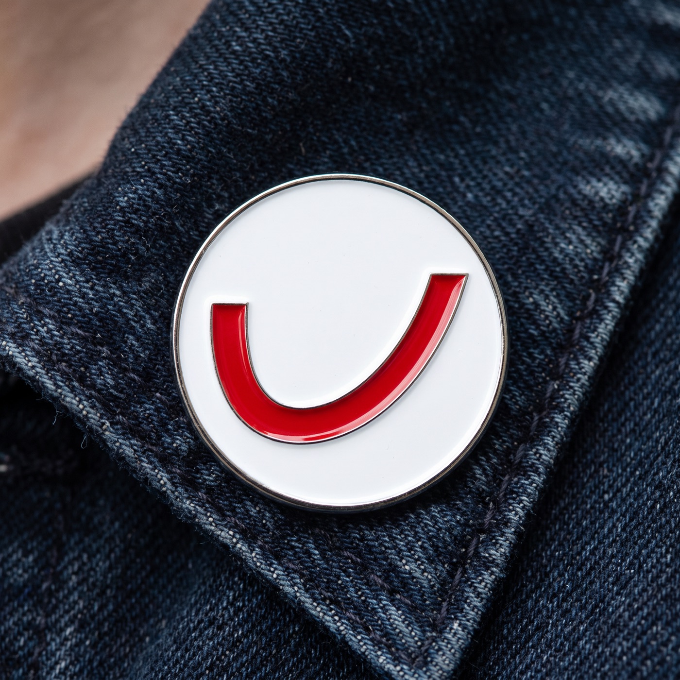
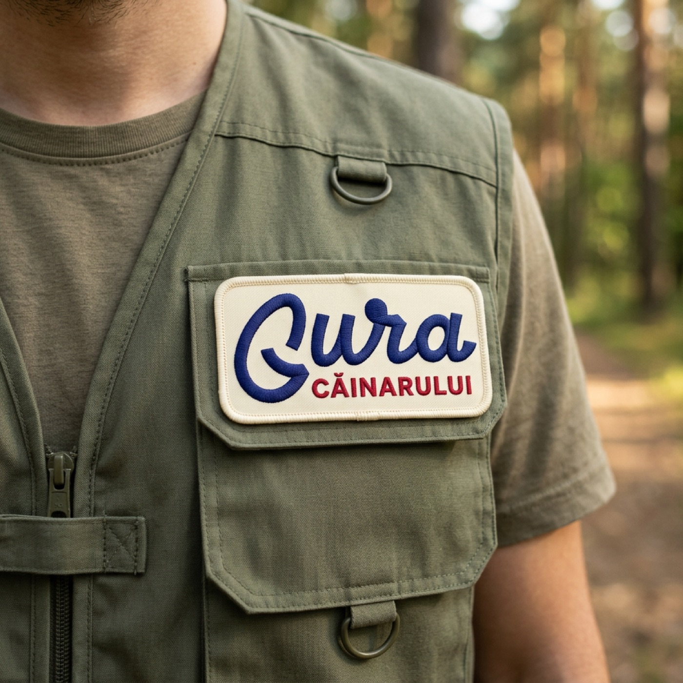
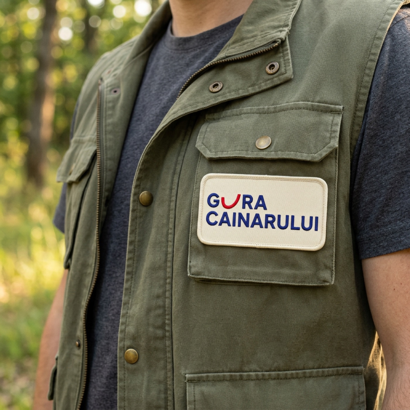
So that the debate does not stay abstract, we took both finalists into the same contexts - same scene, same light, only the logo changes. Throughout: the script on the left, the U-smile on the right. First the system, then the real world.

An honest note before the mock-ups: we did not set out to design labels, packaging or merchandise here. A real label is a project in its own right and deserves far more attention - and done properly, it would clearly look more professional than what follows. The images below have a single purpose: to put the logos in context and let you compare, at a glance, how each would work in different situations.
The strategic bonus: a second life
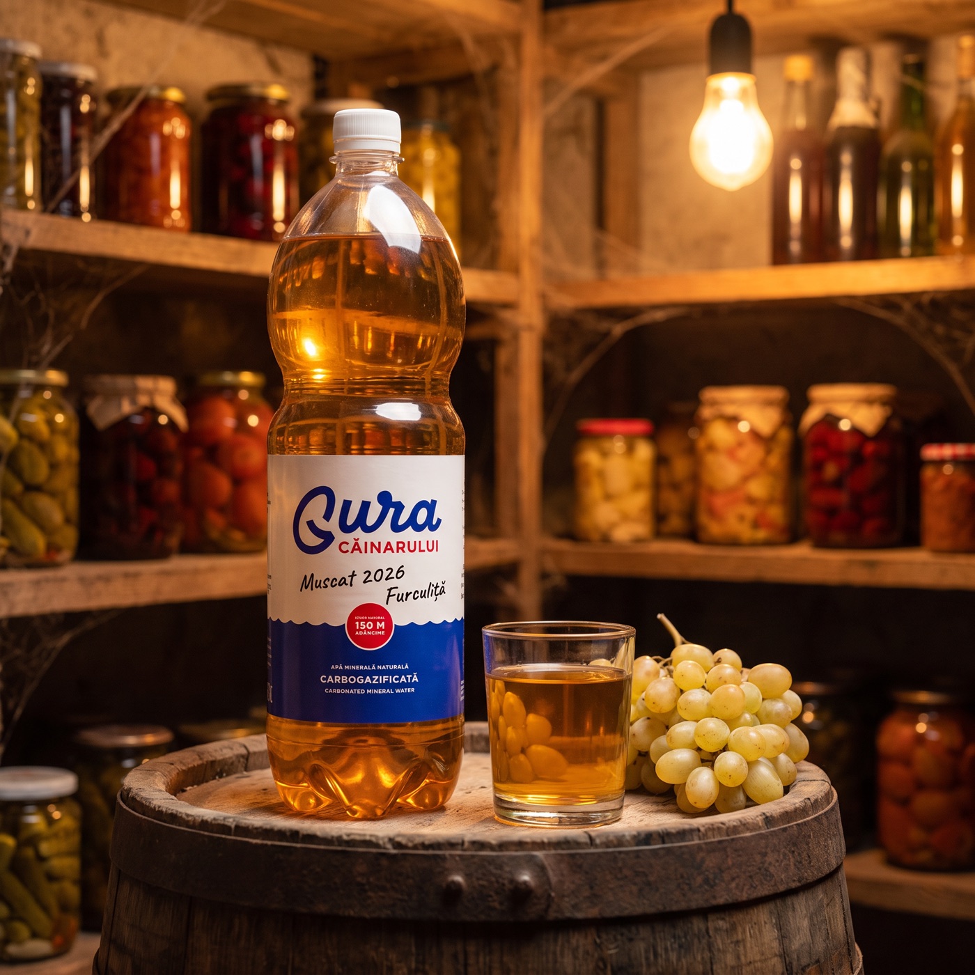
And here is the idea that, in our view, the official rebrand missed - and that either finalist could embrace. The public on TikTok was not mourning a label: it was mourning the bottle in which Moldova keeps its homemade wine. Instead of shying away from the legend, the brand could own it: a Gura Căinarului bottle does not die when the water runs out - that is when it begins.
In practice: the logo embossed back into the PET, where it stays visible even after the label peels off in the cellar - you can see exactly how it looks below. And their current slogan would flip almost by itself: “Aceeași apă. Trăită altfel.” becomes “Aceeași sticlă. Trăită de două ori.” (Same bottle. Lived twice.) A water brand that loves its second life - homemade wine and all - is a story no other water on the shelf can tell.
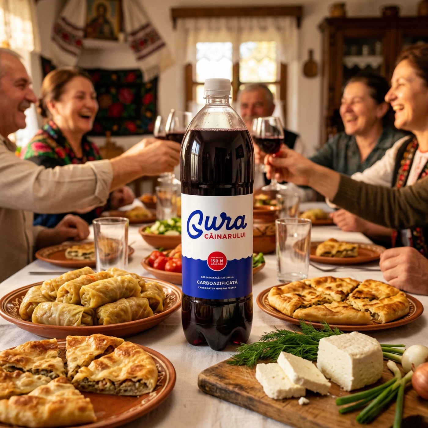
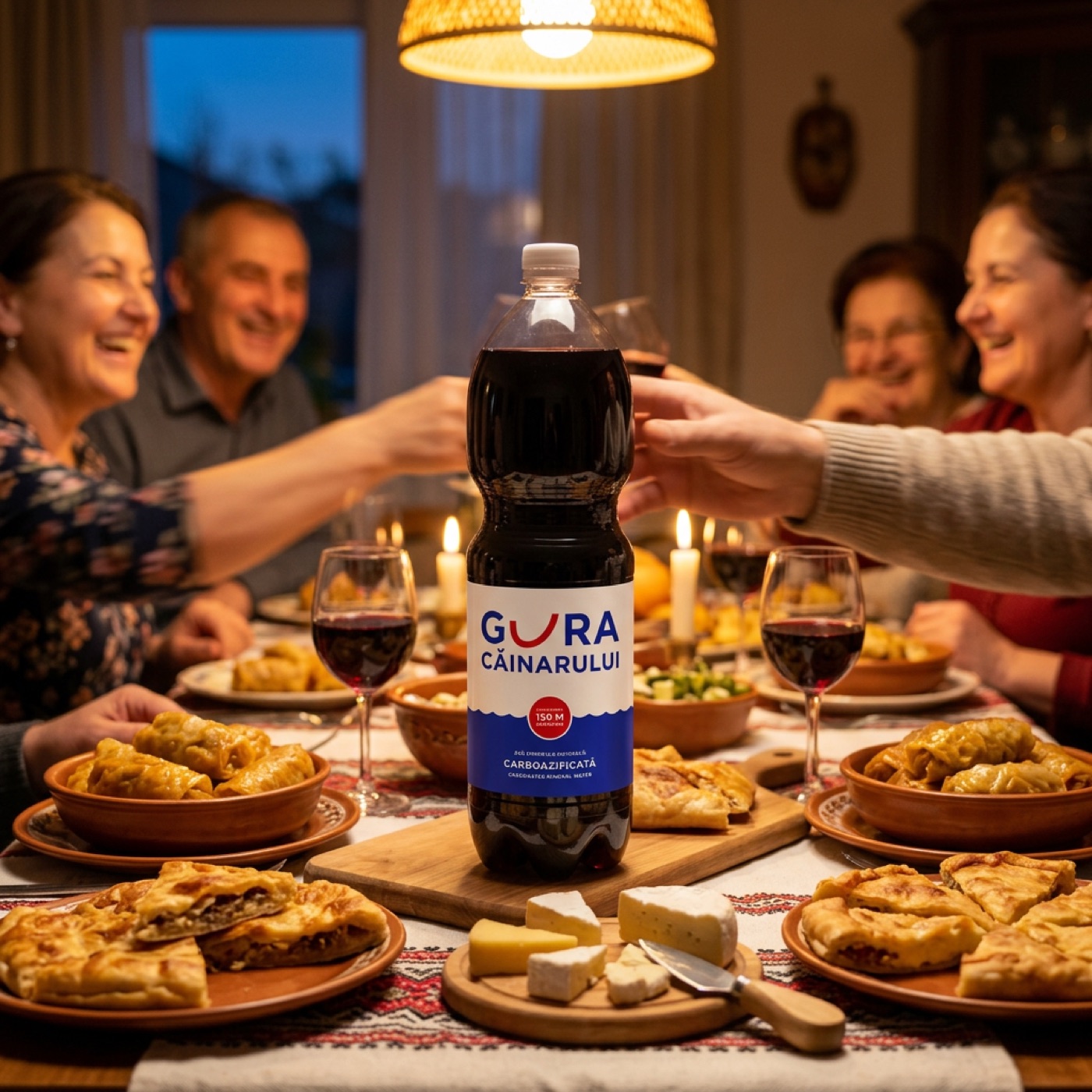
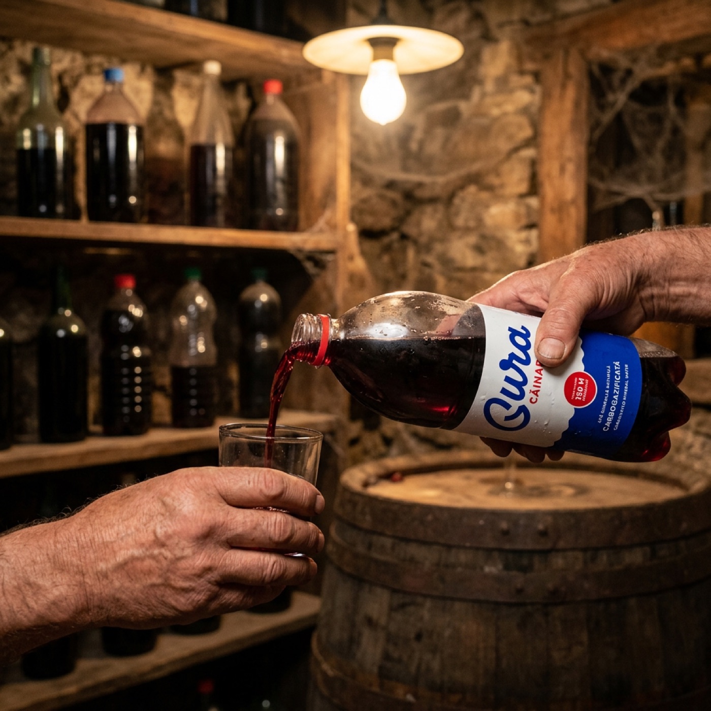
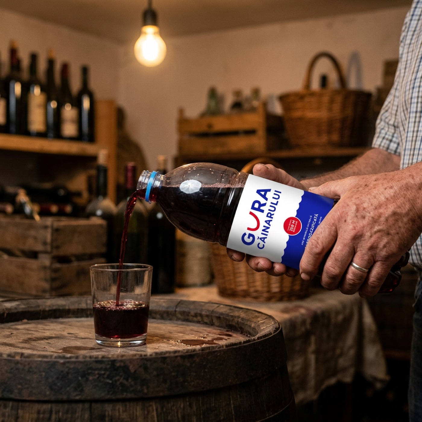
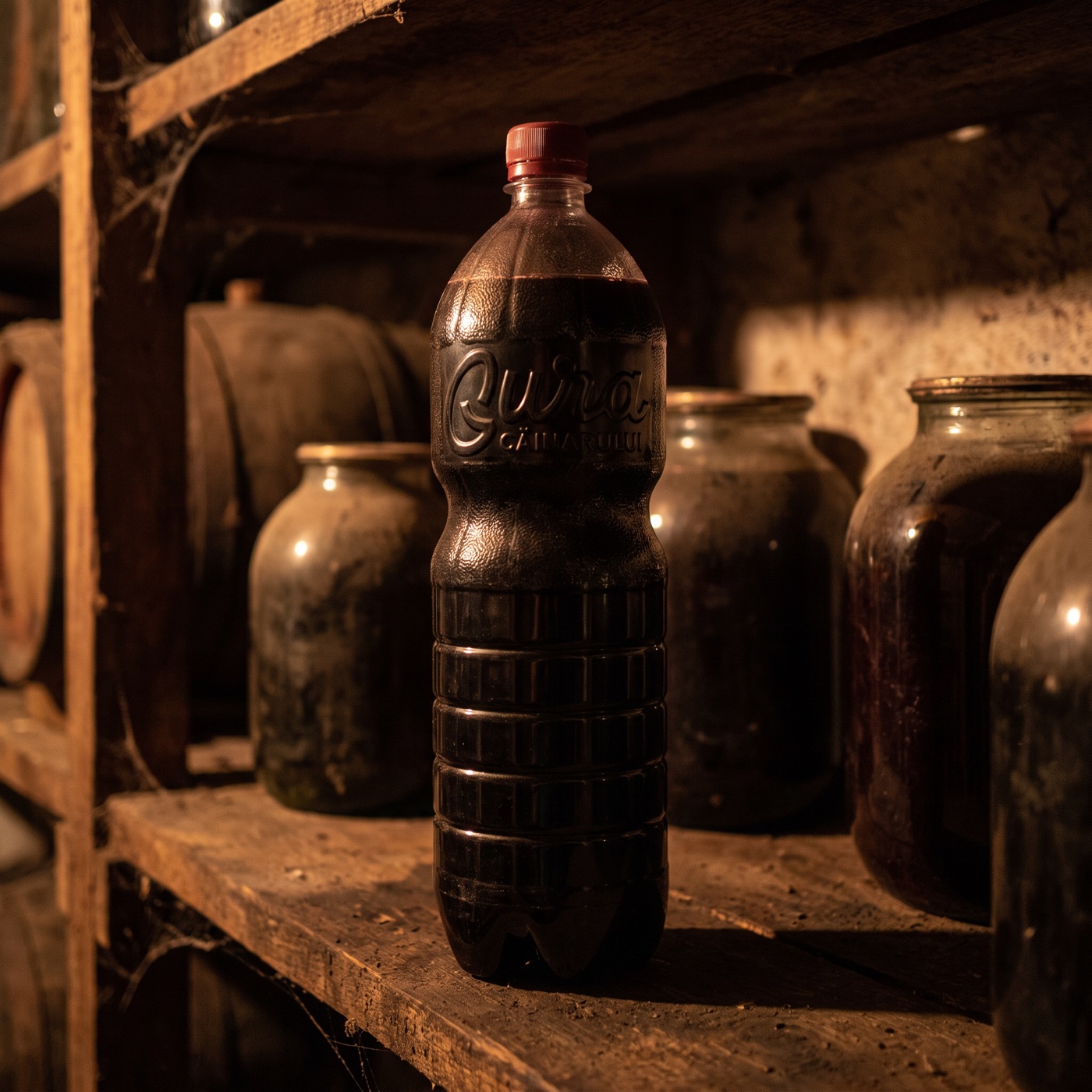
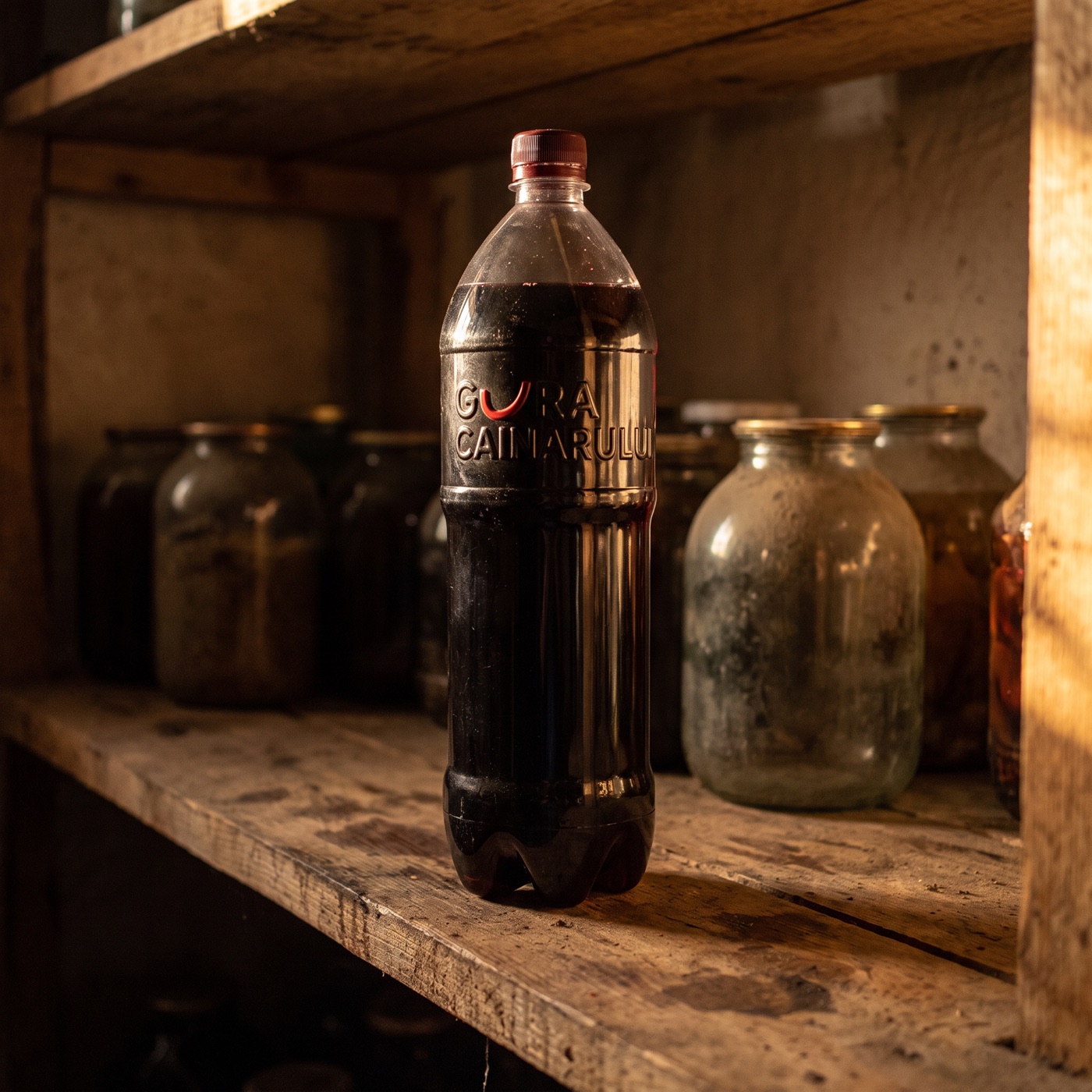
And a label designed from the outset for both lives could look like this: a field to fill in with a marker - the grape variety, the year, the household. We are saving the rest of the concept for a future episode.
Where we stand. For now
Our leaning, today: the script. Not because the U-smile is weak - round by round, it answered almost every objection - but because, for a brand tired of reinventing itself, memory beats the idea. The script is the story only Gura Căinarului can tell: not “we drew something new”, but “we went back to the signature all of Moldova knows - and this time, we built it with discipline”.
But we are not declaring a winner. Both directions stay on the table, and if this process has taught us anything, it is that premature verdicts are exactly how brands end up on their fifth identity. This article does not end with a logo. It ends with a way of thinking.